Just looking for our Best Consultant Website examples list?
Key Takeaways
- Professional Design Builds Trust: A consultant website is a reflection of your expertise—strategic design instantly communicates credibility and positions you as a trusted authority.
- Clear Navigation Drives Conversions: When visitors can easily find your services, reviews, and contact options, they’re far more likely to become qualified leads.
- Ongoing Maintenance is Essential: WordPress sites require regular updates, security checks, and performance tuning to protect your reputation and ensure continued success.
Consultant Website Design Guide: Why Great Design Isn’t Optional
Your website isn’t just a digital business card—it’s your first impression, your 24/7 salesperson, and your most scalable marketing tool. For consultants, whose work hinges on trust and perceived expertise, your online presence can either make or break your client acquisition strategy.
Potential clients visit your consulting website to validate your credibility, evaluate your services, and decide if you’re the right fit. But if your site feels outdated, hard to navigate, or fails to communicate your value, they’ll bounce—possibly to a competitor’s better-built website. This is where professional site design transforms from a luxury into a necessity.
Whether you’re just launching your consulting business or you’re revisiting your digital strategy, your website must do more than look good. It must be structured to convert. That means intuitive user flows, smart use of customer feedback, persuasive copywriting, a clear services page, and an easy-to-find contact form. It also means paying attention to behind-the-scenes factors like search engine optimization (SEO), mobile responsiveness, and loading speed.
Unfortunately, many consultants rely on a generic website builder or template from platforms like Squarespace, thinking it’s “good enough.” But in an increasingly competitive digital world, “good enough” leaves money on the table. A high-performing website is carefully designed with best practices in mind—from layout and structure to CTAs and client feedback—so that every pixel works toward establishing trust and converting visitors into leads.
In this guide, you’ll learn how to build your website the right way—step by step. We’ll cover layout strategies, SEO insights, CRO techniques, and real case studies to illustrate what great design looks like in action. Whether you’re a solo consultant or part of a small business team, you’ll leave knowing exactly how to turn your website into a lead-generating machine.
Let’s get started. The right design can elevate your brand, grow your email address list, and turn your site into your most powerful business asset.
Laying the Foundation: Website Planning & Purpose for Consultants
Before diving into layouts, color palettes, or even your homepage copy, the most critical part of designing a website begins behind the scenes—with planning. For consultants, your website isn’t just an online brochure. It’s your digital handshake, portfolio, and conversion engine all wrapped into one.
The first step is to clarify the core purpose of your site. Ask yourself: Are you trying to generate leads? Build thought leadership? Streamline client communication? For most consultants, the answer is a blend of all three. That’s why effective website planning starts by aligning business goals with site functionality. Your design should support your services, not just describe them.
Next, define your primary audience. Who is your ideal client, and what challenges are they facing when they land on your site? Planning a site without understanding your audience is like writing a book without knowing who’s reading it. Consultants often serve niche markets, so tailoring your message to resonate with your exact client profile will significantly improve conversions.
Equally important is mapping out the key content your site must feature. This typically includes a compelling homepage, a clear services page, high-impact case studies or client testimonials, and a frictionless way to contact you, like a strategically placed form or a persistent “Get in Touch” button. You’ll also want to plan for long-term scalability, ensuring your site can grow with your consulting business and support content like blog posts, downloadable assets, and gated offers.
CyberOptik specializes in helping consultants navigate this planning phase and turn their ideas into functional, high-performance websites. For a tailored approach, explore our consultant website design services to see how we align design strategy with your goals from day one.
Thoughtful planning leads to a site that looks sharp and functions like a well-oiled lead-generation machine. Skipping this step results in wasted time, missed opportunities, and a site that underperforms where it matters most—bringing in clients.
Design Principles That Drive Results
Designing an effective website goes beyond aesthetics. The best designs are rooted in strategy, balancing visual appeal with usability, clarity, and conversion-driven layouts. When a potential client lands on your site, they should instantly understand who you are, what you offer, and why you’re the right choice.
- Simplicity with Purpose
Clean, uncluttered designs communicate professionalism and confidence—qualities clients expect from consultants. Avoid visual noise. Every element on the page should serve a function, whether that’s guiding the visitor’s eyes toward a call to action, reinforcing your brand identity, or providing essential information. A minimalist approach paired with an intuitive structure ensures your message doesn’t get lost. - Strategic Use of White Space
White space isn’t wasted space—it’s a powerful design tool. It helps users focus, improves readability, and increases comprehension. Thoughtfully used margins and spacing can elevate your site from average to elite, giving your content room to breathe and allowing key elements like CTAs or testimonials to stand out. - Hierarchy That Guides the Eye
Professional websites must communicate trust quickly. That’s where visual hierarchy plays a critical role. Use font sizes, color contrast, and positioning to draw attention to your most important content. Headlines should be bold and clear, while supporting text should guide visitors naturally through your service offerings, testimonials, and contact options. - Consistent Branding
Brand consistency across fonts, color palettes, icons, and tone of voice builds recognition and reinforces your professionalism. When visitors feel a coherent visual and verbal experience across your pages—from the homepage to your services page and contact form—they’re more likely to remember you and take action. - Mobile-First Design
More than half of web traffic comes from mobile devices. A modern website must load quickly and function seamlessly on phones and tablets. This includes scalable text, clickable buttons, and layouts that adjust fluidly across screen sizes. A mobile-first approach ensures no opportunity is lost due to a poor user experience. - Accessibility and Readability
Designing with accessibility in mind—such as ensuring sufficient contrast, using readable font sizes, and enabling keyboard navigation—widens your audience and reflects the professionalism expected in the consulting industry. Clear, legible content also supports SEO and user engagement.
For a complete breakdown of how to apply these principles throughout your web project, visit our step-by-step guide to the web design process. We walk you through how strategic design decisions impact user experience and conversions, especially in fields where trust and authority are paramount.
Great design isn’t decoration—it’s a business asset. For consultants, an effective website design should reflect the caliber of your expertise while making it effortless for visitors to learn, trust, and engage with you.
Content & Navigation: Structuring for Clarity, Confidence, and Conversion
A consultant’s website must do more than inform—it must persuade. Effective content and intuitive navigation work together to turn curious visitors into qualified leads. Without a clear structure, even the most polished design can fail to connect with your audience.
1. Prioritize Your Primary Pages
Industry websites should have a clear and concise set of core pages. At a minimum, include:
Homepage: Quickly communicates your value proposition and sets the tone for your brand.
Services Page: Clearly outlines what you offer and who you help, with details that demonstrate your expertise and value.
About Page: Builds trust through your story, qualifications, and approach. This is often one of the most-viewed pages for consultants.
Testimonials or Case Studies: Provides social proof and real-world examples of your success.
Contact Page: Offers an easy way for potential clients to get in touch, typically including a contact form, email address, and phone number.
Each page should serve a strategic purpose. Avoid filler content that clutters your message. Visitors should never wonder what they’re supposed to do next.
2. Build Clear Navigation Menus
Navigation must be simple and intuitive. Limit your main menu to 5–7 items, using familiar labels like “Home,” “Services,” and “About.” Avoid dropdown menus with too many nested items—these can confuse users and hurt usability, especially on mobile devices.
Every menu item should guide users toward taking action or learning more about your expertise. Include a standout call-to-action in the header (such as “Schedule a Consultation”) that remains visible on every page.
3. Use Content Hierarchies to Improve Scannability
Consultant site visitors are often in research mode. They scan more than they read. Structure your content using clear headings (H1, H2, H3), bullet points, and short paragraphs. Start with what matters most, such as outcomes and benefits, then offer more detailed content further down.
Each page should also be built around a single goal. For instance, your Services page should focus on showcasing value and driving visitors to take action, not trying to tell your entire business story.
4. Guide the User Journey with Internal Linking
Use contextual links within your content to guide visitors toward next steps. Link from your homepage to your services page, from services to testimonials, and from blog content to your contact form. This structure improves user experience, and it helps search engines better understand plus index your site.
5. Write for Action, Not Just Information
Every section of your content should lead to a logical next step. This could be a button, form, or link to learn more. Use action-driven language in your CTAs like “Get Started,” “Schedule Your Free Consultation,” or “See How We Work.”
When content and navigation work in harmony, your website becomes a guided experience rather than a passive read. This clarity boosts engagement, builds trust, and ultimately drives more qualified inquiries from your ideal clients.
Visual Elements: Supporting Brand Trust and Guiding the User Experience
Perception is everything. A polished, professional appearance signals competence and builds immediate trust. That’s why visual elements—images, color schemes, icons, typography, and spacing—play such a critical role in how a consultant’s website performs.
1. Establish Visual Consistency Across the Brand
Your website’s visuals should reflect your consulting brand’s tone and values. This includes a consistent color palette, uniform fonts, and cohesive design patterns. These elements help reinforce brand recognition and convey a sense of professionalism and stability, key traits clients seek in a consultant.
Choose a primary and secondary color palette that aligns with your brand personality. Soft, professional hues suggest approachability, while strong, bold colors can convey confidence and leadership. Use these colors intentionally to draw attention to key areas like calls to action, headlines, and contact buttons.
2. Use High-Quality, Purposeful Imagery
Every image on your site should serve a function. Replace generic stock photos with custom imagery or carefully selected visuals that relate directly to your consulting niche. Show yourself in action—working with clients, speaking at events, or showcasing your process. Authentic imagery builds connection and demonstrates legitimacy.
Visuals can also be used to break up text-heavy pages, helping users stay engaged. Avoid overloading your site with large image files that slow down load times; optimization is essential for both user experience and SEO.
3. Leverage Icons and Graphics to Enhance Clarity
Icons are powerful tools to help illustrate services, processes, and value propositions quickly. For example, a clean set of icons under each service area can help users grasp complex information at a glance. Ensure these are stylistically aligned with your overall design and used sparingly to avoid clutter.
Custom illustrations or branded infographics can also provide visual interest while explaining your approach or results. These are particularly effective on process sections or case study summaries.
4. Design With Typography That Enhances Readability
Typography shouldn’t just look good—it must be easy to read. Choose a professional, web-safe font family for headings and body text. Use size and weight variations to establish a clear hierarchy, making it easier for users to scan your content and absorb key points.
Headlines should be large and bold, body text legible and balanced, and CTAs clearly distinguishable from surrounding content. Avoid using too many different fonts, which can make your site look disjointed and amateurish.
5. Maintain Ample White Space
Visual breathing room helps users focus. By spacing out elements and avoiding crowded sections, you create a more comfortable browsing experience. White space supports the hierarchy of your messaging, draws attention to important content, and keeps the interface visually clean.
A website that leverages visual elements strategically does more than look good—it communicates credibility, builds emotional connection, and helps guide users toward taking action. Every image, icon, font, and layout decision should work in harmony to support your brand and the overall user experience.
Ongoing WordPress Maintenance: Why Consultants Can’t Afford to Neglect It
A website is never truly “finished.” Just like your business evolves, your site needs consistent attention to remain secure, functional, and effective. WordPress is a powerful platform for consultants, offering flexibility and scalability, but it also requires regular maintenance to protect performance and prevent issues that could hurt your credibility.
1. Security Updates and Plugin Management
One of the biggest vulnerabilities in any WordPress site stems from outdated plugins and themes. Hackers often exploit known weaknesses in outdated software. Regular updates ensure your site runs the latest versions of WordPress core, themes, and plugins, patching security gaps before they become problems.
For professionals who handle sensitive client information or have contact forms capturing email addresses, secure handling of data isn’t optional. Maintaining updated security protocols helps cement trust and ensures your professional image isn’t compromised by a breach.
2. Performance Optimization
Speed matters. If your consulting website loads slowly, potential clients are likely to bounce before engaging with your content. Ongoing maintenance includes performance checks to reduce image sizes, remove unused code, and optimize your hosting setup. These efforts enhance user experience and improve your search engine rankings.
3. Backups and Restoration Planning
Imagine your site crashes the night before a big campaign launch. Without a recent backup, restoring it could mean hours of downtime or worse—losing key content. Regular automated backups and a defined restoration process are essential for minimizing risk and ensuring business continuity.
Professionals often rely heavily on their online presence for lead generation. Downtime translates directly to lost opportunities.
4. Content and Plugin Audits
Websites naturally evolve, and with that comes plugin bloat, broken links, and outdated content. A quarterly audit of your site’s plugins, functionality, and core messaging ensures you’re always putting your best foot forward. It also offers a chance to improve how you present your services or share recent case studies and testimonials.
5. Compliance and Accessibility Monitoring
Maintaining accessibility and compliance with data protection laws is not a one-time task. Your consulting business may serve diverse clients and markets, so it’s essential to keep your site compliant with ADA guidelines and privacy regulations like GDPR or CCPA. This includes reviewing your cookie policy, privacy notice, and form data handling.
WordPress is a dynamic ecosystem that gives you a professional edge, but that edge is dulled if the site is left unattended. Consistent maintenance protects your investment, improves the client experience, and keeps your site working as hard as you do. When your website is a critical part of your business development strategy, reliability isn’t a luxury—it’s a requirement.
Best Consultant Website Design Examples
Here are some industry examples, including five designed by our agency, with key takeaways for each:
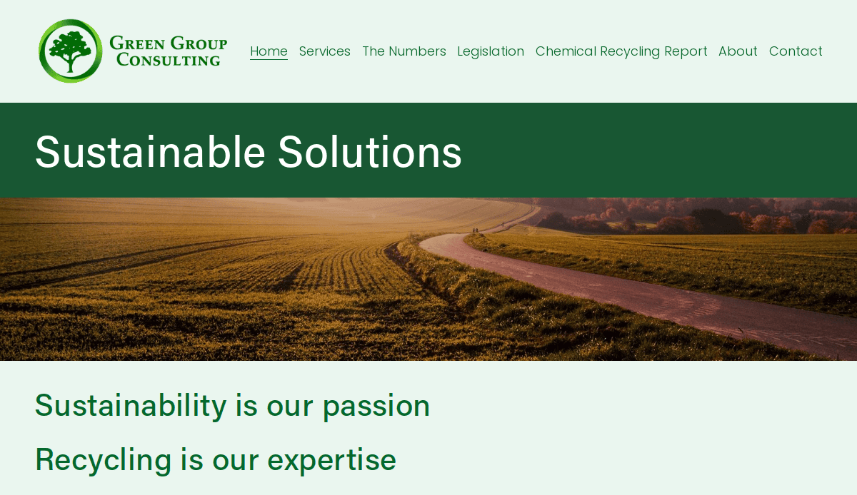
1. The Green Consulting Group
Location: McMurray, PA
3 Key Takeaways:
- Large Video Background:Features an impressive video background above the fold, immediately capturing attention and conveying their focus on sustainability.
- Strategically Placed CTA:A prominent call-to-action is well-placed to encourage visitor engagement.
- Clear Mission Statement:The homepage effectively presents the company’s mission, creating an immediate understanding of their values.
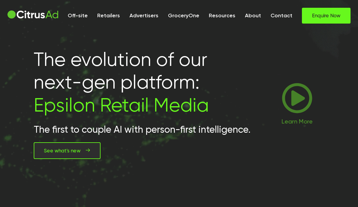
2. CitrusAd
Location: Australia
3 Key Takeaways:
- Sleek & Modern Design:Impressively combines a sleek, modern design with an intuitive user interface.
- Effective Use of White Space:The clean layout, well-chosen color scheme, and effective use of white space make navigation effortless.
- Prominent Engagement Buttons:Clearly labeled sections and prominent “Enquire Now” and “Contact Us” buttons encourage user engagement.
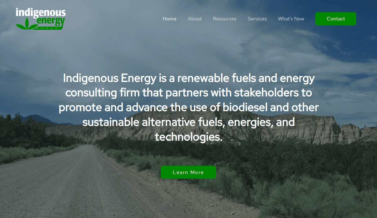
3. Indigenous Energy
Location: St. Chicago, IL
3 Key Takeaways:
- Clean Layout & Organized Structure: Easy for users to navigate through essential sections like “About,” “Resources,” and “Services.”
- Clear Mission Communication: Effectively communicates its mission to promote sustainable alternative fuels and technologies.
- Informative Content: Backed by informative content that positions the firm as an authority in its niche.
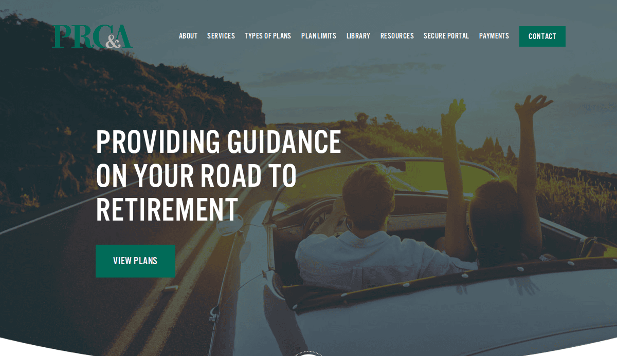
4. Planned Retirement Consultants and Administrators (PRCA)
Location: Ridgewood, NJ
3 Key Takeaways:
- Aura of Professionalism:From the instant viewers land on the website, an aura of professionalism and expertise is immediately evident.
- Crisp Visuals:The use of crisp visuals, such as scenic background images, complements the financial theme.
- Relatability & Trust:Adds a touch of relatability and builds trust with potential clients.
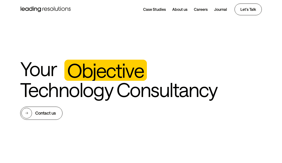
5. Leading Resolutions
Location: United Kingdom
3 Key Takeaways:
- Visually Appealing & Functional:The website is both visually appealing and highly functional, offering a seamless user experience.
- Clean & Professional Layout:A clean and professional layout, complemented by a monochromatic color scheme, instills a sense of trust and reliability.
- Sophistication and Aesthetic Appeal:Boasts sophistication and aesthetic appeal, reflecting the quality of their consulting services.
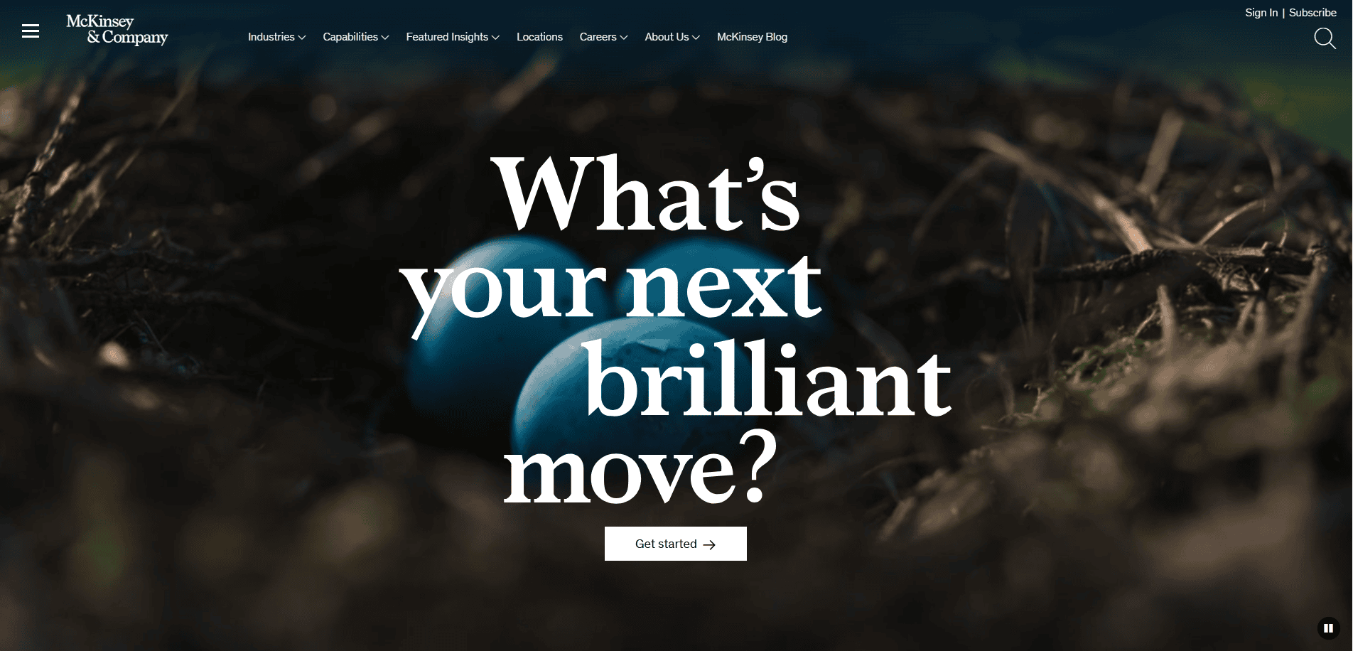
6. McKinsey & Company
Location: Global (Numerous offices worldwide, headquartered in New York, NY)
3 Key Takeaways:
- Thought Leadership Hub:Features extensive insights, research, and publications, establishing them as a global thought leader.
- Clean & Professional Interface:A sleek and intuitive design that reinforces their high-end, strategic consulting services.
- Global Presence & Impact:Effectively communicates their reach and the significant impact they have on various industries and governments.
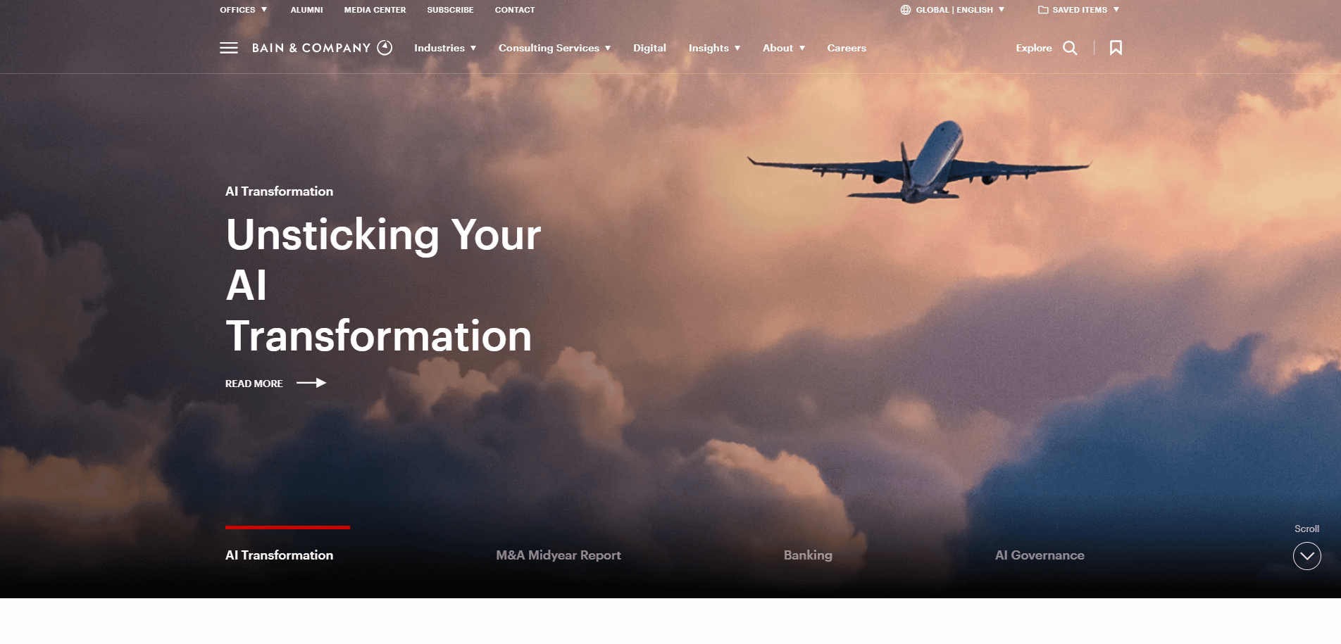
7. Bain & Company
Location: Global (Numerous offices worldwide, headquartered in Boston, MA)
3 Key Takeaways:
- Focus on Client Success Stories:Prominently features real-life experiences and positive outcomes, building strong social proof.
- Clear Value Proposition:Articulates their strategic advice and implementation support clearly across various industries.
- User-Friendly Navigation:Offers easy navigation to explore their services, industries, and career opportunities.
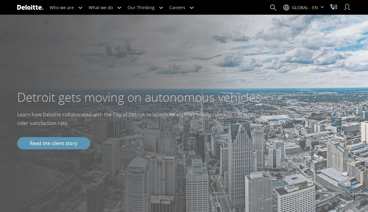
8. Deloitte
Location: Global (Numerous offices worldwide, headquartered in London, UK, and New York, NY)
3 Key Takeaways:
- Comprehensive Service Overview:Showcases a vast array of services (audit, consulting, financial advisory, risk management, tax, and legal) in an organized manner.
- Resource-Rich Content:Provides a wealth of information, from industry insights to case studies, demonstrating their extensive expertise.
- Strong Brand Authority:The website’s design and content consistently reinforce its status as a global leader in professional services.
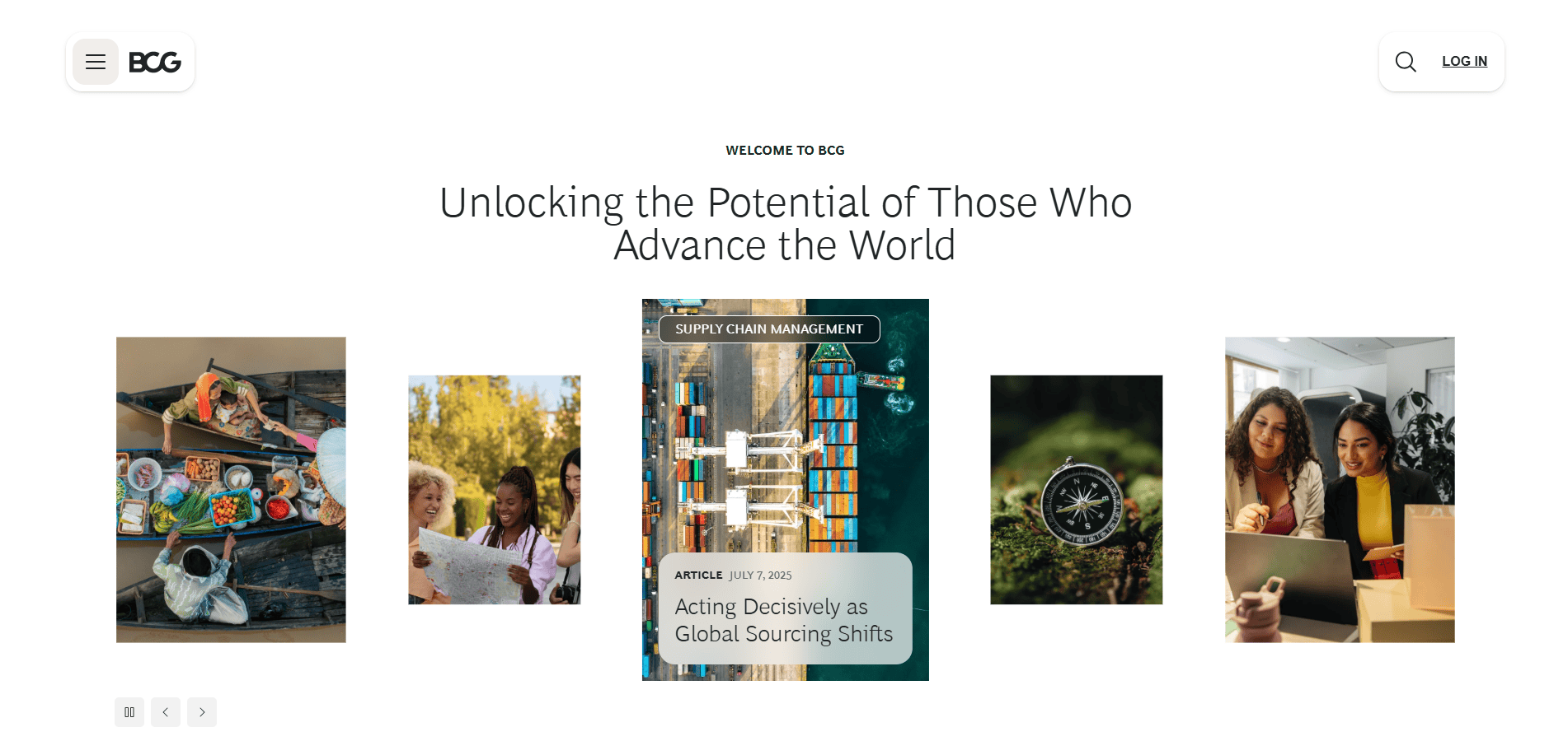
9. Boston Consulting Group (BCG)
Location: Global (Numerous offices worldwide, headquartered in Boston, MA)
3 Key Takeaways:
- Insightful Publications:Highlights their research and publications, showcasing their intellectual capital and strategic thinking.
- Engaging Visuals:Uses high-quality imagery and a modern design to create an engaging user experience.
- Career-Focused Content:Provides detailed information for potential recruits, reflecting their strong talent acquisition focus.
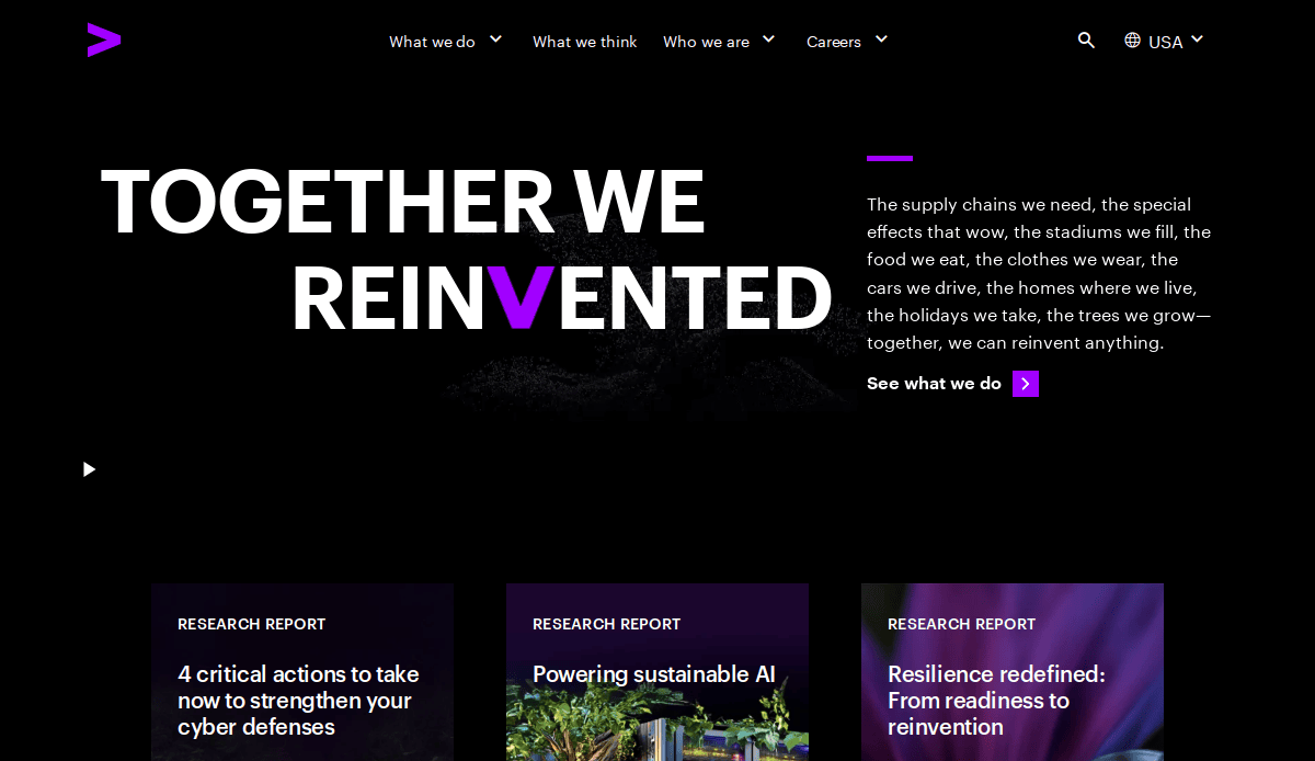
10. Accenture
Location: Global (Numerous offices worldwide, headquartered in Dublin, Ireland)
3 Key Takeaways:
- Future-Forward Positioning:Emphasizes innovation, technology, and industry transformation, aligning with their cutting-edge approach.
- Interactive Elements:Incorporates dynamic elements and clear calls-to-action to guide visitors through their offerings.
- Extensive Case Studies:Offers a rich library of case studies that detail their impact and expertise across diverse sectors.
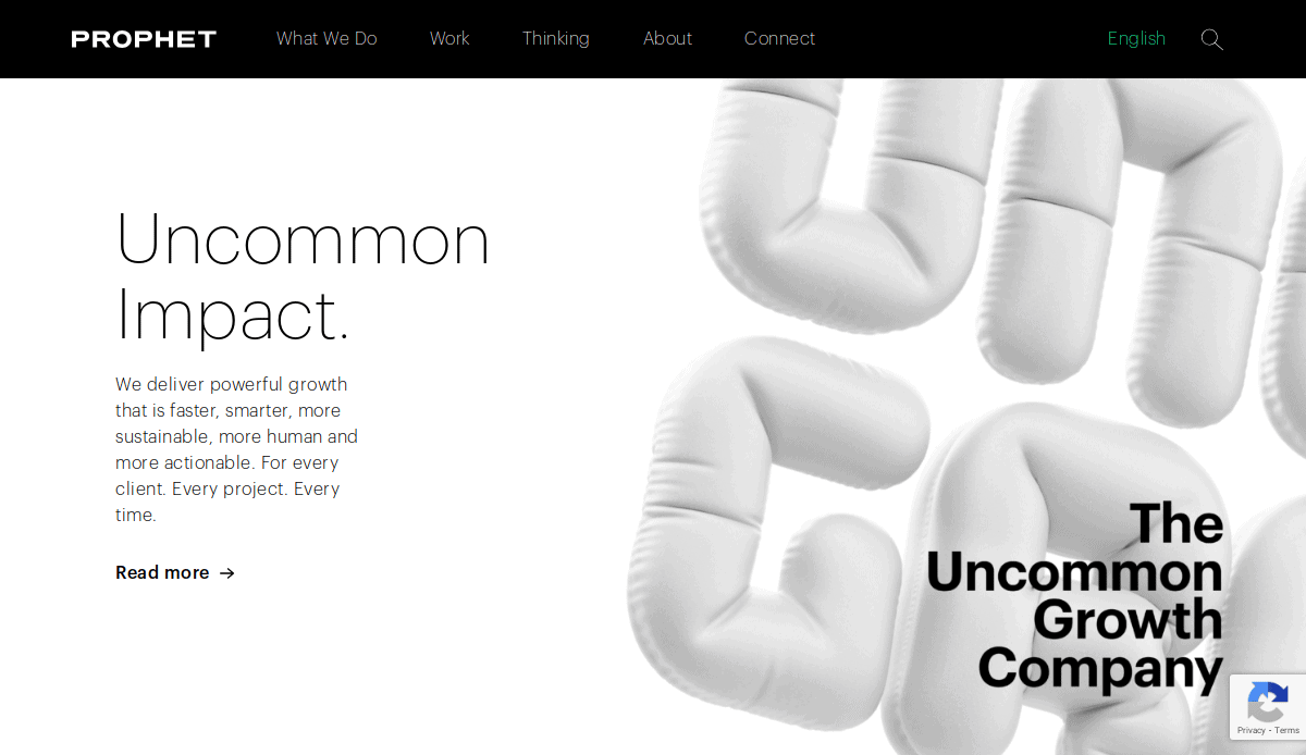
11. Prophet
Location: Global (Offices in various cities including San Francisco, New York, London)
3 Key Takeaways:
- Dynamic Homepage: Features an engaging and modern homepage that immediately highlights their expertise in brand and growth.
- Easy Navigation: Intuitive menu options seamlessly guide users to different sections, from services to insights.
- Strong Visual Branding: The layout and design are sleek and dynamic, echoing the brand’s innovative spirit with a harmonious color palette.
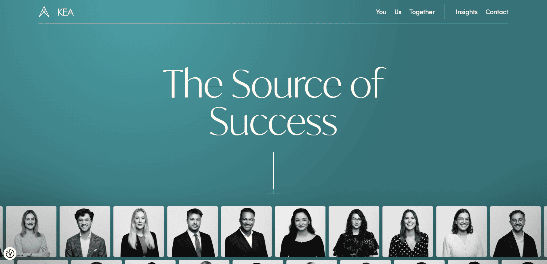
12. Kea Consultants
Location: London
3 Key Takeaways:
- User-Centric Design:Prioritizes user experience, making their designs intuitive and easy to navigate.
- Prominent Team Profiles:Features team members to foster connection and build familiarity.
- Valuable Insights Section:Offers an “insights” page with valuable resources and updates on industry trends.
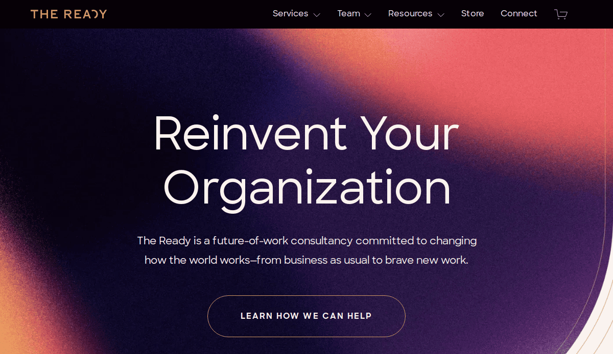
13. The Ready
Location: New York, NY
3 Key Takeaways:
- Modern & Unique Aesthetics:Stands out with a fresh, modern design that breaks from traditional consulting firm visuals.
- Clear Focus on Organizational Change:The content immediately conveys their specialization in organizational transformation and agility.
- Engaging Content Format:Utilizes various content formats, including articles and resources, to share their unique methodology.
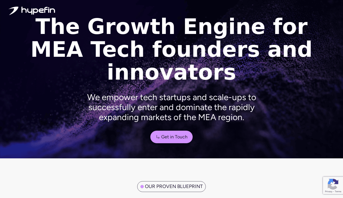
14. HypeFin
Location: (Not specified in search results, but provides FinTech strategy)
3 Key Takeaways:
- Specialized Niche Focus:Clearly communicates their expertise in end-to-end FinTech strategy and solutions.
- Streamlined Layout:The website layout is clean and focused, guiding visitors to their specific service offerings.
- Emphasis on Solutions:Highlights how they deliver solutions from digital banking to payment services.
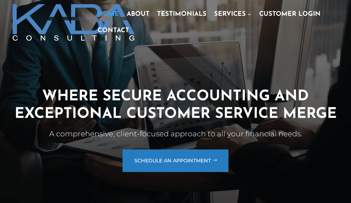
15. Kaba Consulting Inc.
Location: (Not specified in search results, but specializes in sales consulting)
3 Key Takeaways:
Minimalist Design: Features a sleek, clean, and straightforward design, reflecting efficiency and focus.
- Direct Communication:The content is concise and to the point, quickly conveying their sales consulting expertise.
- Professional Image:The overall aesthetic projects a highly professional and trustworthy image.
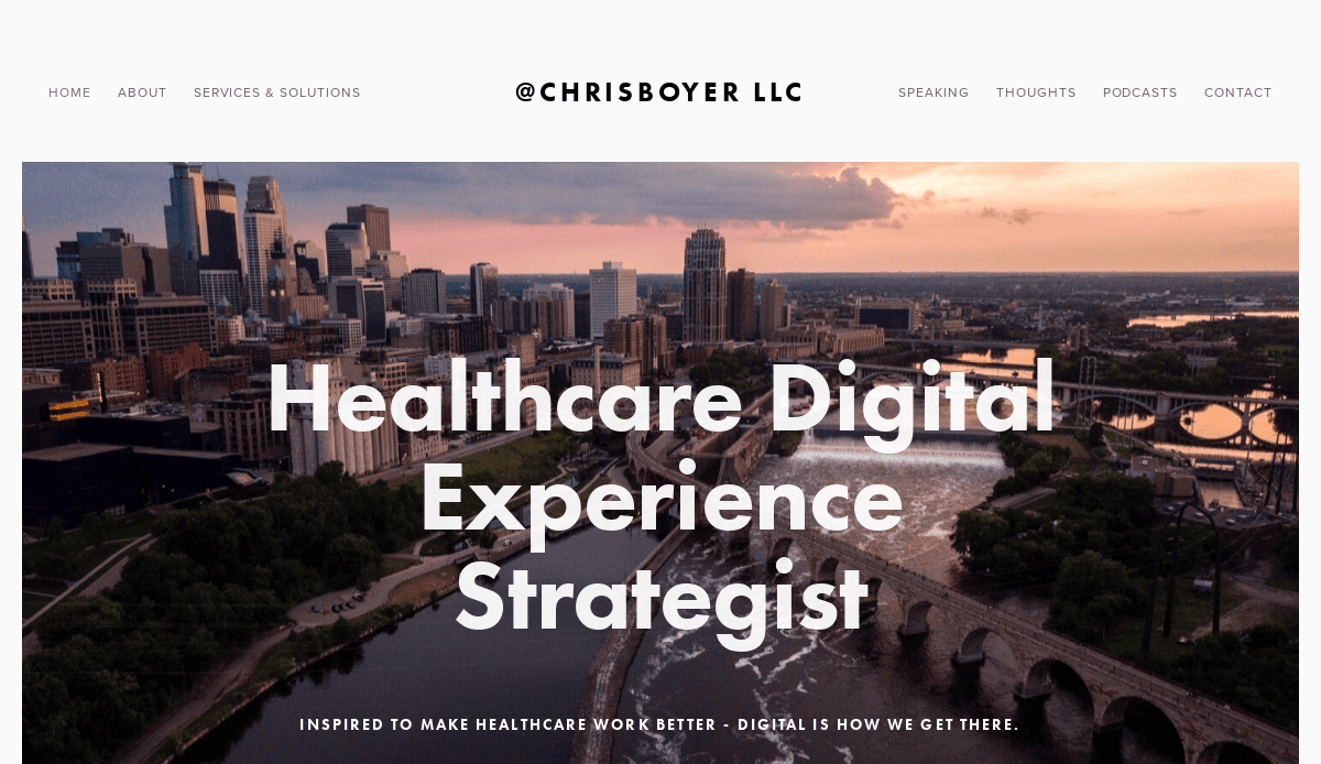
16. ChrisBoyer LLC
Location: New York City, NY
3 Key Takeaways:
- Powerful Tagline in Hero Section:Features a strong hero section with a compelling tagline that immediately communicates value.
- Customer-Centric Content:Content is designed to speak directly to the customer, illustrating how their problems are solved.
- Easy Navigation & Service Links:The website is easy to navigate, with all services clearly linked in the main navigation.
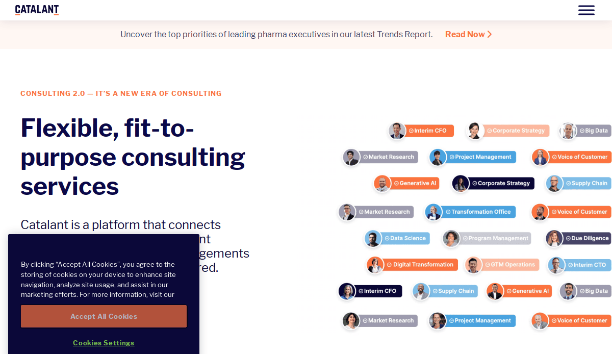
17. Catalant
Location: Boston, MA
3 Key Takeaways:
- Marketplace Model Clarity:Effectively communicates its unique value proposition as a consulting marketplace connecting clients with on-demand expertise.
- Focus on Elite Expertise:Highlights the quality and breadth of its network of over 70,000 consultants.
- Streamlined Matching Process:The site is designed to make it easy for users to find and engage with the right consultants for their needs.
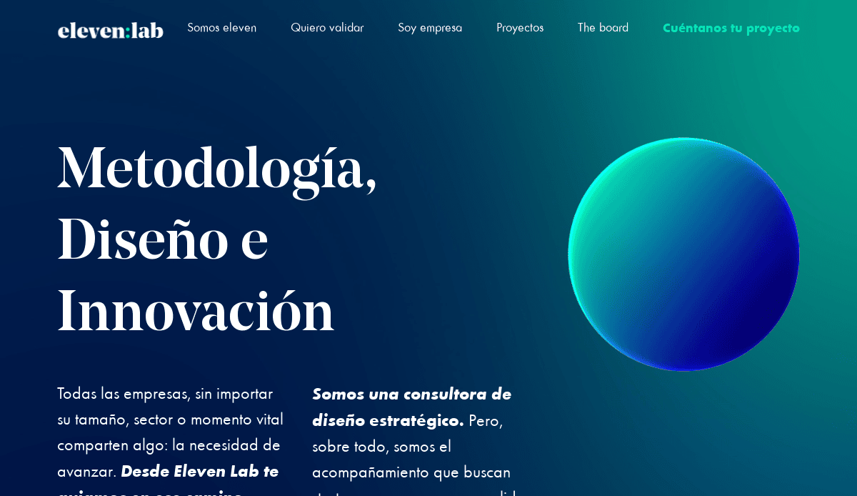
18. Eleven Lab
Location: Madrid, Spain
3 Key Takeaways:
- Specialized Niche Appeal:Clearly targets data science and analytics firms, demonstrating deep industry understanding.
- Data-Focused Design:Designs are not only visually appealing but are built to handle complex data effectively, reflecting their expertise.
- Problem-Solving Orientation:The content emphasizes how they help clients navigate and leverage complex data challenges.
Take the Next Step: Build a Consulting Website That Wins Clients
Your website is often the first interaction a potential client has with your consulting services. It’s your digital storefront, your proof of expertise, and your most consistent marketing tool. Whether you’re setting up your consulting website for the first time or looking to optimize your website for search engines and conversions, the right strategy makes all the difference.
Successful consulting websites aren’t built from generic templates or slapped together with the cheapest website builder for consultants. They are intentionally crafted with your consulting firm’s brand, audience, and goals in mind—from the first page of your website to every service detail and client reviews. A professional website that’s designed with purpose will help you establish trust and credibility, attract qualified consulting clients, and convert website visitors into real leads.
If you’re ready to create a website that supports your business strategy and reflects the quality of your consulting offers, we can help you build your consulting website from the ground up, with clear messaging, modern design elements, and SEO-backed web development.
Discuss Your Project With Our Web Design Team and take the next step in turning your online presence into a client-generating asset.
Frequently Asked Questions About Consultant Website Design
What makes a great consulting website?
A great consulting website is designed with your target audience and business goals in mind. It’s visually professional, easy to navigate, optimized for search engines, and built to convert visitors into clients. Key website features include clear service descriptions, strong calls to action, a clean layout, reviews, and a responsive design. If you’re a consultant, your website is a key element in cementing trust and winning new business.
What pages should I include on my consulting website?
At a minimum, your main website should include a homepage, an about page, a services or consulting offers page, a contact page, and a section for client testimonials or case studies. Consider adding a blog or resources section on your website to boost SEO and provide free resources to visitors. Each page on your website should have a clear purpose and be optimized to guide users toward hiring you as their consultant.
Are there good website templates for consultants?
While website templates can offer a starting point, most templates lack the customization needed for consulting firms. A better approach is working with a professional web designer who understands your industry and can tailor every part of your site—from layout to content—to attract the right consulting clients.
What are the best website platforms for consultants?
WordPress is one of the most flexible and SEO-friendly platforms for building a successful website. It offers full control over design and content, strong performance, and a vast ecosystem of plugins. It’s ideal for marketing consulting agencies and solo consultants alike looking to make a website that performs and scales with their business.
How do I drive traffic to my consulting website?
Driving website traffic requires a mix of strategies, including SEO, content marketing, social media, and paid ads. Start by ensuring your site is fully optimized for keywords relevant to your consulting services. Publishing blog content, updating your website regularly, and gaining backlinks all help search engines recognize your website as a trusted source.
How often should I update or maintain my website?
Maintaining your website is crucial for both performance and security. Regular updates to your CMS, plugins, and content will help your site load quickly, stay secure, and remain relevant to both users and search engines. Ongoing WordPress maintenance also reduces downtime and ensures a consistent user experience.
How much should I invest in website creation?
Your website investment depends on your goals, business size, and the type of website you need. For a consulting agency or firm, website creation is considered a legitimate business expense and a foundational one. A well-designed website helps you generate leads, build credibility, and support your broader marketing efforts.
Can I build a website without coding experience?
Yes, but with limitations. Website builders like Squarespace or Wix offer simplicity, but often lack the flexibility and SEO performance of platforms like WordPress. For a high-converting business website, most consultants work with a site design partner to get a fully developed and optimized site.
What are good examples of successful professional websites?
Successful website examples typically include clean design, strong brand messaging, client feedback, and a clear call to action. They make it easy to access your website’s value within seconds. See our upcoming section on the 25 best consulting website examples for inspiration.
What are the first steps to build my consulting website?
Start with strategy. Define your audience, goals, and core messaging. Then, outline the site structure, key content areas, and choose a platform like WordPress. For detailed guidance, follow these steps in our step-by-step guide to the web design process to get clarity on developing your website the right way.