Just looking for our Best Professional Services Website examples list?
Key Takeaways
- A well-designed website is more than a digital brochure — it’s a powerful sales tool that establishes credibility, builds trust, and drives conversions.
- User experience, strategic branding, and responsive design are essential elements that distinguish high-performing service websites from the rest, impacting both client perception and search engine rankings.
- Integrating SEO, persuasive copywriting, and clear calls-to-action ensures that your site attracts traffic and converts visitors into high-value leads and long-term clients.
Why Your Website Design Is the Key to Business Growth
Your website is often the first impression potential clients have of your company. Today, that impression needs to be exceptional. A high-performing website doesn’t just look good — it functions as a powerful business asset that communicates your brand value, builds credibility, and captures leads.
For service-based companies, the difference between a visitor bouncing and becoming a loyal client can hinge on strategic design choices. Thoughtful navigation, clean design, compelling content, and responsive layouts all contribute to a user experience that supports trust and drives conversions. If your website isn’t designed with your audience in mind, you’re missing out on measurable opportunities to grow your business. This guide will walk you through the essential components and standout examples of professional services web design that deliver results.
Website Planning & Purpose
Before you begin designing a website, it’s essential to step back and define its core purpose. What specific business goals should the website achieve? Whether it’s increasing qualified leads, showcasing expertise through case studies, or establishing authority in a niche market, every element of the site should be aligned with these objectives.
The planning phase should start with audience research. Identify your ideal clients: their needs, pain points, and what they expect from a credible service provider. Next, map out their buyer’s journey — from awareness to decision — and ensure your website content supports each phase. Planning also includes choosing the right structure for navigation, determining which services should be featured most prominently, and crafting a clear messaging strategy.
Key questions to address during this phase:
- What actions do you want visitors to take?
- What content needs to be created or updated?
- How will the website integrate with your broader marketing strategy?
Taking the time to clearly define your website’s purpose ensures a smoother design and development process and leads to a site that supports long-term business growth.
Design Principles for Professional Websites
Designing a professional website requires more than visual appeal — it must strategically communicate trust, professionalism, and clarity. A successful design begins with simplicity and functionality, emphasizing clean layouts, intuitive navigation, and a visual hierarchy that guides visitors effortlessly through the site.
Key design principles to apply include:
- Consistency in Branding: Use a cohesive color palette, font set, and logo placement across all pages to strengthen brand recognition.
- Visual Hierarchy: Prioritize important content such as value propositions, services, and CTAs by placing them in prominent positions, often above the fold.
- Whitespace Usage: Allow elements to breathe by using whitespace strategically to reduce clutter and improve readability.
- Responsive Design: Ensure your site functions seamlessly on all devices, adapting layout and features for desktops, tablets, and mobile screens.
- Fast Load Times: Optimize images, scripts, and plugins to improve performance and reduce bounce rates.
- Accessibility: Use alt tags, readable fonts, and high contrast color combinations to make your site inclusive for all visitors.
For professional services firms, a website needs to project competence, reliability, and efficiency — qualities that must be visually communicated. By following these design principles, you can create a digital presence that looks professional and supports your business’s strategic growth objectives.
Content & Navigation for Professional Services Websites
Effective content and navigation are the backbone of any website. Structuring your content begins with understanding the needs of your target audience and delivering clear, relevant information that guides them toward action.
Content should be organized in a logical hierarchy, starting with a concise homepage that immediately communicates your value proposition. From there, key service pages should highlight each offering with supporting case studies, testimonials, and clear CTAs. An About page can build trust by sharing your firm’s mission, team, and credentials, while a Blog or Insights section can establish authority and improve SEO through valuable, keyword-rich content.
Navigation must be intuitive and consistent. Limit your top-level navigation to essential categories like Services, About, Blog, and Contact. Dropdowns can be used sparingly to include subpages, but avoid overwhelming users with too many options. Sticky navigation or breadcrumb trails enhance usability, especially for deeper site structures.
Other best practices include:
- Use descriptive, benefit-oriented labels in the navigation menu (e.g., “What We Do” instead of just “Services”).
- Highlight your CTA in the top navigation (e.g., “Schedule a Consultation”).
- Ensure mobile-friendly menus that are easy to tap and scroll through on smaller screens.
By strategically organizing your website’s content and streamlining the navigation experience, you ensure that visitors can find the information they need quickly, keeping them engaged and moving toward conversion.
Visual Elements That Enhance Brand and User Experience
Visual elements do more than add aesthetic appeal — they play a crucial role in reinforcing brand identity, guiding user interactions, and shaping the perception of your services. The strategic use of visuals can turn a generic website into a memorable, high-performing digital experience.
Start with strong brand imagery that reflects your firm’s values and personality. This includes professional photography of your team, office environment, and client interactions, as well as custom illustrations that simplify complex services. Avoid stock photos that feel impersonal or overused, as they can erode credibility.
Icons and infographics are powerful tools for breaking down information and visually communicating key messages. They help users absorb content more quickly and add visual interest to dense pages. Use these consistently across the site to support service explanations, feature highlights, or process overviews.
Color schemes and typography should align with your brand standards and be used consistently to establish visual cohesion. Choose color combinations that convey trust, professionalism, and approachability while ensuring sufficient contrast for readability. Typography should enhance legibility across devices and adapt gracefully within different layouts.
Video elements — such as client testimonials, service walkthroughs, or behind-the-scenes insights — add authenticity and keep visitors engaged longer. When embedded properly, video can significantly increase time on site and build a stronger emotional connection with prospects.
Finally, ensure that all visual elements are optimized for performance. Compress images without sacrificing quality, use modern formats like WebP, and implement lazy loading to maintain fast page speeds. Well-executed visuals make your website more engaging and trustworthy.
Ongoing WordPress Maintenance for Professional Services Firms
A high-performing WordPress website requires consistent maintenance to remain secure, functional, and optimized. Ignoring ongoing upkeep can lead to technical issues, security vulnerabilities, and a poor user experience — all of which can hurt credibility and drive potential clients away.
Routine updates should be performed for WordPress core software, themes, and plugins to ensure compatibility and patch known vulnerabilities. Security monitoring is equally important, including firewall configuration, malware scans, and login protection. Automated backups must be scheduled and regularly tested to prevent data loss in the event of a failure or breach.
Performance optimization also includes database cleanups, image compression, and reviewing error logs to address issues before they affect users. This kind of uptime monitoring helps track website availability and alerts you to downtime that could impact business operations. For firms relying on lead generation, it’s vital to regularly check contact forms, chat tools, and integrations with CRMs or marketing platforms to ensure everything is working as intended.
Maintenance should also include SEO audits and analytics reviews to identify areas for improvement and ensure the site continues to support your marketing goals. Treating your website as a living asset means making sure it’s up and running and performing at its best. A structured maintenance plan ensures you protect your investment and continue delivering a positive experience to every visitor.
Best Professional Service Website Examples
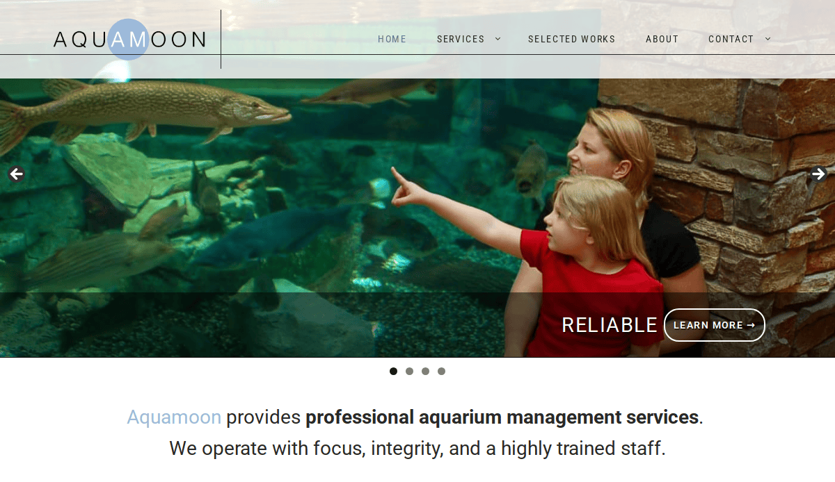
1. Aquamoon
Location: Chicago, IL
Key Takeaways:
- Clean and straightforward design aligns with its aquarium management services.
- Understated color palette keeps focus on content.
- Easy user pathways with clearly labeled sections.

2. Fourfold Consulting
Location: Australia
Key Takeaways:
- Sophisticated and professional design portrays consultancy services.
- Well-organized layout with elegant color scheme.
- High-quality images illustrate the firm’s expertise.
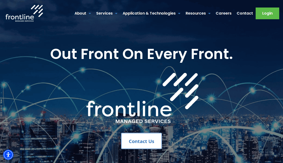
3. Frontline Managed Services
Location: Chicago, IL
Key Takeaways:
- Minimalist and modern layout with monochromatic color palette.
- Compelling imagery underscores global reach.
- Clear and simple content presentation.
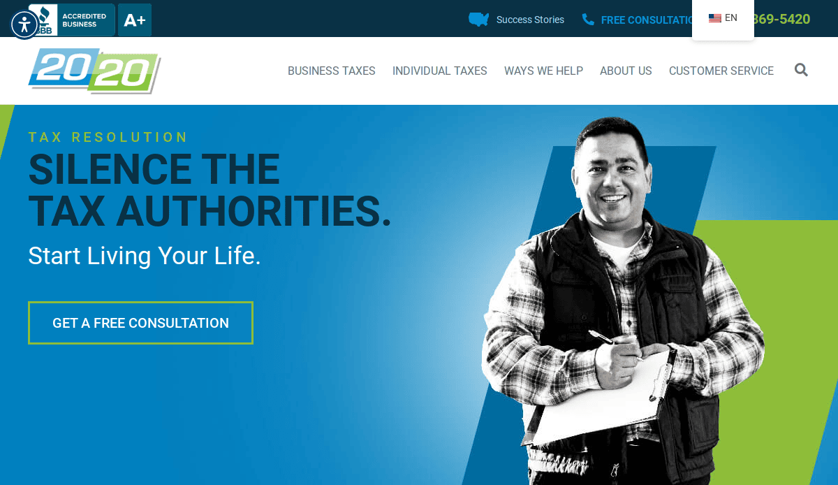
4. 2020 Tax Resolution
Location: Denver, CO
Key Takeaways:
- Greyscale portrait on a solid background creates a lasting impact.
- Engaging content keeps sections interesting.
- Intuitive header area enhances action.

5. Schnackel Engineers
Location: Omaha, NE
Key Takeaways:
- Beautiful line drawings and images showcase design quality.
- Minimal yet well-planned layout.
- Intuitive header area ensures easy pathways.
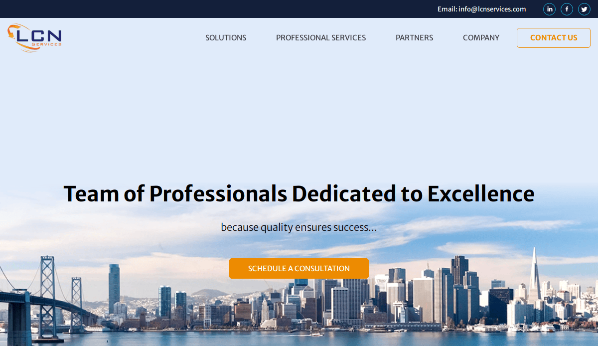
6. LCN Services
Location: Chicago, IL
Key Takeaways:
- Creative use of illustrations and visuals.
- Effective marketing of professional services.
- Engaging and user-friendly design.

7. Kiterocket
Location: Seattle, WA
Key Takeaways:
- Colorful and vibrant design enhances visual appeal.
- User-friendly navigation encourages exploration.
- Bold white text announces partnerships effectively.
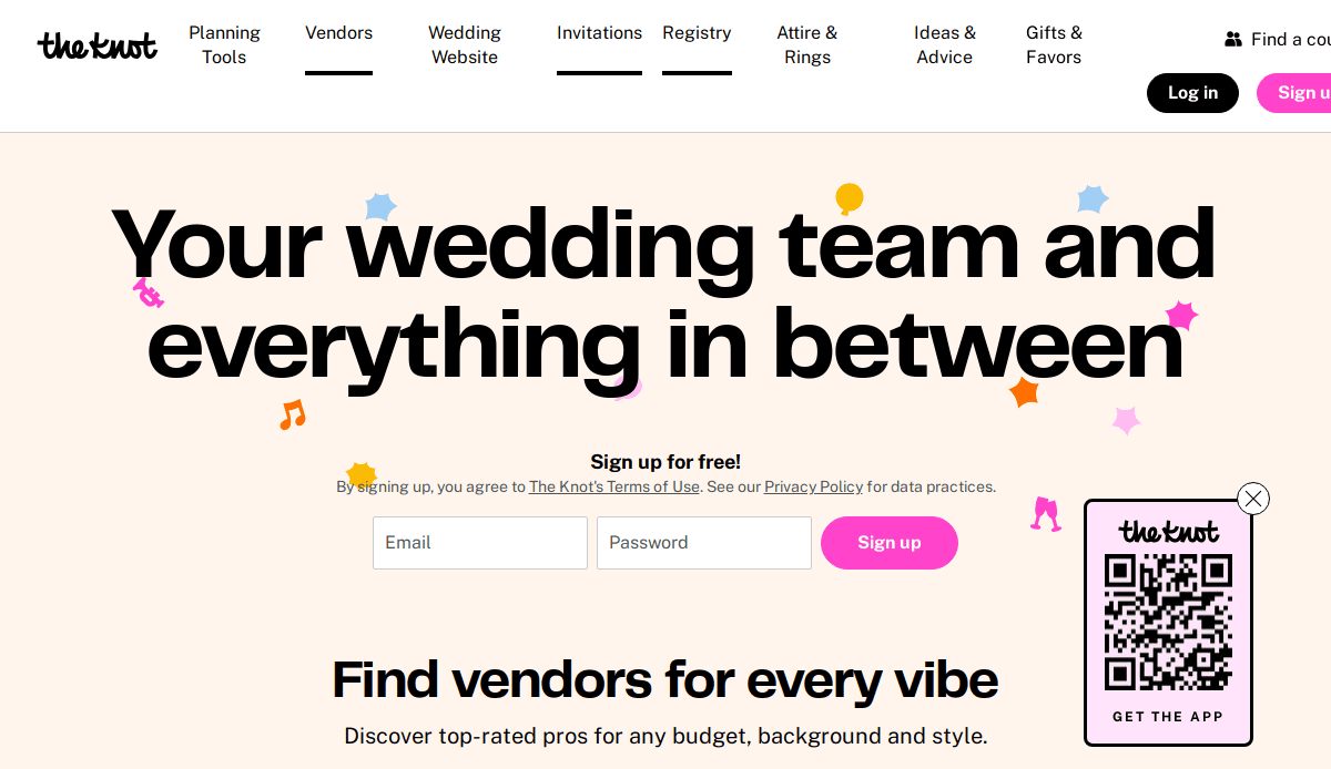
8. The Knot
Location: New York, NY
Key Takeaways:
- Well-known wedding website with pruned essential sections.
- Clear and neat mega menu.
- Compact homepage with clear direction.
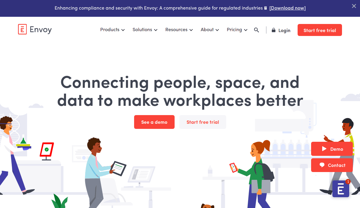
9. Envoy
Location: San Francisco, CA
Key Takeaways:
- Beautiful gradients and bold icons greet visitors.
- Information is broken into smaller parts for mobile-friendliness.
- Clean and modern design.
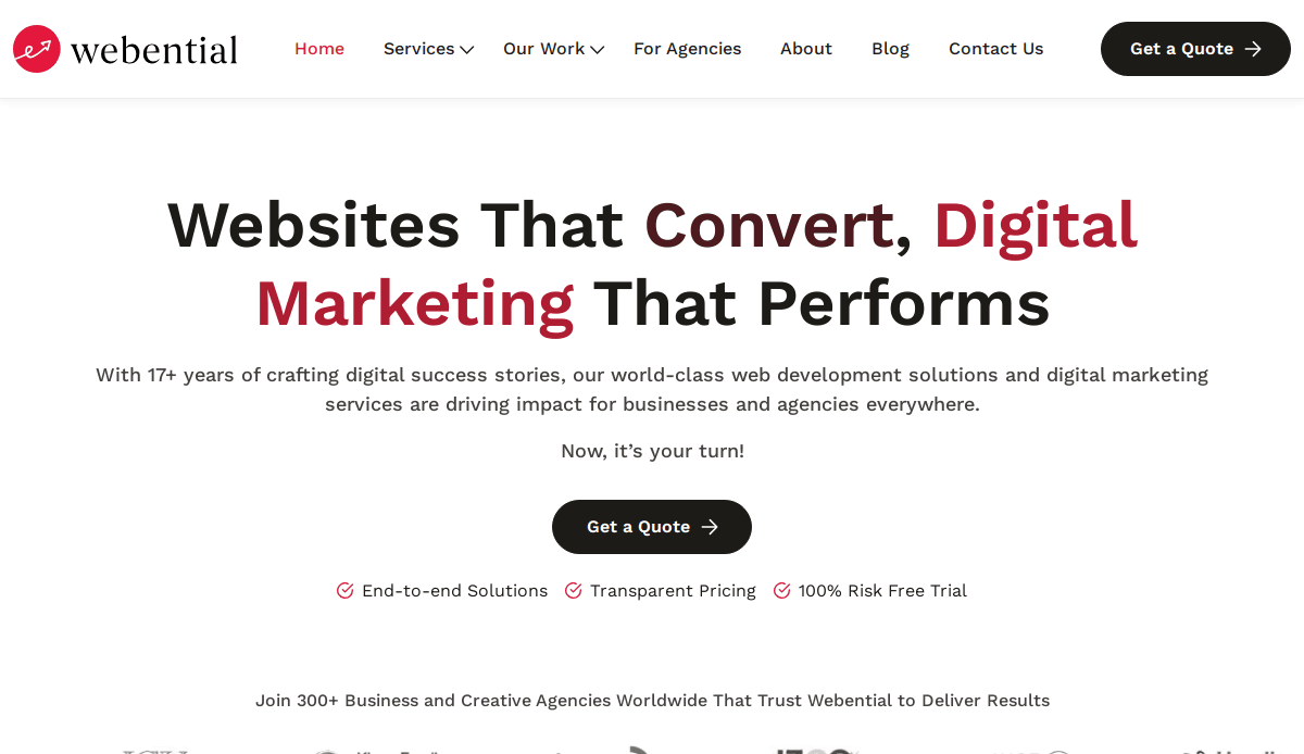
10. Webential
Location: Dallas, TX
Key Takeaways:
- Focus on typography over other design elements.
- Minimalist and clean design.
- Effective communication of services.
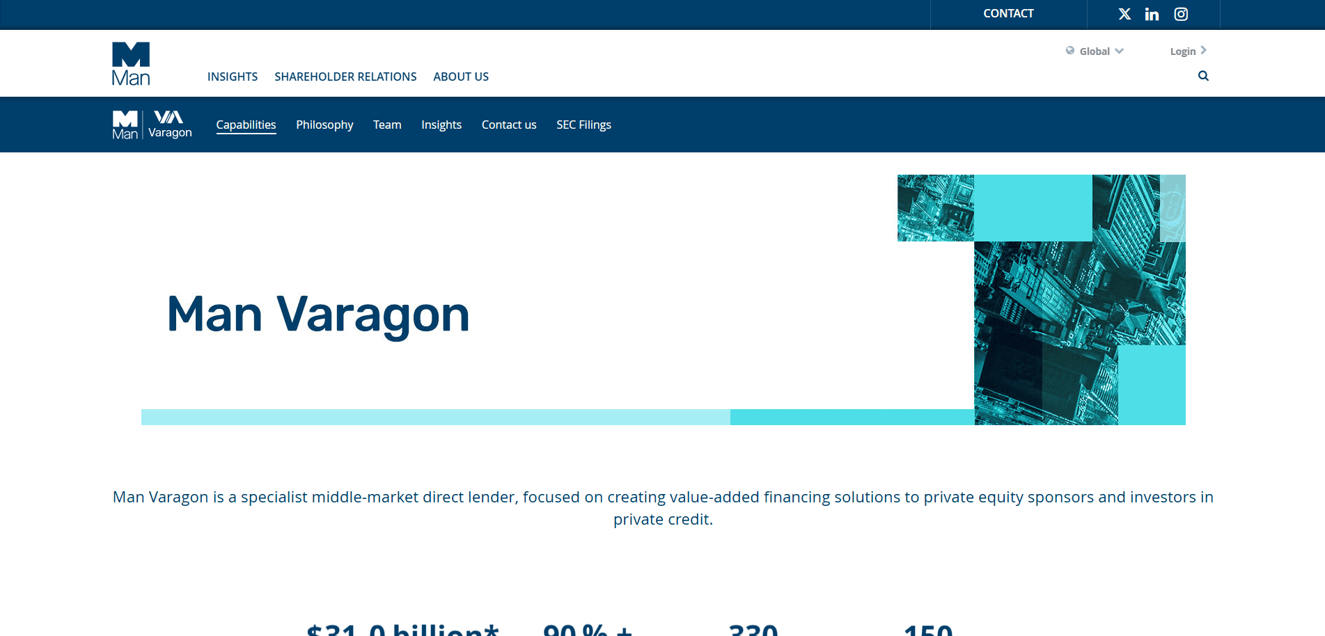
11. Varagon
Location: New York, NY
Key Takeaways:
- Utilization of an anchor scroll for direction.
- Clean canvas with simple typography.
- Minimalist design trend.
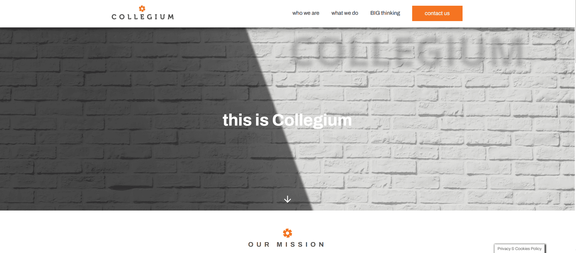
12. Collegium
Location: Boston, MA
Key Takeaways:
- Simple and effective format.
- Minimal design conveys the message.
- User-friendly pathways.
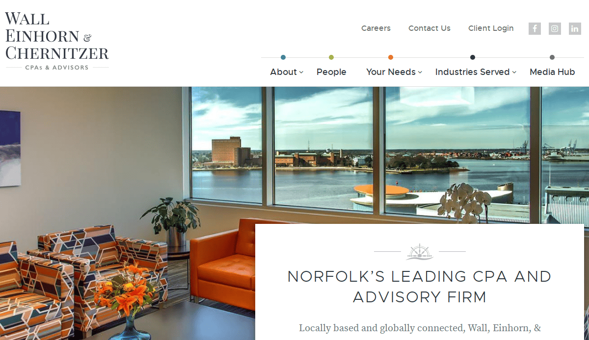
13. Wall Einhorn & Chernitzer
Location: Norfolk, VA
Key Takeaways:
- Minimal design with splashes of colors and graphics.
- High-quality pictures enhance professionalism.
- Clean and organized layout.
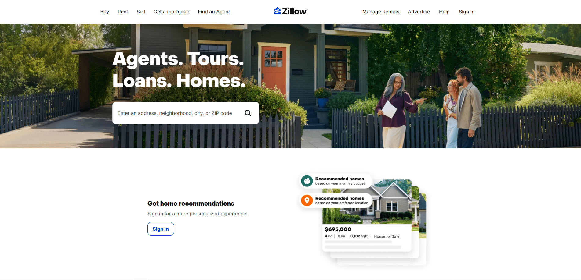
14. Zillow
Location: Seattle, WA
Key Takeaways:
- Simple yet effective layout.
- Compact homepage with clear direction.
- Easy identification of services provided.
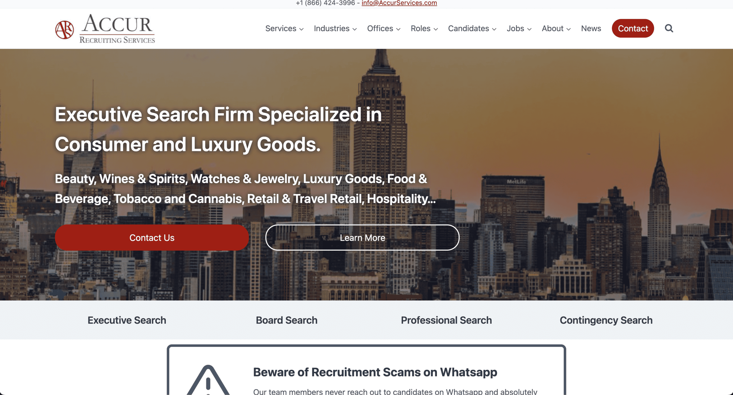
15. ACCUR Recruiting Services
Location: New York, NY
Key Takeaways:
- Modern and sophisticated design.
- Stunning effects and animations.
- Memorable and unique website.

16. Studio Bramble
Location: Portland, OR
Key Takeaways:
- Consistent Rum Swizzle-colored background.
- Bold typography throughout the homepage.
- 3D images of work appear on the homepage.
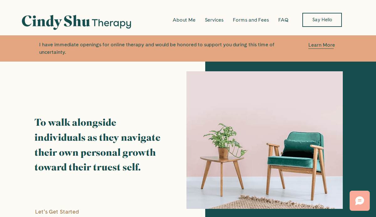
17. Cindy Shu Therapy
Location: San Francisco, CA
Key Takeaways:
- Visually appealing with Lavender Pinocchio and Blue Dianne color scheme.
- Dual-colored hero background with office image.
- Discrete color palette highlights chat option.
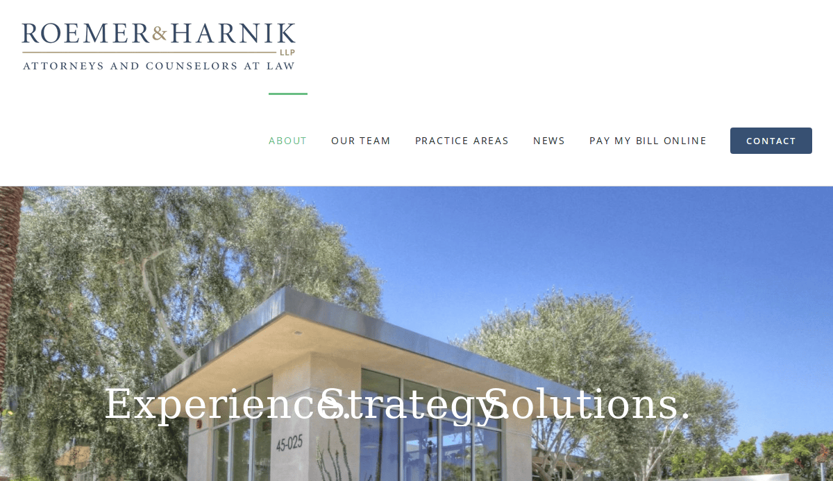
18. Roemer & Harnik
Location: Palm Desert, CA
Key Takeaways:
- Parallax scrolling effect captivates readers.
- Distinctive story about the brand.
- Marine color is used for CTA buttons and fonts.
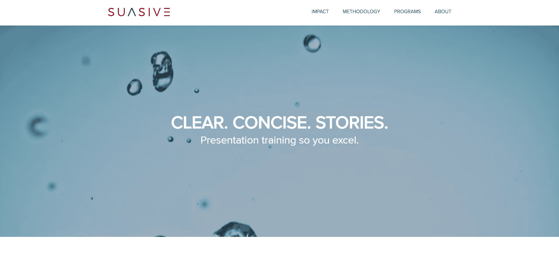
19. Suasive
Location: San Francisco, CA
Key Takeaways:
- Stunning business site with accent colors.
- Simple yet evocative main video background.
- Modern and sleek design.
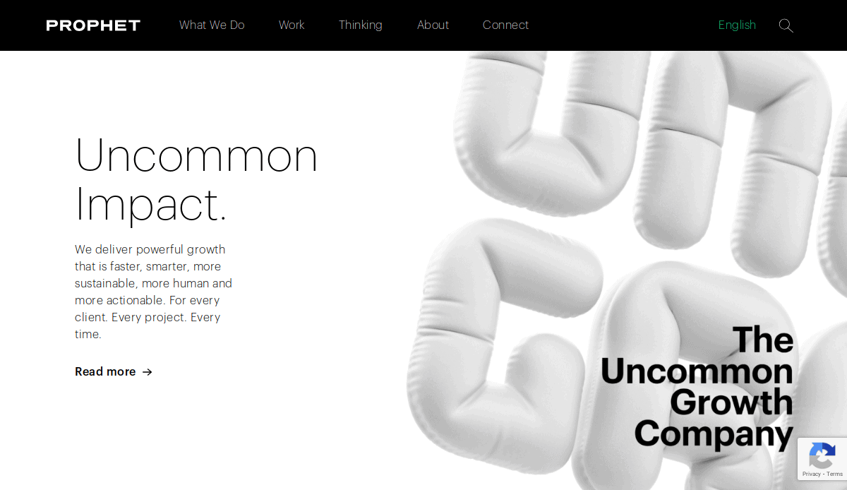
20. Prophet
Location: San Francisco, CA
Key Takeaways:
- Vibrant neon graphics greet visitors.
- Sleek and modern web design.
- Minimal yet abstract graphics.
Ready to Elevate Your Professional Services Website?
If you’re serious about positioning your firm as a leading professional service provider, it’s time to rethink your site design from the ground up. A well-designed website incorporates strategic design elements, thoughtful site content, and an end-to-end design process led by an expert design team. From content management and mobile devices to optimizing your website for every page and subpage, each decision should focus on your audience and how to engage visitors at every stage of the sales cycle.
Many web users expect fast-loading, responsive sites with compelling design elements and clear calls to action. That’s why our digital marketing agency takes a comprehensive approach to web design and development, helping you design a custom website that reflects your brand and delivers the best user experience possible. Whether you’re considering a website redesign or starting fresh, our experienced web designers and project managers are here to guide you.
We work with professional service providers across industries — from business consulting and nonprofits to marketers and designers, and developers — and we understand the unique selling points that matter to decision makers. If you’re looking to elevate your digital presence and get a custom solution tailored to your business goals, we’re the design agency that will get to know your business and support your growth.
Let’s take your website to the next level. Request a demo and connect with our development team today.
Common Questions About Professional Web Design
What are the best professional services website designs?
The best website designs feature intuitive navigation, strategic calls to action, and a strong emphasis on trust-building through testimonials, case studies, and high-quality visuals. See our top picks and explore standout examples here.
How important is content marketing strategy in professional web design?
A content marketing strategy is critical. It helps shape the site’s content, supports SEO efforts, and keeps your audience engaged across every page, guiding prospects at every stage of the buyer’s journey.
What features should a professional website include?
Essential website features include a clear value proposition, responsive design for mobile devices, a well-structured contact page, service overviews, and engaging visuals placed at the top of the page to grab attention immediately.
How can I make my professional website stand out?
Focus on creating a professional, custom design with unique color choices, compelling content, and a seamless experience. Partnering with a digital marketing and design agency ensures your design as a whole is built to convert.
What role does web development play in web design success?
Web development ensures that the design vision is functional and optimized. A solid backend infrastructure powers features like content management, security, and performance.
Why is it important to optimize for on-the-go visitors?
More users browse on mobile devices, making it essential for your site design to adapt fluidly and load quickly. Optimizing for these users increases engagement and conversions.
How do I ensure my website meets professional services website needs?
Start by identifying your audience’s expectations. Design with a focus on site performance, lead generation, and relevant site content. Collaborating with experienced web designers helps tailor every detail.
What makes a strong contact page?
A strong contact page includes multiple contact methods, a brief form, a clear CTA like “request a demo,” and reassurance through reviews or credentials — all critical to converting visitors.
Can design elements really influence trust and conversions?
Absolutely. Thoughtful design elements like layout, typography, icons, and interactive CTAs guide users through the site while reinforcing professionalism and trustworthiness.


