Just looking for our Best Financial Services Website examples list?
When it comes to money, trust is everything. Whether you’re offering wealth management, financial planning, or investment guidance, your website is more than just a digital brochure—it’s your company’s handshake, pitch, and storefront all rolled into one.
A high-performing website does more than look good. It actively drives business results. Strategic website design can increase conversions, improve SEO rankings, and foster deeper trust through a professional, secure, and user-friendly experience. Financial advisors and firms that fail to optimize their homepage, landing pages, and layout risk falling behind in an increasingly digital-first industry.
Effective web design isn’t about flashy animations or trendy fonts. It’s about building clarity, credibility, and compliance into every design element—from streamlined navigation to secure form integrations. A thoughtfully crafted financial services website leads with purpose, reinforces your identity, and speaks directly to your audience’s goals—whether they’re booking a consultation or comparing providers.
In this guide, we’ll explore how the right combination of UX, SEO, theme, and design strategy transforms your site into a growth engine.
Website Planning & Purpose: Build with Strategy, Not Guesswork
Before a single design element is mocked up or a layout is wireframed, strategic website planning is essential, especially in the financial services industry. This isn’t about aesthetics first. It’s about understanding how every component of a financial website must work to inspire trust, drive qualified leads, and meet strict regulatory standards.
For financial advisors, wealth managers, and firms offering planning services, the planning phase begins with a deep understanding of your ideal client’s journey. Who are they? What concerns do they have? Where do they land first—homepage, blog, or a specific landing page? What specific financial services are they seeking, and what motivates them to take action?
This planning process is your opportunity to clarify your firm’s digital purpose. Are you educating? Converting? Reassuring? Every goal must align with your business model and the real-world needs of your audience. Your site needs to do more than explain—it must perform. That means your homepage should introduce your value proposition with clarity, your landing pages must guide users to convert, and your formatting must make it all intuitive and fast to navigate.
For compliance-heavy industries like this, planning also includes outlining disclosures, privacy policies, and ensuring space for legal content that meets regulatory guidelines. Skipping this step can lead to costly redesigns—or worse, lost trust.
Smart web design starts with purposeful planning. Define the site’s objectives. Prioritize user experience. Identify the exact outcomes you expect from every page. A well-planned website doesn’t just “look professional.” It works like a high-performing member of your team—engaging users, reinforcing your identity recognition, and driving measurable growth.
Design Principles for Effective Service-Based Websites
Fintech websites must strike a critical balance: they need to convey professionalism and security while remaining approachable and easy to navigate. Unlike e-commerce or lifestyle brands, financial firms deal in trust, precision, and long-term relationships. That’s why design principles in this industry must be both technically sound and psychologically reassuring.
- Clarity and Simplicity
Users should never have to guess where to go next. A streamlined design, intuitive navigation, and clean typography create an immediate sense of order and credibility. Financial topics are complex enough—your website should simplify, not complicate, the experience. - Consistent Branding
Every design element—from color scheme and font choices to button styles and iconography—should reflect a cohesive brand identity. This consistency builds trust and makes your firm feel more established. Financial clients want to work with professionals, and polished branding signals professionalism before they ever read your bio. - Visual Hierarchy That Guides Action
A well-planned visual hierarchy ensures that the most important content—like calls-to-action, value propositions, or service highlights—is immediately visible. Headlines, subheadings, and strategically placed buttons help users navigate with confidence. - Responsive & Mobile-First Design
Clients expect to access your website from any device, whether they’re reviewing retirement options on a desktop or checking investment tips from their phone. A mobile-first design ensures seamless experiences across screens, which is essential for keeping bounce rates low and engagement high. - Security and Trust Cues
Badges like SSL certificates, FINRA/SEC disclosures, client testimonials, and association memberships can all serve as trust signals. Including these in the design—especially near forms or conversion points—boosts confidence and credibility. - Accessibility for All Users
A website must be usable for every visitor, regardless of physical ability. ADA compliance, alt-text for images, keyboard-friendly navigation, and screen-reader compatibility are not just ethical design considerations—they’re often legal requirements.
For a deeper dive into these concepts, explore the 8 key elements of an effective financial services firm site—a foundational resource that breaks down what every finance-focused website should prioritize. These principles are not just theoretical. They’re the baseline expectations your audience brings to the table. In an industry where reputation is everything, your design must visually and functionally earn trust from the first click.
Content & Navigation: Structure That Builds Confidence and Converts
How content is structured and how users navigate it can make or break trust. Visitors to your website are often cautious, seeking reassurance before they engage. That means every piece of content and every click path must be intentionally designed to deliver clarity, trust, and a seamless user experience.
Start with a Clear Site Architecture
A successful website starts with a logical, easy-to-follow structure. Your main navigation should highlight the most essential sections: Services, About, Resources, Contact, and possibly a client login area. Avoid cluttering the menu—each item should serve a clear purpose and guide visitors deeper into the site.
Homepage with Clear Positioning
Your homepage must immediately communicate who you are, what services you offer, and who you serve. Include a strong value proposition near the top, supported by visual trust cues like logos of affiliations, testimonials, or regulatory badges. Follow this with links to key service pages and client resources to encourage further exploration.
Dedicated Service Pages for SEO & Conversion
Rather than listing services in a single block of text, create a dedicated landing page for each offering, such as Retirement Planning, Investment Strategy, or Wealth Management. These pages can be optimized with targeted keywords while providing more room to educate and persuade.
Content That Educates and Builds Trust
Avoid jargon. Speak in clear, plain language that empowers your visitors to understand their options. Include detailed FAQs, case studies, and explainer content to help demystify financial decisions. Consider integrating interactive tools like calculators or self-assessments to deepen engagement.
Sticky and Contextual Navigation
Implement sticky headers and in-page navigation for long-form content to improve usability. Contextual links within content can guide users naturally to the next logical step, such as linking from a blog post on tax strategies to your consultation booking page.
Calls-to-Action that Feel Natural
Each page should feature one primary, visually distinct CTA—whether it’s “Schedule a Consultation” or “Download Your Free Planning Checklist.” Place these strategically: near the top, midway through, and at the end of the content.
Internal Linking and SEO Support
Smart internal linking helps with SEO and improves user flow. Link your blog posts to relevant services, and cross-reference related pages to keep users engaged longer.
In the financial world, navigation must be intuitive, and content must be both informative and reassuring. Done right, this structure turns browsers into believers—and believers into long-term clients.
Visual Elements: Designing Trust, Authority, and Clarity
Visual elements do more than beautify a site—they signal credibility, guide user behavior, and reinforce identity. A well-designed website uses visuals intentionally to make complex topics feel approachable and to support the user’s journey from curiosity to conversion.
Color Psychology for Financial Trust
Blues, greens, and muted grays are commonly used in financial websites for good reason—they communicate stability, trust, and intelligence. But it’s not enough to default to tradition. The key is selecting a palette that aligns with your specific voice and using it consistently across your site, from buttons to headings to imagery backgrounds.
Typography That Balances Authority with Readability
Sans-serif fonts work well for digital readability and project a modern, clean look. Use a clear hierarchy: larger, bold headers to anchor sections and clean, legible body fonts to reduce cognitive load. Proper line height, spacing, and font weight all play a role in creating a frictionless reading experience.
Photography & Illustration That Humanizes Finance
Avoid cold, generic stock images. Instead, use custom photography that reflects real people—clients, advisors, team members—in authentic financial situations. When appropriate, custom illustrations can explain complex concepts like investment risk or retirement timelines with clarity and visual engagement.
Icons & Microinteractions that Guide Behavior
Icons can break down services at a glance, while hover effects and subtle animations reinforce actions like clicks, downloads, or form completion. These microinteractions offer intuitive feedback that improves usability without overwhelming the user.
Whitespace and Visual Breathing Room
Financial information can be dense. Generous whitespace allows content to breathe, enhances readability, and directs attention to calls-to-action. It also gives your design a clean, modern feel, suggesting professionalism and focus.
Charts, Graphs, and Infographics that Educate
Visual data representations are powerful tools in finance. Use them to show performance trends, explain portfolio diversification, or visualize retirement timelines. Ensure they’re mobile-responsive, ADA-compliant, and clear at a glance.
Video for Personal Connection and Explanation
Short videos featuring your team, client testimonials, or service explainers can significantly increase engagement. In an industry where personal rapport matters, putting a face to your firm builds trust faster than text alone.
For inspiration and direction, view this curated list of the best fintech website designs. It highlights how financial brands are leveraging smart visuals to increase engagement, build credibility, and stay ahead of design trends. Every visual choice must reinforce your credibility and your users’ confidence. Clarity isn’t optional—it’s your competitive edge.
Best Financial Service Website Examples
Here is a list of 20 top financial company websites, with five designed by our professional webmasters, highlighting their effectiveness:
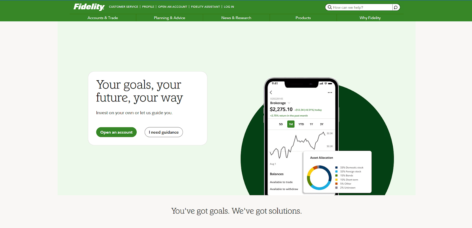
1. Fidelity
Location City In The US: Boston, MA
3 Key Takeaways:
- Comprehensive Information Architecture: Navigates complex financial topics with ease, offering clear pathways for different user needs (investing, retirement, wealth management).
- Robust Self-Service Tools: Provides powerful calculators, research tools, and account access, empowering users to manage their finances.
- Clean and Professional Aesthetic: Maintains a trustworthy and established feel with a straightforward layout that prioritizes clarity.
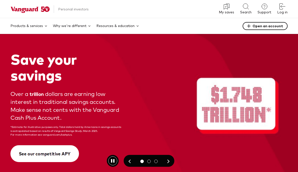
2. Vanguard
Location City In The US: Malvern, PA
3 Key Takeaways:
- Emphasis on Low-Cost Investing: Clearly communicates its core value proposition of cost-efficiency and long-term investing.
- Educational Resources: Offers a wealth of articles, insights, and market commentary, positioning itself as a reliable source of financial knowledge.
- User-Friendly Account Access: Streamlined login and account management features make it easy for clients to interact with their investments.
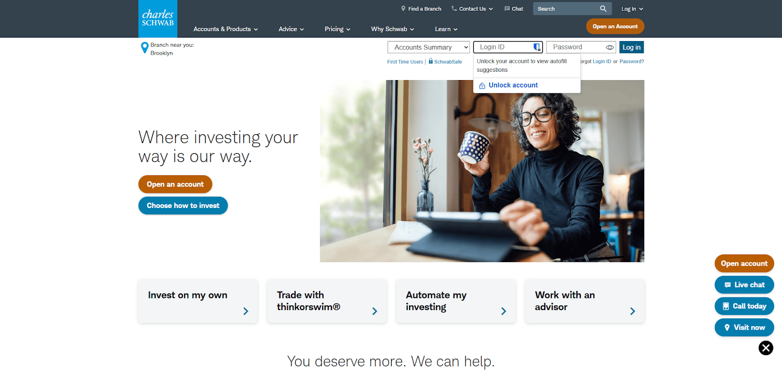
3. Charles Schwab
Location City In The US: Westlake, TX
3 Key Takeaways:
- Seamless User Experience: Intuitive navigation and clear calls to action guide users through various services, from trading to financial planning.
- Rich Content Hub: Features extensive market research, articles, and webinars, appealing to both novice and experienced investors.
- Personalized Pathways: Offers options for self-directed investing, advised portfolios, and wealth management, catering to diverse client segments.
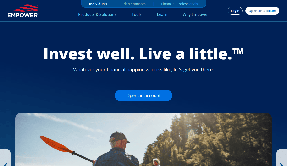
4. Personal Capital (now Empower)
Location City In The US: Denver, CO
3 Key Takeaways:
- Strong Visual Data Presentation: Utilizes engaging dashboards and graphs to help users visualize their financial health and progress.
- Focus on Financial Planning Tools: Highlights its free financial dashboard and planning resources to attract and engage potential clients.
- Clear Call to Action for Advisors: Prominently features options to connect with a financial advisor, converting interest into leads.
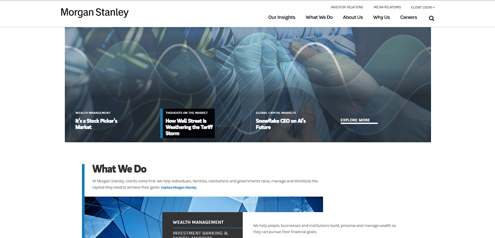
5. Morgan Stanley
Location City In The US: New York, NY
3 Key Takeaways:
- Sophisticated and Polished Design: Reflects its high-net-worth clientele with an elegant and professional visual identity.
- In-depth Insights and Research: Showcases its thought leadership through detailed market analysis and global economic perspectives.
- Client-Centric Information: Organizes content to address specific client needs, from individual investors to institutional clients.
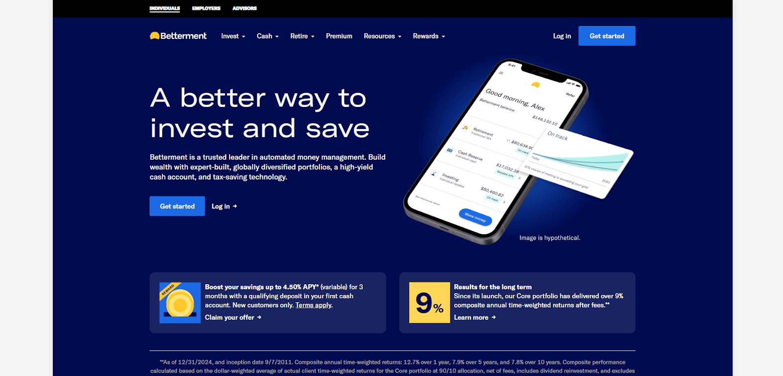
6. Betterment
Location City In The US: New York, NY
3 Key Takeaways:
- Clean and Approachable Design: Simplifies complex investing concepts with a friendly, minimalist interface.
- Clear Value Proposition for Robo-Advising: Highlights automated investing and personalized financial advice as key benefits.
- Engaging Onboarding Process: Guides new users through setting up accounts and goals with an intuitive and encouraging flow.
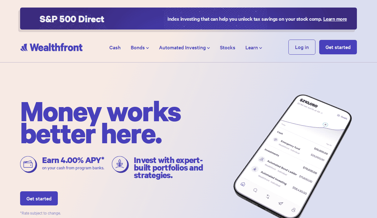
7. Wealthfront
Location City In The US: Palo Alto, CA
3 Key Takeaways:
- Modern, Tech-Forward Aesthetic: Appeals to a tech-savvy audience with a sleek design and emphasis on automated financial services.
- Transparent Fee Structure: Clearly communicates pricing, building trust with potential clients.
- Focus on Passive Investing and Automation: Educates users on the benefits of their investment approach with clear explanations.
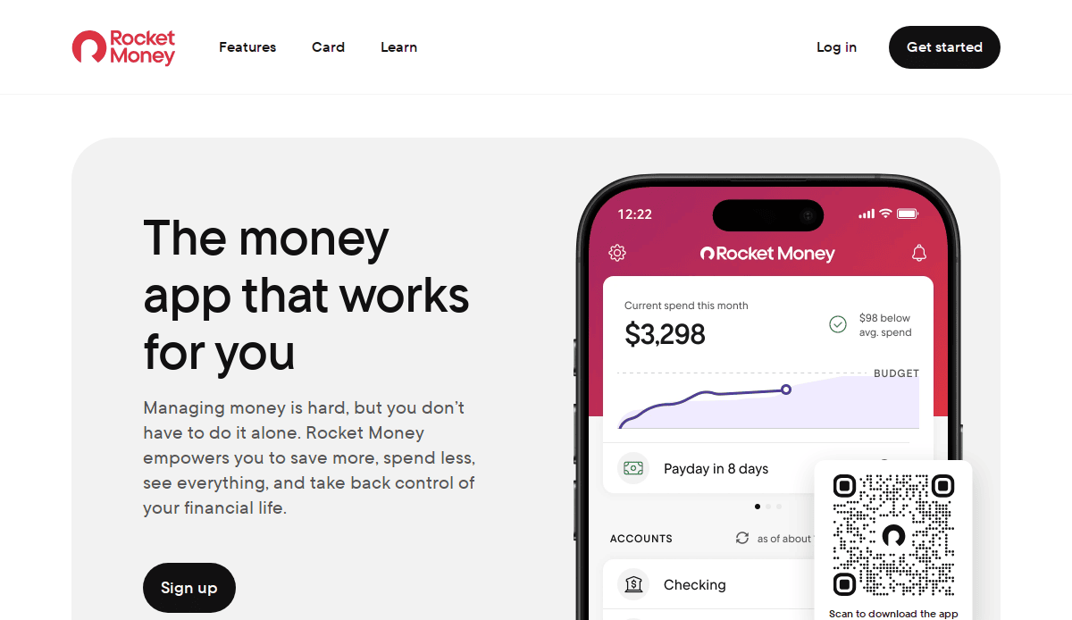
8. Rocket Money (formerly Truebill)
Location City In The US: Silver Spring, MD
3 Key Takeaways:
- Action-Oriented Messaging: Immediately highlights features like subscription cancellation and bill negotiation, addressing common pain points.
- Bright and Engaging Visuals: Uses a vibrant color palette and clear iconography to make personal finance feel less daunting.
- Mobile-First Design Philosophy: Optimized for mobile users, reflecting how many consumers manage their daily finances.
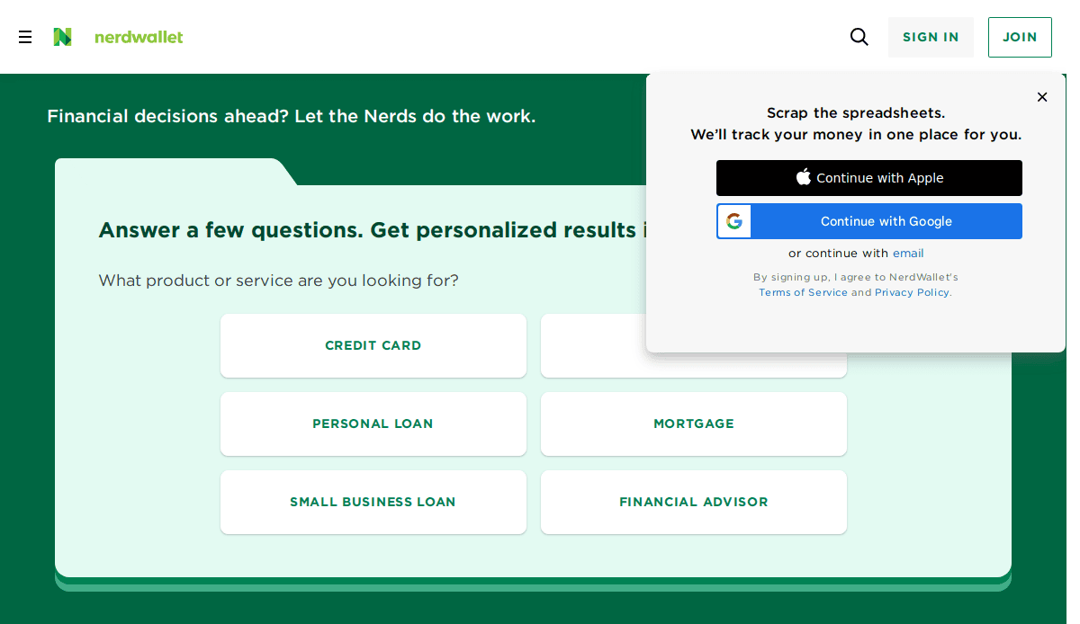
9. NerdWallet
Location City In The US: San Francisco, CA
3 Key Takeaways:
- Extensive Educational Content: Functions as a comprehensive resource for personal finance topics, from credit cards to mortgages.
- Clear Comparison Tools: Provides side-by-side comparisons of financial products, empowering users to make informed decisions.
- User-Centric Navigation: Organized intuitively by financial category, making it easy to find relevant information.
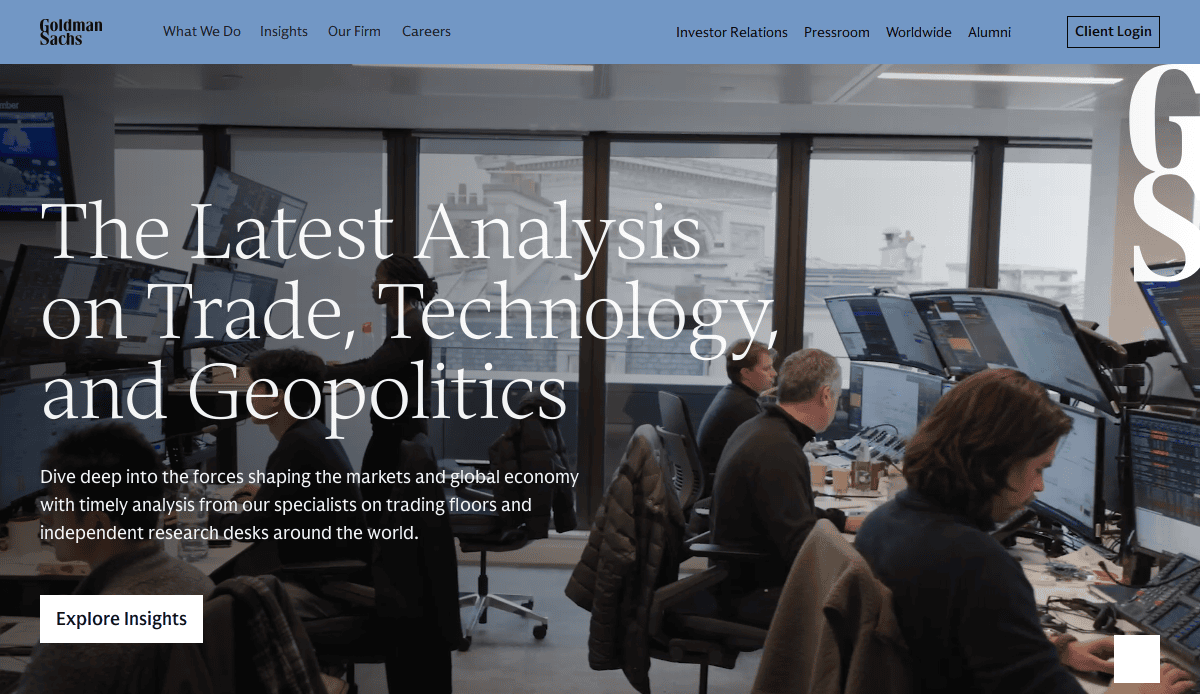
10. Goldman Sachs
Location City In The US: New York, NY
3 Key Takeaways:
- Global and Authoritative Tone: Reflects its status as a leading global financial institution with a formal and informative design.
- Focus on Insights and Research: Prominently features their economic outlooks and thought leadership.
- Streamlined Corporate Presentation: Delivers essential information about their various divisions and services in a clear, professional manner.
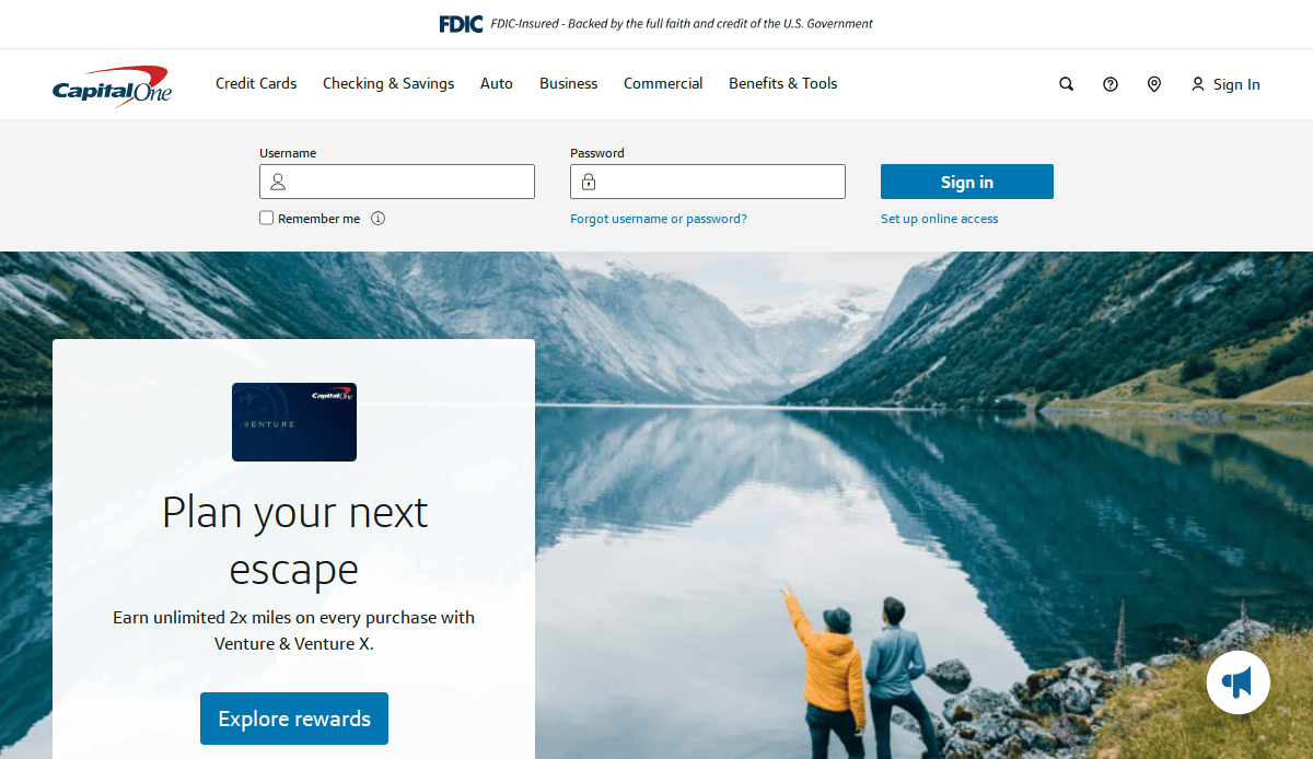
11. Capital One
Location City In The US: McLean, VA
3 Key Takeaways:
- Clean and User-Friendly Interface: Offers easy navigation for banking, credit cards, loans, and other financial products.
- Strong Digital Tools Promotion: Highlights their mobile app features and online banking capabilities.
- Engaging Visual Storytelling: Uses aspirational imagery to connect with customers on a personal level.
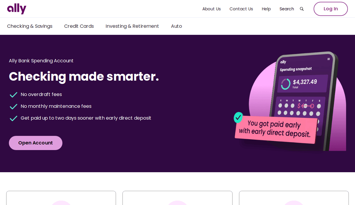
12. Ally Financial
Location City In The US: Detroit, MI
3 Key Takeaways:
- Modern, Digital-First Design: Emphasizes its online-only banking model with a fresh and intuitive interface.
- Clear Value Proposition: Highlights high-yield savings accounts and user-friendly investment options.
- Educational Content Integrated: Offers simple explanations and guides for various financial products.
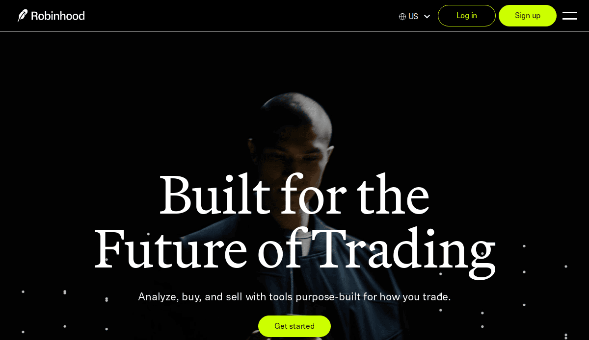
13. Robinhood
Location City In The US: Menlo Park, CA
3 Key Takeaways:
- Simplified Investment Access: The Design clearly focuses on making investing accessible and straightforward for new users.
- Mobile-First Experience: Mimics the clean, intuitive feel of its popular mobile app.
- Visually Appealing Data Presentation: Uses clear charts and graphs to present market data in an easy-to-understand format.
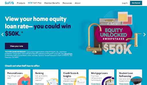
14. SoFi
Location City In The US: San Francisco, CA
3 Key Takeaways:
- Holistic Financial Wellness Approach: Website positions itself as a comprehensive platform for banking, investing, and lending.
- Relatable Lifestyle Imagery: Uses photos of real people to convey financial empowerment and achieve life goals.
- Clear Product Segmentation: Easily distinguishes between their various offerings (loans, banking, investing).
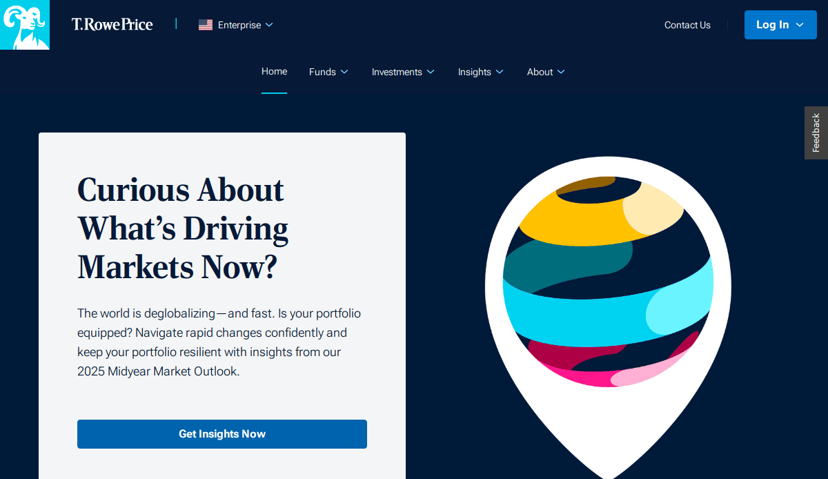
15. T. Rowe Price
Location City In The US: Baltimore, MD
3 Key Takeaways:
- Reputable and Trustworthy Feel: Design conveys a sense of stability and long-standing expertise in investment management.
- Focus on Retirement Planning: Provides specialized resources and tools for individuals saving for retirement.
- Detailed Fund Information: Offers comprehensive data and performance details for their various mutual funds and ETFs.
Financial Company Websites Designed by CyberOptik
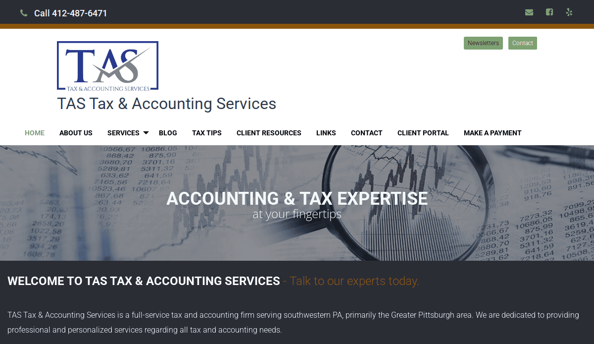
16. Tax & Accounting Solutions (TAS)
Location City In The US: Wexford, PA
3 Key Takeaways:
- Clean and Professional Layout: Reflects the precision and trustworthiness required in accounting and tax services.
- Clear Service Categorization: Makes it easy for visitors to find specific services like tax preparation, bookkeeping, or payroll.
- Direct Contact Information: Prominently displays contact details and a clear call to action for consultations.
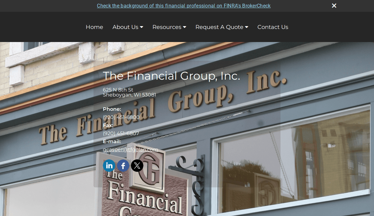
17. The Financial Group
Location City In The US: Sheboygan, WI
3 Key Takeaways:
- Modern and Accessible Design: Combines a contemporary look with user-friendly navigation for diverse clientele.
- Emphasis on Client Relationships: Design elements and content subtly convey a focus on personalized financial guidance.
- Clear Value Proposition: Quickly communicates the benefits of working with their advisors for financial planning and wealth management.
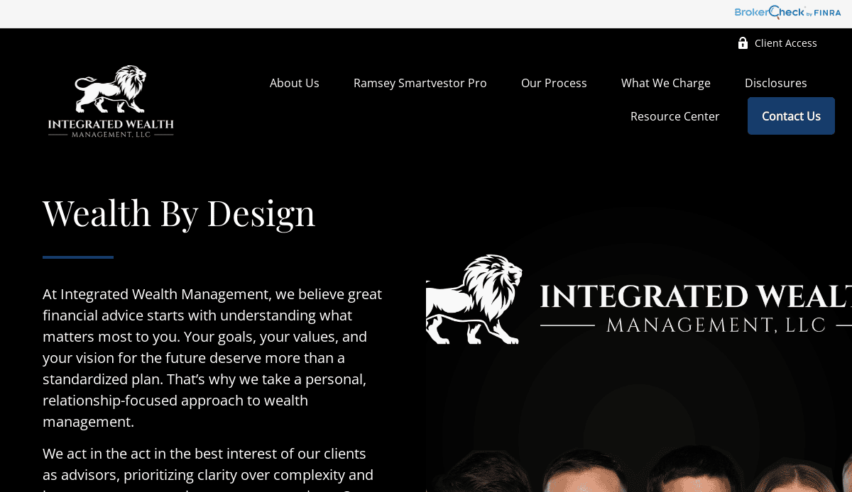
18. Integrated Wealth Management
Location City In The US: Onalaska, WI
3 Key Takeaways:
- Sophisticated Visuals: Uses high-quality imagery and a refined color palette to convey expertise and exclusivity.
- Streamlined Information Flow: Presents complex financial strategies in an easy-to-digest format.
- Prominent Advisor Introductions: Humanizes the firm by showcasing their team and their commitment to clients.
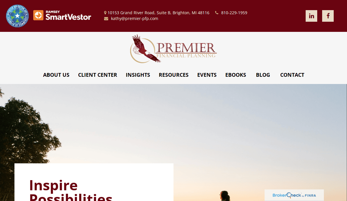
19. Premier Financial Planning
Location City In The US: Brighton, MI
3 Key Takeaways:
- Trust-Inspiring Design: Utilizes a classic and dependable aesthetic to build confidence with potential clients.
- Clear Service Breakdown: Organizes financial planning services into easy-to-understand sections.
- Client Testimonials: Features client success stories to provide social proof and build credibility.
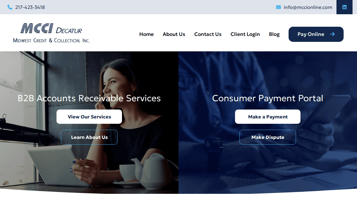
20. Midwest Credit & Connections
Location City In The US: Decatur, IL
3 Key Takeaways:
- Empathetic and Solutions-Oriented Tone: Design and copy are geared towards offering relief and solutions for individuals facing financial challenges.
- Clear Call to Action for Help: Makes it easy for visitors in distress to reach out for assistance.
- Simple and Direct Language: Avoids jargon, making complex debt solutions understandable for a broad audience.
Take the Next Step Toward a High-Performing Financial Website
If you’re aiming to compete in a modern, digital-first world, now is the time to upgrade your online presence. A stunning website isn’t just about visuals—it’s about strategy, trust, and performance. From clean and minimalist homepage design to interactive elements that guide the user through complex financial matters, every decision you make impacts how potential clients perceive your business and how effectively your site supports lead generation.
Whether you’re offering accounting services, financial advisory, or broader business management services, investing in modern and clean website design for financial firms pays off. The best financial websites use professional design, responsive design, and content management systems to provide easy access to information, support search engine optimization, and drive conversions. A site that looks good but fails to engage visitors or reflect the services offered won’t get you far in search engines or in the minds of your audience.
We specialize in creating a website experience tailored for the financial sector, drawing from best practices, clean design principles, and deep industry insight. Whether you’re rethinking your current Squarespace website or launching a new website altogether, our team brings the design expertise needed to build a professional, high-performing platform.
Ready to create a custom website that represents the best finance design principles and helps you grow? Contact us today to schedule your free consultation. Let’s elevate your financial services website design and make your online presence a true player in the financial industry.
Financial Industry Website Design FAQs
What makes a finance website effective for the financial sector?
A finance website is effective when it clearly communicates trust, offers easy access to information, and converts visitors into leads. Great design in this space includes responsive designs, secure hosting, intuitive navigation, and calls-to-action that guide website visitors toward scheduling consultations or downloading a financial guide. For the financial sector, your design choice must reflect credibility and compliance as much as creativity.
How does web design and development impact search visibility?
Search visibility depends on multiple factors—fast page load speed, responsive design, optimized content, and clean code structure. When your website is built with SEO best practices in mind, it ranks better in search engines and draws in more qualified traffic. Strategic internal linking, like pointing users to conversion-optimized design services, also improves engagement and SEO authority.
What are the key design elements in the best industry website designs?
The best designs use a mix of visual consistency, structured layouts, compelling CTAs, and accessible content. Clean typography, professional logo design, and modern design techniques create sites that are easy on the eyes yet conversion-driven. Advisor websites should always include clear service descriptions, credentials, and simple design elements that reinforce trust.
How do I choose the right website colors for a financial firm?
Your color scheme should reflect professionalism, stability, and trust. Blues, greens, and grays are common choices in the financial sector because they signal confidence and security. Contrast is also important—your website colors should provide visual clarity and improve readability for all users.
Do I really need a website if I already use social media for marketing?
Absolutely. Social platforms are valuable, but they don’t replace a dedicated website. A custom website serves as the central hub for your business, financial management services, and client communications. It offers complete control over your messaging, SEO, and lead generation—a necessity if you want to be a serious player in the financial industry.
What’s the ideal homepage layout for a financial firm?
A high-performing homepage should include a clear headline that states the purpose of the site, followed by a concise overview of services offered, trust signals (like testimonials or certifications), and CTAs. A modern and clean design helps guide the user while reinforcing professionalism. View some of the best finance websites for inspiration on layout and structure.
How can I incorporate financial technology into my design approach?
Integrating financial technology such as calculators, secure client portals, or budgeting tools enhances user engagement and positions your site as a solution-oriented resource. These design concepts also support lead generation by offering interactive tools that address common financial questions.
What type of content should be prioritized on a finance website?
Your content should include service pages, educational blogs, and answers to frequently asked questions that resonate with your target audience. Pages like “Google Business Profile Management” and “Local SEO Services” add functional value and boost credibility. A mix of foundational content and educational resources strengthens your authority and helps engage visitors effectively.
Can a simple design really work for complex financial offerings?
Yes, a simple design does not mean basic. It means eliminating clutter, using whitespace strategically, and presenting information in a way that is easy to scan and understand. Even complex financial offerings like investment strategies or retirement planning can be presented with clarity when backed by a thoughtful design approach.
How often should I update my website?
Updates should be ongoing. Regular content updates, performance checks, and design refinements ensure your site stays aligned with current SEO trends, security standards, and evolving client expectations. Websites that remain static lose relevance, especially in the fast-moving world of financial technology and digital user behavior.
Have more questions about creating a standout finance website? Talk to our professional team and get expert answers tailored to your business.


