Just looking for our Best Fence Company Website examples list?
A fence is a physical product. What better way to market this tangible thing to the masses than a custom website? With a website, potential customers can see the quality of the materials and the precision of the installation required, all without needing to leave their home. For most fencing companies, that online presence is little more than a static, online brochure. It shows a few pictures, lists a phone number, and quietly waits for the phone to ring. But what if your company website could be doing so much more?
A generic website in our modern world is like a leaky bucket, letting potential customers slip away to competitors with a more professional and seamless user experience online. A poor design actively costs your fencing business money. Every visitor who clicks away is a lost lead. Every potential client who can’t easily find your gallery or request a quote is a missed opportunity. Without proper optimization, your ideal customers may never even find you in the first place.
This guide is not another technical checklist. It is a strategic blueprint for transforming your approach to web design. We’re moving beyond building a simple digital brochure and into the realm of creating a high-performance sales and operations hub. We will show you how to build a responsive, user-focused fencing website designed for one primary goal: conversion. Prepare to learn how to turn your greatest marketing expense into your most valuable business asset—a site that attracts new clients and streamlines your entire sales process.
Pre-Construction: Laying the Groundwork for a High-Performance Website
Before a single post is set in the ground, a successful fence application requires a detailed plan—measurements are taken, utility lines are marked, and materials are ordered. The exact same discipline is required to build a successful website. Too many professionals skip this critical planning phase and jump straight into picking colors and photos. This is the equivalent of starting to dig post holes without knowing where the property line is. The result is inevitably a website that looks okay but fails to perform its most important job: growing your business.
This pre-construction phase isn’t about design; it’s about strategy. It involves a deep, honest look at your business goals, your customers’ needs, and the competitive landscape. Getting this part right ensures that every subsequent decision—from the layout and content to the features and functionality—is purpose-driven and aimed directly at achieving a measurable return on your investment.
From “Who Is Our Audience?” to “What Is Our Customer’s Biggest Headache?”
It’s easy to say your audience is “homeowners in my service area.” That’s a start, but it doesn’t get to the heart of what drives a sale. To build a website that truly connects, you must move beyond simple demographics and focus on the specific problems, questions, and anxieties your potential customers have. This is the foundation of a strong first impression.
Your future client isn’t just buying a fence; they are buying a solution to a problem. What is that problem?
- The New Dog Owner: Their primary concern is security and safety. They are anxious about their dog escaping. Your website needs to immediately reassure them with language and imagery about secure latches, appropriate fence heights, and durable materials that can withstand a determined pet.
- The Growing Family: Their main driver is privacy and creating a safe play area for their children. They are likely worried about neighborhood perceptions and want a fence that looks great from both sides. Your site should highlight privacy fence options and highlight their aesthetic appeal.
- The Pool Owner: Their need is driven by legal requirements and liability. They are looking for code-compliant pool fencing and self-closing gates. Your website must position you as an expert in local pool safety codes.
- The Frustrated DIYer: They tried to do it themselves and failed, or they are overwhelmed by the options at the big-box store. They are looking for professional guidance and a seamless, hands-off process.
Your website’s content, navigation, and calls-to-action must be engineered to directly address these specific “headaches.” When a potential customer lands on your site and immediately feels understood, you establish trust long before the first phone call.
The “One Thing” Strategy: Defining Your Website’s Primary Job
A website that tries to do everything will accomplish nothing. Before you proceed, you must define its single most important job. While your site will serve multiple functions, it needs one primary, measurable goal that dictates its structure. For most companies, this will be a direct-response action.
Choose your “One Thing”:
- Primary Goal Example 1: Maximize Quote Requests. If this is your goal, the “Get a Free Estimate” button must be the most prominent element on every single page. The user journey should constantly guide visitors toward the quote request form.
- Primary Goal Example 2: Drive Inbound Phone Calls. If you prefer to qualify leads over the phone, your phone number should be large, clickable on mobile devices, and visible at the top of every page. The main call-to-action might be “Call Now for a Free Consultation.”
- Primary Goal Example 3: Qualify Leads Before Contact. If you’re overwhelmed with unqualified leads asking basic questions, your goal might be to use the website as a filter. This means building out detailed FAQ sections, educational blog posts, and perhaps an interactive pricing estimator to ensure that the leads who do contact you are serious and well-informed.
Defining this primary job prevents a cluttered and confusing website. It brings clarity to your design and ensures that you are building a tool, not just an online art project.
Competitor Analysis with a Twist: Finding the “Service Gap”
Finally, it’s time to look at the competition—but not to copy them. Your goal is to find the gaps in their online service and exploit them. Open the websites of the top 3-5 fence companies in your local market and analyze what they don’t do well. Ask yourself these questions:
- How long does it take to understand their process? Are the steps from initial contact to final installation clearly laid out? If not, there’s your gap: create an “Our Process” page that builds confidence through transparency.
- Can you get a rough estimate online? Most fence websites have a simple “contact us” form. If no one offers an instant or interactive quoting tool, this is a massive opportunity to provide immediate value and capture leads before your competitors even see them.
- How good are their project photos? Are they low-resolution, poorly lit, or just dumped onto a single, unorganized page? Your gap is to create a stunning, professionally organized gallery that is filterable by fence type and material.
- Do they speak to specific customer anxieties? Do they have dedicated content for pool safety or pet containment? If their content is generic, your opportunity is to create specific, problem-solving pages that will dominate search engine results for those niche queries.
By identifying these “service gaps,” you are not just building another fencing website. You are building a better, more helpful, and more efficient customer experience. This strategic foundation is the difference between a website that costs you money and a website that makes you money.
The Blueprint: Designing for Leads and Operational Efficiency
Once the strategic foundation is laid, it’s time to design the structure. Remember that your website’s design is not about winning art awards; it’s about winning customers. Every single design choice—from the color of a button to the layout of the homepage—should be made with two goals in mind: building trust with new clients and streamlining their path to requesting a quote. A visually appealing website that fails to convert is a failure. This blueprint focuses on the core design principles that build credibility and drive action.
First Impressions Matter: The Power of Professional, Clean Design
Site visitors make a judgment about your company within seconds of landing on your homepage. An outdated, cluttered, or unprofessional design instantly plants a seed of doubt. If your website looks untrustworthy, they will assume your work is, too. This is why a clean, modern, and professional design is a non-negotiable element of your online presence.
- Visual Hierarchy: Your website should guide the user’s eye naturally to the most important information. This is achieved through the strategic use of size, color, and placement. Your main headline should be the largest text on the page. Your call-to-action buttons (like “Get a Free Estimate”) should be in a contrasting color that stands out. This isn’t just aesthetics; it’s a vital part of creating a seamless user experience that prevents confusion and frustration.
- Consistent Branding: Your logo, color scheme, and typography should be consistent across every single page of your website. This consistency creates a sense of professionalism and reliability. A website that uses five different fonts and a clashing color palette feels chaotic and untrustworthy, directly impacting your conversion rate. Your brand should communicate stability and quality—the very things customers look for in a fencing contractor.
Show, Don’t Just Tell: Creating a Stunning Project Gallery
Your project gallery is your single most powerful sales tool. This is where you provide tangible proof of your craftsmanship. A weak, disorganized gallery with poor-quality photos will do more harm than good. Your goal is to elevate your gallery from a simple collection of images into a “Visual Decision Engine” that helps customers find what they want and feel confident in your ability to deliver it.
- High-Quality Imagery is Essential: Invest in professional photography or, at a minimum, learn to take high-resolution, well-lit photos with a modern smartphone. Capture your work from multiple angles, including close-ups of latch details and post installations. The difference between a grainy, poorly lit photo and a bright, sharp one is the difference between looking like an amateur and looking like a seasoned professional.
- Show Before-and-After Shots: One of the most effective ways to display the transformative impact of your work is with before-and-after photos. This visual storytelling technique clearly demonstrates the value you provide and helps clients visualize the potential for their own property.
- Strategic Categorization: Don’t dump all your photos onto one page. Allow users to filter your gallery by the categories that matter to them:
- By Material: Vinyl, Wood, Aluminum, Chain-Link, etc.
- By Style: Privacy, Picket, Pool Fencing, Farm Fencing, etc.
- By Location (for SEO): Add captions to your photos like “Cedar Privacy Fence Installation in [City, State]” to boost your local search engine optimization.
Building Trust with an Authentic “About Us” Page
After viewing your work, a visitor’s next step is often to find out who, exactly, they would be hiring. This is the purpose of your “About Us” and “Meet the Team” pages. In an industry where trust is paramount, humanizing your brand is a critical step. Customers want to know there are real, accountable people behind the logo.
- Tell Your Story: Why did you start this fencing business? What are your company’s values? A brief, authentic story helps build an emotional connection and differentiates you from faceless competitors.
- Use Real Photos of Your Team: Avoid stock photos at all costs. A picture of your actual owner, project managers, and installation crew creates an immediate sense of authenticity and transparency. It shows you are proud of your team and have nothing to hide. This simple act can significantly increase the level of trust a prospective client feels toward your company.
The Importance of a Mobile-First, Responsive Design
Today, the majority of prospects will likely visit your site on a smart device. They might be searching for local fence companies while on their lunch break or standing in their own backyard looking at a problem area. If your website is not designed to be responsive and easy to use on a small screen, you are actively turning away the majority of your potential clients.
- Thumb-Friendly Navigation: Buttons and menu items must be large enough to be easily tapped with a thumb. Complicated drop-down menus that work well on a desktop are often a disaster on mobile.
- Click-to-Call Functionality: Your phone number should be a clickable link that immediately opens the phone’s dialer. Forcing a mobile user to manually copy and paste your number is an unnecessary barrier that will cost you leads.
- Simple Forms: Your quote request forms must be designed for mobile. This means using a single-column layout, large input fields, and minimizing the number of fields required. A form that is easy to fill out on a desktop can be an exercise in frustration on a phone, leading to high abandonment rates.
Content & Navigation: The Strong Frame of Your Digital Presence
If design is the curb appeal of your website, then your content and navigation are its structural frame and floor plan. A confusing layout or a lack of essential information will frustrate visitors and send them searching for a competitor, no matter how good your site looks. The goal is to create a clear, intuitive path that allows visitors to find the exact information they need with minimal effort. In the fencing industry, this means guiding them from their initial problem to the solution you provide, culminating in a quote request.
Effective navigation isn’t about being clever; it’s about being clear. A visitor should be able to land on any page of your site and understand within seconds where they are, what you do, and where to go next. This clarity builds immediate confidence and is a cornerstone of a positive user experience.
The Must-Have Pages for Every Professional Website
While your specific needs may vary, a high-performing website must be built on a foundation of several key pages. Each page serves a distinct purpose in the customer’s journey, and together they work to build trust, demonstrate expertise, and drive leads.
- The Homepage: Your Digital Handshake:Your homepage is your most important page. Its job is to answer three questions in under five seconds: Who are you? What do you do? and What should I do next?
- Key Content:
- A clear, benefit-driven headline (e.g., “Quality Fencing Solutions for [Your City] Homeowners”).
- High-quality images of your best work.
- Clear, concise introductions to your main services (Wood, Vinyl, Aluminum) with links to those service pages.
- Trust-building elements like customer testimonials, awards, or “Licensed & Insured” badges.
- A prominent, can’t-miss call-to-action (CTA) like a “Get a Free Estimate” button.
- The About Us Page: Building Human Connection:Customers hire people they trust, especially when inviting them to their property. This page is your opportunity to tell your story and show the real people behind your business.
- Key Content:
- Your company’s story and mission.
- Photos of the owner and key team members (not stock photos).
- A clear statement of your service area and commitment to the local community.
- The Project Gallery: Your Proof of Quality: As detailed in the design section, this is where you exhibit your craftsmanship. It must be well-organized and visually impressive.
- Key Content:
- High-resolution photos of completed projects.
- Categorization by fence material and style for easy browsing.
- Descriptive captions that can include location keywords for an SEO boost.
- The Contact Us Page: Opening the Door for BusinessMake it as easy as possible for potential clients to get in touch with you.
- Key Content:
- A simple, easy-to-fill-out contact form.
- Your business phone number (make it “click-to-call” for mobile users).
- Your business address and an embedded Google Map.
- Your hours of operation.
- The Blog or Resources Center: Establishing Expertise: A regularly updated blog is one of the most powerful tools for search engine optimization (SEO) and for establishing your company as the local fencing authority.
- Key Content:
- Answers to common customer questions (“How much does a vinyl fence cost?”, “What are the pool code requirements in [Your County]?”).
- Guides on fence maintenance.
- Local project spotlights.
The Power of Dedicated Service Pages
One of the most common mistakes professionals make on their website is listing all their services on a single page. This is a massive missed opportunity for both UX and SEO. A much more effective strategy is to create a dedicated page for each core service you offer.
For example, instead of one “Services” page, your main navigation might have a dropdown menu that includes:
- Wood Fences
- Vinyl Fences
- Aluminum Fences
- Chain-Link Fences
- Commercial Fencing
- Fence Repair
Why is this so effective?
- For the Customer: A prospective client looking specifically for information on vinyl privacy fences doesn’t want to sift through details about chain-link security fences. A dedicated page provides them with exactly what they are looking for—galleries, benefits, and color options related only to vinyl, creating a better, more relevant experience.
- For SEO: Search engines like Google want to rank the most authoritative page for any given query. A detailed page titled “Expert Vinyl Fence Installation in [Your City]” has a much higher chance of ranking for the search “vinyl fence company near me” than a generic services page that mentions vinyl in a single paragraph. This structure allows you to target highly specific keywords on each page, dramatically increasing your visibility in search results.
For more guidance on web page design, check out our Guide to Organizing Your Website and Pages
Key Takeaways from Our Fence Company Website Design Blueprint
Here is a summary of the essential strategies for transforming your professional website from a simple online brochure into a powerful engine for lead generation and business growth.
Shift Your Website’s Purpose from a Brochure to a Business Hub
Your website should do more than just showcase your work; it should actively streamline your entire business. The primary goal of a modern website design is to integrate marketing, sales, and operations into one central platform. Think of it not as an expense, but as your most efficient employee, working 24/7 to attract customers and manage leads.
Design for Your Customer’s Problems, Not Just Your Services
To build a website that converts, you must address the core concerns of your customers. A successful design goes beyond listing fence types and focuses on providing solutions.
- Solve Headaches: Understand customer pain points like pet safety, privacy needs, or confusion over materials, and build your site content and navigation to directly address them.
- Create Visual Decision Tools: Don’t just create a photo gallery. Build an interactive, filterable project portfolio that allows visitors to sort by material (vinyl, wood, aluminum), style, and even budget to help them make confident buying decisions.
- Build Deeper Trust: Go beyond standard testimonials. Increase credibility by featuring your licensed and insured status prominently, introducing your installation crew, and being transparent about the quality brands of materials you use.
Engineer Your Website for Lead Generation and Efficiency
Every element of your website should be designed to guide visitors toward requesting a quote while reducing your administrative workload.
- Frictionless Quoting: Design your “Get a Quote” forms to be as simple as possible. The fewer fields a user has to fill out, the higher the conversion rate.
- Integrate with Your CRM: Connect your website’s contact forms directly to your Customer Relationship Management (CRM) software (like Jobber or AccuLynx). This instantly turns a new lead into a manageable customer profile, automating follow-ups and eliminating manual data entry.
- Leverage Hyperlocal SEO: Focus your SEO efforts on ranking for “long-tail” keywords specific to your service areas (e.g., “wood privacy fence installer in [Town, ZIP Code]”). This attracts highly qualified local customers who are ready to buy.
Future-Proof Your Website to Stay Ahead of the Competition
A static website will quickly fall behind. Your digital presence must be built to adapt to future industry trends and marketing strategies.
- Build a Content Moat: Create valuable, evergreen content that your competitors can’t easily replicate. Develop detailed local permit guides for the towns you serve, offer DIY maintenance video tutorials, and create resources that explain the factors influencing fence costs.
- Plan for Technological Shifts: Be prepared for emerging trends like smart fences, integrated lighting, and advanced gate automation by choosing a website platform that is flexible and easy to update with new services.
- Focus on Measurable Results: Avoid the “set it and forget it” mentality. Regularly review your website’s analytics to understand user behavior, track your quote form’s conversion rate, and continuously optimize for better performance.
Post-Launch: Ongoing WordPress Maintenance to Protect Your Investment
Launching your new website is a major milestone, but the work isn’t over. A website is not a “set it and forget it” asset; it is a dynamic piece of software that requires regular maintenance to function securely and effectively. Just as your tools and vehicles need scheduled service to perform reliably on the job site, your WordPress website requires ongoing attention to protect it from security threats, ensure it runs quickly, and maintain its value as a lead-generating tool.
Neglecting website maintenance is one of the most common and costly mistakes a business can make. An unmaintained site is slow, vulnerable to hackers, and will eventually break. This section outlines the critical maintenance tasks necessary to protect your online presence and ensure it continues to produce results for your fencing business.
Core Software, Plugin, and Theme Updates
WordPress is constantly evolving. The WordPress core software, along with the plugins that provide functionality (like contact forms or photo galleries) and the theme that controls your site’s design, receive regular updates from their developers. These updates are not optional suggestions; they are essential for your website’s health.
- What they are: These updates contain security patches to close vulnerabilities, bug fixes to resolve performance issues, and new features to improve functionality.
- Why they are critical: The single most common entry point for hackers into a WordPress website is through an outdated plugin or theme. When a vulnerability is found, developers release a patch. Hackers actively scan the internet for websites that have not applied these patches. Ignoring these update notifications is like leaving the front door of your office unlocked. Regularly updating all components of your site is your first and most important line of defense.
Consistent Website Backups: Your Digital Insurance Policy
What would happen if your website were hacked and defaced, or if a software update went wrong and crashed your entire site? Without a recent backup, you would be forced to rebuild your website from scratch, losing all your content, leads, and search engine rankings. This is a catastrophic and entirely preventable scenario.
- What it is: A complete copy of all your website’s files and its database, stored in a secure, separate location from your web server.
- Why it is critical: Regular, automated backups are your insurance policy. They provide the ability to restore your website to a fully functional state within minutes of a disaster. Backups should be performed daily or weekly, depending on how frequently you add new content, and they must be stored off-site. If your backups are stored on the same server as your website, they will be lost along with everything else in the event of a server-wide failure.
Proactive Security Monitoring
You install security fences to protect your clients’ property; you must apply the same principle to your own digital property. Because WordPress is the world’s most popular website platform, it is also the most targeted by malicious actors. Proactive security monitoring helps identify and block threats before they can do damage.
- What it is: The use of security software to scan your website’s files for malware, suspicious activity, and known vulnerabilities. These tools also often include a web application firewall (WAF) that blocks hacking attempts and malicious traffic before they can even reach your website.
- Why it is critical: A security scanner can detect infected files that could be used to steal customer information submitted through your forms, redirect your visitors to spam websites, or even get your website blacklisted by Google. A firewall acts as a vigilant guard, preventing brute-force login attempts and blocking access from known bad IP addresses, keeping your website and your business reputation safe.
Performance Checks and Optimization
A slow website will cost you leads. Modern internet users expect pages to load almost instantly. If your site takes more than a few seconds to load, prospective clients will hit the “back” button and go to your competitor’s site. Google also uses page speed as a ranking factor, meaning a slow site will rank lower in search results.
- What it is: The regular process of running speed tests on your website and performing optimization tasks to ensure it loads as quickly as possible. This includes tasks like clearing your website’s cache, optimizing the file size of images in your project gallery, and ensuring your hosting server is performing adequately.
- Why it is critical: Every second of load time increases your “bounce rate”—the percentage of visitors who leave after viewing only one page. For a business whose most valuable asset is its project gallery, having large, unoptimized images can cripple site speed. Regular performance checks ensure a seamless user experience, which keeps new clients engaged and improves your position in search engine rankings.
20 Examples of Web Design for Fencing Services
1. Peerless Fence Group
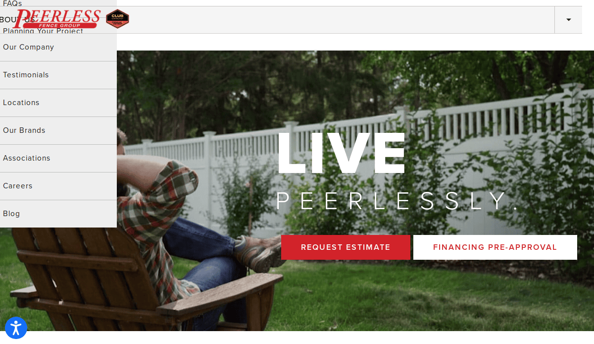
- Location: West Chicago, IL
- 3 Key Takeaways:
- Strong Brand Identity: The website uses a consistent and professional color scheme and logo, establishing a sense of trust and reliability from the moment the page loads.
- Clear Audience Segmentation: Right on the homepage, users can choose their path (“Protect a Home” or “Protect a Business”), leading to a more tailored and relevant user experience.
- Inspiration-Focused Galleries: The portfolio is presented as an “Inspiration” section, which is a more engaging and customer-focused approach than a simple project gallery.
2. First Fence Company
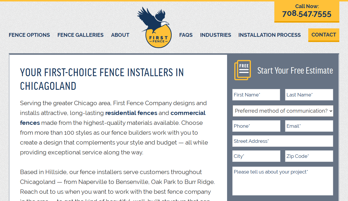
- Location: Hillside, IL
- 3 Key Takeaways:
- Service-Area Focused: The company prominently features its Chicagoland service area, which is excellent for local SEO and immediately qualifies potential customers.
- Emphasis on Education: The site takes the time to educate visitors on the benefits of different materials, positioning the company as a knowledgeable expert and trusted advisor.
- Featured Projects with Detail: The “Featured Projects” section provides not just photos, but also details about the city and fence type, adding valuable context and SEO value.
3. SP Fence Company
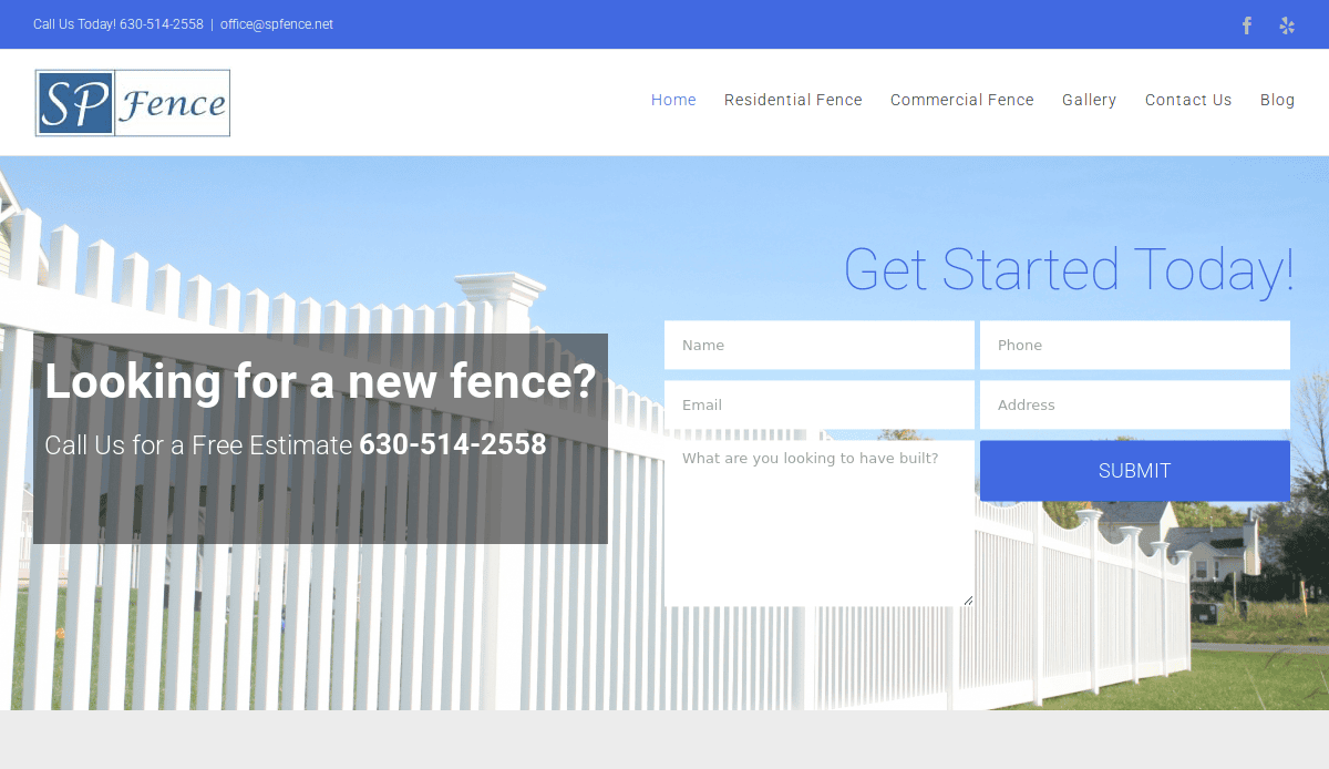
- Location: Warrenville, IL
- 3 Key Takeaways:
- Trust-Building Reviews: Customer testimonials are placed prominently on the homepage, providing immediate social proof and building credibility with new visitors.
- Simple, Direct Navigation: The website uses a very clear and straightforward navigation menu, making it easy for users to find exactly what they need without confusion.
- Family-Owned Angle: The site effectively communicates its identity as a family-owned business, which fosters a sense of trust and personal service that resonates with homeowners.
4. Krugel Cobbles(Landscape & Hardscape)
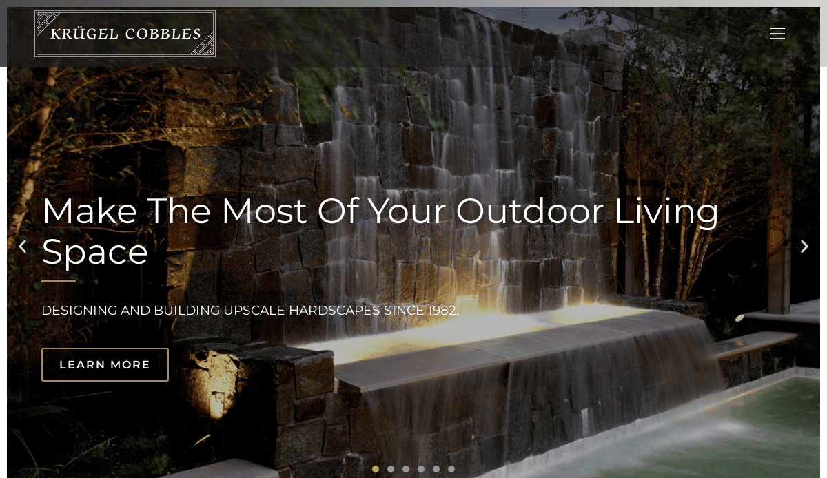
- Location: Oak Brook, IL
- 3 Key Takeaways:
- Stunning Visuals: The website leads with high-end, professional photography that immediately showcases the quality of their work and creates a premium feel.
- Service-Specific Landing Pages: Each service has its own detailed page, which is great for SEO and provides in-depth information for users with specific interests (like patios or walkways).
- Prominent Portfolio: The “Our Work” section is a primary focus, allowing the quality of their projects to be the main selling point and building desire in potential clients.
5. Electronic Entry Systems (Gates & Access Control)
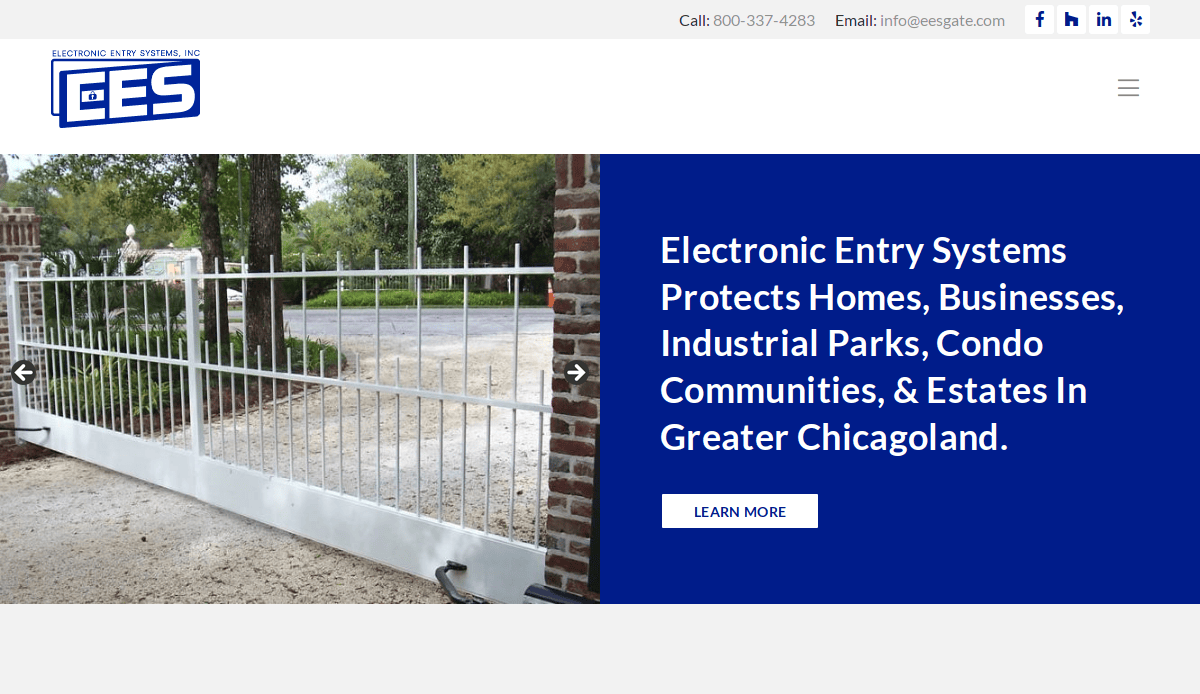
- Location: Chicago, IL
- 3 Key Takeaways:
- Niche Expertise: The website is clearly focused on the technical niche of automatic gates and access control, establishing them as specialists rather than generalists.
- Product-Centric Navigation: The navigation is organized by product type (Gate Operators, Entry Systems), which is ideal for customers who already have an idea of what they need.
- Clear Support Options: The site makes it easy to find information on service and support, which is critical for a company dealing with technical and electronic products.
6. American Fence Company

- Location: Omaha, NE
- 3 Key Takeaways:
- Massive Scope & Authority: The website immediately communicates the company’s large scale with its numerous locations and divisions, establishing it as a major player in the industry.
- Interactive Map: The locations page features an interactive map that is highly user-friendly and visually communicates its extensive service area.
- Resource-Rich: With multiple divisions like a gate company, playground company, and material sales, the site acts as a comprehensive resource for a wide range of needs.
7. Buzz Custom Fence
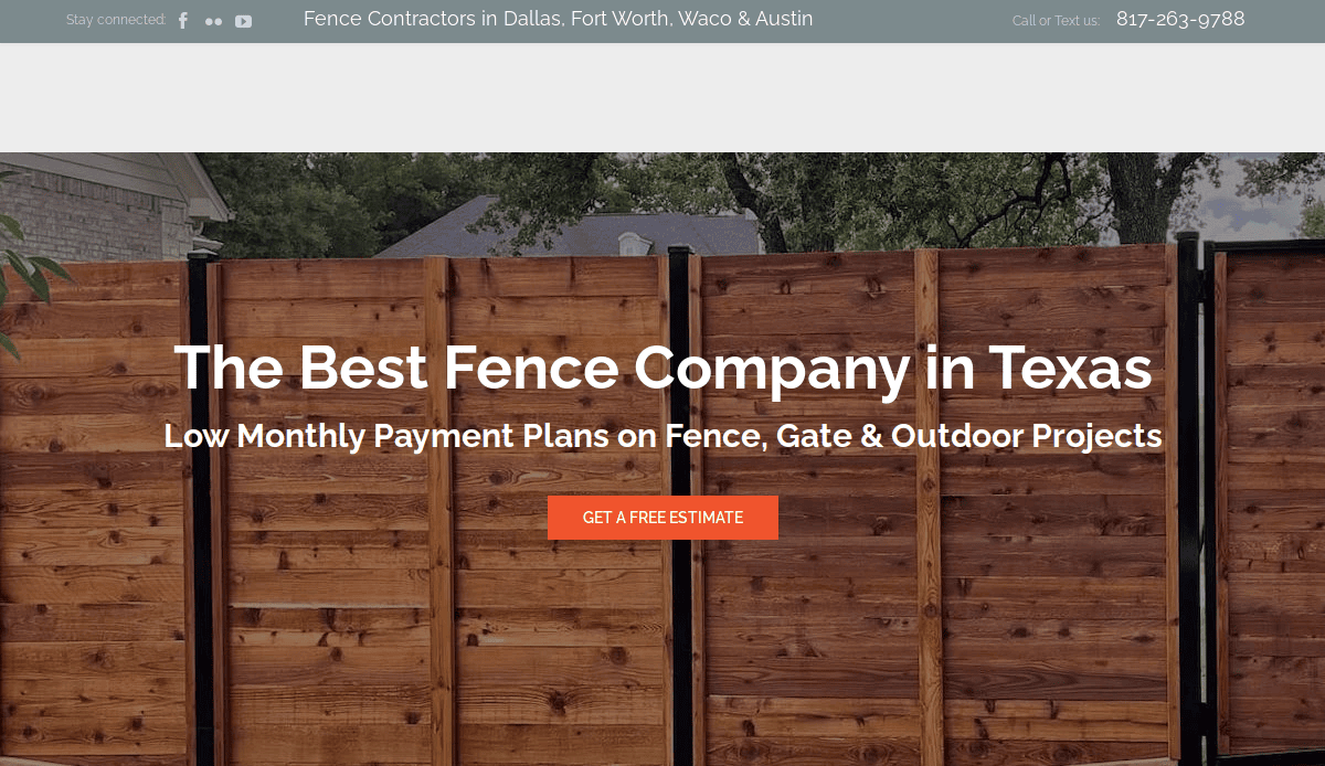
- Location: Fort Worth, TX
- 3 Key Takeaways:
- Strong Local SEO: The site effectively uses location-specific language and has dedicated pages for different service areas (e.g., Fort Worth, Dallas), targeting local customers.
- “Idea Book” Gallery: Framing their gallery as an “Idea Book” is a customer-centric approach that encourages browsing and inspiration.
- Prominent “Free Quote” CTA: The call-to-action for a free quote is consistently visible and easy to access, effectively driving lead generation.
8. Walpole Outdoors
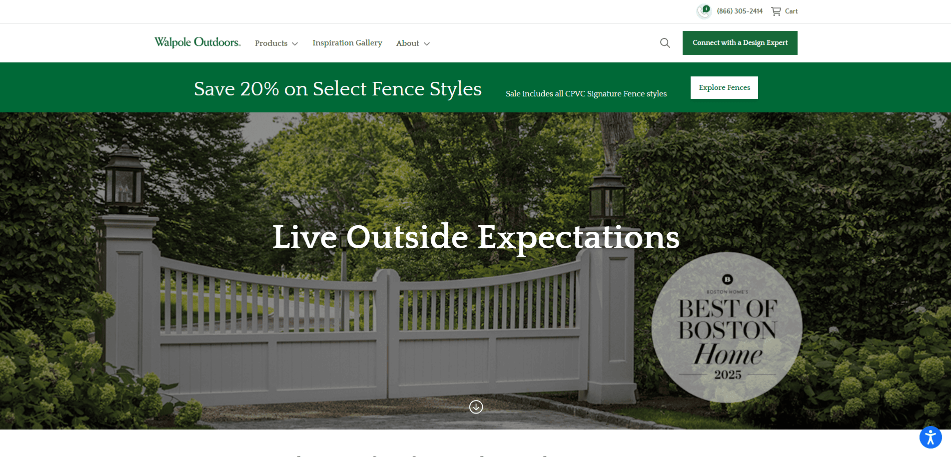
- Location: Walpole, MA
- 3 Key Takeaways:
- Luxury Branding: The website uses elegant typography, high-end photography, and a clean, spacious layout to position itself as a premium, high-quality brand.
- Inspirational “Lookbook”: Offering a downloadable “lookbook” is a great way to generate leads while providing value and showcasing their beautiful designs in a sophisticated format.
- Direct-to-Consumer & Professional Channels: The site effectively caters to both homeowners and industry professionals (designers, architects) with dedicated sections.
9. Lions Fence
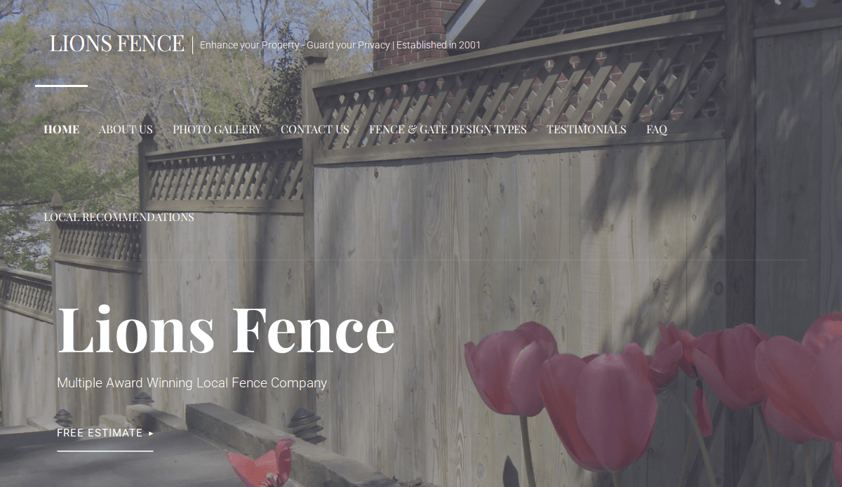
- Location: Fairfax, VA
- 3 Key Takeaways:
- Award-Winning Proof: The site prominently features its “Multiple Award Winning” status, which immediately builds trust and credibility with visitors.
- Value-Driven Content: The “Company Values” section (Family, Integrity, Kindness) helps to humanize the brand and create a personal connection with potential customers.
- Simple & Effective Lead Capture: The “FREE ESTIMATE” call-to-action is clear, and a simple contact form makes it easy for users to inquire.
10. Cascade Fence & Deck
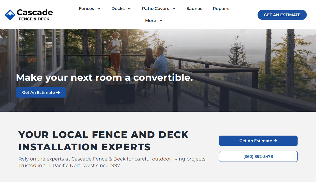
- Location:Vancouver, WA
- 3 Key Takeaways:
- Hero Video: The use of a high-quality video on the homepage immediately engages visitors and showcases their work in a dynamic way.
- Focus on Team Culture: The website highlights their team and culture, which helps build trust and shows they are proud of the people behind the work.
- Interactive “Design Your Deck” Tool: Offering an interactive design tool is a powerful lead-generation feature that provides immense value to the user and captures their interest.
11. Ergeon
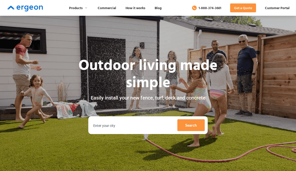
- Location:West Hollywood, CA
- 3 Key Takeaways:
- Technology-Forward Approach: Ergeon positions itself as a tech company in the construction space, emphasizing its online quote and project management tools.
- Social Proof Overload: The site heavily features its impressive number of reviews and high average rating, making a powerful case for its reliability and customer satisfaction.
- Transparent Process: The website clearly lays out “The Ergeon Process,” which demystifies the project for customers and builds confidence.
12. Northland Fence
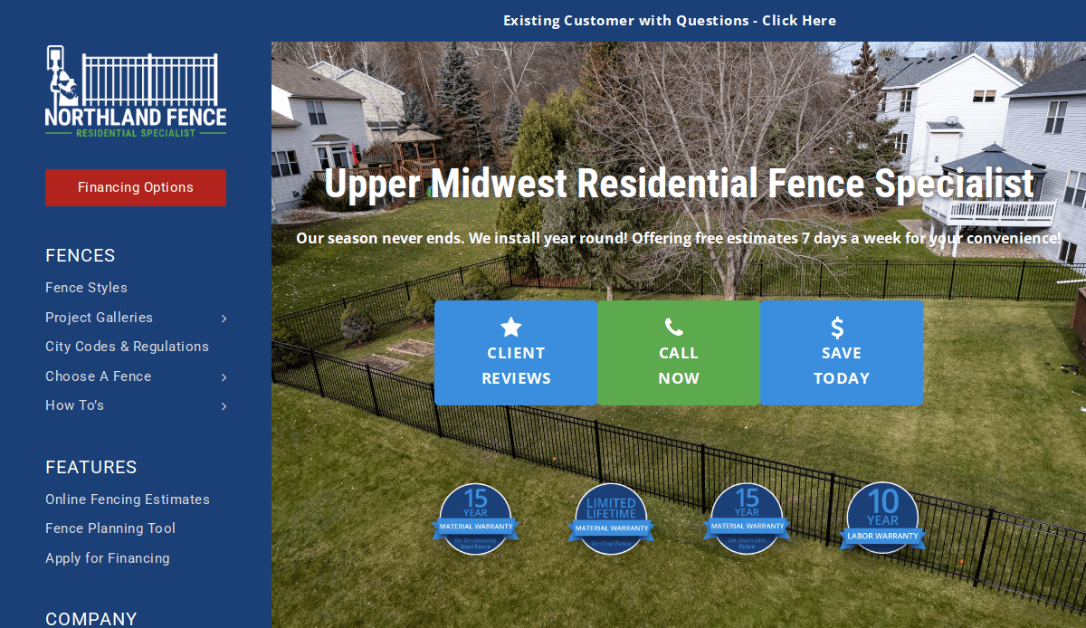
- Location:Rogers, MN
- 3 Key Takeaways:
- Strong Guarantee: The prominent “Lifetime Warranty” offer is a powerful selling point that addresses customer concerns about durability and quality head-on.
- Video Testimonials: Using video testimonials in addition to written ones adds a higher level of authenticity and personal connection.
- Clear Problem/Solution Content: The site does an excellent job of presenting common fencing problems (e.g., “rotting posts”) and showing how their specific installation method solves them.
13. Florida State Fence
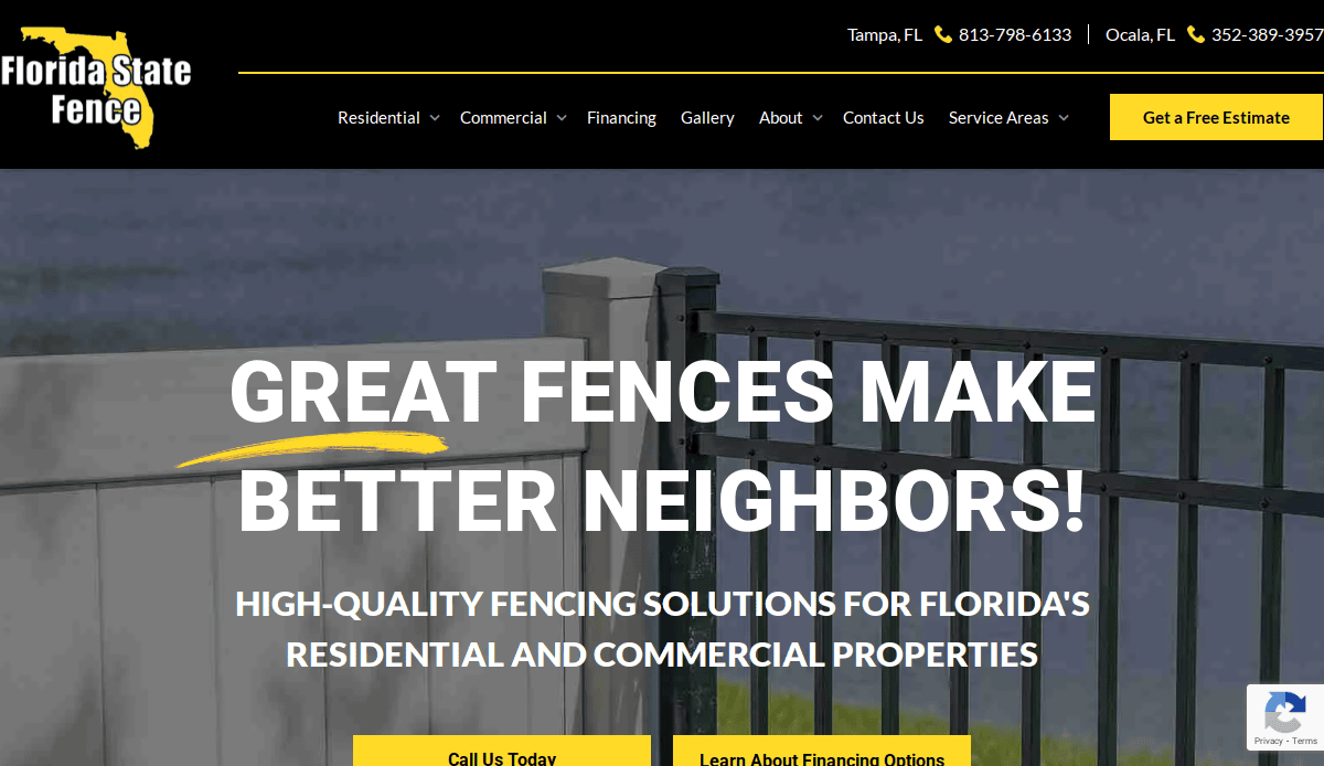
- Location: Tampa, FL
- 3 Key Takeaways:
- Environment-Specific Solutions: The website directly addresses the challenges of the Florida climate (salty air, storms), showing local expertise and that their products are built to last in that environment.
- Comprehensive Service Pages: Each fence type has a dedicated, detailed page explaining the pros and cons, which is great for both users and SEO.
- Financing Information: Offering and highlighting financing options make their services more accessible to a wider range of customers.
14. Texas State Fence & Patio
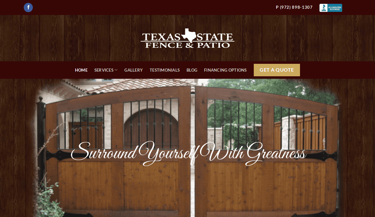
- Location: Dallas, TX
- 3 Key Takeaways:
- Strong Visual Branding: The use of the Texas state outline in the logo and throughout the site creates a memorable and strong local brand identity.
- Advanced Quote Tool: The site mentions using “advanced satellite software” for faster proposals, which positions them as modern and efficient.
- Warranty Highlight: Promoting their 10-year structural warranty on cedar fences is a key trust builder and a strong competitive differentiator.
15. Action Fence

- Location: Chattanooga, TN
- 3 Key Takeaways:
- Decades of Experience: The website prominently features its long history (“Since 1981”), which immediately establishes a legacy of stability and expertise.
- Clear Service Categories: The site effectively segments its services for Residential, Commercial, and even Farm fencing, appealing to a broad audience.
- Meet the Owner Section: Including a section on the owner and the company’s history helps to personalize the business and build a connection with visitors.
16. Smith Fence
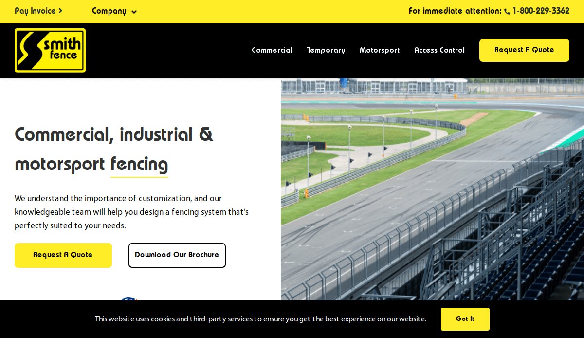
- Location:Clearwater, FL
- 3 Key Takeaways:
- Strong Commercial Focus: The website’s imagery and project highlights are heavily geared toward large-scale commercial and government work, clearly defining their primary niche.
- “Our Work” as the Centerpiece: The portfolio is front and center, showcasing impressive projects like airports and sports complexes to establish credibility for large jobs.
- Safety & Compliance Emphasis: The site highlights its commitment to safety and compliance, which is a crucial selling point for commercial and industrial clients.
17. Sierra Fence
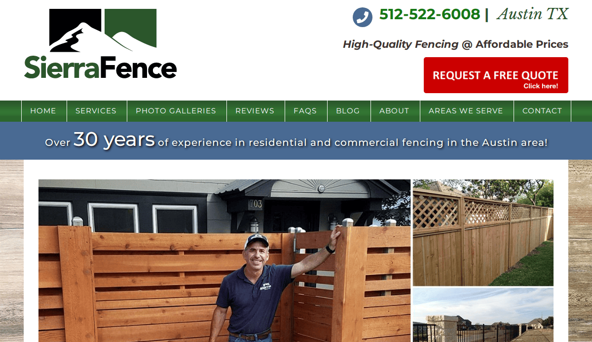
- Location: Austin, TX
- 3 Key Takeaways:
- Clean & Modern Design: The website has a very clean, minimalist layout with beautiful typography that creates a professional and high-end impression.
- High-Quality Photo Gallery: The gallery uses large, high-resolution images that truly showcase the quality and detail of their work.
- Simple, Focused Navigation: The site avoids clutter with a simple menu, guiding the user directly to the most important sections like the gallery and contact page.
18. All-State Fence & Supply

- Location: Lubbock, TX
- 3 Key Takeaways:
- Strong Local Authority: The site immediately establishes itself as “The Fencing Authority of West Texas” and mentions being “Voted ‘Best Fence Company’ 20 Years in a Row.”
- DIY & Contractor Supply: They clearly cater to both homeowners needing installation and DIYers/contractors needing materials, expanding their customer base.
- Multiple Locations Highlighted: The site effectively showcases its multiple locations, reinforcing its status as a large, reputable regional provider.
19. Bravo Fence Company

- Location: Kennesaw, GA
- 3 Key Takeaways:
- Benefit-Oriented Headings: The website uses headings that focus on the benefits to the customer, such as “Enhance Your Property’s Curb Appeal” and “Secure Your Perimeter.”
- Interactive Elements: The site includes subtle animations and interactive elements that make the user experience more engaging and modern.
- Clear Process Explanation: The website breaks down the installation process into simple steps, making it feel less intimidating for potential customers.
20. Long Fence
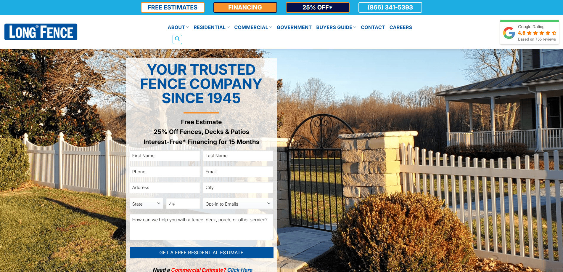
- Location: Capitol Heights, MD
- 3 Key Takeaways:
- Iconic Branding: Long Fence has an instantly recognizable brand that they use consistently across their site, built over many decades.
- Vast Product Selection: The website showcases an enormous range of products beyond fencing, including decks, patios, and awnings, positioning them as a one-stop shop for outdoor projects.
- Customer-Centric Navigation: The site organizes its products by residential and commercial needs, allowing users to quickly find the solutions relevant to them.
Build a Website That Builds Your Business
You now have the complete blueprint for creating a website for your business that does more than just exist online. Today, a generic, cookie-cutter website simply won’t cut it. To truly stand out from the competition, business owners need more than a digital brochure; they need a powerful marketing tool. A professionally built custom website is the foundation of all effective digital marketing strategies. It’s how you build a strong online presence, create a site that converts, and implement a system that leads and grows your business for years to come.
Stop wrestling with a website that doesn’t perform. If you’re ready to invest in professional web design that will generate leads and help streamline your business, our team is here to help. Schedule your free, no-obligation consultation today to get started.
Common Questions About Fence Website Design, Answered
Why can’t I just use a cheap template from a website builder for my company’s fencing site?
While a template from a website builder can help you create an online presence quickly, it often results in a cookie-cutter website that looks like many others. To be seen, you need a site that helps you stand out from the competition. A custom-designed website allows for specific website features tailored to your fencing business, such as advanced galleries for your fencing projects and integrated quote forms. A professional approach to website development ensures your site looks reputable, strategically built to generate leads and support your marketing efforts.
What are the most important factors for making my website rank higher in search results?
Improving the online visibility of your website involves several key SEO strategies. First, your site must be a responsive website, meaning it works flawlessly on all devices, especially mobile phones. Second, instead of one generic page, create detailed pages for the various fencing solutions you offer, like “Residential Fencing” or “Commercial Fence Installation.” Finally, a critical factor is having a clear structure. Following a proper website organization guide ensures both users and search engines can easily navigate your site, which helps you rank higher in search and drive more traffic to your website.
How much does a new website typically cost?
The cost of a new website varies widely and depends entirely on the scope of the project. A basic informational site will cost less than a large, custom-designed website with many advanced features. Factors that influence the price include the number of pages, the complexity of the design, and whether you need custom functionality like an interactive “free quote” calculator. The best approach is to view it as an investment in a marketing tool that helps your business get more leads. The final investment is determined through a detailed discovery and a step-by-step web design process.
Beyond photos of my work, what else makes for a great website for a fencing contractor?
A great website acts as your digital salesperson. While showcasing your fencing projects is crucial, other elements build trust and drive conversions. Customer testimonials are vital for showing high customer satisfaction. A blog with articles answering common fencing needs helps establish you as an expert. For design inspiration, it’s smart to see how top-tier professional firms handle their online presence. For instance, reviewing these best private equity website designs reveals how clean layouts and strong branding create authority. These universal design principles can help fence contractors create a site that reinforces their reputation as a reputable business.


