Just looking for our Best Logistics Website examples list?
Your website isn’t just a digital business card in the world of logistics, it’s a vital sales engine. Whether you specialize in freight forwarding, 3PL, or supply chain solutions, your website’s design plays a critical role in how prospects perceive your brand, understand your capabilities, and ultimately choose to work with you. A modern, user-friendly website is not a luxury; it’s a necessity for staying competitive and capturing leads in a high-stakes industry.
Customers today expect seamless online experiences, even in the B2B logistics space. That means fast load times, real-time tracking visibility, intuitive navigation, and clear paths to request quotes or schedule consultations. We’re exploring what separates a mediocre website from a high-performing one, from foundational dynamic design features to next-gen website visitors’ features that impress clients and improve conversion rates.
Logistics Site Planning & Purpose
Every successful website begins with a clear purpose and a well-defined plan. The planning phase is where strategy meets execution, and it’s essential for ensuring that the final product isn’t just functional but effective in achieving business goals. For transportation companies, this phase involves identifying key audience segments—shippers, manufacturers, supply chain managers—and determining how the website can serve their unique needs.
The planning process starts with setting objectives: Are you aiming to generate leads, improve your digital presence, or streamline communication with clients? These goals shape everything from the site’s architecture to its content strategy. Next comes creating detailed user personas and mapping out customer journeys to ensure a seamless experience from landing page to conversion. Logistics websites must clearly convey service offerings like freight forwarding, warehousing, and 3PL solutions while maintaining intuitive navigation.
It’s also important to integrate tools and features that address industry-specific needs. This might include real-time tracking portals, RFQ (Request for Quote) forms, or interactive service maps. These features enhance user experience and communicate a company’s capabilities effectively. Ultimately, a well-planned site builds trust, supports sales efforts, and serves as a 24/7 extension of the company’s operations.
Site Design Principles
Design principles are the backbone of an effective website, guiding the visual and functional elements to ensure clarity, consistency, and conversion. Within the industry, the stakes are high: your website must communicate complex services quickly and convincingly to a variety of stakeholders, from procurement officers to freight managers.
One of the first rules is clarity over complexity. Logistics websites should feature clean, minimalist layouts that emphasize scannability. Avoid visual clutter and prioritize whitespace, making it easy for users to absorb information without distraction. Strong headings, bullet points, and strategically placed visuals help structure content effectively.
Consistency in branding is another critical principle. Your logo, color palette, typography, and tone of voice should be aligned across every page to build trust and establish a professional image. Use brand-aligned design elements to visually support core messages, such as dependability, global reach, or technological innovation.
Navigation should be intuitive and user-focused. Employ a top-level menu that clearly categorizes your services, company background, case studies, and contact information. Sticky headers and breadcrumb trails improve usability, especially for potential customers browsing on mobile devices or under time constraints.
Responsiveness is non-negotiable. A modernized site must function flawlessly across desktops, tablets, and smartphones. This includes touch-friendly design elements of digital marketing that optimize your website’s load times and images that adapt to screen sizes without losing clarity or impact.
Finally, emphasize visual hierarchy and call-to-action prominence. Highlight key actions—”Request a Quote,” “Track Your Shipment,” or “Contact Sales”—using contrasting colors and strategic placement. These should stand out without being intrusive, guiding users naturally toward conversion.
By adhering to these core design principles, companies can build websites that reflect their professionalism and capabilities and drive measurable business outcomes.
User Content & Navigation
For all companies, content and navigation must work hand-in-hand to discover the best way to guide users toward valuable information and key conversion points. The structure should reflect the user’s journey—from learning about your company to requesting a quote—without unnecessary friction.
Start with a content hierarchy that puts the most critical information first. The homepage should succinctly introduce your company, highlight core transportation services like freight forwarding or 3PL, and direct users to action with bold calls to action (CTAs). Service pages must be clear, benefit-driven, and include sub-sections for specialties such as warehousing, last-mile delivery, or global logistics. Each section should answer common client questions about the range of services offered and lead naturally with interactive features to guide visitors to the next step with effortless navigation.
Incorporate client-centric language throughout your content. Focus on how the logistical solutions on your website stand to solve problems and deliver outcomes. Avoid generic buzzwords and make every paragraph count by including keywords like “supply chain management,” “freight solutions,” or “logistics capabilities” that align with user intent.
Navigation should be intuitive, streamlined, and strategically labeled. Include top-level links like Home, Services, Industries, Case Studies, About, and Contact. Dropdowns can organize multiple services without cluttering the header. Use clear labels—for example, “Solutions” instead of “Services”—to increase clarity. A sticky navigation bar ensures users can move between sections without scrolling back to the top.
Logistics websites must also include secondary navigation aids such as footer menus, internal linking within content, and a search bar. These additions help users find what they need quickly and improve the overall user experience. When content and navigation are thoughtfully integrated, your website becomes a conversion-focused tool rather than just an informational brochure.
Winning Visual Elements
Visual elements do more than beautify a site—they guide the user experience, enhance engagement, and reinforce your brand’s credibility. In a highly competitive industry, a custom website that’s visually appealing helps companies like yours convey trustworthiness, innovation, and operational scale.
Start with a strong visual identity that aligns with your brand. This includes a consistent color palette, typography, logo usage, and imagery style. For example, a brand focusing on high-tech logistics might use sleek, modern fonts and blue-toned visuals to suggest precision and efficiency. A company emphasizing reliability and scale could use bold graphics and real-world photography to build confidence.
Use high-quality imagery and iconography to support key messaging. Custom icons can help differentiate services, while images of your team, facilities, and fleet can humanize your brand. Avoid stock photos that feel generic—authentic visuals build trust and reinforce your company’s operational presence.
Interactive visual features such as animated route maps, real-time shipment tracking interfaces, or hover effects on service cards can keep users engaged and improve usability vs. the basic infographics. These features add polish and communicate logistics functionality in a user-friendly way that boosts trust and confidence in your brand.
Implement video content strategically, such as explainer videos, customer testimonials, or behind-the-scenes clips of your logistics process. Videos are excellent tools for storytelling and provide a more dynamic way to communicate value propositions.
Ensure that all visual elements are mobile-optimized and do not compromise site speed. Use scalable vector graphics (SVGs), compress images appropriately, and follow accessibility guidelines to ensure that every visitor can engage with your visuals regardless of device or ability.
In short, your visual appeal should never be an afterthought. When done right, they enhance credibility, simplify complex logistics business offerings, and drive user engagement across the site.
Ongoing WordPress Maintenance
A website built on WordPress is only as strong as its ongoing maintenance strategy. In this industry, where reliability and efficiency are non-negotiable, your website must remain secure, fast, and fully functional 24/7. Failing to maintain your site negatively impacts user experience and risks data vulnerabilities, broken features, and SEO setbacks.
Regular updates are the cornerstone of WordPress site health. This includes updates to the core platform, plugins, and themes. Without consistent updates, your site becomes a target for malware and performance degradation. This could mean customers experiencing broken tracking portals or delayed quote requests—issues that erode trust.
Security monitoring is equally critical. A professional maintenance plan should include daily backups, firewall protection, malware scanning, and intrusion prevention. These safeguards ensure that your logistics web design stays protected from cyber threats while allowing for quick recovery in case of issues.
Performance optimization must also be prioritized. Routine tasks like database cleanups, image compression, and speed audits keep your site loading quickly, which is vital for both SEO and user retention. A slow website can increase bounce rates and harm your search engine rankings, reducing visibility among potential clients.
Finally, most websites benefit from ongoing content updates and plugin testing. Whether it’s publishing new case studies, adding service pages, or ensuring compatibility after WordPress updates, these actions maintain the integrity and relevance of your site.
With a structured WordPress maintenance plan in place, the focus is on logistic operations, knowing their digital front door is secure, high-performing, and optimized for growth.
20 Best Logistics Website Designs
These are 20 leading global examples of comprehensive transportation website templates with supply chain services across the U.S., each demonstrating exceptional design, functionality, and user experience. Which site design inspires you to take action as a first-time visitor, and why?
1. Flexe
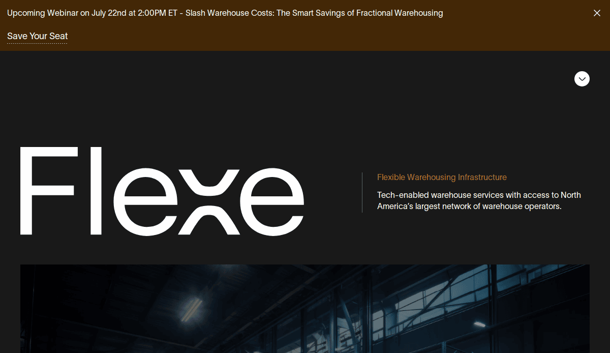
Location: Seattle, WA
Key Takeaways:
- Clean and modern layout with a black-and-white color palette.
- Homepage effectively highlights key services like on-demand warehousing.
- Intuitive site structure simplifies navigation.
2. GlobalTranz
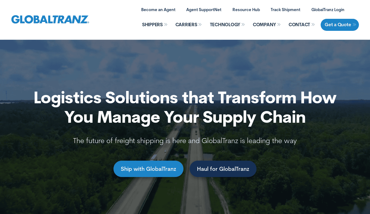
Location: Phoenix, AZ
Key Takeaways:
- Dynamic hero image with a clear call-to-action.
- Highlights services for shippers, carriers, and agents.
- User-friendly navigation with clear service categories.
3. Murphy Logistics
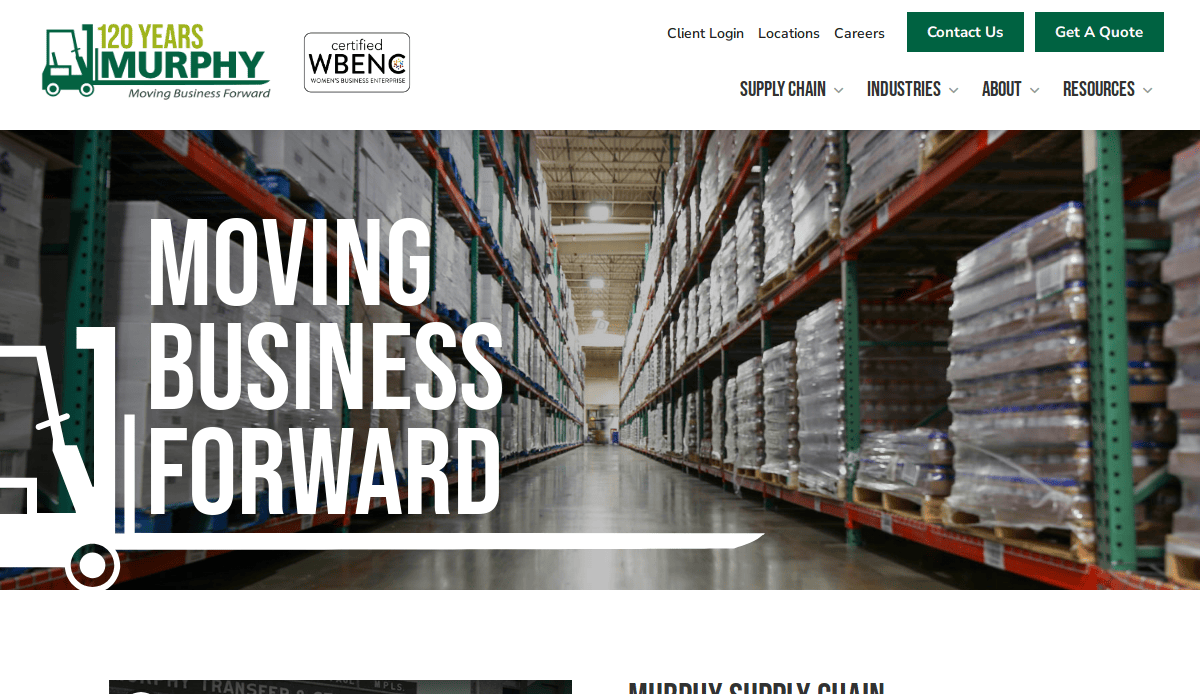
Location: Minneapolis, MN
Key Takeaways:
- Professional design with a focus on supply chain solutions.
- Detailed service pages with informative content.
- Strong emphasis on company history and values.
4. C.H. Robinson
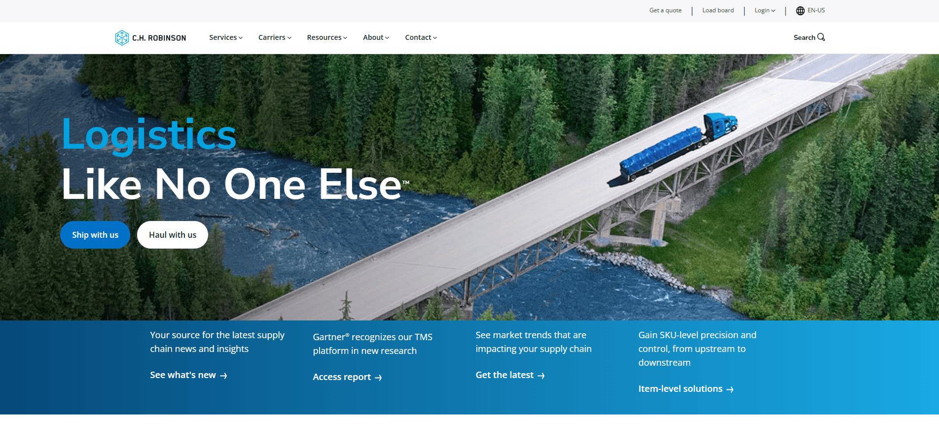
Location: Eden Prairie, MN
Key Takeaways:
- Comprehensive service offerings are displayed prominently.
- Interactive tools for tracking and quoting.
- Clean design with a focus on user experience.
5. Gamer Packaging
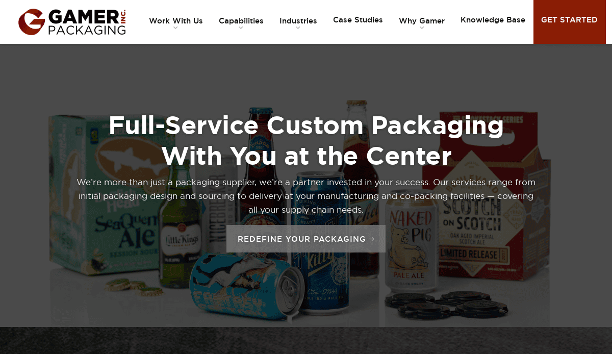
Location: Minneapolis, MN
Key Takeaways:
- Unique focus on packaging logistics.
- Visually appealing design with custom graphics.
- Clear navigation and service breakdowns.
6. OTR Transportation
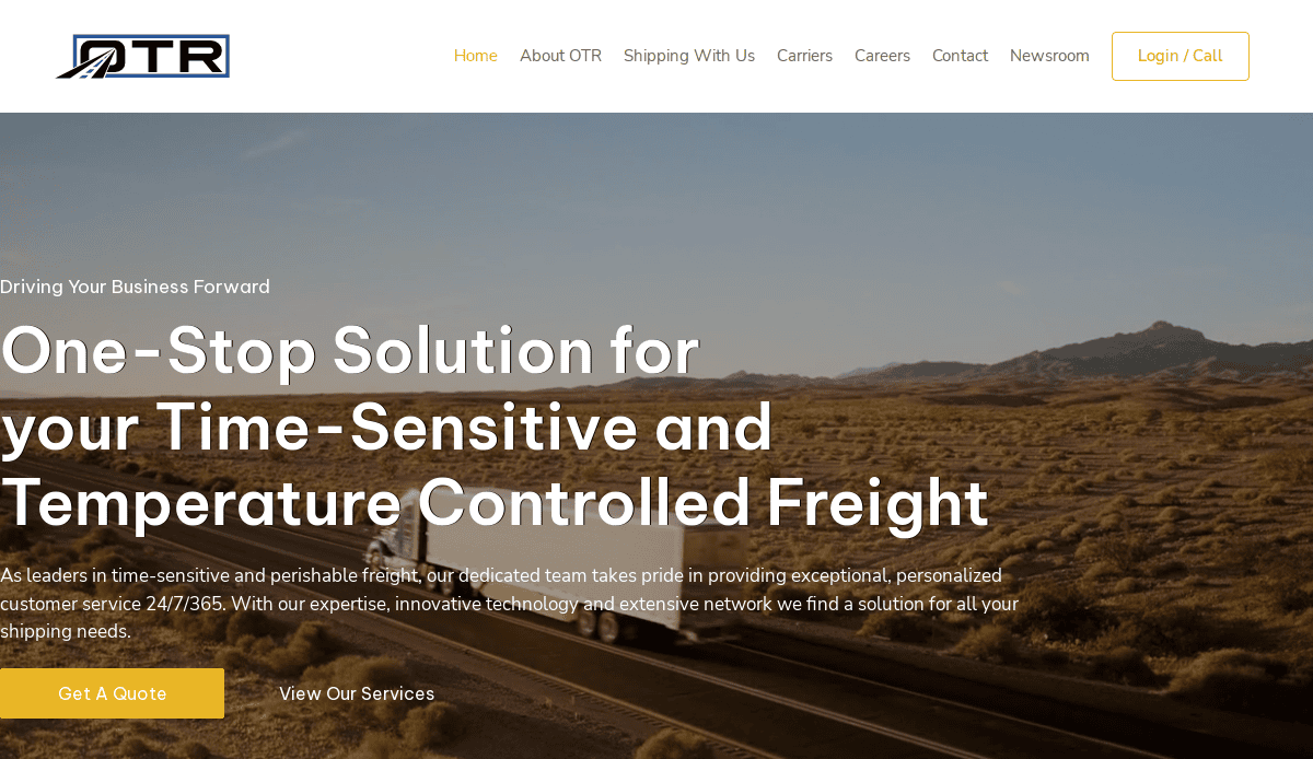
Location: Chicago, IL
Key Takeaways:
- Modern design with high-quality imagery.
- Interactive homepage slides showcasing services.
- Consistent color palette enhances brand identity.
7. Best Logistics Group
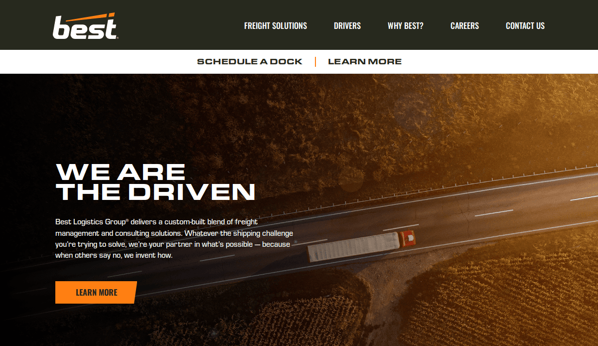
Location: Raleigh, NC
Key Takeaways:
- Compelling messaging using the StoryBrand framework.
- Clear calls-to-action throughout the site.
- Responsive design optimized for various devices.
8. Freightos
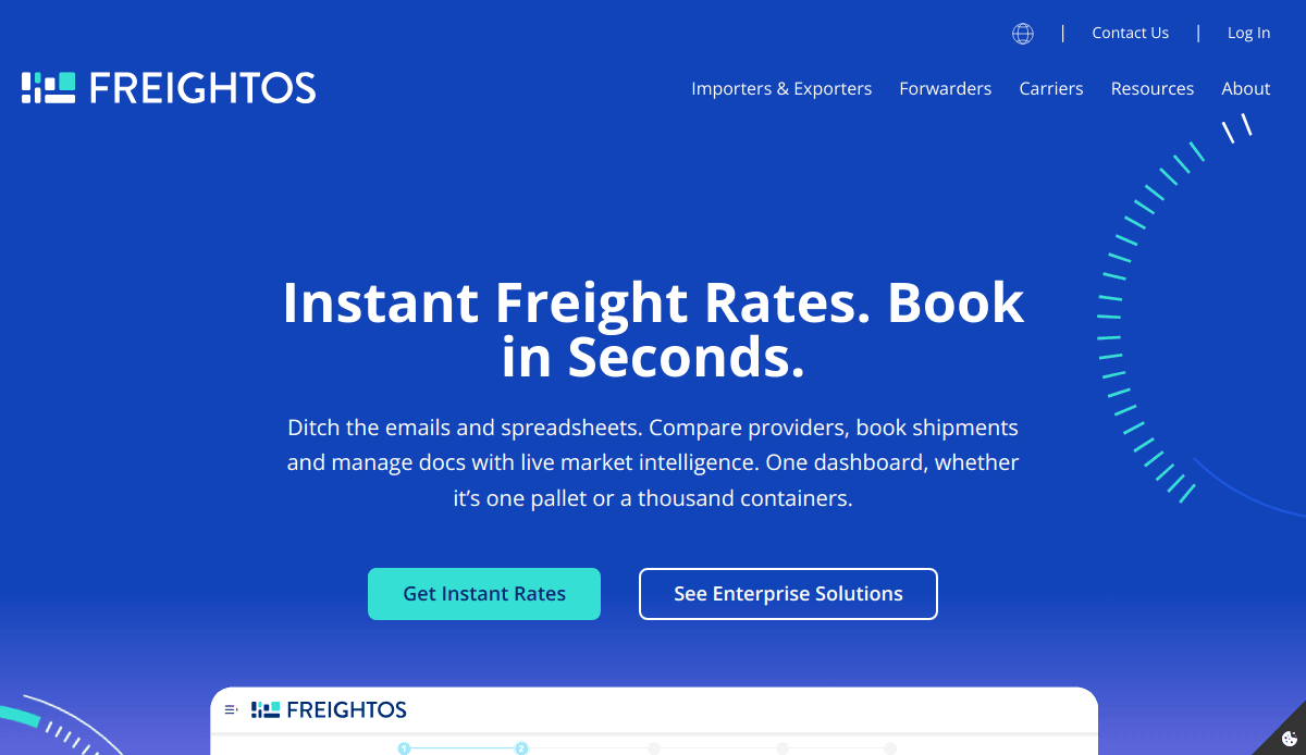
Location: Oregon City, OR
Key Takeaways:
- Digital booking and payments platform for international goods.
- Real-time tracking and rate comparison tools.
- User-friendly interface with comprehensive resources.
9. Traffic Tech
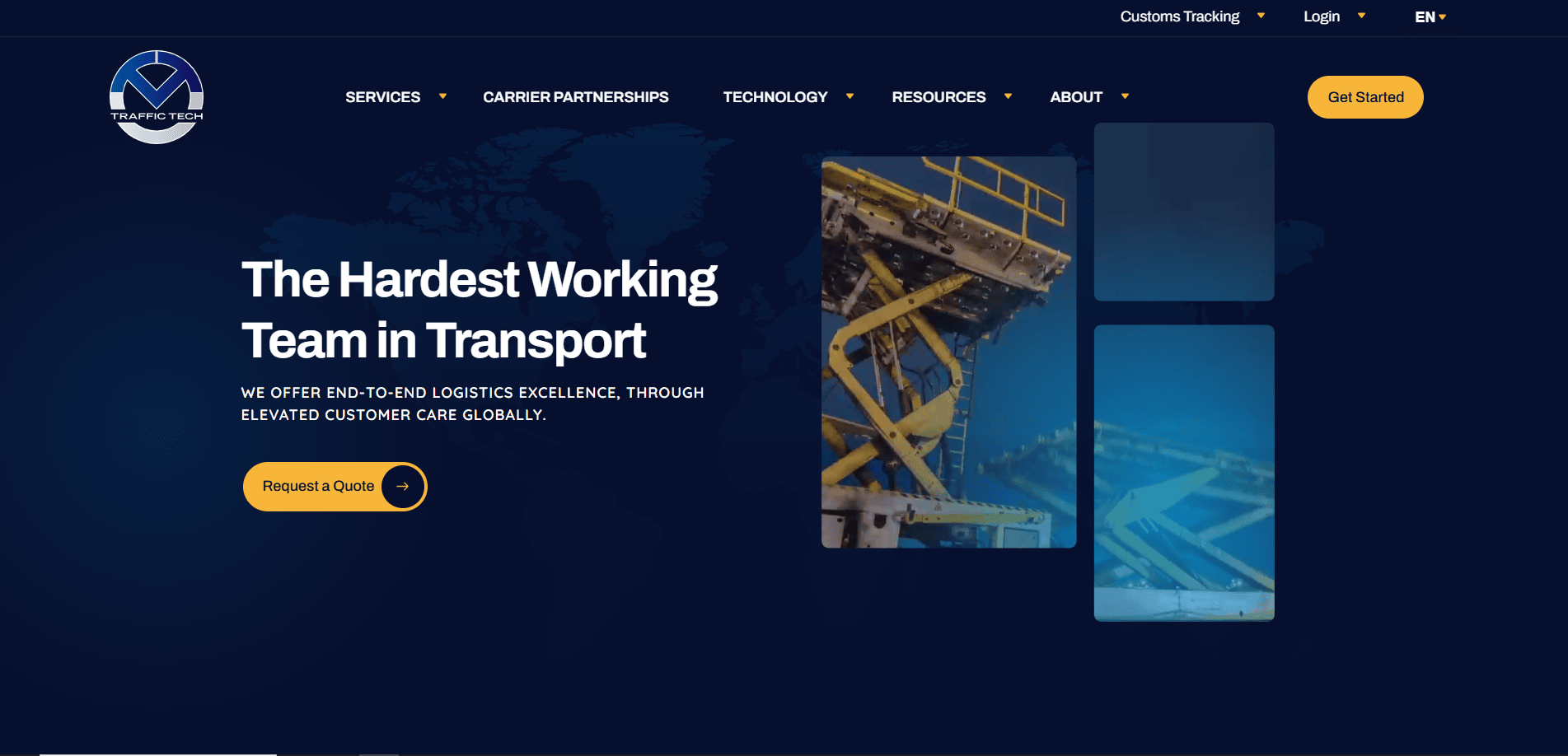
Location: Chicago, IL
Key Takeaways:
- Global services facilitate shipments across various modes.
- Access to over 600,000 independent truckers.
- Robust digital infrastructure for clients.
10. UPS
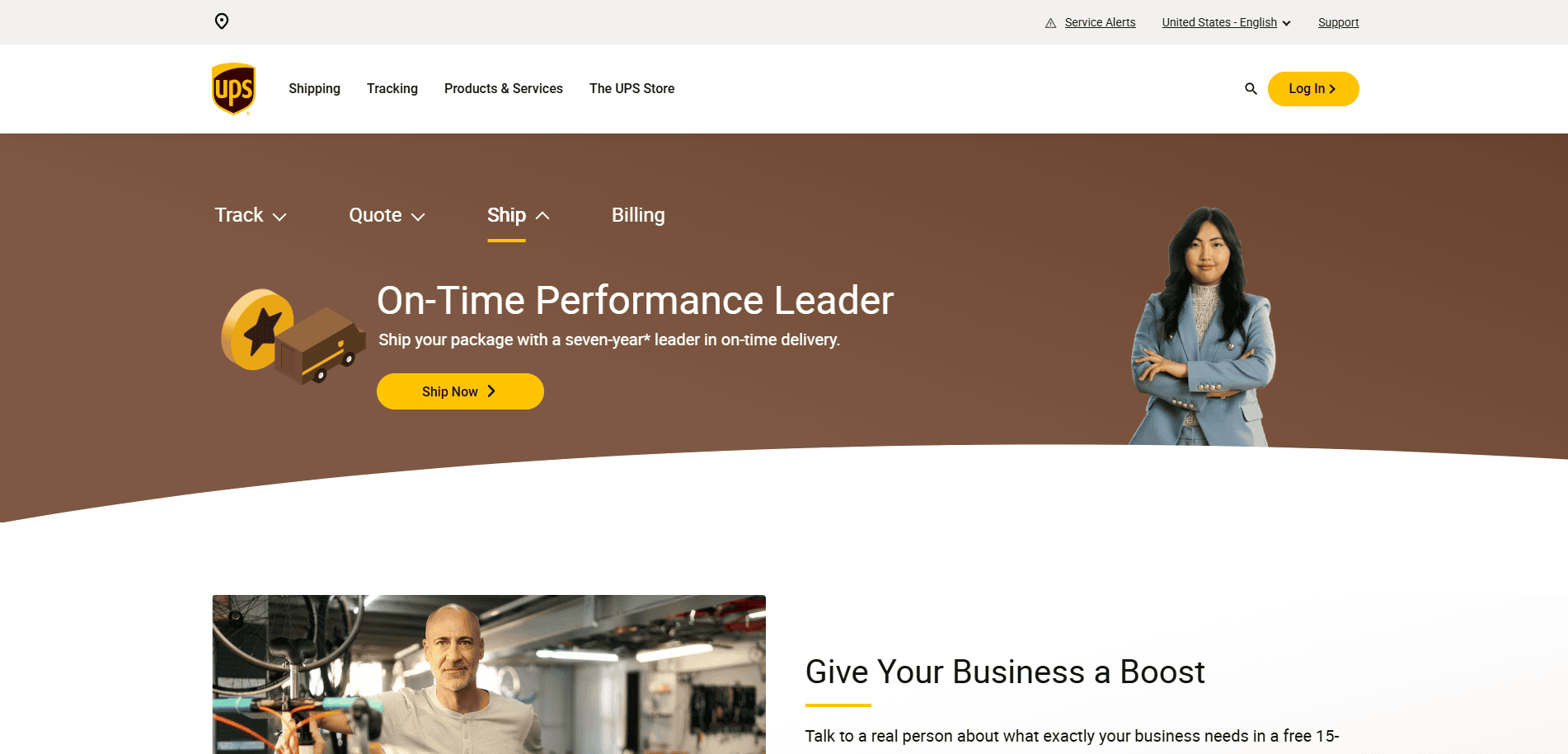
Location: Atlanta, GA
Key Takeaways:
- Comprehensive logistics solutions with global reach.
- User-friendly tools for tracking and shipping.
- Consistent branding and design across platforms.
11. FedEx
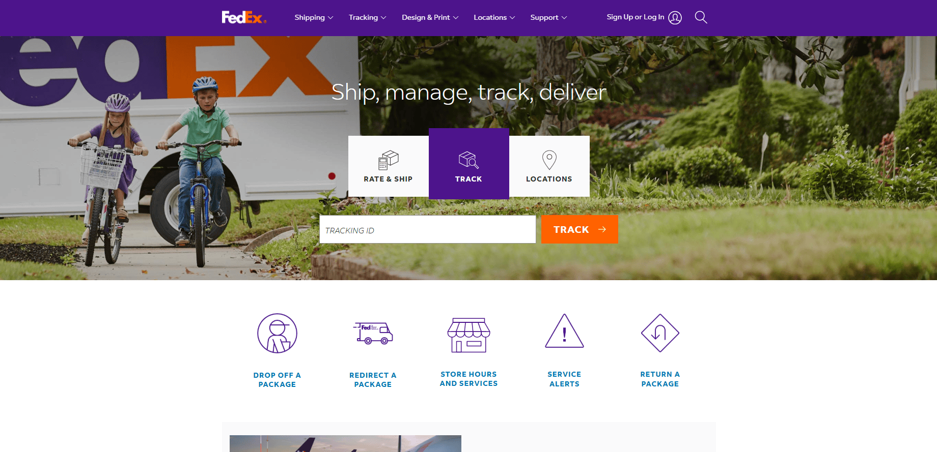
Location: Memphis, TN
Key Takeaways:
- Innovative technology integration for logistics.
- Real-time package tracking and online services.
- Clean design emphasizing efficiency.
12. DHL
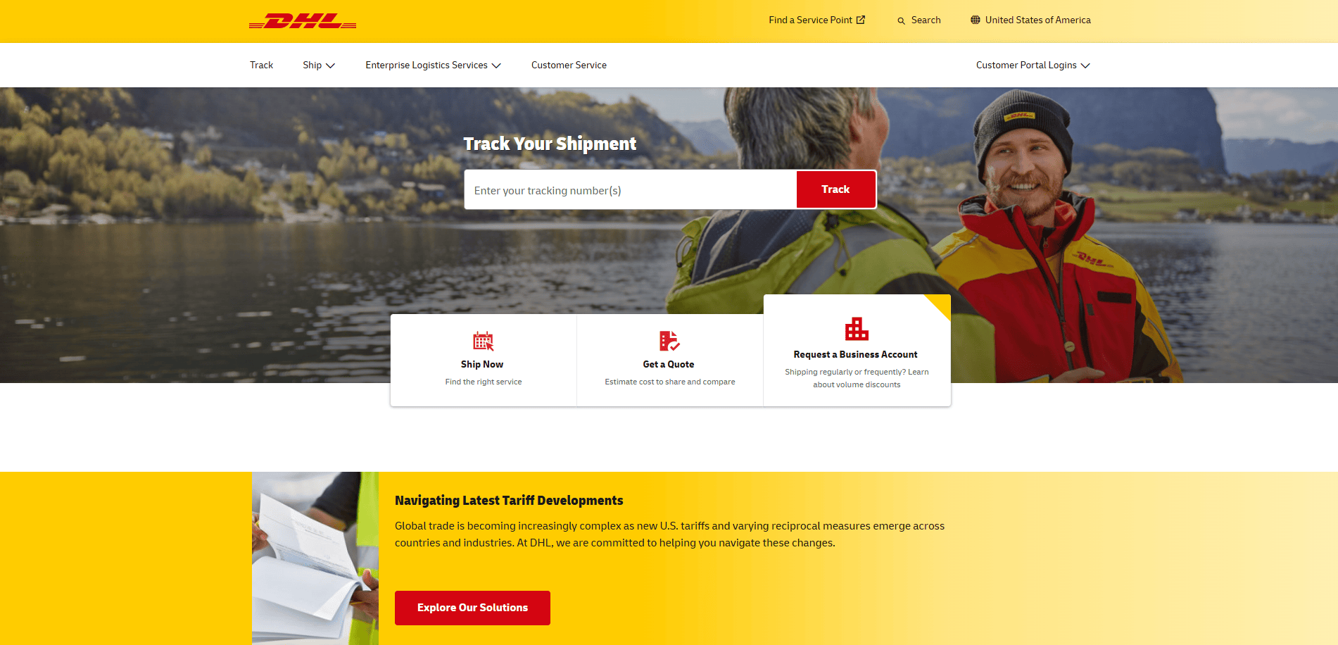
Location: Plantation, FL
Key Takeaways:
- Global logistics services with a focus on speed.
- Interactive tools for shipment tracking.
- Bright, engaging design elements.
13. XPO Logistics
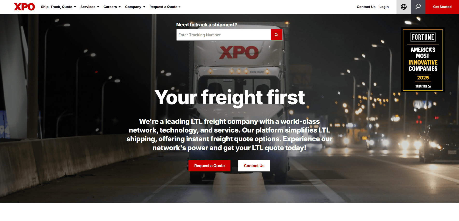
Location: Greenwich, CT
Key Takeaways:
- Emphasis on supply chain innovation.
- Detailed service descriptions with supporting visuals.
- Responsive design for various devices.
14. Coyote Logistics
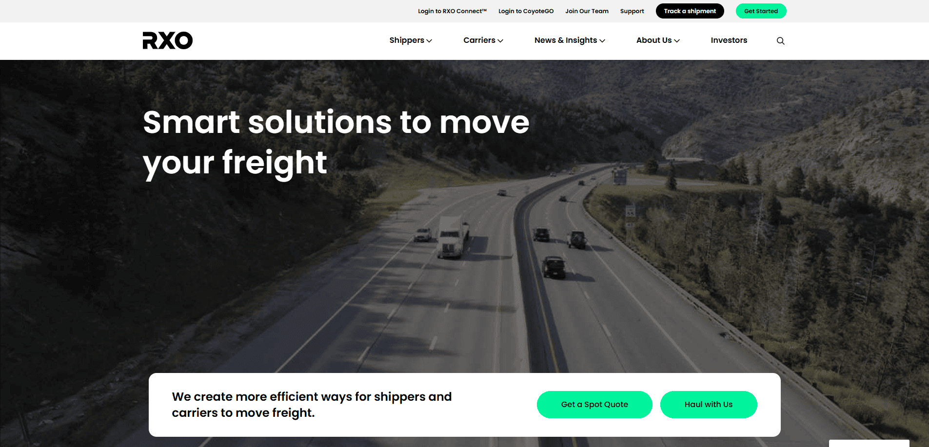
Location: Chicago, IL
Key Takeaways:
- Modern design with a focus on technology.
- Clear navigation and service breakdowns.
- Strong visual elements support the content.
15. Echo Global Logistics
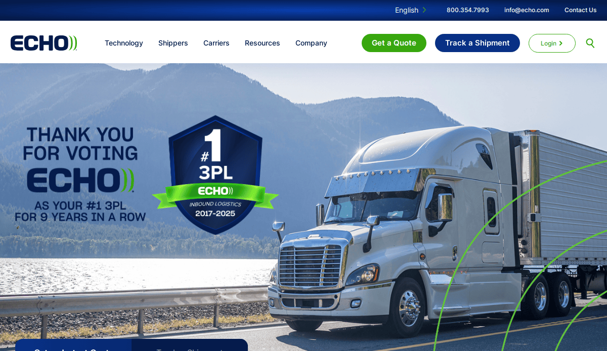
Location: Chicago, IL
Key Takeaways:
- Comprehensive solutions are showcased effectively.
- User-friendly tools for clients.
- Consistent branding and design.
16. Kenco Logistics
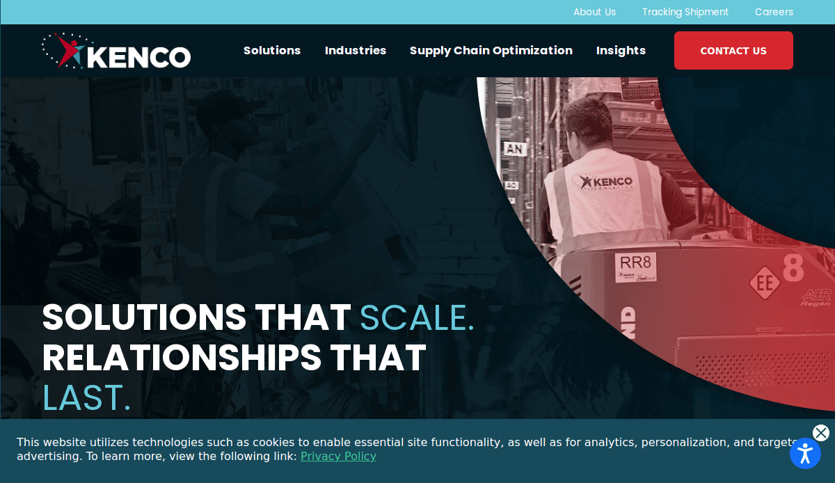
Location: Chattanooga, TN
Key Takeaways:
- Focus on supply chain innovation and technology.
- Engaging visuals and informative content.
- Clear calls-to-action guiding users.
17. Ryder
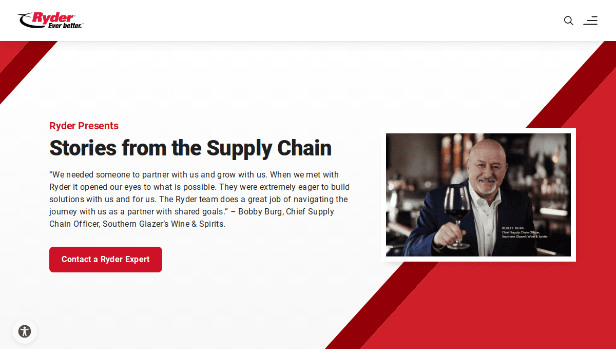
Location: Miami, FL
Key Takeaways:
- Emphasis on fleet management and solutions.
- Interactive tools for service exploration.
- Clean, professional design.
18. Lineage Logistics
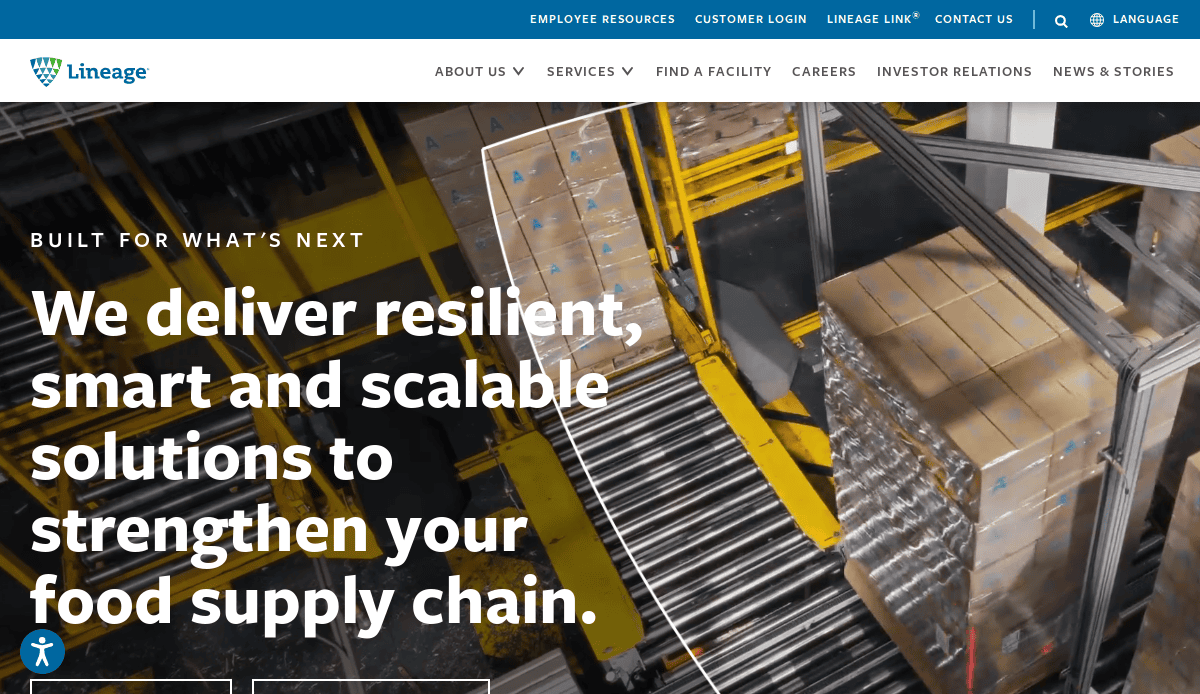
Location: Novi, MI
Key Takeaways:
- Specialization in temperature-controlled logistics.
- Strong visual storytelling through imagery.
- Detailed service pages with clear navigation.
19. SEKO Logistics
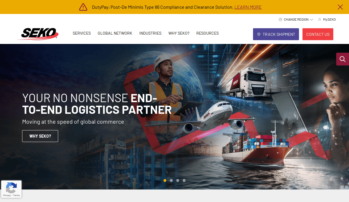
Location: Itasca, IL
Key Takeaways:
- Global logistics services with a tech-forward approach.
- User-focused interface with comprehensive resources.
- Consistent branding and design elements.
20. Ceva Logistics
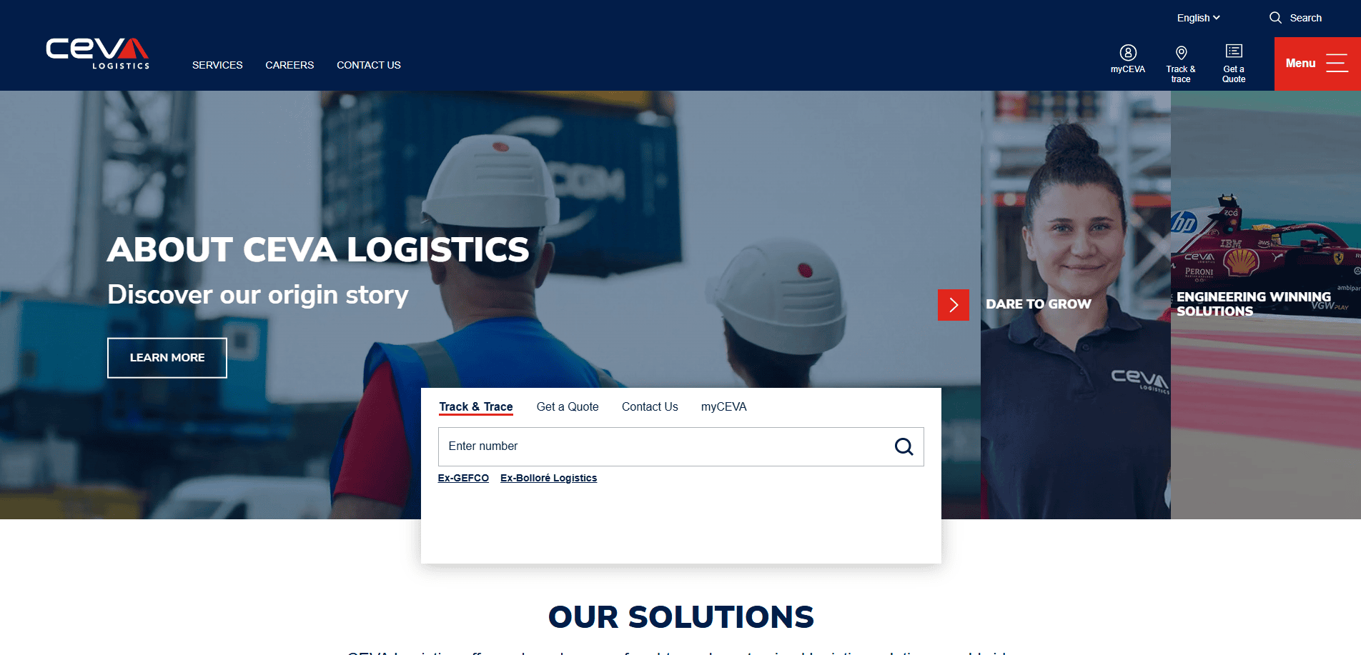
Location: Houston, TX
Key Takeaways:
- Integrated logistical solutions were showcased effectively.
- Interactive tools for clients and partners.
- Clean, modern design emphasizing efficiency.
These sites exemplify best practices in design, user-friendly experience, and functionality, serving as excellent references for creating or updating a company’s online presence.
Take the Next Step: Build a Website That Moves Cargo and Business
You’ve seen what goes into a powerful website—clear content, smart design, dynamic features, and proactive maintenance. Now it’s time to take action. Whether you’re looking to refresh your existing site or start from scratch, your online presence should reflect the strength and reliability of your logistics operations.
We specialize in logistics website design that converts. From strategy to execution, we’ll help you create a digital experience that drives leads from your target audience, supports sales, and sets your brand apart.
Contact us today for a free consultation and start building your logistics website today. Your business deserves it.
Web Design for Logistics Providers FAQs
What should be on a website’s homepage?
Your homepage should clearly communicate who you are, what services you offer, and why a visitor should trust you. Include a strong hero statement, quick access to core services, and visible calls-to-action like “Request a Quote” or “Track a Shipment.” Consider linking directly to your logistics website design services.
How do I make a website user-friendly?
Prioritize clean navigation, clear service descriptions, fast loading speeds, and mobile responsiveness. Features like sticky headers, breadcrumb navigation, and real-time tracking interfaces enhance usability and help visitors find what they need fast.
What are common website mistakes in the logistics industry?
Overloading the homepage with text, using outdated visuals, slow page speeds, a lack of mobile optimization, and unclear service messaging are frequent errors. Avoid these by investing in professional web design to create your logistics website as well as ongoing WordPress maintenance.
How can my logistics site improve lead generation?
Use compelling CTAs, offer quote request forms on every service page, implement lead capture tools like pop-ups or sticky forms, and ensure your content highlights clear benefits. Strong SEO and CRO strategies also play a vital role—learn more in our SEO services overview.
What’s the ROI on a new website?
A professionally built website should reflect higher conversion rates, improved SEO rankings, and stronger client engagement, delivering measurable ROI over time. Clients often see increased quote requests and stronger sales pipelines.
How does logistics SEO differ from general SEO?
Logistics SEO includes industry-specific keywords (e.g., “3PL,” “freight forwarding,” “supply chain solutions”), and focuses on services, location-based searches, and B2B lead generation. It requires tailored keyword research and content strategies.
Should my company website offer customer login or portals?
Yes, especially for B2B companies. Portals enhance customer support features and overall experience by allowing order tracking, communication, and access to historical data, increasing trust and operational efficiency.
Do logistics companies need blogs?
Absolutely. A blog improves SEO, builds authority, and allows you to share logistics insights, updates, and case studies. It also keeps your site content marketing fresh, which Google loves.
Can a WordPress site work for logistics firms?
Yes. WordPress is flexible, scalable, and ideal for logistics companies when combined with expert design and secure ongoing maintenance.
How often should most websites be updated?
Content should be reviewed quarterly, and software/plugins should be updated monthly. Frequent updates ensure optimal performance, security, and relevancy in a competitive digital landscape.

