Just looking for our Property Management Website examples list?
When it comes to winning new business and retaining satisfied tenants, your property management website isn’t just a digital business card—it’s your most powerful marketing, service, and conversion tool. Today, PMs who choose to invest in high-quality website design are already outpacing those who rely on outdated layouts or generic templates.
For property management companies, the right website acts as an operational hub. It should deliver intuitive user experiences for tenants submitting maintenance requests, property owners tracking investment performance, and potential clients comparing management services. A well-optimized site must combine aesthetics with function, ensuring mobile responsiveness, fast load speeds, and seamless integration of listing platforms, tenant access points, and communication systems.
But performance isn’t about design alone—it’s about visibility. Strong search engine optimization (SEO) ensures that your site ranks prominently when prospects search for terms like “property management companies near me” or “rental property listings in [city].” The best-performing sites are strategically structured with responsive frameworks, internal linking strategies, and localized content, all designed to attract the right traffic and convert visitors into leads.
This guide dives deep into property management website design best practices. Whether you’re building from scratch or refreshing your existing member areas, you’ll find actionable insights to help optimize every aspect of your digital presence—from optimization foundations to design templates to advanced portal features.
Website Planning & Purpose
Before writing a line of code or selecting a design template, successful property management websites start with a strategic planning phase. This step is more than just defining how the site will look—it’s about establishing a clear purpose for how the site will serve multiple audiences: tenants, property owners, and prospective clients.
Begin by outlining your primary goals. Do you want to reduce administrative burden by offering self-service options through a tenant portal? Are you looking to attract new property owners by showcasing your property management services? Or is your focus on listing rental properties and improving your local search engine visibility? The answers to these questions will guide the site’s layout, functionality, and content priorities.
Next, create detailed audience personas to better understand the journey each user type will take. Tenants expect quick access to rent payments and maintenance requests. Owners want transparency, often in the form of real-time dashboards and performance metrics. Prospects are seeking credibility through testimonials, available properties, and an introduction to your team. Mapping out these journeys ensures that every element of the site—from homepage hierarchy to footer navigation—has a clearly defined role.
During the planning phase, it’s also important to consider scalability and future needs. Your platform should be built to grow with your portfolio, supporting additional posts, integrations with leasing systems, and enhancements to optimization features over time.
For inspiration, consider reviewing our curated list of the best WordPress themes for real estate websites. These themes are tailored for property professionals and serve as a practical starting point for identifying features that matter most in your niche.
By starting with strategic planning, you ensure your property management website meets today’s demands and is positioned to evolve alongside your business.
Design Principles for Property Management Websites
Effective website design in the property management industry goes far beyond visual appeal—it creates trust, improves usability, and drives results. Design decisions should align with user behavior, industry expectations, and digital marketing goals to ensure every page performs its intended function.
Clarity and simplicity are at the core of successful layouts. Avoid cluttered interfaces by using whitespace strategically, applying consistent font hierarchies, and maintaining clear call-to-action buttons that guide tenants, owners, and prospects toward key actions like logging into an access point, viewing properties, or scheduling a consultation.
Mobile-first responsiveness is no longer optional. With tenants and owners frequently accessing property websites via smartphones, your design must adapt fluidly to any device. Responsive design ensures that critical functions—like submitting a maintenance request or browsing opportunities—are frictionless regardless of screen size.
Visual hierarchy plays a crucial role in guiding users through content. High-priority items such as contact information, available properties, or login portals should be easily accessible without scrolling. Use color contrasts, typography weight, and section spacing to signal importance and drive engagement.
Trust-building elements must be prominent throughout the site. This includes high-quality photos of properties, clear team bios, company credentials, and client testimonials. The visual consistency of logos, brand colors, and professional photography contributes to a sense of credibility.
Accessibility and inclusivity are essential for compliance and user equity. Ensure all buttons are clearly labeled, navigation is keyboard-friendly, and text has sufficient contrast. Sites that meet ADA guidelines serve broader audiences and reduce legal risk.
Finally, speed and performance need to be considered early in the design process. Optimizing image sizes, using lightweight themes, and leveraging browser caching all contribute to faster load times—a critical ranking factor for search engines and a major influence on user retention.
By adhering to these core design principles, property professionals can create a user-centric, conversion-focused website that looks polished and works efficiently for every visitor.
Content & Navigation Structure
A well-designed website is only as effective as its content and navigation. Content must serve multiple audiences with distinct needs, while the navigation should ensure that each visitor finds what they’re looking for in just a few clicks.
Start by organizing your website content into clear, strategic categories. These typically include Home, About Us, Services, Property Listings, Owner Portal, Tenant Portal, Blog, and Contact pages. Each section should be purpose-driven. For example, the Property Listings page should integrate with real-time listing feeds and include filtering capabilities by location, price, and availability. You can explore our guide on the best IDX plugins for WordPress to learn how to seamlessly sync available properties on your site.
Navigation should be intuitive and persistent. Use a top menu bar that remains visible across all pages, and include dropdown options for subcategories like “Residential Services” or “Commercial Management.” Consider a sticky header with quick links to the most-used pages: maintenance requests, login gateways, and rental applications.
Each navigation decision should reflect a user’s intent. Tenants will prioritize speed and convenience—give them one-click access to log in, pay rent, and request maintenance. Property owners want performance metrics and access to reports, which should be logically grouped under the Owner Portal. Prospects need persuasive content—case studies, testimonials, and team bios—that builds trust.
Don’t overlook internal linking. Cross-linking blog posts to service pages or highlighting available listings within blog content keeps visitors engaged longer and helps search engines understand site structure.
Lastly, prioritize a clean footer design that includes contact information, office hours, social media icons, and key navigation links. The footer is a consistent touchpoint and an opportunity to reinforce calls to action.
An effective content and navigation strategy ensures that your property management website serves as both a sales tool and a service platform—one that guides users effortlessly from interest to interaction.
Visual Elements That Elevate Brand and Experience
Visual elements play a critical role in shaping how users perceive your brand and how easily they can interact with your website. In the property management industry, visuals are not just decorative—they serve strategic purposes, from improving usability to building trust with prospects, tenants, and property owners.
Start with consistent branding across the entire site. Your logo, color palette, typography, and iconography should align with your company’s visual identity. This consistency reinforces credibility and helps users feel secure when navigating your digital platform. For property management companies, brand consistency is especially important for standing out in a competitive, often locally driven market.
High-resolution images are essential. Use original photography where possible to showcase properties, staff, and your office environment. If stock images are necessary, choose those that reflect diversity and professionalism. Avoid generic or overused photos—these can make your business feel impersonal or untrustworthy.
Videos can enhance storytelling and engagement. Consider a brief homepage video tour of your most impressive property, or testimonial clips from happy tenants or owners. These dynamic elements can establish emotional connections and extend the time users spend on your site.
Icons and visual cues improve usability. Simple, intuitive icons next to key actions—like login, pay rent, or submit maintenance—can make navigation more efficient and reduce cognitive load. Just as important, these icons should be consistent in style and meaning across the site.
Interactive maps, embedded calculators, and hover effects on listings further contribute to a modern user experience. Visual interactivity should never feel excessive; rather, it should serve to highlight important content or simplify key decisions.
Whitespace matters just as much as what you include. By giving elements room to breathe, you enhance legibility, guide the user’s eye, and keep the layout feeling clean and professional. Avoid cramming too much visual information into one space—this creates confusion and overwhelms your visitors.
Altogether, the thoughtful use of visual elements reinforces your authority as a property management expert, creates a more engaging browsing experience, and ultimately helps drive more conversions from visitors who trust what they see.
Ongoing WordPress Maintenance
For property management websites built on WordPress, ongoing maintenance is essential to ensure security, speed, and uninterrupted service delivery. These websites serve as critical infrastructure for business operations, including payment processing, lead generation, and owner-tenant communications.
WordPress core updates, theme upgrades, and plugin patches must be performed regularly. Neglecting these can lead to security vulnerabilities that put both client data and operational integrity at risk. Maintenance schedules should include weekly or biweekly checks for software updates, broken links, and outdated content.
Data backups are non-negotiable. Automated daily backups with off-site storage provide peace of mind and a fallback in case of system failure, hacking, or data corruption. Backups should be tested periodically to ensure successful restoration when needed.
Performance optimization is another maintenance priority Compressing images, clearing cache, and monitoring Core Web Vitals help maintain fast page loads. A slow site frustrates users and reduces lead conversion, especially on mobile devices.
Security monitoring tools should be installed to detect malware, brute-force attacks, or unusual login activity. Implementing strong passwords, two-factor authentication, and secure hosting environments further reduces risk.
A WordPress site should also be reviewed monthly for plugin conflicts or compatibility issues, particularly after major updates. Regular audits of user roles and permissions help control access to sensitive areas of the site.
Maintaining your WordPress site is not a one-time task. It’s an ongoing responsibility that ensures your property management business stays reliable, professional, and competitive online.
Best Property Management Website Examples
Effective property management websites go beyond simple listings. They provide a seamless experience for property owners and tenants alike, establish trust, and streamline operations. Here’s a list of 19 highly engaging industry websites, highlighting what makes each effective.
1. Investment Realty Inc.
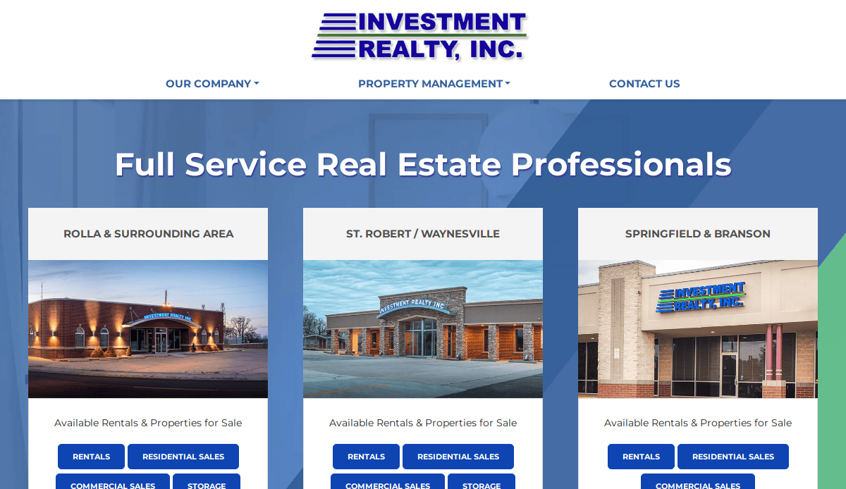
- Location City In The US: Springfield, MO
- 3 Key Takeaways:
- Clear Owner/Tenant Portals: Provides distinct, easy-to-access gateways for both property owners and tenants, streamlining core interactions.
- Integrated Property Search: Allows users to quickly search and filter available properties, enhancing the rental or buying experience.
- Professional and Trustworthy Aesthetic: The clean design and organized information instill confidence in their management services.
2. Community Builders Management
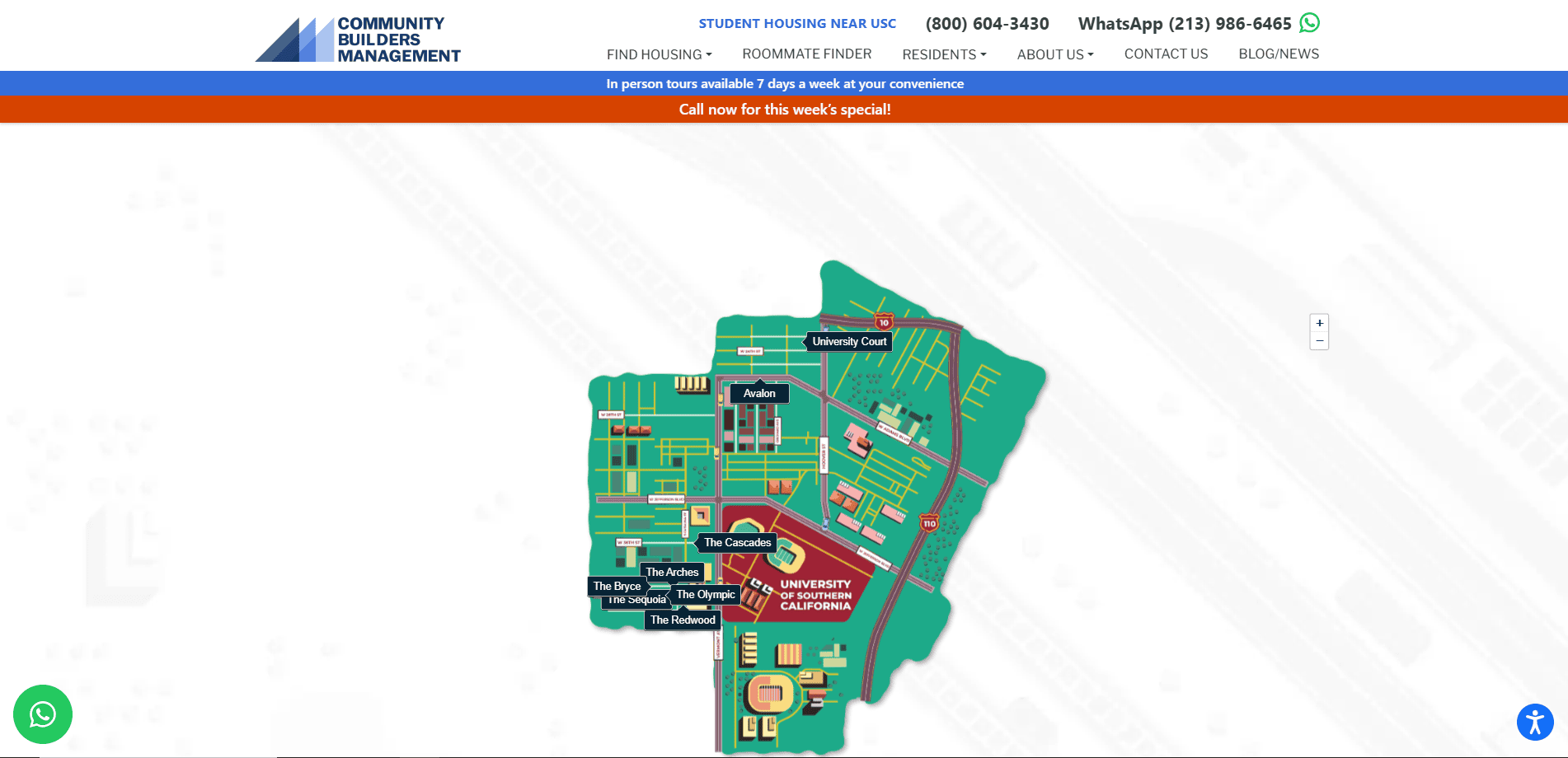
- Location City In The US: Los Angeles, CA (based on search result context for student housing)
- 3 Key Takeaways:
- Focus on Community Aspect: Design emphasizes the living experience rather than just properties, appealing to residents.
- Student Housing Specialization: Clearly caters to a specific niche with relevant information and resources for students.
- Strong Visuals of Properties: Showcases the quality of their managed properties through high-quality photography.
3. Property Management Associates
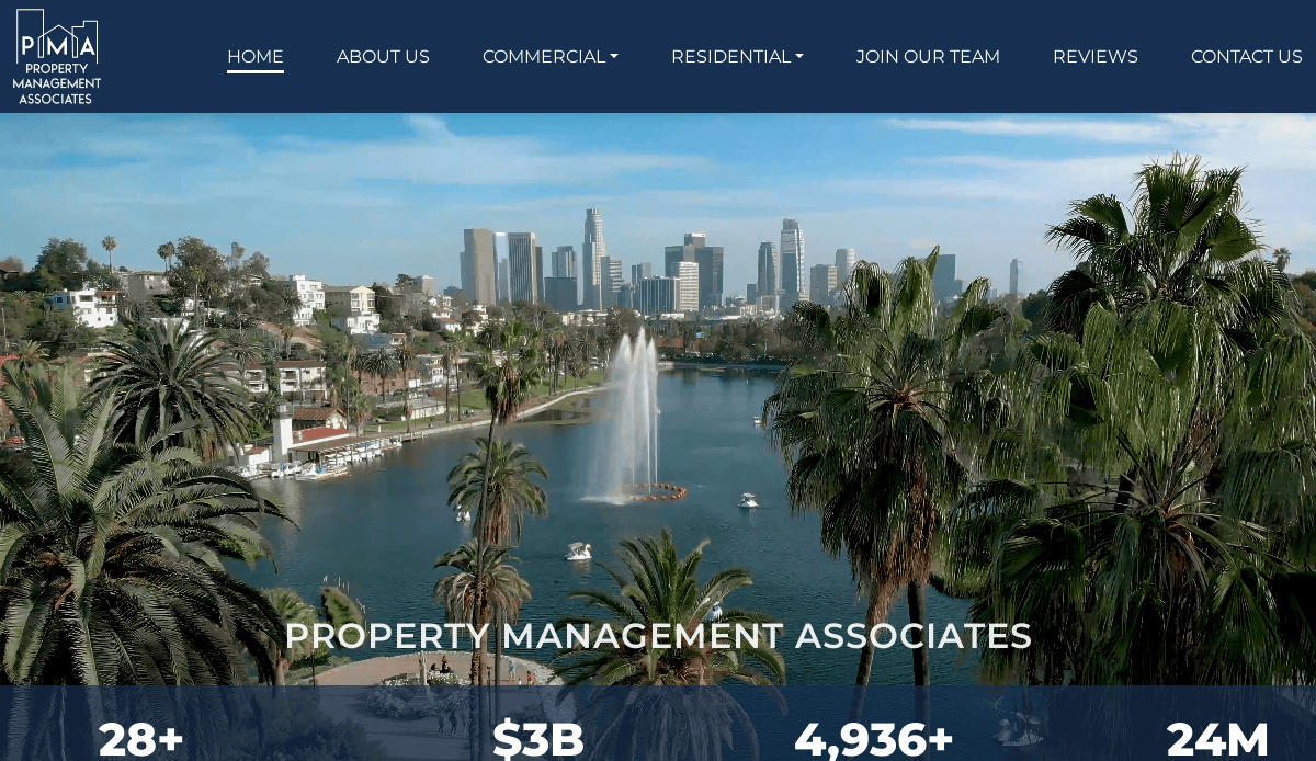
- Location City In The US: Southern California (based on search result context)
- 3 Key Takeaways:
- Comprehensive Service Offerings: Clearly outlines all property management services for owners, addressing diverse needs.
- Integration with Management Software (Yardi): Seamless integration with industry-standard software enhances functionality and data management.
- Experienced Professional Tone: The design and content convey a sense of reliability and long-standing expertise.
4. hello Management
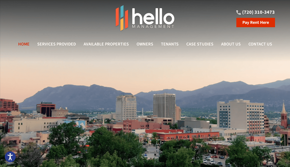
- Location City In The US: Denver, CO
- 3 Key Takeaways:
- Modern and Welcoming Design:A fresh, approachable look that stands out in the property management space.
- Clear Value Proposition:Immediately communicates benefits for both owners and tenants.
- Emphasis on Unique Needs:Highlights their tailored approach for small to mid-sized properties, resonating with a specific clientele.
5. Santorini Property Management
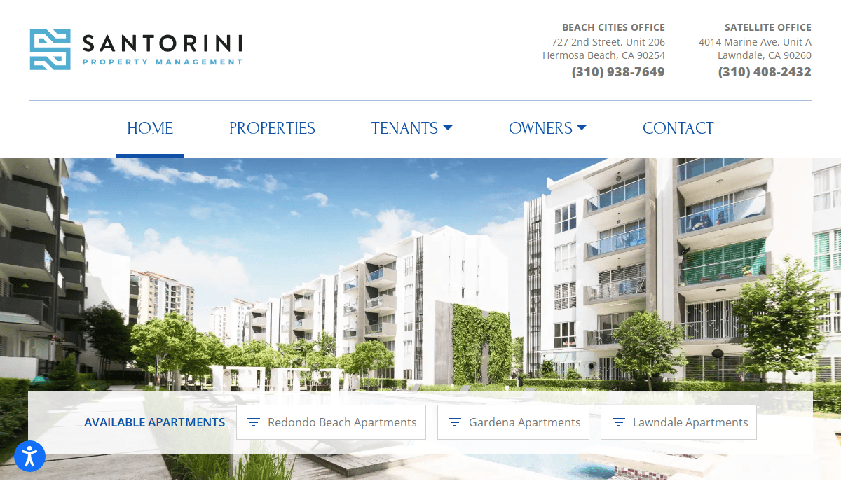
- Location City In The US: Hermosa Beach, CA
- 3 Key Takeaways:
- Geographically Focused Expertise: Clearly communicates their specialized knowledge of the South Bay area.
- Service-Oriented Navigation: Easy access to details on their full-service offerings for owners and tenants.
- Professional and Established Feel: The design conveys a sense of trust and long-term experience in the local market.
Other Engaging Property Management Websites
6. Grace Property Management & Real Estate
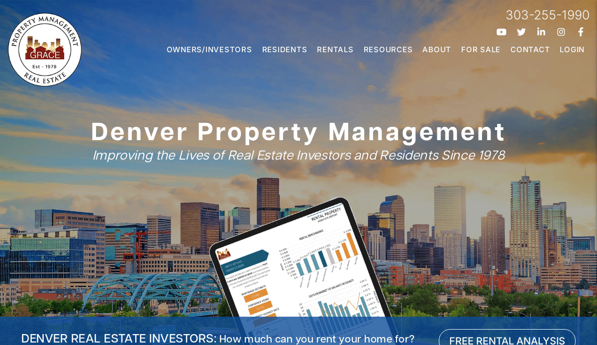
- Location City In The US:Longmont, CO (based on their listed office)
- 3 Key Takeaways:
- Clear Segmentation of Audiences: Distinct pathways for Owners and Renters from the homepage, making navigation intuitive.
- Strong Testimonials and Social Proof :Features client reviews prominently to establish trust and credibility.
- Educational Resources: Offers valuable content for both owners and tenants, establishing them as an authority.
7. Second Nature
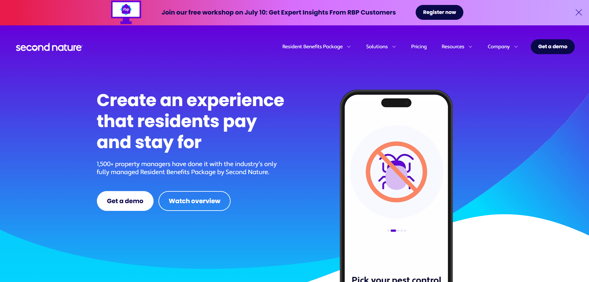
- Location City In The US:Raleigh, NC (based on company information)
- 3 Key Takeaways:
- People-Focused Language: Uses empathetic language like “residents” instead of “renters,” creating a more humanistic connection.
- Prominent Resident Benefits Package: Highlights unique offerings that add value beyond basic property management.
- Solution-Oriented Content: Focuses on how their services improve lives for residents, investors, and managers.
8. Chambers Theory
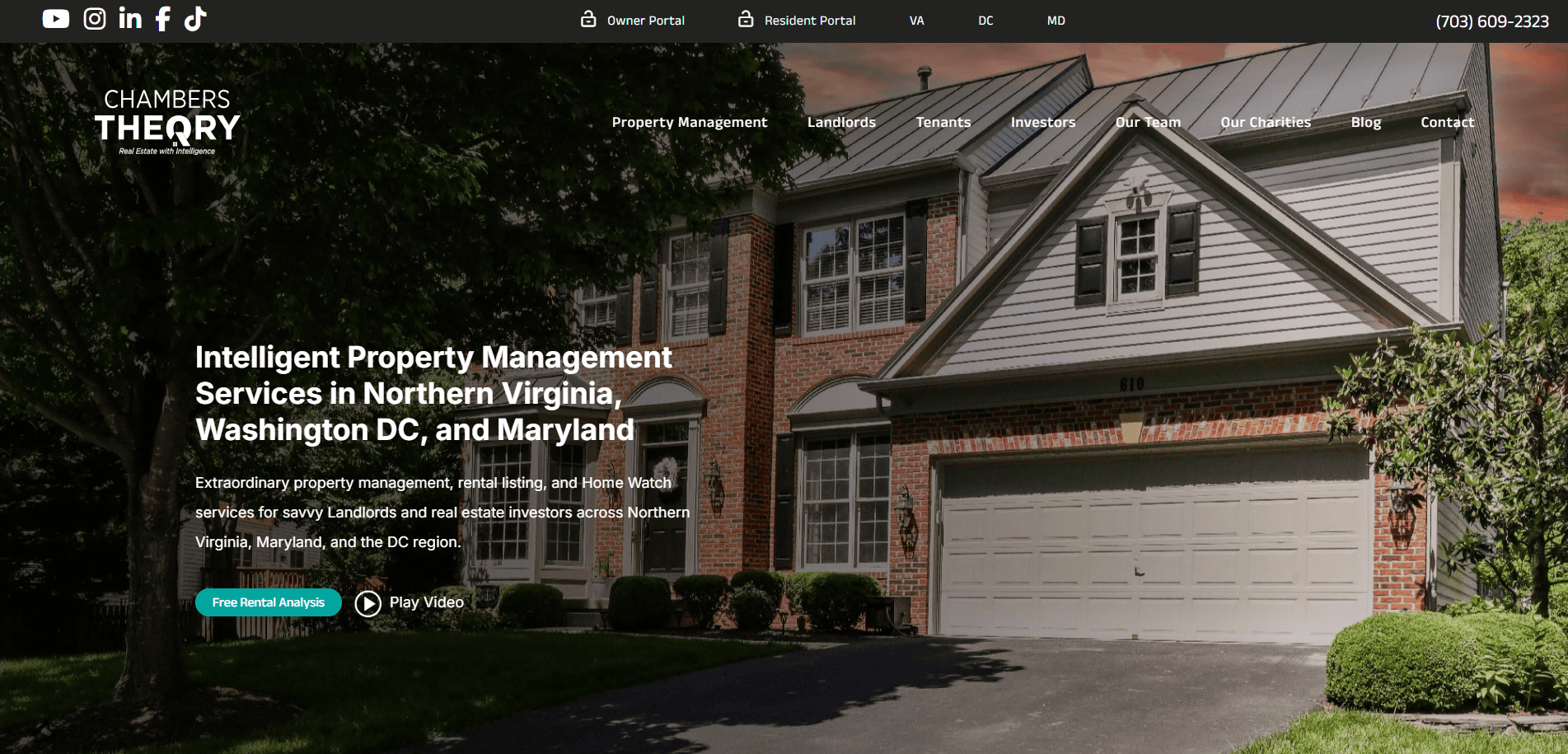
- Location City In The US: Alexandria, VA (based on company location)
- 3 Key Takeaways:
- Extensive Video Content: Utilizes over 160 professionally produced videos to educate and engage visitors.
- Multilingual Support: Offers videos in multiple languages, catering to a diverse clientele (e.g., military, foreign service).
- Educational Approach: Aims to educate prospective residents and owners on various real estate topics, building expertise.
9. Nest DC
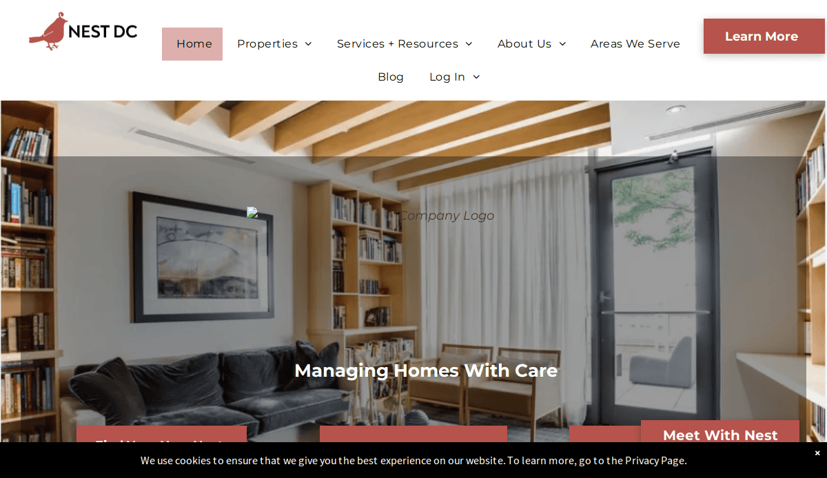
- Location City In The US:Washington, D.C.
- 3 Key Takeaways:
- Unique Branding and Playful Tone: Incorporates an “avian” theme (“About the Birds”) that makes the site memorable and approachable.
- Sleek and User-Friendly Design: Despite the playful branding, the site maintains a clean, clear, and professional layout.
- Focus on Families and People: Emphasizes the human element behind properties and investments.
10. Bay Management Group
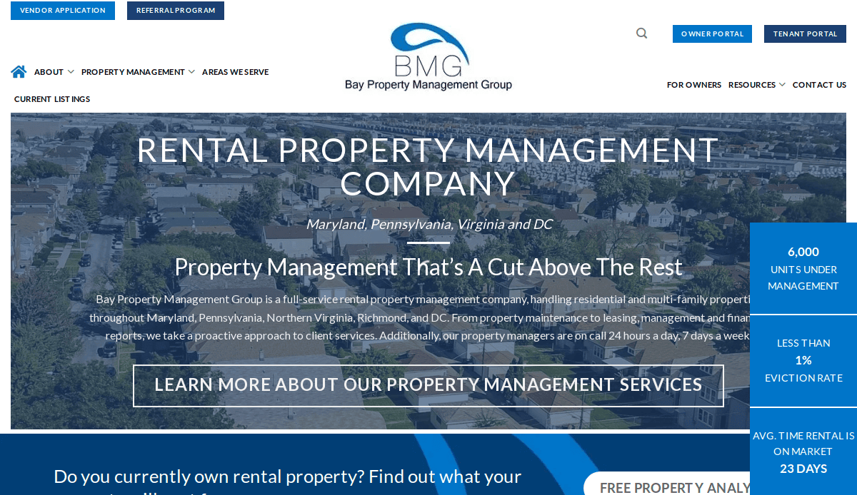
- Location City In The US: Baltimore, MD (based on company information)
- 3 Key Takeaways:
- Investor/Owner-Centric Design: Clearly targets real estate investors and property owners with relevant information.
- Robust Video Library: Features instructional and advisory videos for tenants, property managers, and landlords.
- Trust-Conveying Visuals: Uses a blue-toned design common in financial institutions to connote trustworthiness and reliability.
11. AppFolio
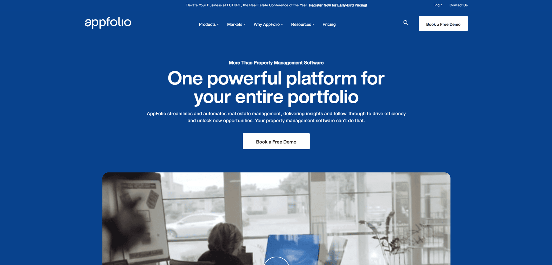
- Location City In The US: Goleta, CA
- 3 Key Takeaways:
- Comprehensive Feature Showcase: Clearly outlines a wide range of features for property managers, owners, and residents.
- Modern, Clean Interface: Professional and easy-to-navigate design that emphasizes functionality.
- Strong Call to Action for Demo/Trial: Guides potential clients towards experiencing their software directly.
12. Buildium
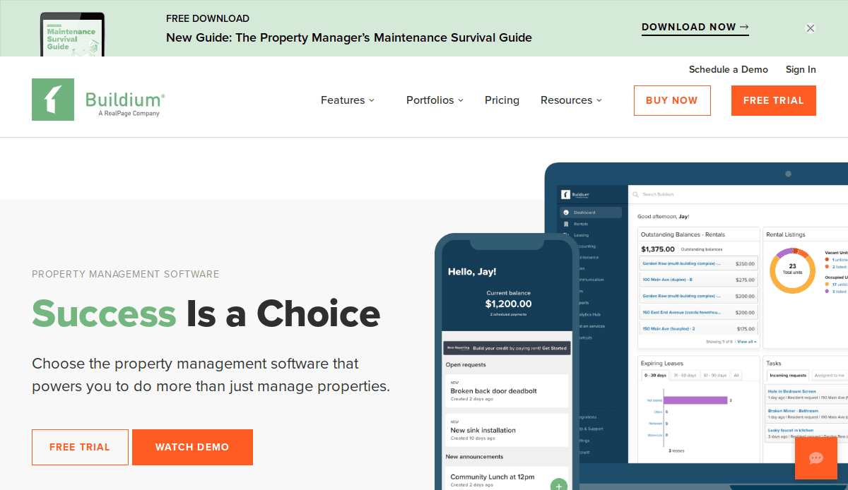
- Location City In The US:Boston, MA
- 3 Key Takeaways:
- Solutions-Oriented Messaging: Highlights how their software solves common property management challenges.
- Clear Pricing Structure: Transparent and easy-to-understand pricing tiers for different business sizes.
- Extensive Resource Library: Offers a wealth of blog posts, guides, and webinars for industry insights.
13. DoorLoop
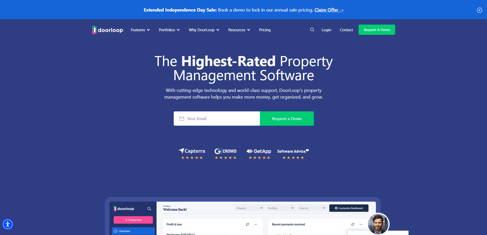
- Location City In The US: Miami, FL
- 3 Key Takeaways:
- All-in-One Value Proposition: Emphasizes its comprehensive features for various property types.
- Clean and Fast UI: Focuses on ease of use and efficient navigation for busy property managers.
- Dedicated Website Feature: Highlights its own property management website service as part of its offering.
14. Rentec Direct
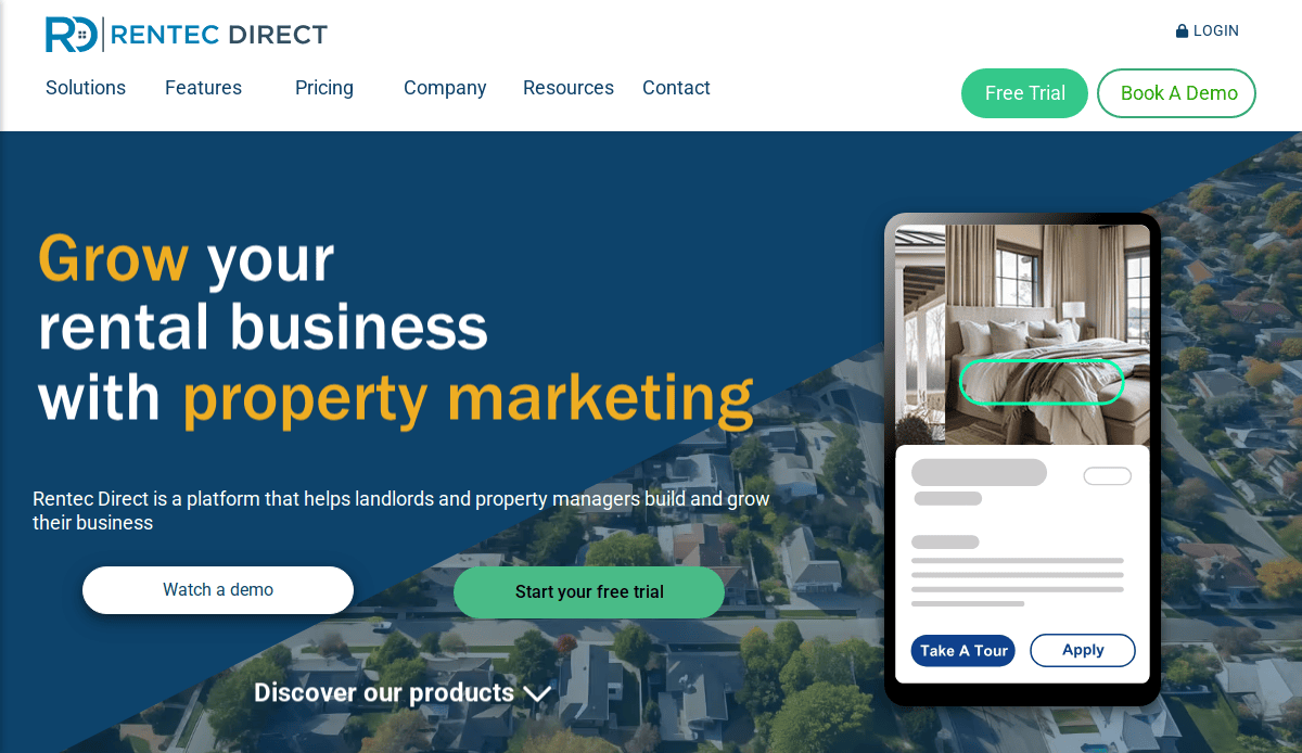
- Location City In The US: Grants Pass, OR
- 3 Key Takeaways:
- Balanced Features Showcase: Clearly presents a wide range of tools for landlords and property managers.
- Transparent Pricing: Offers clear pricing based on the number of units, making it easy for users to assess costs.
- Support and Training Emphasis: Highlights customer service and resources for ease of use.
15. Yardi Breeze
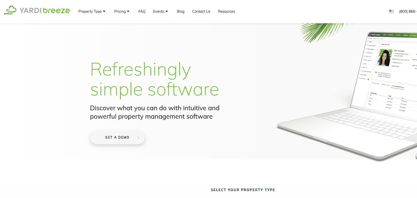
- Location City In The US: Santa Barbara, CA
- 3 Key Takeaways:
- Intuitive Interface for Beginners: Designed for ease of use, making it accessible for those new to property management software.
- Clear Feature Grouping: Organizes features by property type or user need, simplifying navigation.
- Direct Demo/Trial Call-to-Action: Encourages users to experience the platform firsthand.
16. Property Matrix
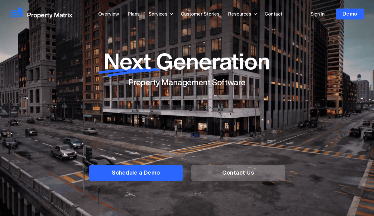
- Location City In The US: Los Angeles, CA
- 3 Key Takeaways:
- High Customization Emphasis: Appeals to users seeking a highly tailored software solution.
- Mobile App Highlight: Prominently features its mobile app for on-the-go management.
- Feature-Rich Presentation: Clearly lists a wide array of specialized features for property management.
17. Rent Manager
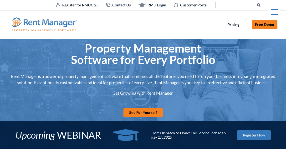
- Location City In The US:Cincinnati, OH
- 3 Key Takeaways:
- Targeted for Mid to Large Portfolios: Design and content reflect the needs of larger property management operations.
- Robust Reporting Capabilities: Highlights in-depth analytics and reporting tools for strategic decision-making.
- Comprehensive Solutions: Showcases a broad spectrum of features, from accounting to maintenance.
18. RentRedi
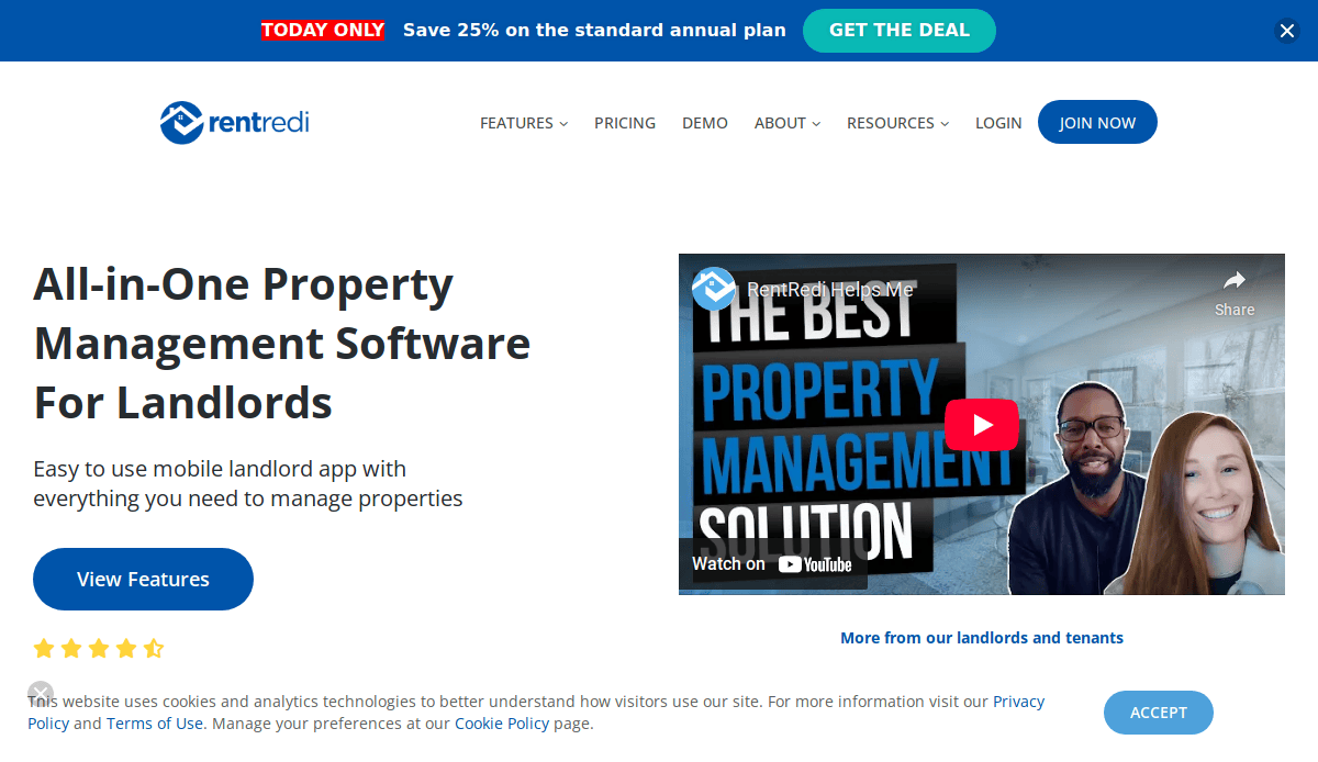
- Location City In The US: New York, NY (based on company information)
- 3 Key Takeaways:
- Virtual Lease Solution Focus: Highlights its core strength in digital lease management.
- Landlord-Centric Features: Clearly outlines benefits for landlords, such as publishing apartments and collecting rent.
- Mobile-First Experience: Design emphasizes ease of use via mobile devices for both landlords and tenants.
19. Build to Rent
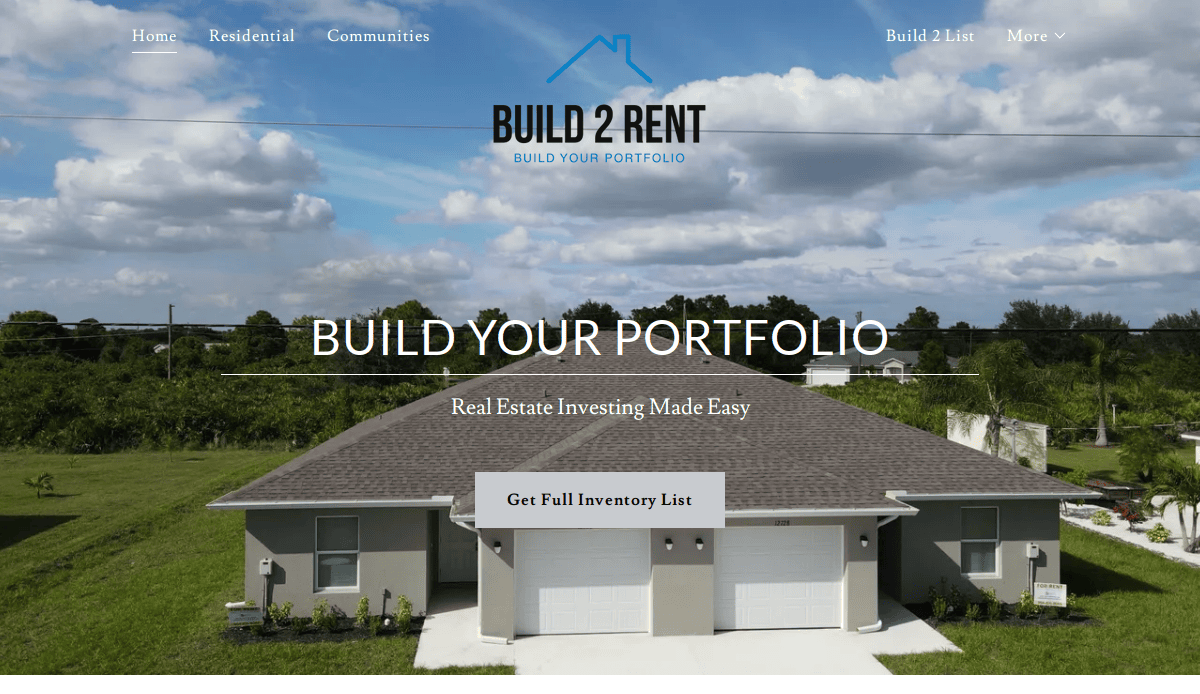
- Location City In The US: New York, NY (based on company type)
- 3 Key Takeaways:
- Niche Specialization: Focuses specifically on the “build-to-rent” model, appealing to developers and investors in this space.
- Project Showcase: Highlights successful developments with strong visuals and detailed information.
- Partnership and Investment Focus: Clearly targets clients looking for collaboration or investment opportunities in this sector.
Ready to Build a High-Performing Property Management Website?
Your website is one of the most important tools for attracting new tenants and property owners, retaining current clients, and streamlining your operations. A website should have a clear structure, showcase available properties, integrate with your property management software, and convert website visitors into leads. Whether you’re exploring different website templates or building your own custom site from scratch, every detail matters.
As a top-tier web design and development agency, we help build modern websites for property management companies that drive results, from content management system setup to contact forms that convert. Our design services are tailored to the real estate industry and focus on building a user-friendly website that improves conversion rates, enhances your web presence, and brings more traffic to your website.
If you’re ready to build a website that performs like the best property management websites in the industry, get in touch with us today.
Frequently Asked Questions by Property Managers About Site Design
What should a property management website include?
A good website for your property management business should include available property availability, tenant and owner hubs, mobile responsiveness, SEO-optimized content, and clear contact forms. These elements of a property management site improve user experience and increase conversion rates.
How does a property management website help attract new tenants and property owners?
A great website helps establish trust and credibility. It serves as a digital storefront where potential tenants and property owners can easily find you, review your services, and submit inquiries. By offering an intuitive property search and responsive design, your site improves web traffic and encourages new relationships.
Is it necessary to have a WordPress website for property management?
While it’s not mandatory, a WordPress website offers flexibility, ease of use, and robust plugin support, including tools for listings, property search, and optimization. It’s a strong content management system ideal for building a website that scales with your portfolio.
Can I use a website template instead of building a custom site?
Yes, many website templates are available and offer a quick, affordable way to launch a new website. However, custom designs offer more control, brand alignment, and long-term value.
What role does a website play in SEO and lead generation?
Your website is central to your SEO strategy. It helps boost visibility on search engines, attract new clients, and convert visitors into leads through content, structure, and technical optimization. Without a website or with one that lacks SEO focus, you miss significant opportunities.
What kind of website design packages are available for property managers?
Website design packages vary based on features like IDX integration, property management software syncing, mobile optimization, and custom branding. Our agency offers tailored web design services that meet your unique business needs.
Can a new website help retain property owners and existing tenants?
Yes. A modern website should include user gateways, maintenance request forms, and billing access. A streamlined experience improves satisfaction and shows professionalism, helping you retain property clients and tenants alike.
How can I increase website traffic and engagement?
To boost web traffic, use a comprehensive guide like this one to audit your content, add keyword-rich blog posts, optimize your site structure, and use internal links. Make sure your website helps answer user questions and guides tenants to apply or owners to contact you.
How long does it take to build a new website?
Timelines depend on complexity. A simple website using a template may take 2–4 weeks. Building your own site with custom features could take 6–10 weeks, including design, development, and testing.
Do I need property management software integrated into my website?
Integrating your management system or property management software allows for real-time updates, easier tenant communication, and owner reporting. It’s essential for automating workflows and delivering a professional experience to everyone visiting your website.

