Just looking for our Best Orthodontist Website examples list?
Why Orthodontic Website Design Matters More Than Ever
Today, a website is often the first point of contact you make with a prospective patient. For any orthodontic practice, a high-performing, mobile-friendly site isn’t just a nice-to-have—it’s an essential business tool that directly impacts your ability to attract and convert new patients. Great website design establishes trust, enhances user experience, and delivers the kind of first impression that turns clicks into appointments.
Whether you’re just launching or looking to refresh your digital presence, understanding what makes a website truly effective is key. From clean, modern aesthetics to powerful SEO and CTAs that drive conversions, every element must work in harmony to deliver real results. Professional web design tailored for your industry amplifies your marketing strategies, improves your search engine rankings, and helps you stand out in increasingly crowded search results.
In this comprehensive guide, we’ll explore the foundational principles of orthodontic site design, how to optimize for local SEO, and what design choices encourage website visitors to schedule that all-important first consultation. If your practice wants to elevate its digital marketing game and convert more visitors into patients, this is the guide you can’t afford to skip.
Website Planning & Purpose: The Blueprint Behind Every Successful Site
Before a single line of code is written or any design is sketched, the most effective websites begin with a clear, strategic plan. For an orthodontic practice, the planning phase of site design is where business goals, patient expectations, and branding come together to shape the foundation of a high-performing digital presence.
This industry thrives on trust, clarity, and professionalism—traits that must be reflected throughout the website. Planning starts with defining the core objectives: Are you focused on generating more patient consultations? Improving your local SEO rankings? Showcasing your range of treatments, from braces to clear aligners? Each answer influences the site’s structure, content strategy, and design elements.
One of the most important components during this phase is understanding your audience. Your layout must resonate with parents researching dental care for their children, adults seeking discreet orthodontic solutions, or anyone unsure about their options. That means crafting a UX that’s informative, intuitive, and optimized to guide website visitors through the decision-making journey.
Equally important is aligning the site with your brand’s personality. From the tone of your copy to the color scheme and imagery, every detail should reflect the professionalism and warmth patients expect. This is where working with a strategic design partner can make a difference. For instance, integrating proven design principles from other high-performing industries can spark ideas that elevate your website beyond the typical template.
Lastly, the planning phase must include technical and SEO considerations, ensuring your site is mobile-friendly, fast-loading, and structured for visibility in search engines. It’s also the best time to identify key CTAs, map out the patient journey, and plan for integrations like online scheduling, patient portals, or digital one-on-ones.
Skipping or rushing the planning phase often leads to missed opportunities and lackluster performance. A well-thought-out site isn’t just a marketing tool—it’s a growth engine for your practice.
Design Principles That Power High-Performing Websites
Creating a visually appealing website is only part of the equation. To truly drive patient engagement and practice growth, your site must be rooted in strong, strategic design principles that align with how today’s users browse, engage, and make decisions online. The best industry site designs don’t just look great—they convert website visitors into new patients through clarity, structure, and trust-building design.
Clarity and Simplicity
The truth is that less is often more. A clutter-free layout with plenty of white space allows visitors to focus on what matters: your treatments, credentials, and clear pathways to book a consultation. Use clean typography, organized menus, and well-labeled CTAs to remove friction and keep the focus on your offerings.
Visual Hierarchy
Patients typically land on your website with questions—what services you offer, how much they cost, and how to schedule an appointment. Strategic use of visual hierarchy—through font size, color contrast, and layout—ensures these answers are immediately accessible. Headlines should lead the visitor through a smooth narrative, highlighting the most valuable content first.
Consistent Branding
A website is often the first branded touchpoint for a prospective patient. Every element—from your logo placement to your color palette and image style—should create a cohesive visual experience that reflects your practice’s professionalism and personality. A consistent brand identity cements trust and reinforces your authority as a local orthodontic provider.
Mobile-First Responsiveness
With the majority of traffic now coming from mobile devices, mobile optimization is no longer optional. An effective orthodontist website must deliver a seamless mobile experience with thumb-friendly navigation, click-to-call buttons, and fast-loading pages. A responsive design ensures your site looks and performs great across all screen sizes.
Conversion-Oriented Layouts
Every page of your website should serve a purpose, especially when it comes to guiding visitors toward booking a consultation. This means placing CTAs in key locations—like above the fold, within service descriptions, and in the footer—so users are always one click away from becoming a patient. Contact forms, online scheduling, and live chat are key features to consider in your layout strategy.
Modern Aesthetic and Technical Agility
A dated-looking website can undermine the perception of your practice. Staying updated with the latest design trends—like soft animations, minimalist interfaces, and micro-interactions—helps your site feel fresh and competitive. For insights on forward-thinking design approaches, check out our breakdown of 2025’s top web design trends, which can be tailored to the orthodontic space.
By applying these core design principles, your website can serve as a powerful business tool, building trust with prospective patients, improving search engine performance, and ultimately growing your practice with professionalism and polish.
Content & Navigation: Structuring the Patient Journey with Strategy
When designing a site, the structure of your content and navigation plays a pivotal role in how visitors experience your practice online. A high-quality website isn’t just about aesthetics—it’s about clarity, ease of use, and guiding each potential patient toward taking action. From page layout to menu design, your content and navigation strategy must be seamless, purposeful, and user-centric.
Clear, Purposeful Page Structure
Every page on your website should have a specific objective and be structured to support that goal. Your homepage serves as a central hub, introducing your practice and directing visitors to other key pages. Services pages should clearly describe each orthodontic treatment offered—such as braces, Invisalign, or early intervention—using digestible content and supportive visuals. The “About” page helps cement trust by showcasing your credentials, mission, and patient care philosophy. Don’t forget the importance of a well-crafted “Contact” page that includes clickable phone numbers, a map, and an easy-to-use scheduling form.
Intuitive Navigation Menus
A well-structured menu guides users effortlessly through your site. A top navigation bar with clear, concise labels like “Treatments,” “Meet the Team,” “New Patients,” and “Schedule a Consultation” works best. Avoid overwhelming dropdowns or too many menu options, which can confuse users and lead to frustration. Logical navigation boosts UX and ensures website visitors stay longer, explore more, and convert at a higher rate.
Content That Answers Questions and Builds Trust
Patients typically have a lot of questions: How much will it cost? What are the treatment options? What can they expect during their visit? Your content should preemptively answer these questions in a straightforward, friendly tone. Use bulleted lists, subheadings, and brief paragraphs to make information skimmable and digestible. Supporting your claims with patient testimonials, FAQs, and blog content further builds credibility.
Strategic Internal Linking and Clear CTAs
Effective site design also relies on smart content relationships. Internal linking—directing visitors from service pages to blog posts, FAQs, or your contact page—keeps users engaged and improves search engine optimization. Clear calls-to-action (CTAs), such as “Schedule Your Free Consultation” or “Learn More About Braces,” should be placed strategically throughout each page to convert casual visitors into new patient leads.
User-Focused Navigation Planning
For a deeper dive into how to effectively structure your site’s hierarchy and navigation for maximum usability and SEO impact, read our complete Website Organization Guide. It outlines best practices that can be directly applied to professional industry websites, ensuring every page has a clear purpose and every click moves the visitor closer to conversion.
When content and navigation work together, your website becomes an interactive, persuasive tool that informs, reassures, and encourages patients to take the next step. Whether they’re ready to book or just beginning their research, your site should always guide them forward with ease and clarity.
Visual Elements: Bringing Your Orthodontic Brand to Life Online
Visual elements are far more than decoration—they’re critical tools for enhancing UX, communicating your brand, and building trust with potential patients. A thoughtfully designed visual strategy ensures that every visitor immediately understands who you are, what you offer, and why they should choose your practice.
Professional Photography Builds Instant Credibility
Stock images might be convenient, but they rarely inspire confidence. High-quality, professional photography of your office, staff, and real patients (with permission) gives your site a genuine, welcoming feel. These visuals show that your practice is professional, approachable, and proud of the people behind the brand. Photos of clean, modern facilities, friendly team members, and before-and-after results can significantly increase engagement and conversions.
Visual Consistency Reinforces Your Brand Identity
Your visual elements should align with your practice’s overall branding. That includes your logo, color scheme, typography, and imagery style. Consistent use of these elements across your site helps create a cohesive experience that reinforces brand recognition and trust. Whether your tone is modern and high-tech or family-friendly and personal, your visuals should reflect that identity clearly and consistently.
Design That Supports the User Journey
Every visual component—buttons, icons, illustrations, spacing, and layout—should support your site’s usability. CTAs need to stand out with contrasting colors and clean design. Icons can help users navigate information quickly, especially on mobile devices. Visual indicators, such as arrows or highlighted sections, can guide visitors toward key actions like scheduling a consultation or reading about treatment options.
Before-and-After Galleries Offer Powerful Proof
Orthodontics is one of the few industries where visual results are central to the value of your service. A well-organized before-and-after gallery helps potential patients visualize their own transformation. These images are among the most persuasive tools you can offer and should be presented with clarity, context, and professionalism.
Videos and Motion Add Depth to the Experience
Short, embedded videos—whether they’re virtual office tours, treatment explainers, or patient testimonials—add personality and interactivity to your site. When done well, video content can improve time on page and boost search engine performance. It also offers a more dynamic way to tell your brand story and connect emotionally with visitors.
Clean, Balanced Layouts Keep Users Focused
White space isn’t wasted space—it’s a design element that improves readability and helps guide the eye to what matters most. A balanced layout avoids clutter, highlights key content, and reduces cognitive load for the user. Combined with high-quality imagery, this approach keeps your website both professional and inviting.
By combining these visual elements with strategic design, your company website becomes a powerful brand asset. It doesn’t just represent your practice—it actively works to convert visitors into loyal, long-term patients.
Ongoing WordPress Maintenance: Keeping Your Website Healthy and Secure
A successful website doesn’t stop working once it goes live. Behind every high-performing company website is a consistent and reliable maintenance routine, especially when it’s built on WordPress. For practices that rely on their website to attract new patients, support consultations, and showcase their services, ongoing WordPress maintenance is essential to ensure speed, security, and a seamless user experience.
Security Updates and Plugin Management
WordPress websites are only as secure as their latest update. Regularly applying core, theme, and plugin updates helps patch vulnerabilities that hackers can exploit. Medical practices handle sensitive data—appointment forms, patient inquiries, health-related questions—which makes it critical to keep the backend of the site secure and up to date.
Performance Optimization
A slow-loading website can drive new patients away before they’ve read a single sentence. Ongoing maintenance includes optimizing images, clearing cache files, and monitoring uptime to ensure fast, smooth performance. Regular speed tests help identify issues early, maintaining a consistently quality user experience for visitors on both desktop and mobile devices.
Form Testing and Function Checks
Your consultation forms, contact submissions, and online scheduling tools must work flawlessly at all times. Periodic testing ensures these vital features function properly—missed inquiries due to a broken form can mean lost opportunities. Maintenance routines often include scheduled audits to confirm that all CTAs, links, and integrations are operating correctly.
Backup and Recovery Protocols
Website downtime can be a nightmare, especially during peak patient inquiry hours. Reliable WordPress maintenance includes automated backups and a clear recovery plan. If something goes wrong—a broken plugin, server error, or cyberattack—your website can be restored quickly without losing data or damaging your online presence.
Content Updates and SEO Consistency
Regularly refreshing content, updating blog posts, and monitoring SEO performance helps your site stay relevant in search results. Ongoing maintenance supports these efforts by ensuring the content management system functions properly and aligns with current best practices in local SEO and web accessibility.
Compliance and Compatibility Monitoring
Orthodontic websites must stay compatible with evolving web standards, browser updates, and legal regulations like ADA compliance. Ongoing maintenance helps address these changes proactively, keeping your site accessible to all users and avoiding costly oversights.
By committing to ongoing WordPress maintenance, your practice ensures its website remains fast, secure, and effective. This isn’t just technical upkeep—it’s a core part of delivering a consistent, professional experience to every visitor who interacts with your brand online.
20 Orthodontic Web Design Examples to Inspire
Here are 20 of the best orthodontic practice websites, the first five having been designed by our agency. Note the design key takeaways for each:
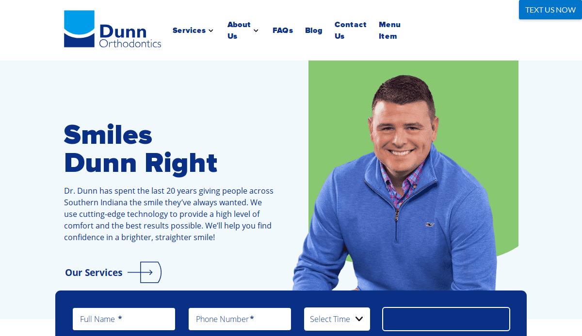
1. Dunn Orthodontics
Location City In The US: Sellersburg, IN
3 Key Takeaways:
- Bright & Modern Design: The website utilizes a clean, vibrant aesthetic with unique imagery and videos that make it stand out.
- Compelling CTAs: Strong calls-to-action are strategically placed, making it easy for visitors to engage, particularly for free consultations.
- Professional Yet Fun: The design successfully balances professionalism with an engaging and approachable feel, reflecting a modern practice.
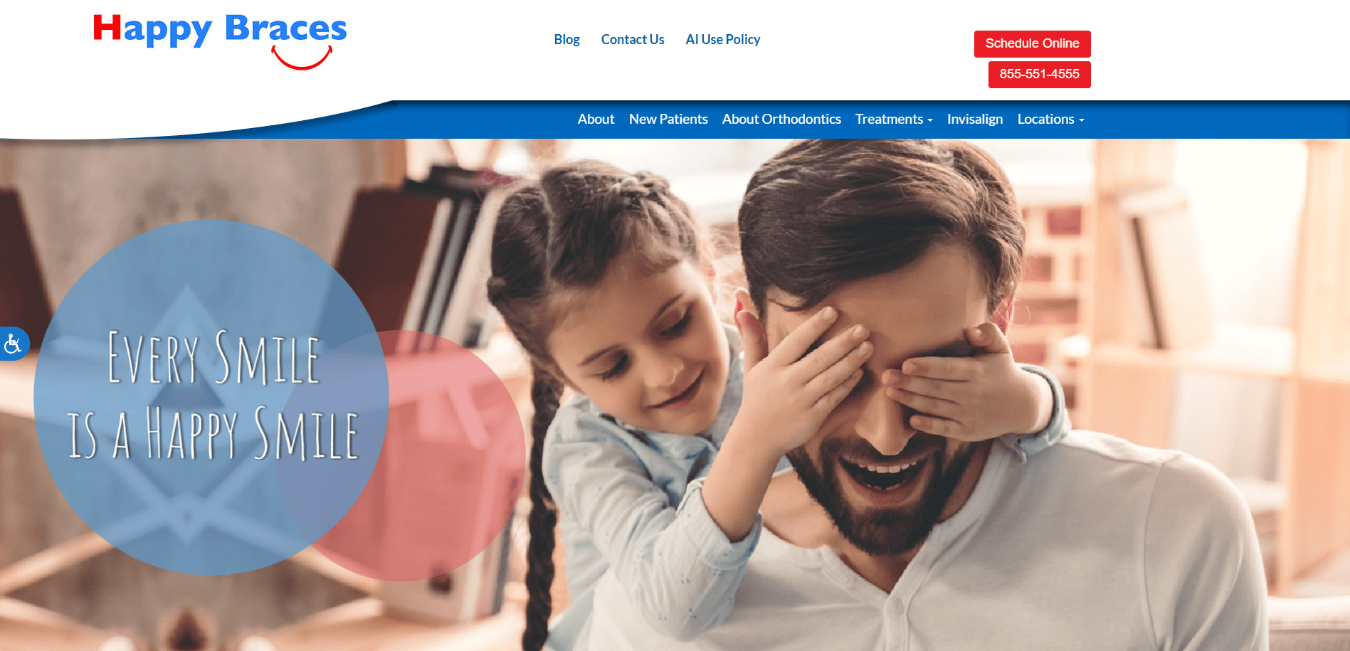
2. Happy Braces
Location City In The US: Los Angeles, CA
3 Key Takeaways:
- Warm & Welcoming Design: The site immediately greets users with a friendly and inviting feel, aligning with their “Every Smile is a Happy Smile” tagline.
- High-Quality Image Sliders: Prominent image sliders on the hero page showcase services and information effectively.
- User-Friendly Appointment Booking: A smoothly integrated online booking system allows for effortless appointment scheduling.
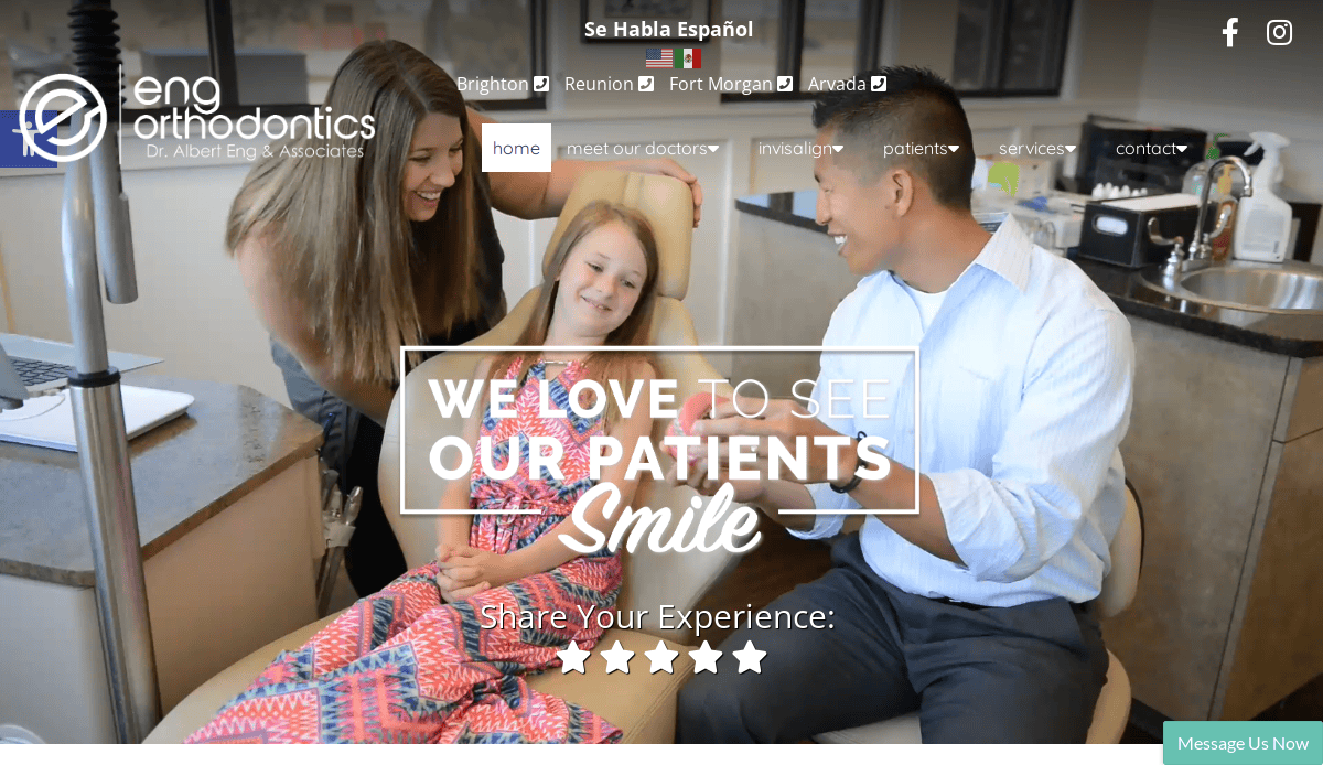
3. Eng Orthodontics
Location City In The US: Brighton, CO
3 Key Takeaways:
- Clean & Elegant Design: The website features a refined color palette, subtle animations, and high-quality imagery, creating a professional and modern aesthetic.
- Polished Visuals: Professional imagery and videos exude trust and reliability, contributing to a reassuring image of the practice.
- Commitment to Quality: The design perfectly aligns with the practice’s commitment to quality orthodontic care.
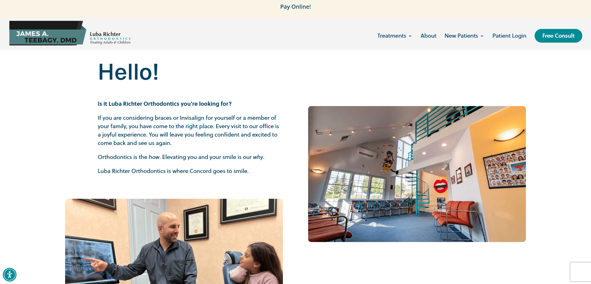
4. Luba Richter Orthodontics
Location City In The US: St. Concord, NH
3 Key Takeaways:
- Sophistication with Accessibility: The website blends a sophisticated design with easy accessibility, mirroring the precision and warmth of the practice.
- Calming Color Palette & High-Quality Imagery: Strategic use of calming colors and imagery showcasing genuine smiles conveys trust and expertise.
- Intuitive Navigation & Free Consultation Offer: The clean, modern design with intuitive navigation and a prominent free consultation offer encourages engagement.
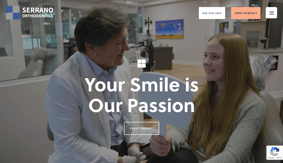
5. Serrano Orthodontics
Location City In The US: Phoenix, AZ
3 Key Takeaways:
- Visually Pleasing & Modern Design: The homepage welcomes visitors with a contemporary and aesthetically appealing design, using a harmonious color palette.
- High-Quality Video Presentation: A prominent and engaging video on the homepage instantly grabs attention and conveys professionalism.
- Integration of Authenticity: High-quality visuals, including authentic before-and-after photos, build trust and showcase real results
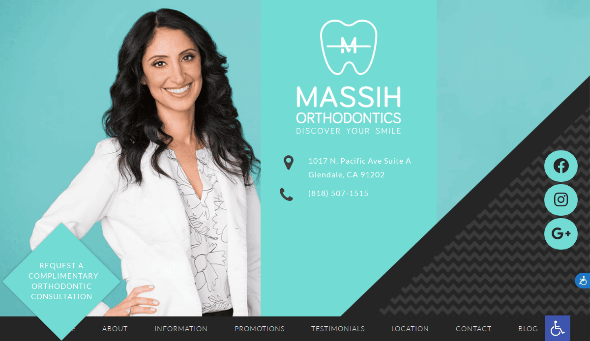
6. Massih Orthodontics
Location City In The US: Glendale, CA
3 Key Takeaways:
- Fresh & Easy-to-Navigate Layout: The site offers a clean and intuitive layout, making it simple for visitors to find information.
- Welcoming Textile Backdrops: Unique and inviting textile backdrops create an impressive overall look.
- Clever Branding: The branding and logo are smart and appealing, conveying competence and professionalism.
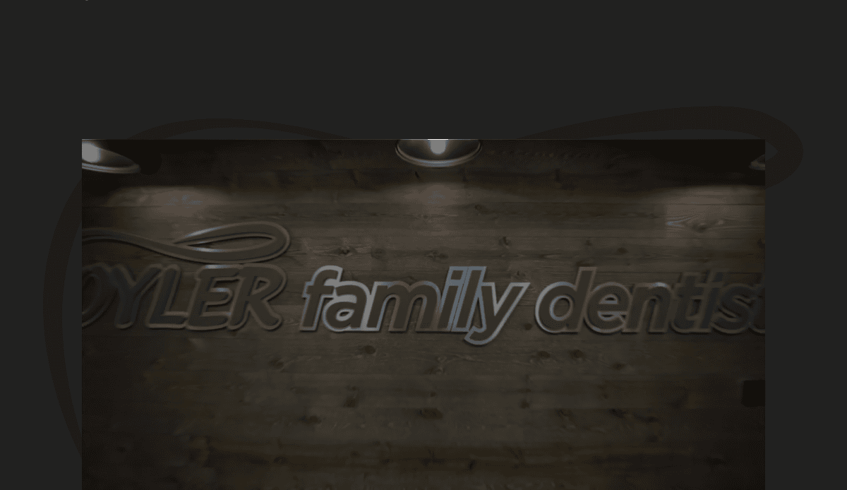
7. Oyler Orthodontics
Location City In The US: Greendale, IN
3 Key Takeaways:
- Bold & Colorful Design: Uses a vibrant color palette and strong typography to create a memorable impression.
- Clear Patient Journey: Guides prospective patients through steps from initial consultation to treatment completion.
- Community Focus: Highlights community involvement, adding a personal and trustworthy touch to the practice.
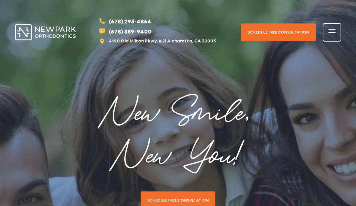
8. Newpark Orthodontics
Location City In The US: Alpharetta, GA
3 Key Takeaways:
- Consistent Branding: Effectively applies branding across all aspects of the company, making a positive impact.
- Crisp Pictures & Office Tour: High-quality images and an office tour visually highlight the practice’s environment.
- Bright Colors & White Space: The combination of bright colors and ample white space creates a refreshing and engaging site.
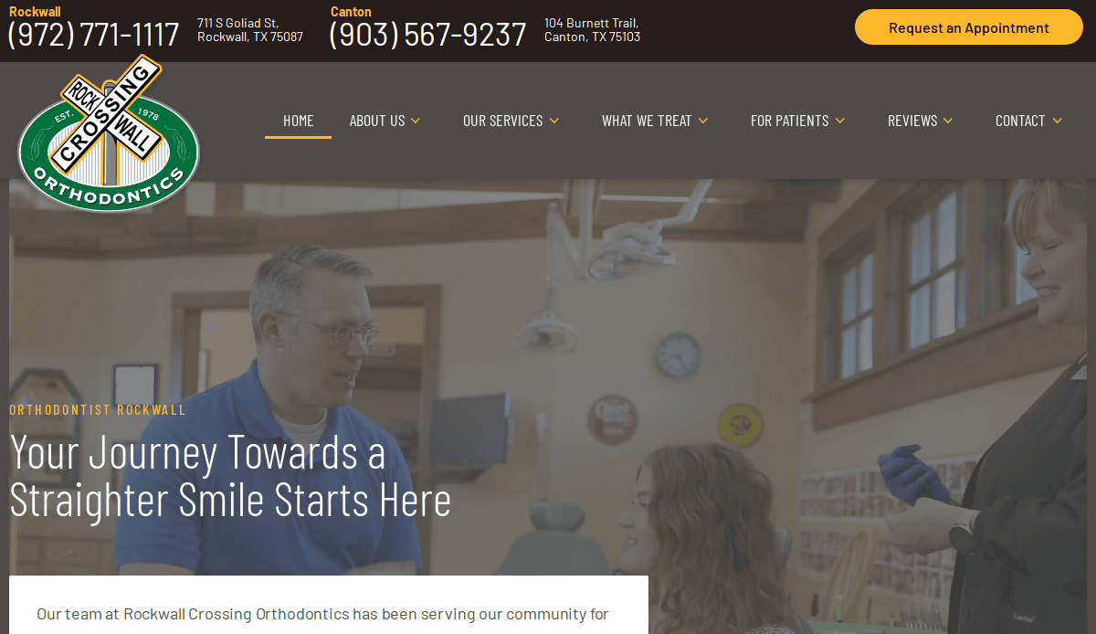
9. Rockwall Crossing Orthodontics
Location City In The US: Rockwall, TX
3 Key Takeaways:
- Strong Expert Authority: The website immediately establishes Dr. Bart Miller as an orthodontic expert.
- Integration of Social Proof: Likely includes patient testimonials and success stories to build trust.
- Clear Trust Signals: Designed to quickly convey why patients should trust the practice.
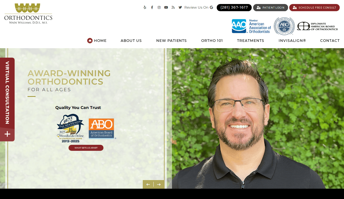
10. Wade Williams Orthodontics
Location City In The US: Woodlands, TX
3 Key Takeaways:
- Clean & Simple Design: Presents a straightforward and uncluttered website.
- Patient Process Clarity: Clearly explains “Your First Visit” to guide new patients.
- Trust-Building SEO: Incorporates a map and directions, enhancing local SEO and building trust.
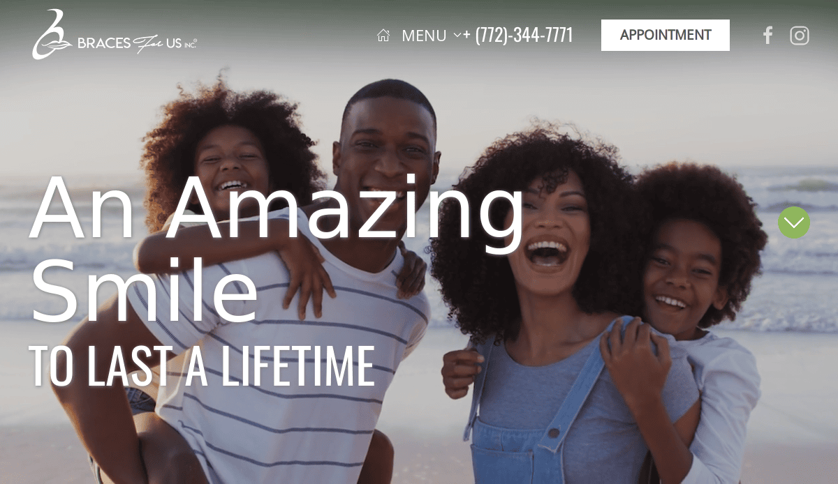
11. Braces For Us
Location City In The US: St. Lucie, FL
3 Key Takeaways:
- Concise Content Presentation: Avoids overwhelming visitors with too much content, breaking it up effectively.
- User-Friendly Layout: The layout is designed for comfortable and intuitive navigation.
- Focus on Clarity: Provides just enough information without unnecessary clutter.
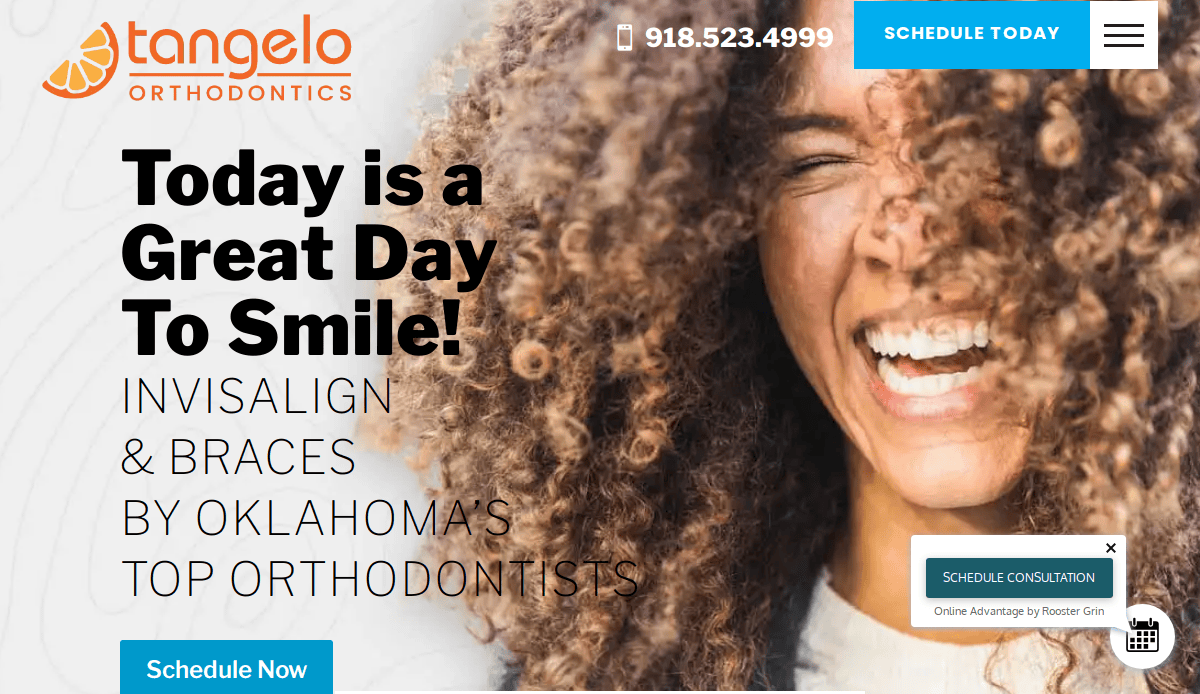
12. Tangelo Smiles
Location City In The US: Bartlesville, OK
3 Key Takeaways:
- Crisp & Professional Design: Features a clean, polished, and clutter-free aesthetic.
- Comprehensive Homepage Information: Offers a wide array of valuable information directly on the homepage, including an office tour.
- Personalized Introduction: Provides details about the orthodontist, building a personal connection.
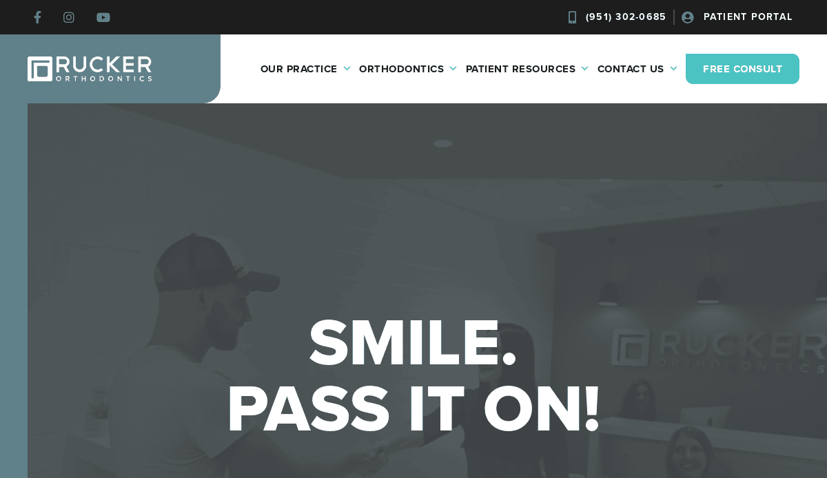
13. Rucker Orthodontics
Location City In The US: Temecula, CA
3 Key Takeaways:
- Personality Integration: Successfully injects the practice’s personality into the website design.
- Clear Value Proposition: Clearly states what makes the practice unique for visitors.
- Compelling & Well-Placed CTAs: Features effective calls-to-action placed strategically to encourage engagement.
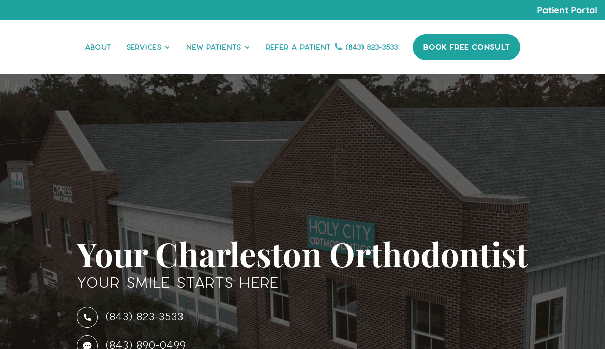
14. Holy City Orthodontics
Location City In The US: Charleston, SC
3 Key Takeaways:
Engaging Header Video: A captivating header video provides an instant virtual tour of the practice, building trust.
- Strong Patient Testimonials: Likely integrates prominent patient testimonials to provide social proof.
- Clear Visitor Roadmap: Guides visitors through the site effectively, making information easy to find.
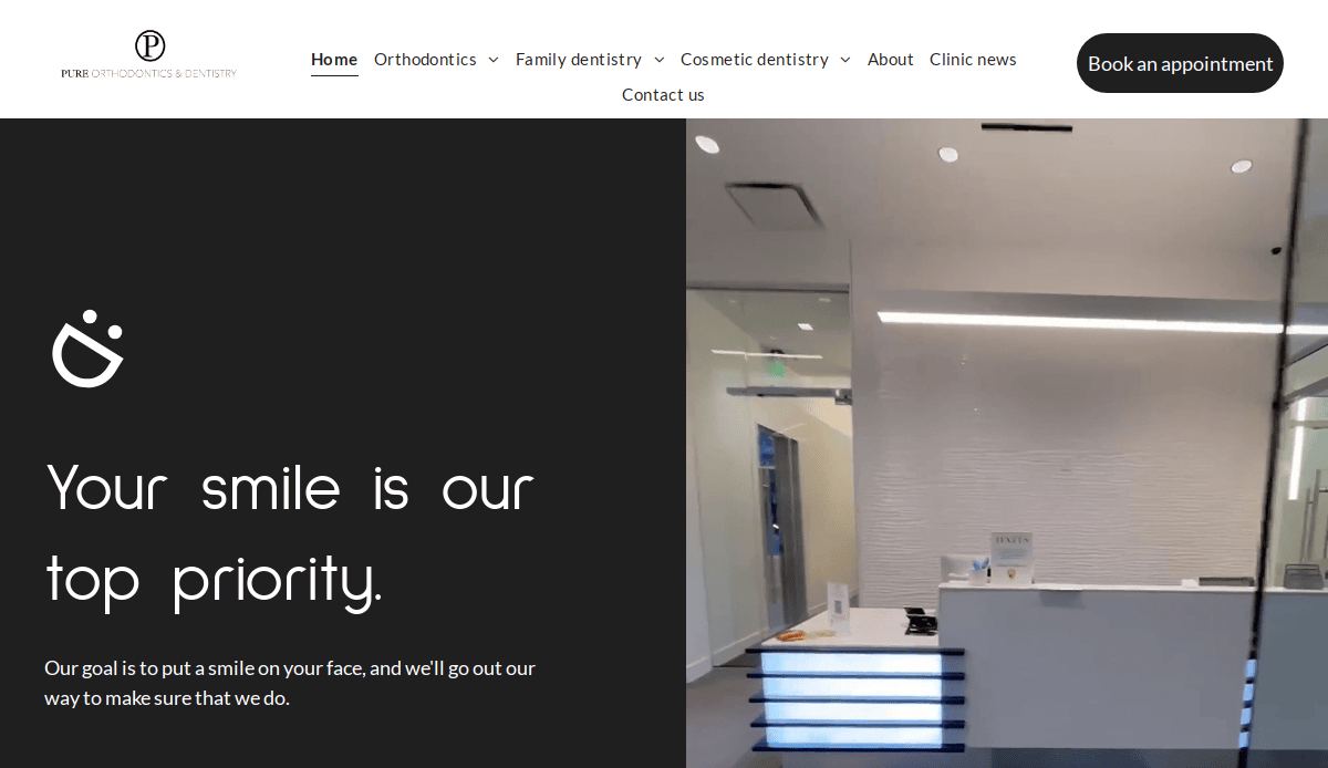
15. Pure Orthodontics
Location City In The US: Grand Blanc, MI
3 Key Takeaways:
- Modern Aesthetic: Presents a contemporary and appealing visual design.
- Focus on Patient Experience: Likely emphasizes a comfortable and positive patient journey.
- Clear Service Offerings: Effectively communicates the range of orthodontic services available.
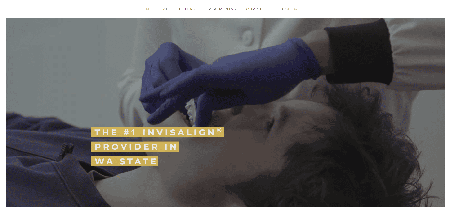
16. Ballard Orthodontics
Location City In The US: Seattle, WA
3 Key Takeaways:
- High-Quality Photography: Uses professional and inviting images to enhance visual appeal.
- Bold CTAs: Features clear and prominent calls-to-action to drive patient inquiries.
- Informative Content: Provides comprehensive and helpful information for potential patients.
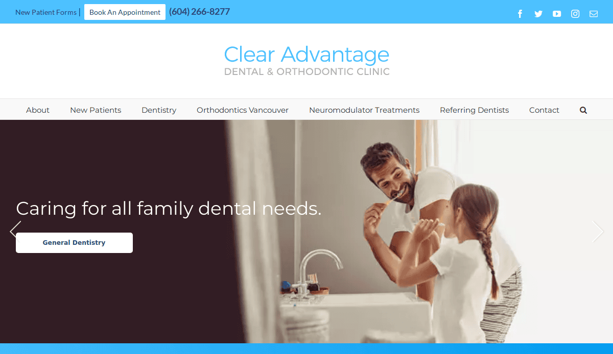
17. Clear Advantage Orthodontics
Location City In The US: Vancouver, WA
3 Key Takeaways:
- SEO-Optimized Content: Website copy is clearly optimized for search engines, making it easily discoverable.
- High-Quality Family-Focused Images: Employs images depicting family dental care, appealing to a broad audience.
- Prominent Doctor Profile: Includes the leading orthodontist’s profile, building credibility and trust.)
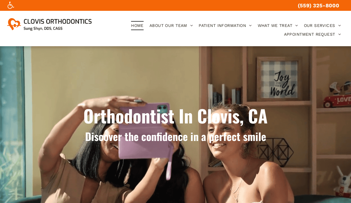
18. Clovis Orthodontics
Location City In The US: Clovis, CA
3 Key Takeaways:
- Engaging Autoplay Video: Features an automatically playing video that immediately captures visitor attention.
- Dynamic Visuals: Uses video to convey the practice’s atmosphere and services effectively.
- Modern & Welcoming: Creates a contemporary and inviting online presence.
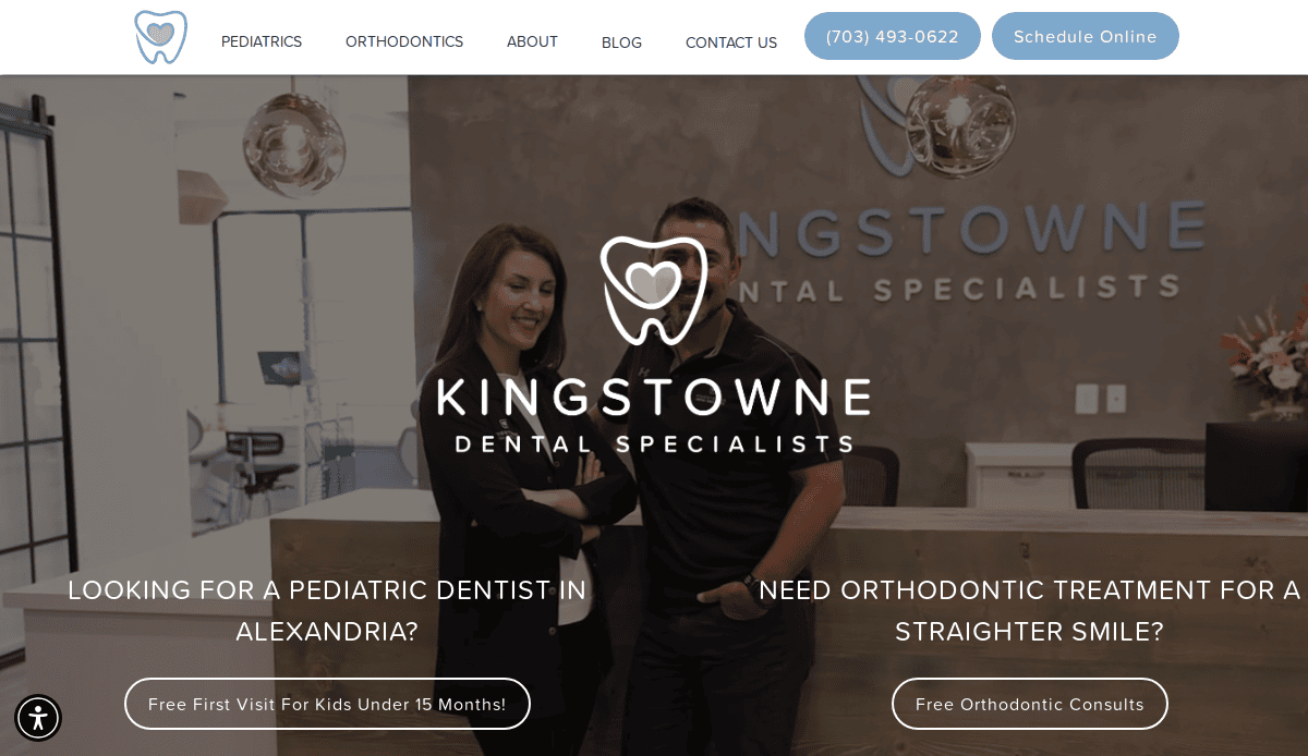
19. Kingstowne Dentist (Includes Orthodontic Services)
Location City In The US: Alexandria, VA
3 Key Takeaways:
- Image-Rich Design: Incorporates numerous high-quality images and graphics to make content more engaging.
- Strong Visual Storytelling: Uses visuals effectively to convey information and the practice’s brand.
- Excellent Logo Design: Features an appealing and memorable logo that enhances brand recognition.
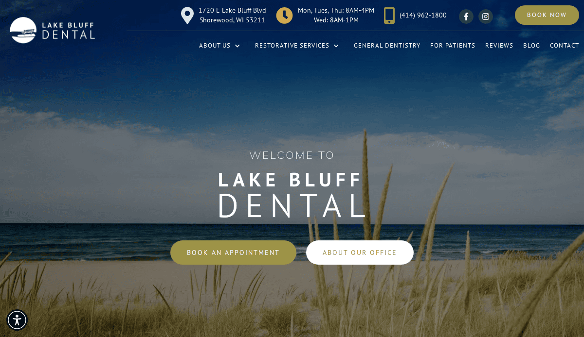
20. Lake Bluff Dental (Includes Orthodontic Services)
Location City In The US: Lake Bluff, IL
3 Key Takeaways:
- Ample White Space: Utilizes large white spaces for a clean and uncluttered look.
- Captivating Hero Image: Features a prominent and engaging hero image on the homepage.
- Minimalist & Professional: Achieves a sophisticated and professional aesthetic through minimalist design principles.
Turn Your Orthodontic Website Into a Growth Engine
A modern website is more than an online brochure—it’s a critical part of your growth strategy. From responsive site design and page speed to compelling content and SEO for orthodontists, every element should work together to help patients find what they need, feel confident in your expertise, and take action.
If your current site isn’t bringing in new patients or reflecting the professionalism of your practice, it’s time to rethink your approach. Whether you’re launching a new practice, building a website from scratch, or improving an outdated site, working with a web design agency that specializes in healthcare marketing is essential. Our agency delivers high-converting orthodontic websites built with modern design, user-friendly navigation, and digital marketing strategies that rank higher and help patients feel confident choosing your care.
Looking for a professional website that loads fast, is easy to read, and converts more visitors? Explore our web design services for orthodontists and let’s talk about creating a custom website that makes a great first impression and helps your practice grow.
Frequently Asked Questions About Orthodontic Website Design
Why is a responsive website important for orthodontists?
A responsive website ensures that your site looks and functions properly across all devices, including smartphones and tablets. This is critical, as mobile usage continues to grow and patients expect a seamless experience. Google also prioritizes mobile-friendly websites in its search results, meaning a responsive design can help your website rank higher and attract more local patients.
How can orthodontists improve their website’s search engine visibility?
Improving search visibility involves a combination of SEO techniques, including optimizing page speed, content relevance, keyword usage, and local listings like Google My Business. Working with an experienced web design company ensures that technical SEO and dental marketing strategies are built into your website from the start.
What should a professional website include to convert more visitors?
A high-converting dental website should include a clean layout, fast-loading pages, clear calls-to-action, trust-building elements like testimonials, and an easy way to schedule bookings. Make sure your site communicates your value clearly and helps potential patients find what they need without digging through cluttered menus or excessive content.
How often should I update my website?
Your website should be updated regularly to reflect new treatments, team changes, blog content, and evolving optimization trends. Regular updates ensure your site remains competitive in search results and continues to deliver a fast, secure experience. A reliable web development partner can help you maintain an ongoing update schedule and monitor performance.
Can my company’s websites help with local patient acquisition?
Yes, absolutely. Local SEO strategies—like optimizing your Google My Business profile, including city-specific keywords, and listing your practice in reputable dental directories—help ensure that nearby patients find you online. This is a key piece of effective dental marketing and can significantly increase your local visibility.
What role does web development play in my practice’s online success?
Web development is the backbone of your online platform. A well-coded, secure, and fast-loading site improves UX, supports optimization, and integrates with tools like appointment scheduling and marketing automation. It’s critical for ensuring your website loads quickly, is accessible, and is easy to manage—qualities that impact whether your website ranks well and makes a good first impression.
Should I work with a general agency or one that specializes in dental site design?
While general agencies may provide broad services, a company that specializes in site design for specific industries brings specific insight, patient behavior knowledge, and compliance awareness. A specialized agency like ours is more likely to offer detailed services tailored to the unique needs of orthodontic practices and healthcare marketing.
How do I measure the effectiveness of my orthodontic website?
Key metrics include organic traffic, conversion rates (e.g., booked appointments), bounce rate, and rankings in search engine results. Additionally, tracking interactions like form submissions and phone clicks can show whether your dental website is effectively engaging visitors. Performance tools can also show how well your website loads and how users interact with your pages.
By answering these essential questions, your orthodontic practice can better navigate the challenges of building a professional, results-driven website that attracts more patients and enhances your digital presence. For tailored support, our full-service digital marketing agency provides web design and marketing services that help you stand out in a competitive market.


