Just looking for our Best IT Company Website examples list?
What Makes a Great IT Company Website Design
Your IT company’s website is more than a brochure—it’s your most powerful sales tool. Whether you’re targeting startups, scaling SaaS providers, or enterprise-level clients, a high-performing website can be the difference between winning new business and getting overlooked.
But what makes a great IT website? It’s not just clean code and good looks. Strategic design choices—like intuitive navigation, fast load speeds, engaging visuals, and compelling copy—can dramatically impact how visitors engage, convert, and come back for more.
We’ll walk you through everything you need to know to design an IT company website that looks professional and performs like a powerhouse. Let’s dive in.
Planning an IT Website That Aligns with Business Goals
Before jumping into visuals and features, every great IT company website starts with a solid plan. The planning phase is crucial—it aligns the design with your company’s business goals, audience expectations, and brand identity.
Start by defining the primary purpose of your site. Are you aiming to generate leads, build brand credibility, support existing customers, or all of the above? For IT companies, common goals include showcasing technical capabilities, educating prospects on services, and prompting action with compelling CTAs.
Next, clarify your target audience. Are you speaking to CIOs of Fortune 500s or tech startups looking for their first MSP? Understanding their pain points—like cybersecurity concerns, integration challenges, or digital transformation goals—helps tailor content and design that resonates.
Finally, plan the site architecture. Structure your navigation so it guides users logically, from learning about your services to scheduling a consultation. Clear user flows, minimal friction, and strategically placed lead capture forms are critical to meeting your business objectives.
With a strong purpose and blueprint in place, the rest of the design process becomes more strategic, efficient, and conversion-driven.
Essential Design Principles for a Modern IT Company Website
Strong design principles form the visual and functional foundation of every successful IT website. They ensure a polished appearance, optimize for user experience, clarity, and brand alignment.
- Consistency Across All Elements
Consistency in typography, color palette, iconography, and layout ensures your website feels cohesive and trustworthy. Use a defined style guide to unify the look and feel across pages. - Responsive & Mobile-First Design
Your audience will access your site from a variety of devices. A responsive, mobile-first design guarantees a seamless experience regardless of screen size, crucial for both user satisfaction and search engine rankings. - Visual Hierarchy & White Space
Use size, contrast, and positioning to guide visitors’ attention to the most important elements, like CTAs or service descriptions. Effective use of white space prevents visual clutter and enhances readability. - Accessibility & Readability
Design with inclusivity in mind. Choose accessible color contrasts, alt text for images, and legible fonts. Ensure interactive elements like buttons and links are easy to identify and use. - Visual Engagement With Purpose
Incorporate high-quality images, animations, and illustrations that support your messaging, not distract from it. Every visual should reinforce your expertise, professionalism, and trustworthiness. - Fast Load Speed & Technical Performance
Minimize design bloat by optimizing images, using clean code, and leveraging caching. Fast websites lower bounce rates and improve user satisfaction, which in turn boosts SEO performance.
By applying these design principles, your IT website can offer a visually appealing, functional, and user-centric experience that builds trust and drives engagement.
Structuring Content and Navigation for Maximum Engagement
A successful IT company website pairs engaging content with intuitive navigation to guide visitors through their journey. Your content should educate, build trust, and ultimately convert, while your navigation should make it easy to explore.
- Hierarchical, Clear Navigation
Limit your top-level navigation to 5–7 items, such as Services, Solutions, About, Blog, and Contact. Use drop-downs for subcategories and ensure logical grouping to keep the experience streamlined. Include a sticky navigation bar so users can easily explore no matter where they are on the site. - Homepage as the Strategic Gateway
Your homepage should quickly communicate your core offering and direct visitors to the right next steps. Include key CTAs, service previews, trust signals like testimonials or client logos, and concise messaging that supports your value proposition. - Tailored, Value-Driven Service Pages
Each service should have its own optimized page explaining what you do, how it helps, and why your company is the best fit. Use benefit-oriented copy, relevant visuals, and FAQs to reduce friction and objections. - Supporting Content That Educates
Blog posts, case studies, white papers, and webinars help reinforce your expertise. Structure this content into a Resources or Insights hub to keep it organized and accessible. - Strategic Internal Linking
Guide users deeper into your website by linking related service pages, blogs, and CTAs. Use descriptive anchor text that enhances SEO and clarifies the destination. - Conversion Points Everywhere
Add CTAs across the site—not just on the Contact page. Embed lead capture forms in service pages, footers, and blog posts to capture interest at every stage of the buyer journey.
A clear content hierarchy paired with intuitive navigation ensures your website looks good and functions as a high-performing marketing asset.
Using Visual Design to Build Trust and Showcase Innovation
Visual elements are not just decorative—they’re strategic tools that shape perception, communicate value, and enhance user experience. For IT companies, visuals must reflect innovation, trust, and technical excellence.
- Consistent Brand Imagery
Use a visual style that aligns with your brand identity, including consistent use of logos, icons, photography, and illustrations. Ensure every image reinforces your professionalism and credibility. - Custom Graphics and Icons
Avoid overused stock visuals. Instead, invest in custom graphics and icon sets that represent your services and processes. This adds authenticity and makes complex ideas easier to understand. - Animation with Purpose
Strategic animations—like hover effects, loading transitions, or scroll-triggered content—can increase engagement and guide users’ attention. Keep them subtle and purposeful to avoid distraction. - Visual Proof Points
Showcase data, results, or client success through charts, infographics, and visual storytelling. These elements build trust by highlighting the real-world impact of your solutions. - High-Quality Photography
If you include team or office photos, ensure they are professionally shot and well-composed. Authentic photography humanizes your brand and builds an emotional connection with visitors. - Color, Contrast & Readability
Use a color palette that supports your brand and ensures accessibility. High contrast between text and background enhances readability and usability across all devices.
In the IT space, where trust and professionalism are non-negotiable, your visual elements should work together to create a clean, modern, and trustworthy digital presence.
Why Ongoing Maintenance is Critical for IT Websites
A high-performing IT website doesn’t end with launch—it demands consistent maintenance to stay secure, functional, and optimized. For companies using WordPress, ongoing maintenance is especially critical due to the platform’s dynamic ecosystem of plugins, themes, and frequent updates.
- Security Monitoring & Updates
Regular updates to WordPress core, themes, and plugins are essential for closing security vulnerabilities. Implement automated security scans and firewalls, and always back up your site before updates. - Performance Optimization
Monitor site speed, uptime, and broken links with performance tools. Routinely clean up unused plugins and images, and leverage caching and content delivery networks (CDNs) to ensure fast load times. - Regular Backups
Set up automated backups—daily or weekly, depending on site activity. Store backups securely in multiple locations (e.g., cloud + local) to ensure rapid recovery in case of data loss or malware attacks. - Plugin & Theme Management
Deactivate and delete unused plugins to reduce vulnerabilities. Test new plugins thoroughly and ensure compatibility with your existing version of software and theme to avoid breaking the site. - SEO & Analytics Review
Check and update SEO settings regularly using tools like Yoast SEO or Rank Math. Monitor site performance with Google Analytics and Search Console to identify traffic issues and improve content strategy. - Content & User Testing
Periodically review your content to ensure accuracy and update CTAs, service descriptions, or team profiles. Test forms, buttons, and interactive features to confirm everything is working as expected.
For IT companies offering professional services, your website is often the first impression—keeping it updated, fast, and secure reflects your commitment to quality and reliability. Ongoing web maintenance for WP ensures your digital presence stays polished and high-performing 24/7.
5 Best Information Technology Website Examples
1. Align
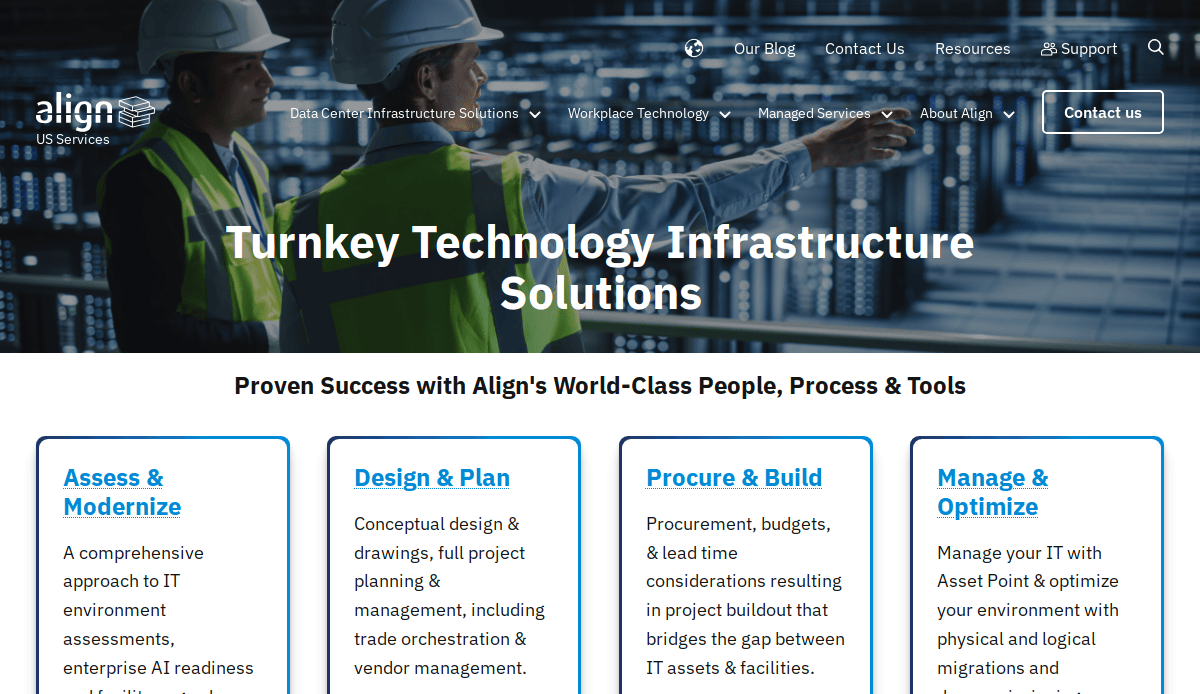
- Location: New York, NY
- Key Takeaways:
- Showcases high-caliber IT infrastructure solutions with a clean aesthetic.
- Structured and easy-to-navigate layout.
- Emphasis on functionality through intuitive navigation and clear calls to action.
2. Dashlane
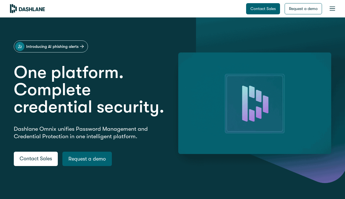
- Location: New York, NY
- Key Takeaways:
- Modern and visually appealing design captures visitor interest.
- Bold colors, high-quality photos, and crisp writing produce a polished appearance.
- Layout emphasizes vital elements such as features, benefits, and pricing information.
3. Axcient
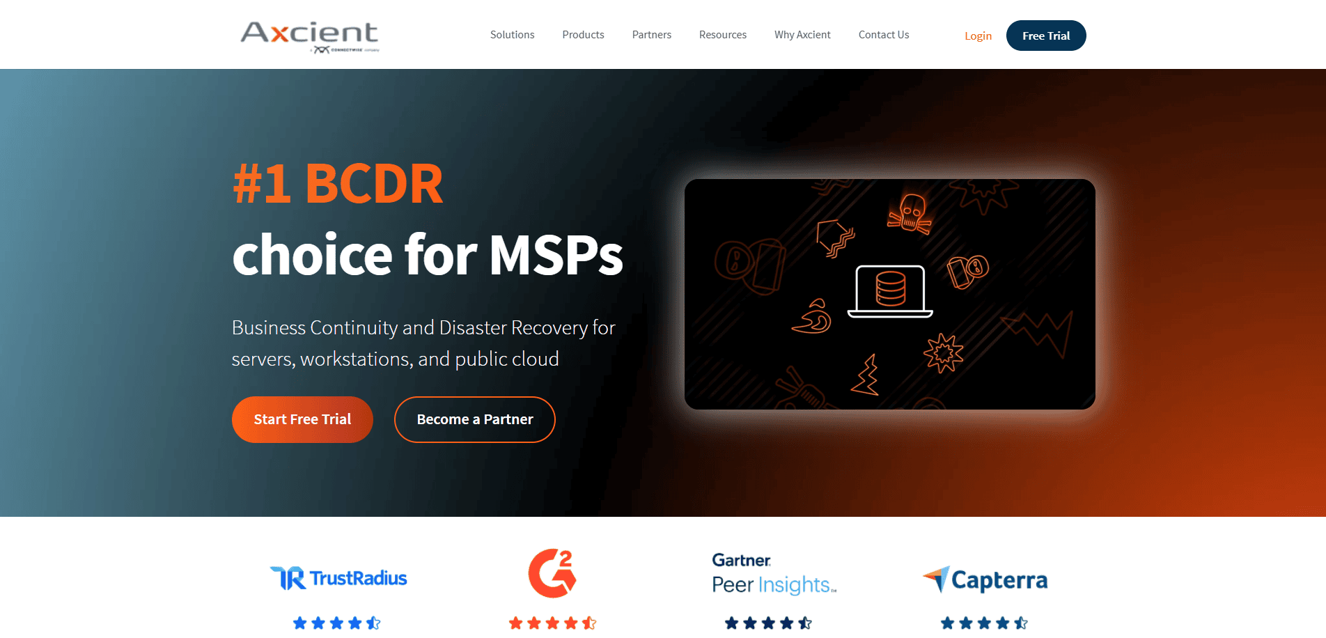
- Location: Denver, CO
- Key Takeaways:
- Minimalist website with straightforward design.
- Reviews and industry awards arranged in a four-column layout serve as social proof.
- Unique font type makes each section engaging for users.
4. On-Site Technical Services
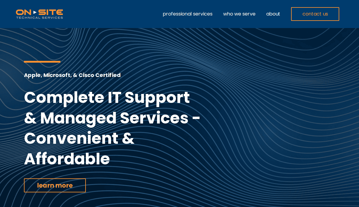
- Location: Chicago, IL
- Key Takeaways:
- Polished and streamlined design emphasizing IT service expertise.
- User-friendly layout facilitating effortless navigation.
- Effective use of white space enhances content legibility.
5. Netlink
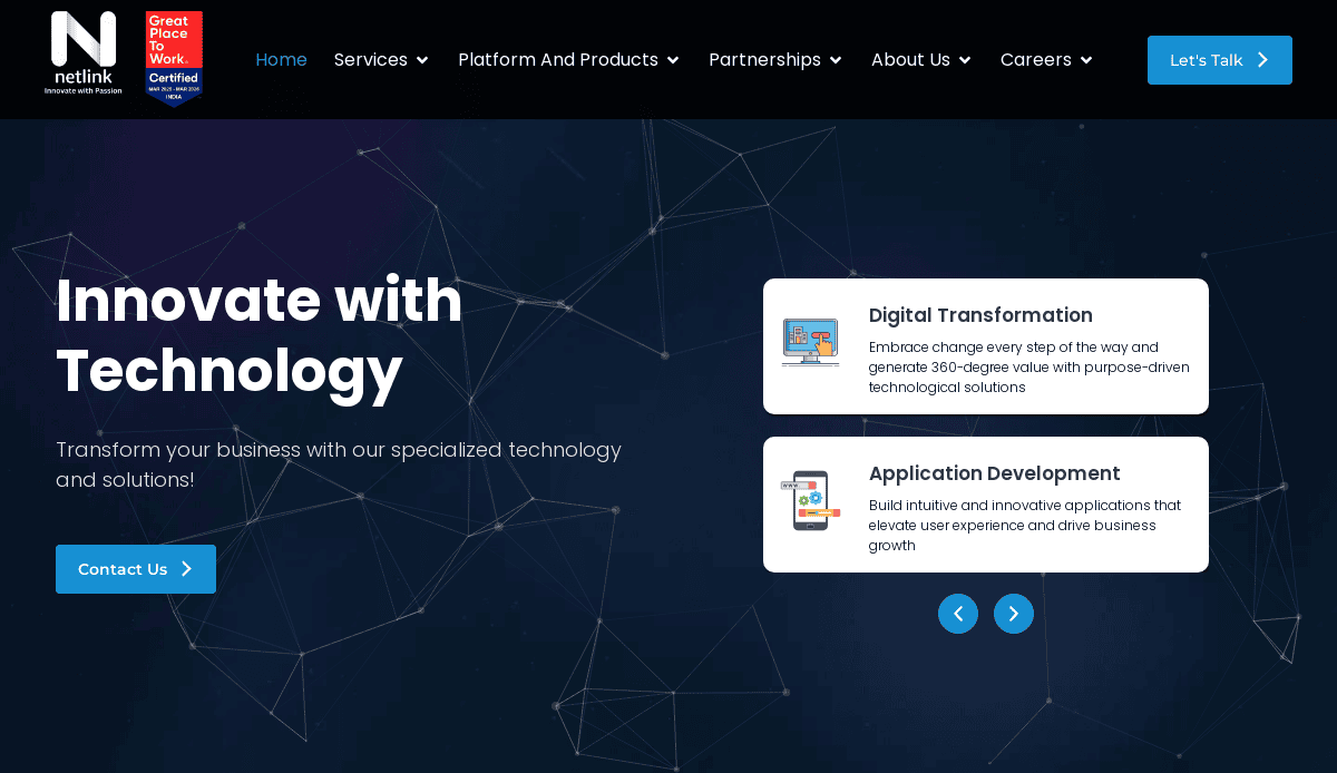
- Location: Chicago, IL
- Key Takeaways:
- Modern design with a focus on showcasing IT solutions.
- Responsive design ensures accessibility across devices.
- Integration of client testimonials to build trust.
Ready to Build a Website That Performs Like Your Best Salesperson?
You’ve seen what makes top-performing IT company websites succeed—now it’s time to turn insights into action. Whether you’re starting from scratch or ready for a redesign, your website should showcase your technical expertise, generate quality leads, and grow with your business.
Our full-service digital marketing agency specializes in professional IT company website design that blends sleek visuals with strategy-driven performance. From development to SEO and conversion optimization, our team is here to help you elevate your digital presence.
Let’s make your website your strongest digital asset. Schedule a free consultation to get started today.
Your IT Website Design Questions Answered (FAQs)
What makes a website effective for an IT company?
An effective IT website clearly communicates your services, demonstrates expertise, includes strong CTAs, and is easy to navigate. Learn more in our Web Design Services page.
How often should an IT company update its website?
You should review your website every 12-18 months and perform regular WordPress maintenance monthly. Frequent content updates and performance checks are also key to maintaining an uncluttered, professional, and modern website.
What pages should an IT company website include?
Essential pages include Homepage, Services, About, Case Studies, Blog, and Contact. For details on how to build these effectively, see our Custom WordPress Design solutions.
Why is mobile responsiveness so important?
Mobile devices account for more than half of web traffic. A feature-rich, mobile-friendly design enhances usability, increases conversions, and boosts your SEO rankings.
How do visuals impact the effectiveness of an IT website?
Visuals enhance brand trust, simplify complex services, and create engagement. Don’t hesitate to use colors and bold print with fonts, in addition to whitespace where needed. Use original imagery, consistent branding, and purposeful animations.
Can SEO be integrated into the design process?
Absolutely. Keyword research, proper HTML tags, optimized page speed, and structured content should all be included during the technology website customization design phase.
How do I get more leads from my IT website?
Use clear CTAs, benefit-driven copy, and strategically placed forms, especially on landing pages. A/B test elements like headlines and button placements for information on products to increase conversions.
What’s the best platform to build an IT website on?
WordPress is highly recommended for tech websites because of its flexibility, SEO-friendliness, and wide support network. It’s also ideal because it has free, modern, and clean templates to showcase your expertise as a tech company. It doesn’t hurt that they have ongoing updates and integrations.
How long does it take to build an IT company website?
Depending on complexity, it usually takes 6–12 weeks for a professional design. This includes planning, design, development, content, and testing.
Do you offer support after the site launches?
Yes, as professional web developers, we offer comprehensive post-launch support, including updates, troubleshooting, and strategy consulting.


