Just looking for our Best Deck Builder Website examples list?
Why Building a Deck Building Company Website That Drives Real Results is More Important Than Ever
Today, a website is the engine that drives quote requests, form submissions, and new projects. Whether you’re a seasoned deck designer or launching your first deck business, a high-performing, responsive design can dramatically improve your visibility, attract potential clients, and boost conversions.
With competition heating up across local search and platforms like Google, it’s no longer enough to rely on referrals or local home shows. Today’s homeowners start their journey online, researching ideas, evaluating services, and exploring design inspiration before making a call. Your site needs to reflect the quality of your work, from interactive deck design tools and 3D planners to mobile-optimized project galleries that showcase completed decks and custom deck builds.
This guide will walk you through everything from integrating free deck designer software and optimizing for SEO to aligning with local building codes and crafting compelling calls to action. Whether you specialize in wood or composite decking or multi-level designs, we’ll show you how to curate your dream website that converts visitors into satisfied clients.
If you’re ready to turn browsers into booked projects, keep reading. This isn’t just another deck planner blog—it’s the complete blueprint for dominating online in the deck construction industry.
Website Planning & Purpose: Laying the Foundation Right
Before you design a site, it’s essential to understand what success looks like in the industry. The planning phase is where your goals are aligned with your target audience’s expectations—and where many marketers miss the mark. Effective planning ensures every aspect of your site—from content to functionality—works together to drive inquiries, highlight craftsmanship, and generate leads.
Start by defining the core purpose of your website. Are you focused on promoting premium outdoor living solutions in high-end neighborhoods? Or are you offering budget-friendly options for suburban families searching for free plans and building resources? This clarity influences your messaging, tone, layout, and even your calls to action.
Next, map your buyer’s journey. Most project planning processes start with research. Potential customers are browsing for design ideas, exploring materials like composite or wood decking, plus looking at completed projects. Your content should guide them through awareness (blog posts, gallery), consideration (service pages, deck design software), and decision (contact forms, free consultation CTAs).
Finally, plan your site structure around intuitive navigation and responsive design. A typical sitemap includes a homepage, services, gallery, about, blog, and contact. Each page must be optimized for mobile devices, since a majority of deck construction research now happens via phone.
By grounding your site in a clear purpose and thoughtful strategy, you’ll create a site that attracts traffic, establishes trust, and drives results. That’s the real foundation of growth.
Design Principles: Crafting a Website That Reflects Quality and Trust
Great design isn’t just about aesthetics—it’s about aligning form with function to support business goals. The principles of clarity, hierarchy, consistency, and conversion-focused usability are non-negotiable. Each design element should help you guide visitors toward exploring completed projects, requesting a free consultation, or using a design tool to customize your vision.
Visual hierarchy should make it obvious where to look first. Use bold headlines to introduce sections like “Outdoor Living Solutions” or “Multi-Level Deck Designs,” supported by short paragraphs and strong visuals. Apply design inspiration from your best work that impresses, loads quickly, and displays well on all smart devices.
Consistency in branding cements trust. Your site’s color palette, typography, and tone should reflect your company’s identity and appeal to your local audience. If you target families building their first outdoor space, the tone should be warm and helpful. If you cater to luxury clients looking for 3D deck planning software, elevate the aesthetic and focus on innovation.
Also, prioritize responsive design. Your layout, buttons, and navigation must adapt seamlessly to phones and tablets. Make forms simple and quick, especially when requesting a free estimate or downloading free design plans. Eliminate any friction that might slow down form submissions.
Finally, every page should include a clear call to action. Whether it’s “View Completed Deck Projects” or “Design Your Deck Online,” your CTAs should be compelling, benefit-driven, and visible without scrolling. These best practices turn a visually attractive site into a high-converting marketing asset.
Content & Navigation: Structuring for Clarity and Engagement
Effective content and navigation are the backbone of any successful website. Visitors arrive with specific goals—getting deck ideas, checking service areas, or requesting a free estimate. Your website should anticipate these needs and guide them through a seamless experience using clean layouts, logical structure, and intuitive pathways.
Start with a navigation bar that clearly labels your core pages: Home, Services, Gallery, About, Blog, and Contact. If you offer multiple deck services or operate in several local home markets, use dropdowns to organize by category or region. Always keep your most important CTA—such as “Schedule Your Free Consultation”—accessible at the top right of every page.
Your content should be structured with both users and search engines in mind. Use H1 for your main page title, H2s for key sections, and H3s for supporting points. Incorporate long-tail keywords like “custom composite deck builder in [City]” naturally into your headings and paragraphs without sounding forced. Break up large text blocks with subheadings, bulleted lists, and visuals to maintain reader attention.
On service pages, include details like materials used (e.g., wood decking, composite decking), project timelines, and local expertise in local building codes. On gallery pages, organize completed projects by deck type, material, or layout (e.g., multi-level deck, small backyard decks). Include project details and a CTA under each image, encouraging visitors to “Complete Your Design” or “Request a Quote.”
Finally, embed internal links within content to encourage deeper browsing, such as linking your “Deck Planning Tips” blog post on your services page. This structure improves optimization and keeps users engaged longer, increasing the chances of form submissions and conversions.
Visual Elements: Bringing Your Experience to Life Online
Visual elements create trust, clarify information, and connect with a customer’s lifestyle goals. High-impact visuals like large-format photography, interactive 3D visualizations, and video walk-throughs make your work real and relatable. Your audience wants to picture themselves enjoying that outdoor living space, and visuals help them do just that.
Start with a strong hero image or video on your homepage that represents your signature style. Whether it’s a multi-level build in a wooded backyard or a sleek composite design overlooking a pool, it should amplify the quality of your work and the lifestyle it supports. Follow this with images throughout your site that are sharp, well-lit, and optimized for fast loading on all mobile devices.
Use project galleries to your advantage. Feature completed projects with before-and-after sliders, filterable categories, and detailed descriptions of the materials, layout, and challenges overcome. These exhibit design skills, help with local SEO when you geo-tag images and include city-specific metadata.
Icons and visual cues should guide navigation without overwhelming users. Use design tools like hover effects to highlight clickable areas and infographics to explain deck planning steps, warranty options, or local building requirements. Visual structure helps reduce bounce rates and keeps visitors moving through your content.
Remember, visuals are a key trust builder. Quality imagery signals professionalism. Clean design and consistent branding throughout the site visually reinforce your reliability, ultimately increasing the likelihood of form submissions and quote requests.
Ongoing WordPress Maintenance: Keeping Your Website Performing Like New
Maintaining your WordPress site is essential if you want it to continue attracting leads, staying secure, and ranking well in local search. Too many contractors invest in beautiful websites but neglect the technical upkeep that keeps them running smoothly. A neglected website becomes a liability, leading to outdated content, broken features, and reduced visibility.
Routine updates are the foundation of site health. This includes updating WordPress core files, plugins, and themes to patch security vulnerabilities and maintain compatibility. Delayed updates can expose your site to cyber threats or cause layout issues that frustrate users and discourage form submissions.
Regular backups protect your investment. Backups should be scheduled daily or weekly, depending on how frequently your site is updated. These backups ensure that if a technical glitch or hack occurs, your content and data can be fully restored with minimal disruption.
Performance monitoring is also critical. Broken links, slow load times, and downtime all hurt SEO and conversion rates. Use uptime monitoring tools and performance scans to ensure every page—including your service details, project galleries, and free estimate forms—is always available and loading fast across mobile devices.
Security plugins and firewalls provide added protection. For businesses managing quote requests and private client details, securing your site builds trust and meets privacy expectations. Make sure SSL certificates are current, malware scans are automated, and user login attempts are limited.
Finally, treat web maintenance as a monthly service, just like regular maintenance on a physical deck. When done right, it extends the life of your investment, protects your online presence, and ensures your business continues to thrive in a competitive market.
Best Deck Builder Web Design Examples
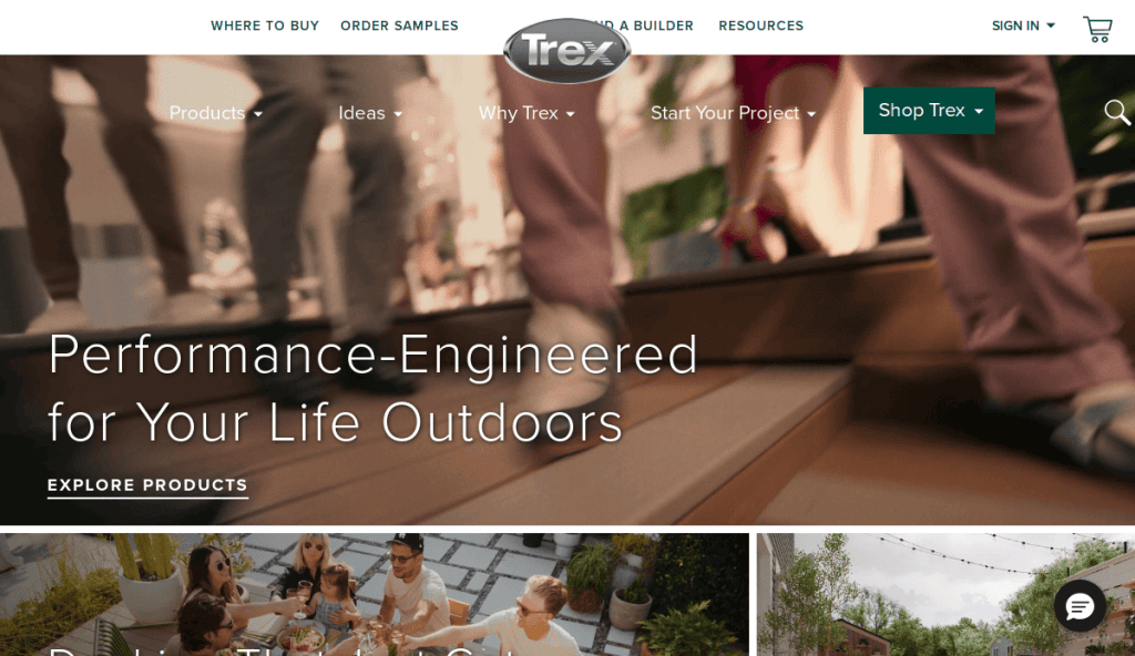
1. Trex
Location City In The US: Winchester, VA (Corporate Headquarters)
3 Key Takeaways:
- Interactive Deck Designer Tool: Offers a comprehensive online tool for users to design their own decks in 3D, enhancing engagement and planning.
- Extensive Material & Design Inspiration: Showcases a wide range of decking materials, colors, and design plans, inspiring potential customers.
- “Find a Builder” Functionality: Connects users directly with TrexPro® deck builders in their area, streamlining the path from design to construction.
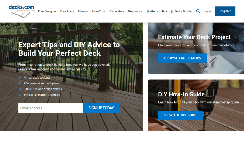
2. Decks.com
Location City In The US: Not a service provider, but a resource (owned by Internet Brands, based in El Segundo, CA)
3 Key Takeaways:
- Rich Resource Hub: Provides extensive how-to guides, deck plans, DIY articles, and project estimators, positioning itself as an authority.
- Virtual Deck Designer: Offers a tool for users to design their decks virtually, aiding in planning and visualization.
- Community and Expert Content: Features articles from renowned deck builders and architects, adding credibility.
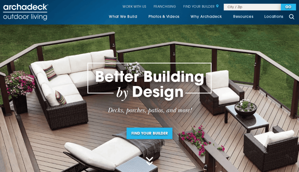
3. Archadeck
Location City In The US: Nationwide (Franchise, corporate office in Richmond, VA)
3 Key Takeaways:
- Strong Portfolio & Galleries: Features numerous high-quality images of completed projects, inspiring potential clients with diverse styles and sizes.
- Clear Service Offerings: Clearly outlines their custom deck, porch, and outdoor living solutions, making it easy for users to understand their services.
- Prominent Consultation Request: A clear call to action to “Schedule a Complimentary Design Consultation” drives lead generation.
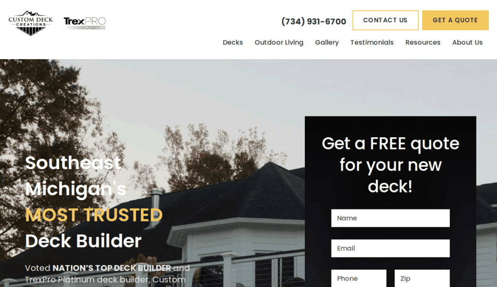
4. Custom Deck Creations
Location City In The US: Canton, MI
3 Key Takeaways:
- Emphasis on Client Experience: Highlights “client experience above all else” and boasts numerous 5-star Google ratings, building immediate trust.
- Awards & Recognition: Prominently displays “Nation’s Top Deck Builder” award, establishing strong credibility.
- Transparent Process: Mentions their “proven design-build process” to reassure customers about the project flow.
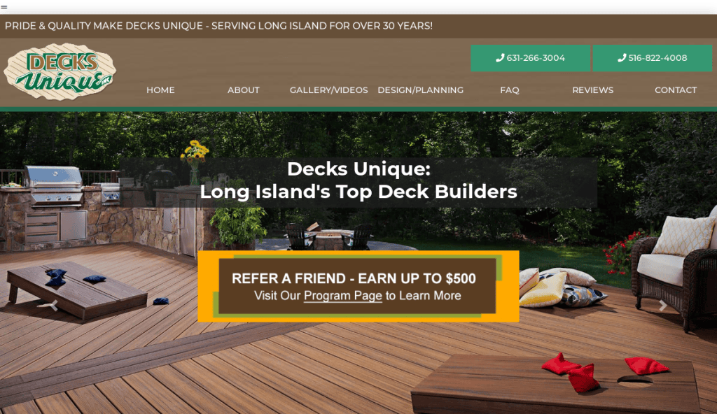
5. Decks Unique
Location City In The US: New York (serving the NY area)
3 Key Takeaways:
- Focus on Innovative Design: Known for creative designs, unique features, and incorporating elements like lighting and built-in seating.
- Customization Emphasis: Highlights bespoke services that help homeowners realize their specific vision for outdoor space.
- High-End Appeal: The design and content suggest a focus on premium, custom-built decks.
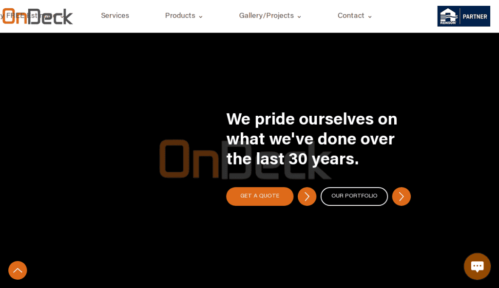
6. OnDeck
Location City In The US: Lake Zurich, IL (serving Lake County, Cook County & Wisconsin)
3 Key Takeaways:
- Comprehensive Outdoor Living Focus: Showcases expertise beyond just decks, including porches, pergolas, and outdoor kitchens, broadening their appeal.
- Long-Standing Experience: Highlights over 37 years of expertise, building significant trust and credibility.
- Detailed Service Area: Clearly lists the specific counties and states they serve, aiding local customers.
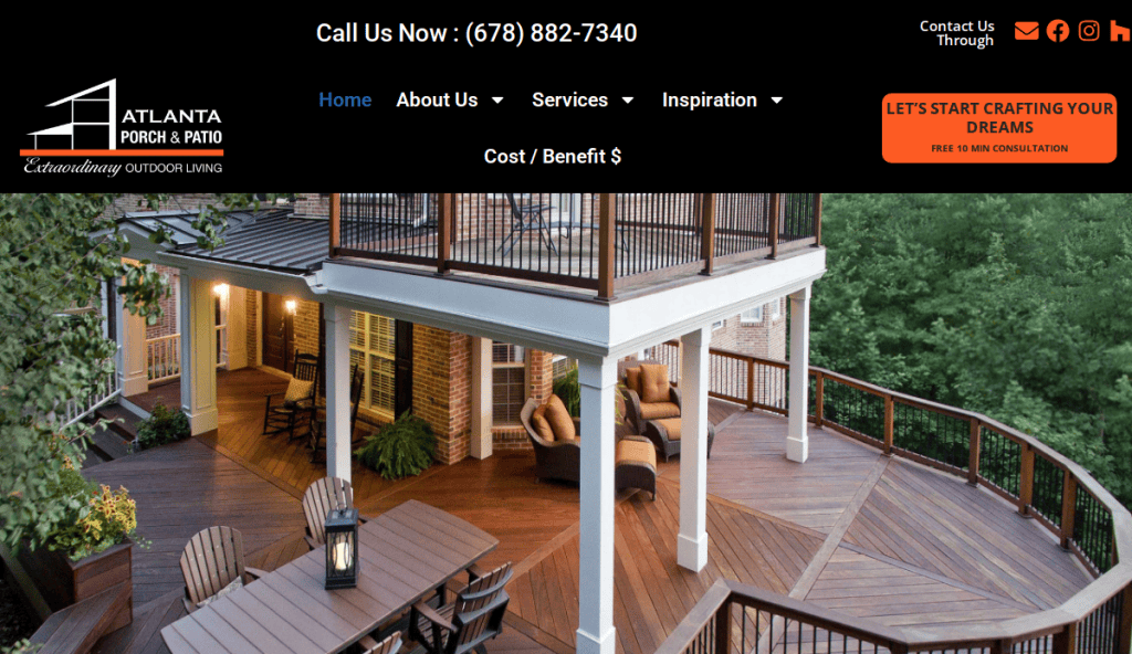
7. Atlanta Porch & Patio
Location City In The US: Marietta, GA (serving Metro Atlanta area)
3 Key Takeaways:
- Mission-Driven Approach: States a clear mission to “turn clients’ ideas, dreams, and visions into personalized, tangible outcomes,” resonating with customers.
- Licensed & Insured: Clearly states their team is licensed, insured, and up-to-date on codes and trends, assuring professionalism.
- Step-by-Step Consultation Process: Outlines their consultation and design plan process, setting clear expectations.
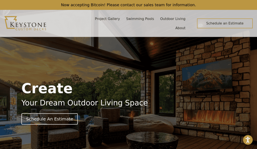
8. Keystone Custom Decks
Location City In The US: Northeast US (serving Pennsylvania, Maryland, New Jersey, Delaware, New York)
3 Key Takeaways:
- Emphasis on High-End & Luxury: Positions itself as a builder of “luxurious outdoor living spaces” with high-end, custom-designed decks.
- Integrated Outdoor Features: Highlights expertise in integrating various outdoor features, appealing to clients seeking comprehensive solutions.
- Strong Visual Galleries: Features visually stunning projects that showcase their craftsmanship.
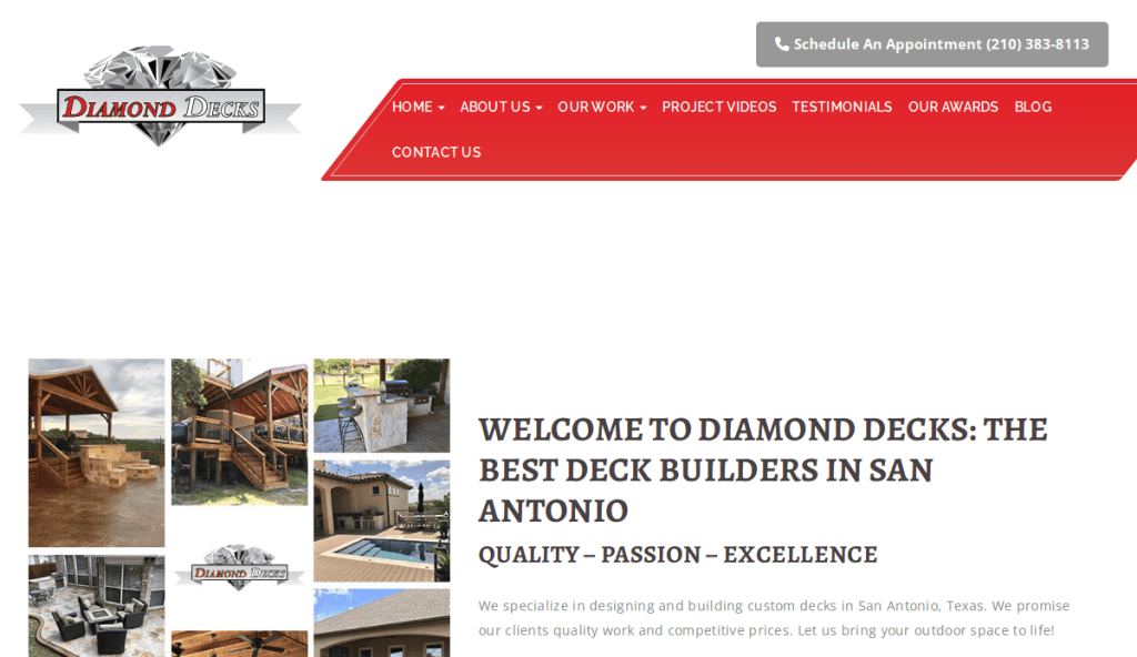
9. Diamond Decks
Location City In The US: Maryland (serving the Maryland area)
3 Key Takeaways:
- Exceptional Craftsmanship Focus: Emphasizes high-quality craftsmanship and a wide range of custom outdoor features.
- Precision & Creativity: Highlights their ability to bring client visions to life with “precision and creativity.”
- Diverse Project Showcase: Features examples of multi-level decks and intricate railing systems
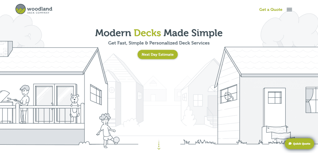
10. The Woodland Deck Company
Location City In The US: Ohio (serving the Ohio area)
3 Key Takeaways:
- Durability & Craftsmanship: Focuses on building decks that “stand the test of time” with high-quality craftsmanship and durable materials.
- Meticulous Attention to Detail: Emphasizes their precision and personalized customer service.
- Clear Service Area: Indicates their primary service region.
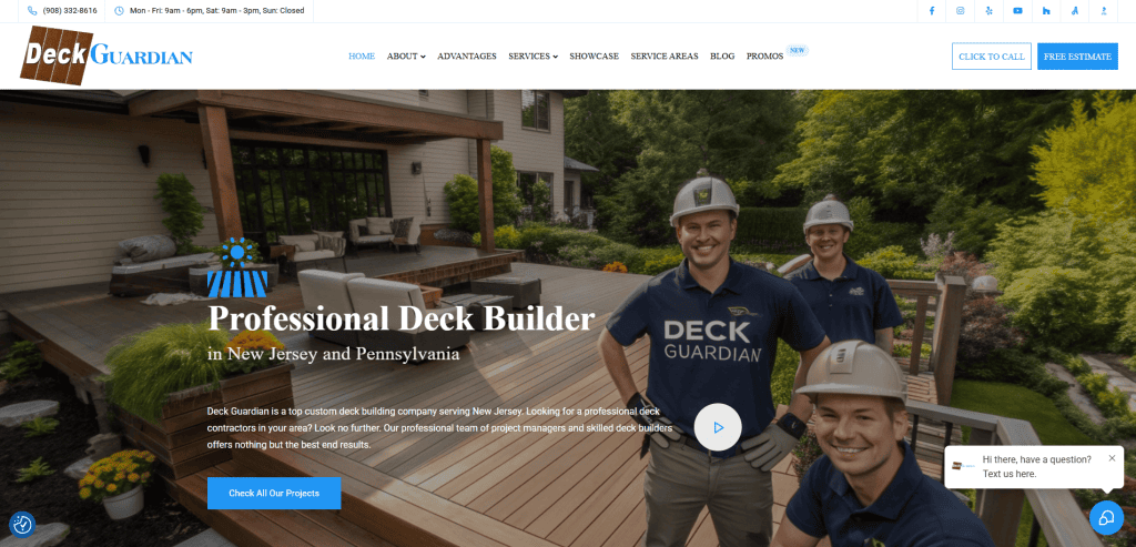
11. Deck Guardian
Location City In The US: New Jersey (serving the New Jersey area)
3 Key Takeaways:
- Transformation Focus: Emphasizes transforming outdated decks into modern outdoor spaces.
- Quality & Client Satisfaction: Highlights a commitment to quality and ensuring client satisfaction.
- Custom Design Emphasis: Offers custom designs tailored to client needs.
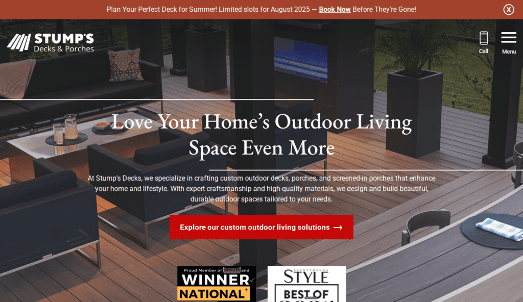
12. Stumps Decks & Porches
Location City In The US: Ohio (serving the Ohio area)
3 Key Takeaways:
- Functionality & Style: Focuses on building beautiful outdoor spaces that offer both practicality and aesthetic appeal.
- Specialized Services: Clearly outlines their specialization in decks, porches, and screened-in patios.
- Creating Outdoor Retreats: Appeals to clients looking for a perfect outdoor escape.
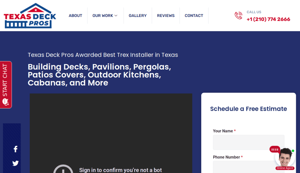
13. Texas Deck Pros
Location City In The US: Texas (serving various areas in Texas)
3 Key Takeaways:
- Local Expertise: Positions itself as a local expert in Texas deck building.
- Clear Service Scope: Details the types of decks and outdoor structures they build.
- Customer-Centric Approach: Implies a focus on understanding and delivering on customer needs.
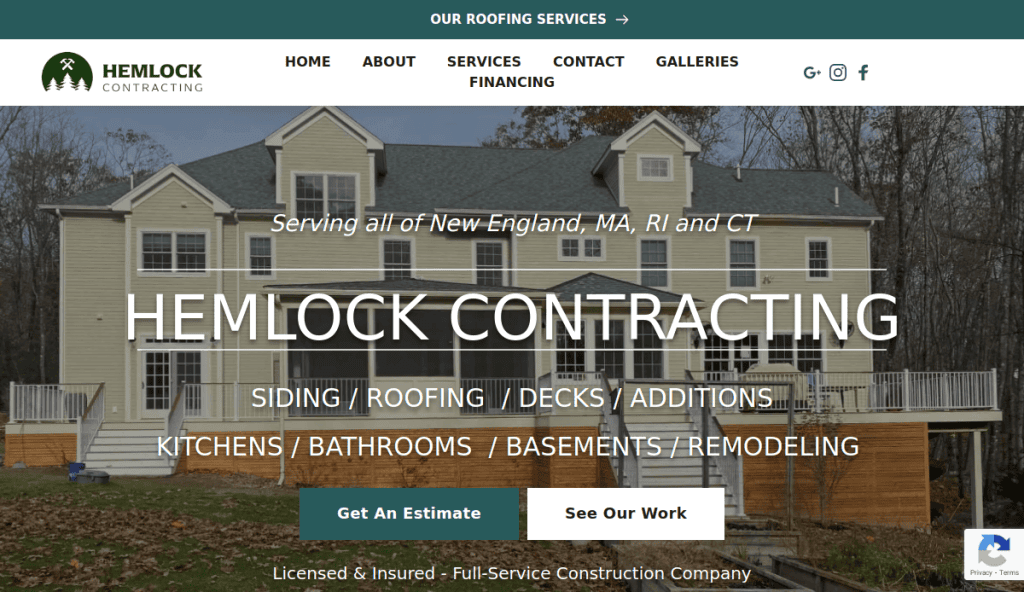
14. Hemlock Construction
Location City In The US: Massachusetts (serving the Massachusetts area)
3 Key Takeaways:
- Eco-Friendly Materials: Stands out for its use of sustainable and environmentally friendly materials.
- Custom Wood Designs: Specializes in custom wood designs that integrate well with natural landscapes.
- Environmental Consciousness Appeal: Attracts clients who prioritize sustainability.
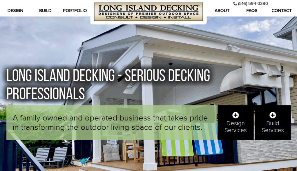
15. Long Island Decking Inc.
Location City In The US: Long Island, NY
3 Key Takeaways:
- Custom Deck Specialization: Focuses on high-quality custom deck designs and full outdoor renovation services.
- Reputation for Quality: Has earned a reputation for quality work in their local area.
- Enhancing Outdoor Spaces: Emphasizes solutions that improve outdoor living areas.
The examples below reflect the likely design philosophy for deck builders that our professional webmasters might produce, though not each was specifically designed by our agency.
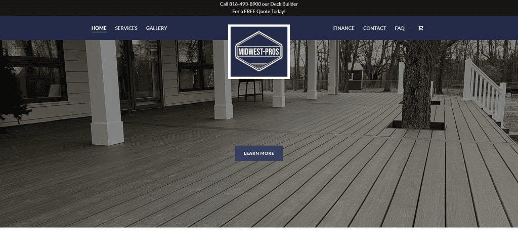
16. Midwest Deck Pros
Location In The US: Missouri
3 Key Takeaways:
- Stunning Visual Portfolio: Features a prominent, full-screen image gallery or video showcasing various completed deck projects, making a strong visual impact.
- Clear Service Categories & Materials: Easily navigable sections for different deck types (e.g., composite, wood, multi-level) and materials, with detailed descriptions.
- Direct “Request a Quote” Form: A straightforward, conversion-focused form prominently displayed to capture leads efficiently.
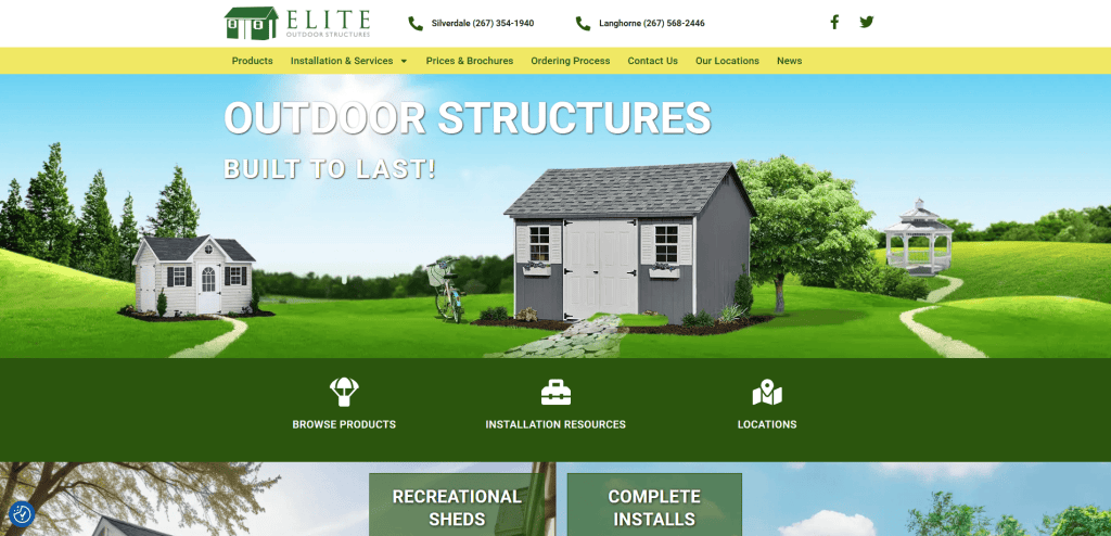
17. Elite Outdoor Structures
Location In The US: Pennsylvania
3 Key Takeaways:
- Modern & Clean Aesthetic: A minimalist design with a focus on high-quality photography and plenty of white space, conveying sophistication and professionalism.
- Integrated Testimonials & Reviews: Features a dynamic testimonial slider or dedicated section with genuine client feedback to build trust.
- “Why Choose Us” Section with Value Props: Clearly articulates their unique selling points (e.g., licensed, insured, experienced, custom designs) to differentiate themselves.
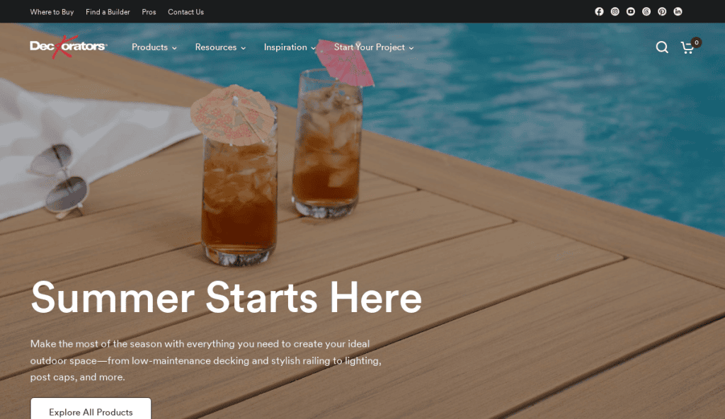
18. Deckorators
Location In The US: Michigan
3 Key Takeaways:
- Hero Section with Strong Value Statement: A compelling headline and sub-headline immediately communicate the company’s core benefit, accompanied by an attractive image or video.
- Optimized for Local SEO: Content is strategically written with location-specific keywords and includes a service area map or list to attract local clients.
- Streamlined Contact Options: Multiple ways to get in touch (phone number clickable, email, online form) are prominently displayed for user convenience.
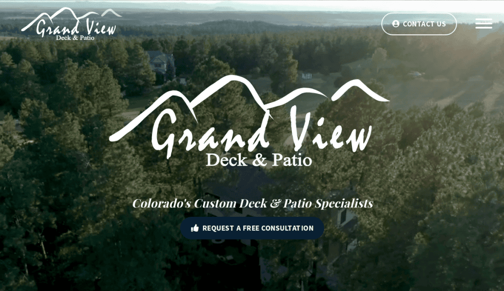
19. Grand View Decks
Location In The US: Colorado
3 Key Takeaways:
- Interactive Design Process Explanation: Visuals or infographics illustrating their step-by-step design and build process, demystifying the project for clients.
- Blog/Resource Section: Offers valuable content like “Deck Maintenance Tips,” “Choosing the Right Materials,” or “Latest Deck Trends” to establish expertise and improve SEO.
- Before & After Gallery: A dedicated section showing dramatic transformations from old/no deck to a beautiful new outdoor space, highly persuasive for potential clients.
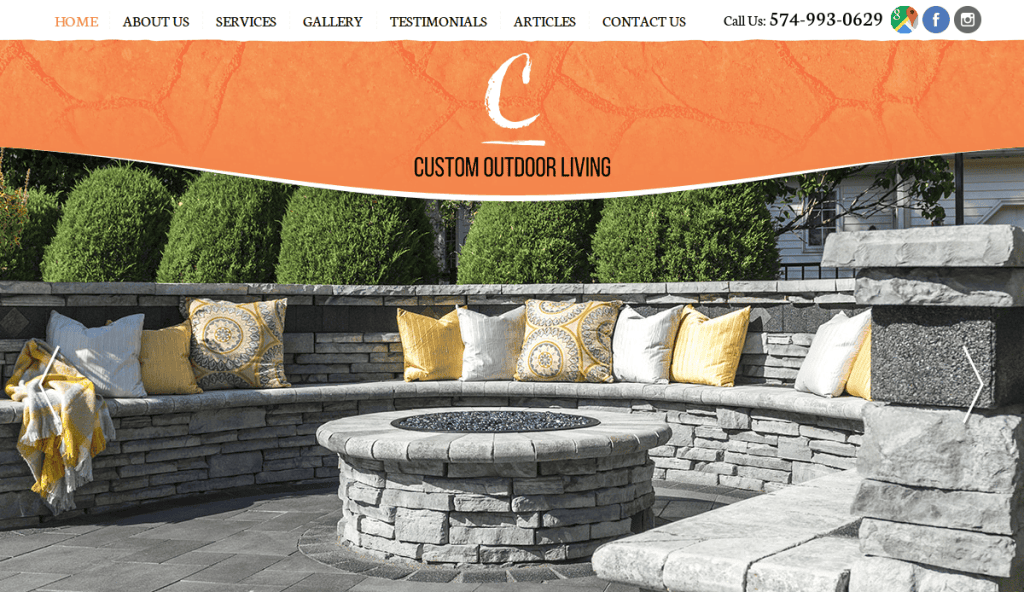
20. Custom Outdoor Living
Location In The US: Michigan
3 Key Takeaways:
- Emphasis on Lifestyle & Experience: Imagery and copy focus on the joy and benefits of outdoor living (e.g., entertaining, relaxing) rather than just the structure itself.
- Client Showcase with Project Details: Each portfolio entry includes a brief description of the project’s scope, materials used, and specific challenges overcome.
- Mobile-First Responsive Design: Ensures the site looks and functions perfectly on smartphones and tablets, crucial for users researching on the go.
Get a Custom-Built Website That Grows Your Deck Business
The challenges for growing professionals don’t stop at designing and building the perfect deck. A high-performing, well-maintained website is just as critical to supporting your growth. From highlighting beautiful deck galleries to managing quote requests under varied site conditions, your site should serve as the digital extension of your craftsmanship and service.
Whether you need a fully designed website, better integration with your Google Business Profile, or assistance presenting different design options online, our full-service digital marketing agency is here to support your success. Let us help you create a seamless online experience that generates real results for your building projects.
Schedule a free consultation with our top-tier agency and turn your website into your most powerful sales tool.
FAQs: Answers to Common Deck Builder Website Questions
What should a professional deck builder’s website include?
It should feature a homepage, services overview, image galleries of specific deck builds, testimonials, blog content, and a strong call to action. Use tools like responsive web design to make it mobile-friendly and optimized for SEO.
How do I attract local customers online?
Focus on local SEO strategies like adding your Google Business Profile, embedding maps, and including city-specific keywords on landing pages. Include localized galleries of building decks in real neighborhoods to boost credibility.
What is the best way to showcase professional projects?
Use high-resolution photos, before-and-after sliders, and sort galleries by material, layout, or project type. Highlight each beautiful deck with captions that explain materials and the client’s goals.
How often should my WordPress website be updated?
Update plugins, themes, and core WordPress files at least monthly. Run performance scans and backups weekly to ensure site stability and protect leads. Website maintenance plans help automate this.
Can I add a free tool for planning decks?
Yes, offering a free tool like a deck cost estimator or design configurator can increase engagement and drive leads. These tools help users visualize and plan their best deck before contacting you.
What’s the ideal layout for a deck contractor site?
Use a clear structure: homepage > services > project gallery > about > blog > contact. Make your quote request or “design your deck” CTA visible on every page to guide users effectively.
How do I optimize my site for SEO?
Target long-tail keywords (e.g., “composite deck builder in [City]”), use meta descriptions, header tags, alt text, and internal links. Review professional SEO services for full optimization support.
Do I need to write blog posts for a deck-building service website?
Absolutely. Blogging about seasonal maintenance tips, design trends, or FAQs helps attract traffic and supports keyword strategy. Answering common questions positions your brand as an expert.
How can I highlight different design options?
Use visual content like carousels and grid layouts to feature different design options, including materials, layouts, and custom features. Help clients visualize their dream deck before they call.
Why is mobile responsiveness important?
Most users search and browse from phones. A non-mobile-friendly site leads to high bounce rates and lost leads. Responsive design ensures a smooth online experience across devices.

