Just looking for our Best Senior Living Website examples list?
Key Takeaways:
A well-crafted and professional website is no longer optional—it’s a critical tool for attracting and converting potential residents and their families. Here are the key insights from our comprehensive guide:
- Senior-Centered UX Matters
Design with empathy. A successful website prioritizes intuitive navigation, readable typography, and accessibility features tailored to older users and their loved ones. ADA compliance is not just ethical—it’s essential. - SEO is a Growth Lever
Search engine optimization isn’t an afterthought. Implementing senior living-specific keywords, metadata, and structured content helps your community appear in Google searches and AI-powered summaries, leading to increased traffic and qualified leads. - High-Quality Visuals and Virtual Tours Build Trust
Authentic photography and 360° virtual tours allow prospective residents to visualize life in your community. These elements create emotional engagement and encourage deeper exploration of your offerings. - Strategic Content Drives Conversions
Clear, benefit-driven copywriting that speaks directly to seniors and their families turns visitors into leads. Key content elements—like testimonials, FAQs, and service pages—must be strategically placed to guide decisions. - Mobile Optimization is Non-Negotiable
With more families researching on the go, your site must function flawlessly on mobile devices. A responsive layout ensures the user experience remains strong across screen sizes. - Strong CTAs and Lead Funnels Boost Inquiries
Whether it’s a “Schedule a Tour” button or a gated brochure download, every page should move the visitor toward action. Integrated lead generation strategies can significantly improve conversions. - Custom Branding Reflects Your Community’s Identity
Your website should convey your unique culture and values. From fonts and colors to messaging tone, cohesive branding builds credibility and creates emotional alignment.
Why Senior Living Website Design is Your Community’s Most Valuable Marketing Asset
Your website is often the first impression a prospective resident or their family has of your senior living community. And first impressions are everything.
Today, a site must be more than just informative—it needs to be intuitive, emotionally resonant, and optimized for action. A high-performing website doesn’t just reflect your business; it drives business outcomes. From boosting search engine visibility to increasing tour bookings and inquiries, the right design choices translate directly into measurable ROI.
This guide unpacks everything you need to know about crafting a senior living website that doesn’t just look good, but delivers results. Whether you’re launching a new site or improving an existing one, we’ll walk through design fundamentals, search engine optimization tactics, copywriting essentials, and real-world examples to inspire your next steps.
Website Planning & Purpose: Setting the Foundation for Success
Before diving into design elements or content strategy, senior living communities must clarify their website’s purpose and map out a thoughtful plan. This planning phase is where successful digital transformations begin.
For the senior living industry, a website serves multiple high-stakes functions. It acts as a digital brochure, a lead generation engine, and a trust-building platform. During the planning stage, it’s critical to identify core objectives: Are you aiming to increase tour bookings? Improve awareness? Simplify communication with families? Each goal will influence the site’s architecture, content priorities, and functionality.
Planning also includes auditing your existing site (if one exists) to evaluate what’s working and what’s not. Look at bounce rates, engagement metrics, form submissions, and other key data to uncover pain points. Align these findings with your community’s unique value propositions and resident personas.
Another crucial component is stakeholder alignment. Marketing teams, sales staff, operations managers, and executive leadership should collaborate early to ensure that the final product meets everyone’s needs. Misalignment during planning often results in delayed timelines and underperforming sites.
Finally, define technical requirements early. Determine which content management system (CMS) will power your site, how integrations with CRM or marketing automation tools will function, and what scalability needs you anticipate for the next 3–5 years.
By investing time into comprehensive planning and defining a clear website purpose, senior living spaces can ensure their online presence serves as a powerful business asset, not just a digital placeholder.
Design Principles: Building a Website That Resonates and Converts
When designing a website, aesthetics alone are not enough. Every design element must serve a strategic purpose, helping to connect emotionally with visitors while driving measurable engagement. Here are the essential design principles tailored to this industry:
Simplicity and Clarity
Senior living websites must communicate with clarity. A clean layout with generous white space, intuitive menus, and concise headings helps guide users efficiently. Avoid clutter and complexity—visitors should find what they need in just a few clicks.
Accessibility and Inclusivity
Design for inclusivity from the start. Use high-contrast color schemes, scalable font sizes, and screen-reader compatibility to meet ADA standards and ensure that older users and those with visual impairments can navigate comfortably.
Emotional Connection Through Imagery
Photos and videos should be warm, genuine, and community-focused. Show real residents, staff interactions, and events to convey a sense of home and care. Avoid sterile stock images that feel impersonal or generic.
Clear Visual Hierarchy
Typography, spacing, and color should establish a clear visual order. Highlight CTAs with contrasting buttons, and structure pages so that the most important information appears above the fold and is easy to scan.
Trust Signals and Transparency
Design elements should build trust. Prominently feature accreditation logos, partner affiliations, and security certifications. Testimonials, reviews, and staff bios add authenticity and help validate your credibility.
Responsive Design
Mobile responsiveness is not optional. Ensure the design adjusts fluidly across devices and screen sizes, preserving usability without sacrificing aesthetics. This is crucial for family members researching smartphones.
Consistent Branding
From font choices and color palettes to imagery style and tone of voice, your design should reflect your community’s personality and values. Consistency reinforces recognition and builds a cohesive experience across platforms.
By grounding your website in these proven design principles, you create a user-friendly, emotionally resonant digital presence that informs and inspires action.
Content & Navigation: Structuring for Usability and Discovery
Effective content and navigation are the backbone of a website’s success. Visitors come with specific goals—whether it’s finding care options, scheduling a tour, or reviewing amenities. Your site must guide them seamlessly from the landing page to lead conversion.
Clear and Logical Navigation
Use a top-level menu with 5–7 main items to reduce cognitive load. Prioritize pages like Home, About, Services, Floor Plans, Amenities, Testimonials, Blog, and Contact. Drop-down menus should be intuitive and group related content logically.
Sticky navigation bars and clear labels like “Schedule a Tour” or “Explore Services” improve usability. Always ensure that every page is reachable within three clicks from the homepage.
Content Hierarchy and Layout
Content should be structured from general to specific. Start each page with an overview and guide the reader deeper with subheadings, bullets, and CTAs. Use an F-pattern layout and scannable content blocks to align with user reading behavior.
Avoid long text blocks. Instead, break up copy with images, icons, and calls-to-action that encourage interaction. Visual indicators like arrows or contrasting buttons help direct attention to the next steps.
Targeted Content for Each Audience
Segment content to address both seniors and their families. Include dedicated sections or callouts for family caregivers, outlining support services, safety protocols, and resident stories. Provide practical resources like downloadable brochures or FAQ pages.
Ensure every major service line—independent living, assisted living, memory care—has its own optimized page. These should explain offerings clearly and incorporate relevant keywords for optimization.
Internal Linking Strategy
Use contextual internal links to guide visitors and improve search performance. For example, a memory care service page should link to testimonials, team bios, and the contact form. This encourages deeper site exploration and boosts engagement.
By focusing on intuitive navigation and well-structured content, you can ensure that every visitor, regardless of their stage in the decision-making process, finds relevant, actionable information that builds trust and inspires action.
Visual Elements: Enhancing Brand Identity and User Experience
Visual design plays a powerful role in shaping the perception of your community space. The right images, colors, and graphic treatments can communicate compassion, professionalism, and warmth long before a visitor reads a single word.
Photography and Videography
High-resolution, authentic imagery builds emotional connection. Feature real residents, staff, and daily activities to highlight the personality of your community. Include candid moments, smiling faces, and welcoming environments to make the experience feel tangible.
Video content—such as virtual tours, resident interviews, and staff spotlights—can significantly boost engagement. These elements give prospective families a more immersive, transparent look at your offerings.
Color Palette and Typography
Colors should reflect the tone of your brand, typically calm, reassuring, and dignified. Use a consistent palette that aligns with your logo and marketing materials.
Typography should prioritize readability. Choose legible fonts with sufficient contrast and avoid elaborate typefaces that may strain the eyes, especially for older users.
Icons and Graphics
Custom icons and graphics can break up text, guide users, and make complex information more digestible. Use them consistently across your site to enhance comprehension and reinforce branding.
Layout and Whitespace
An uncluttered layout with ample whitespace helps users focus. Avoid overwhelming visitors with dense content or multiple competing elements. Visual breathing room enhances comfort and improves retention.
Consistent Visual Language
From homepage to footer, your site should speak a cohesive visual language. This consistency strengthens recognition and creates a seamless experience across pages, devices, and marketing channels.
Visual elements are more than decoration—they are strategic tools for storytelling, usability, and trust-building. When thoughtfully executed, they elevate your senior living website from informative to unforgettable.
Ongoing WordPress Maintenance: Sustaining Performance and Security
Once your website is live, ongoing maintenance becomes essential for ensuring long-term performance, security, and relevance. WordPress, while user-friendly and powerful, requires consistent updates and oversight to remain effective.
Core, Plugin, and Theme Updates
Most websites on WordPress are built using a core platform, themes for design, and plugins for extended functionality. Each component is updated regularly by developers to address bugs, enhance features, and fix security vulnerabilities. Failing to apply these updates in a timely manner can expose your site to performance issues and cyber threats.
Security Monitoring
Older adults and their families expect to interact with a safe and professional website. Routine maintenance should include proactive monitoring for malware, suspicious login attempts, and outdated security protocols. Installing a robust firewall and implementing regular security scans helps prevent breaches.
Backup and Recovery Planning
A dependable backup system ensures that your website can be restored quickly in the event of a failure or attack. Maintenance plans should include scheduled daily or weekly backups, stored off-site, and tested periodically to confirm reliability.
Performance Optimization
Over time, WordPress sites can accumulate bloat from outdated plugins, unoptimized images, and redundant data. Ongoing maintenance includes cleaning up your database, compressing media files, and using caching tools to improve load times, critical for user retention and search engine ranking.
Accessibility and Compliance Reviews
As regulations and accessibility standards evolve, it’s important to reassess your site regularly. Maintenance should include audits for ADA compliance, usability testing, and updates to ensure your content and code remain inclusive and legally sound.
Content and SEO Refreshes
Website content can become outdated quickly. Maintenance plans should include scheduled reviews of service pages, blog content, and meta tags to keep your messaging current and search-engine-optimized. A consistent publishing schedule also helps maintain strong visibility.
Analytics and Reporting
Tracking the right metrics helps you understand how your site is performing and where improvements are needed. Regular reporting on traffic, bounce rates, form submissions, and goal completions provides insights that inform ongoing strategy.
Ongoing WordPress maintenance is not a one-time task—it’s a continuous investment in your community’s digital health. By staying on top of updates, performance, and content, your website will continue to serve as a reliable and high-performing marketing asset.
Best Senior Living Website Examples
1. Brookdale Senior Living
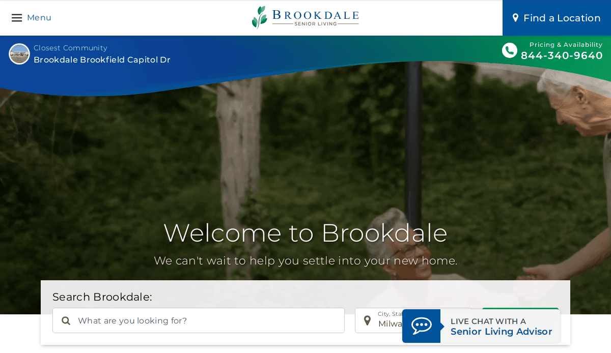 Location: Brentwood, TN
Key Takeaways:
- Engaging full-width images of residents enjoying daily life.
- Clear navigation with sections like Locations, Services, and About Us.
- Warm and professional color schemes that are inviting and easy on the eyes.
2. Atria Senior Living
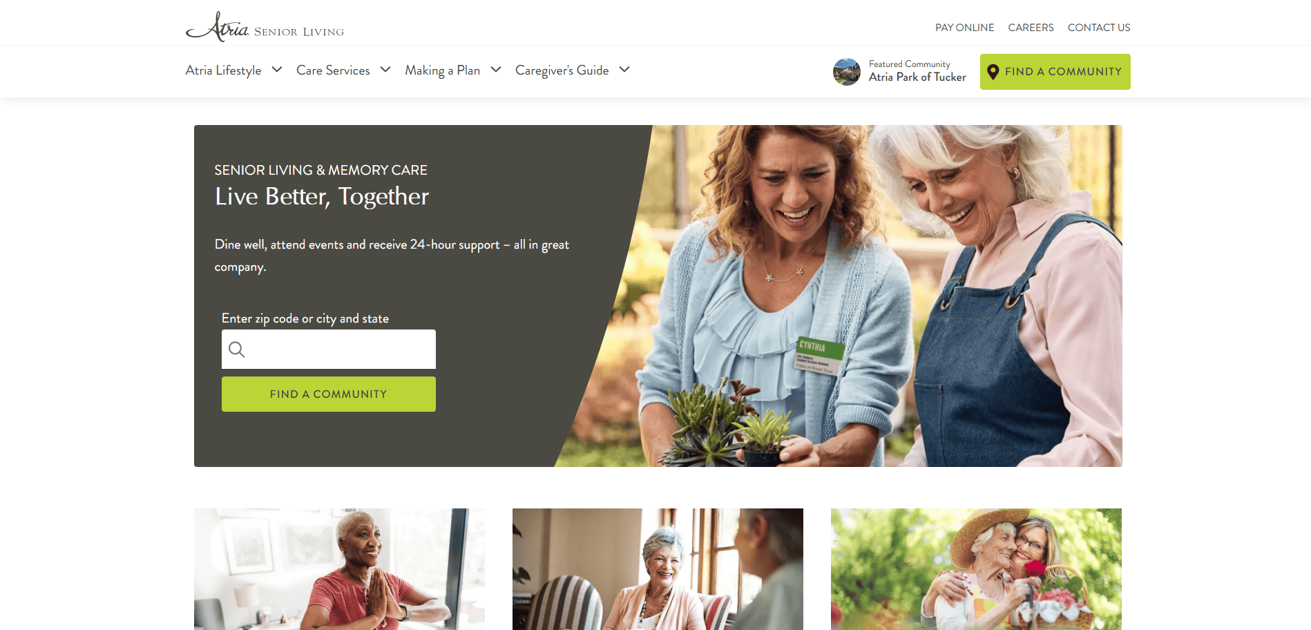 Location: Louisville, KY
Key Takeaways:
- Clean and simple design with a white background and green accents.
- Zip code search bar for easy location-based community searches.
- Live chat option for immediate assistance.
3. Merrill Gardens
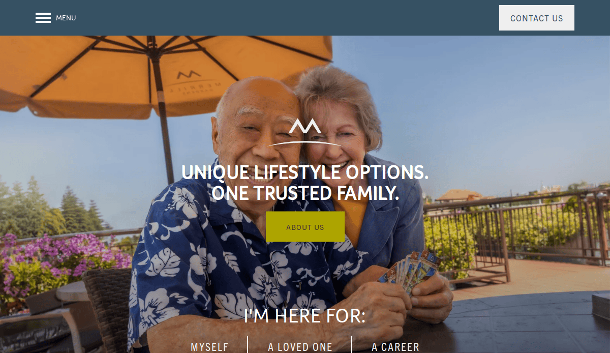 Location: Seattle, WA
Key Takeaways:
- Modern and sophisticated look with a white and blue theme.
- Creative bold title fonts to highlight sections.
- “Find A Community” feature for personalized searches.
4. Solana at The Park
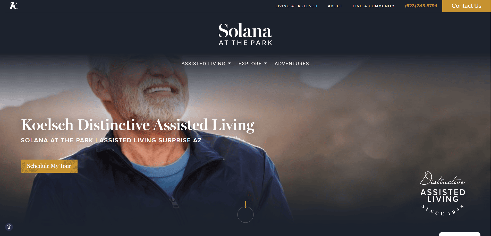 Location: Surprise, AZ
Key Takeaways:
- Glamorous appeal with white and golden color themes.
- Detailed floor plans to comfort prospective residents and families.
- Timeless design elements with golden accents.
5. Life Enriching Communities
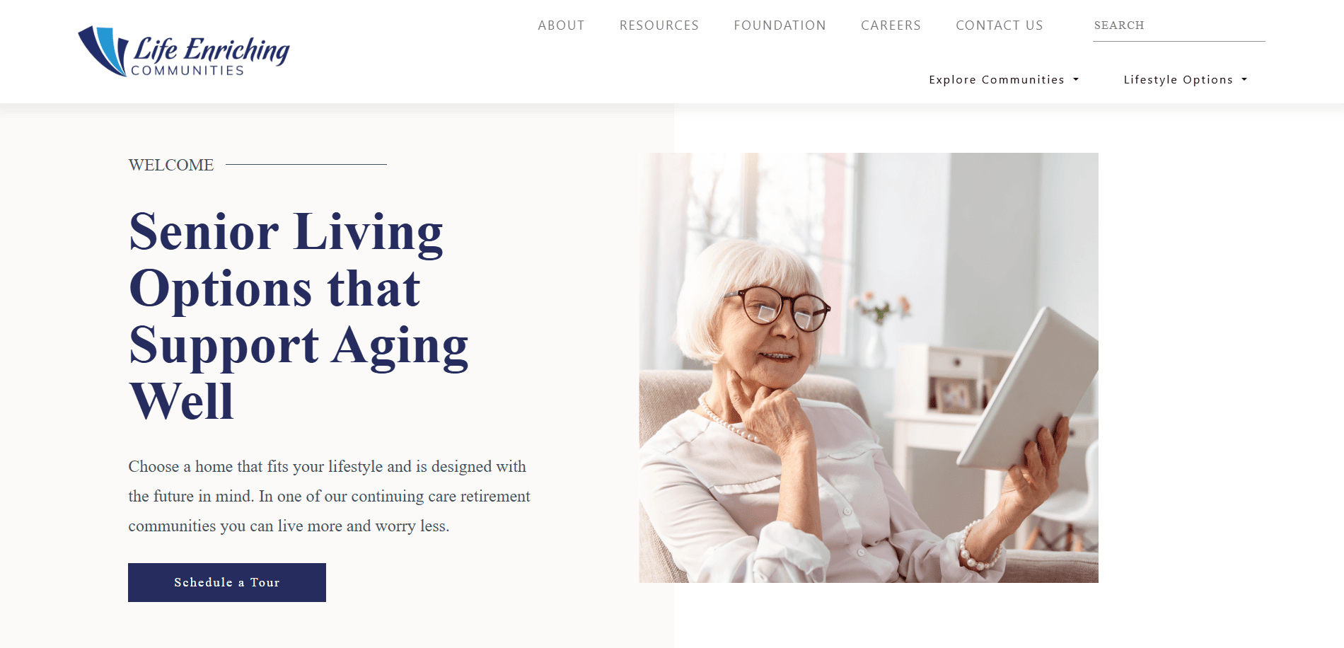
Location: Cincinnati, OH
Key Takeaways:
- Comprehensive lists of services, including independent and community living.
- Detailed blogs about various communities.
- Use of white space to enhance readability.
6. Sunrise Senior Living
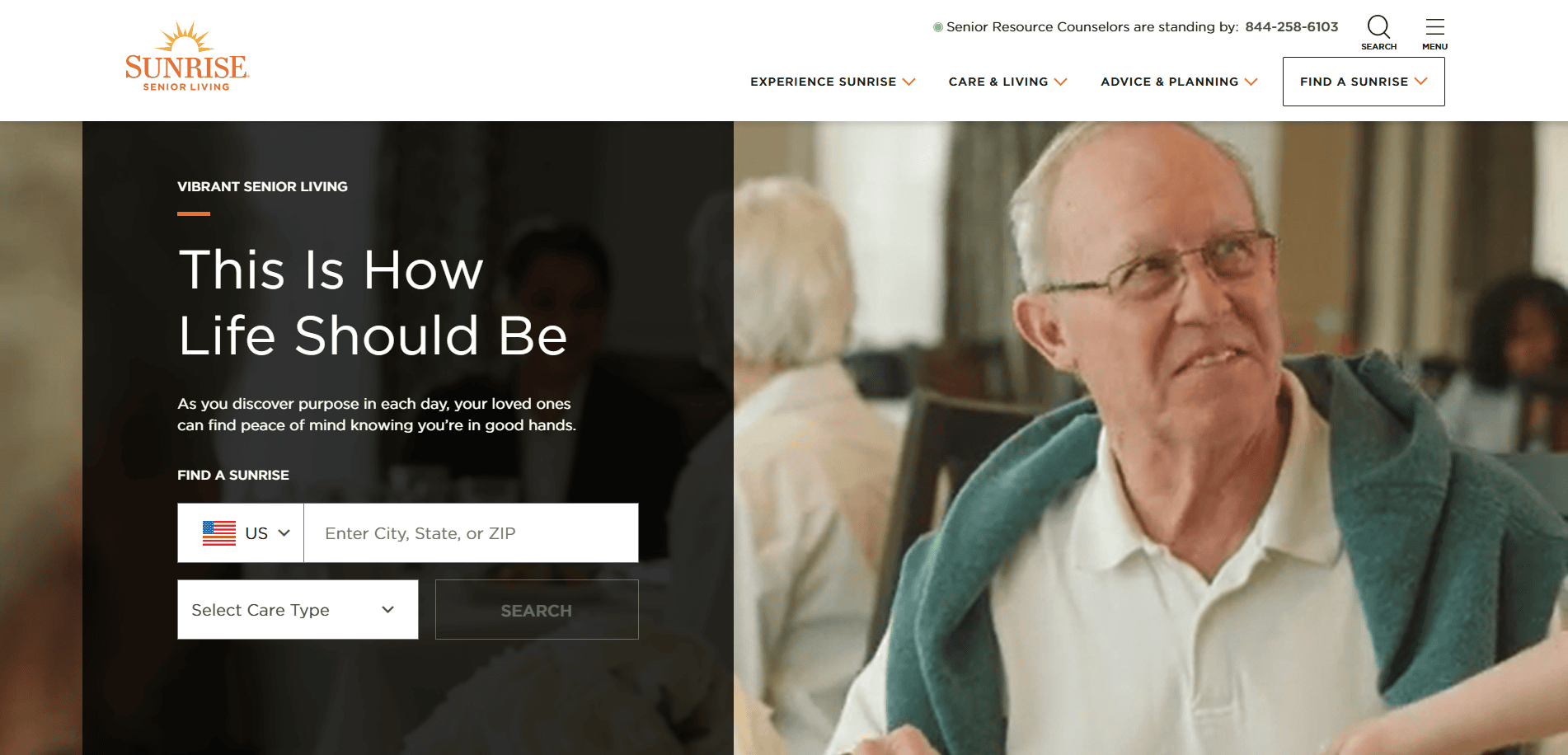
Location: McLean, VA
Key Takeaways:
- Over 270 communities across the U.S. and Canada.
- Services include independent and assisted living plus memory care.
- User-friendly website with clear information.
7. Erickson Senior Living
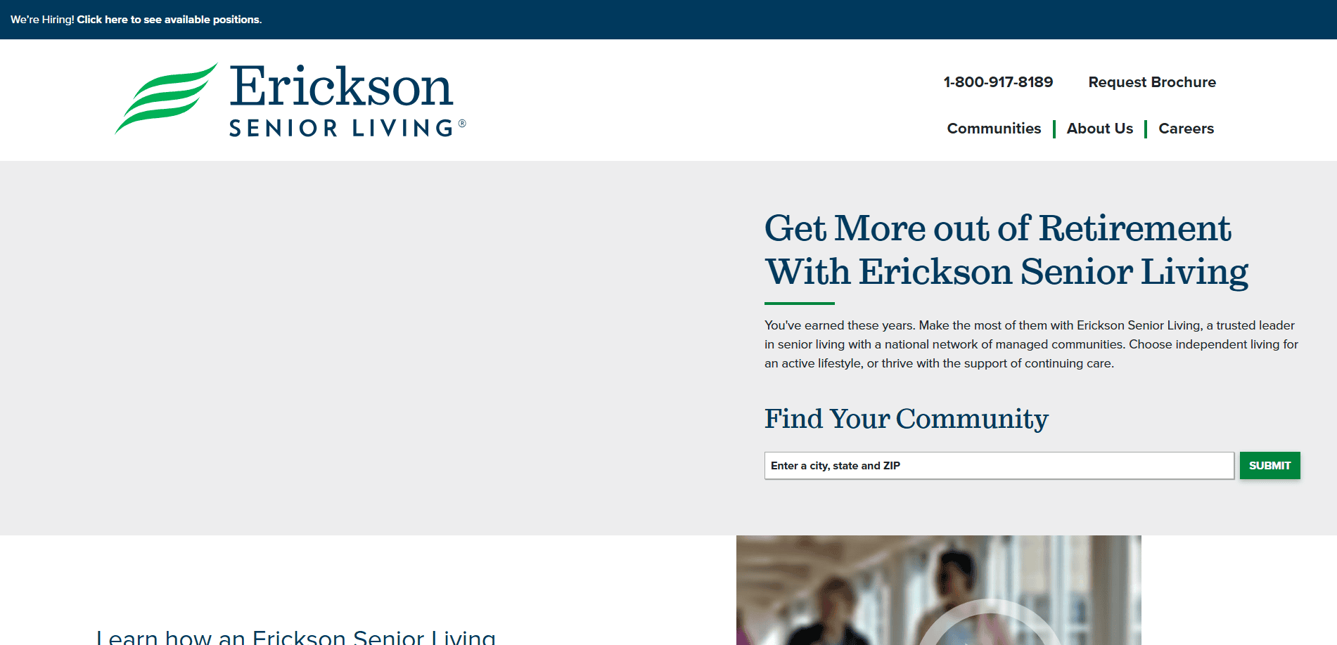
Location: Catonsville, MD
Key Takeaways:
- Manages 20 campus-style retirement communities in 11 states.
- Comprehensive services include independent living and skilled nursing care.
- Informative website detailing services and locations.
8. On Lok
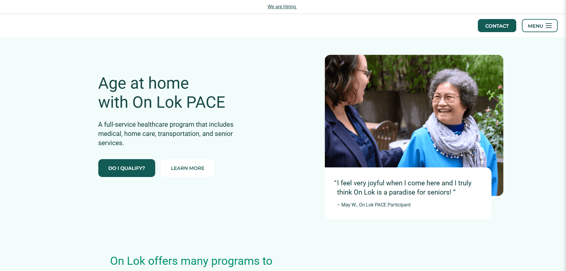 Location: San Francisco, CA
Key Takeaways:
- Community-based organization offering programs for seniors.
- Developed the PACE model for comprehensive care.
- The website provides detailed information on services and programs.
9. Legacy House
 Location: Seattle, WA
Key Takeaways:
- Non-profit community living facility serving Asian and Pacific Islander clientele.
- Staff speak over 15 Asian languages to assist residents.
- The website emphasizes cultural diversity and community services.
10. GenCare Lifestyle
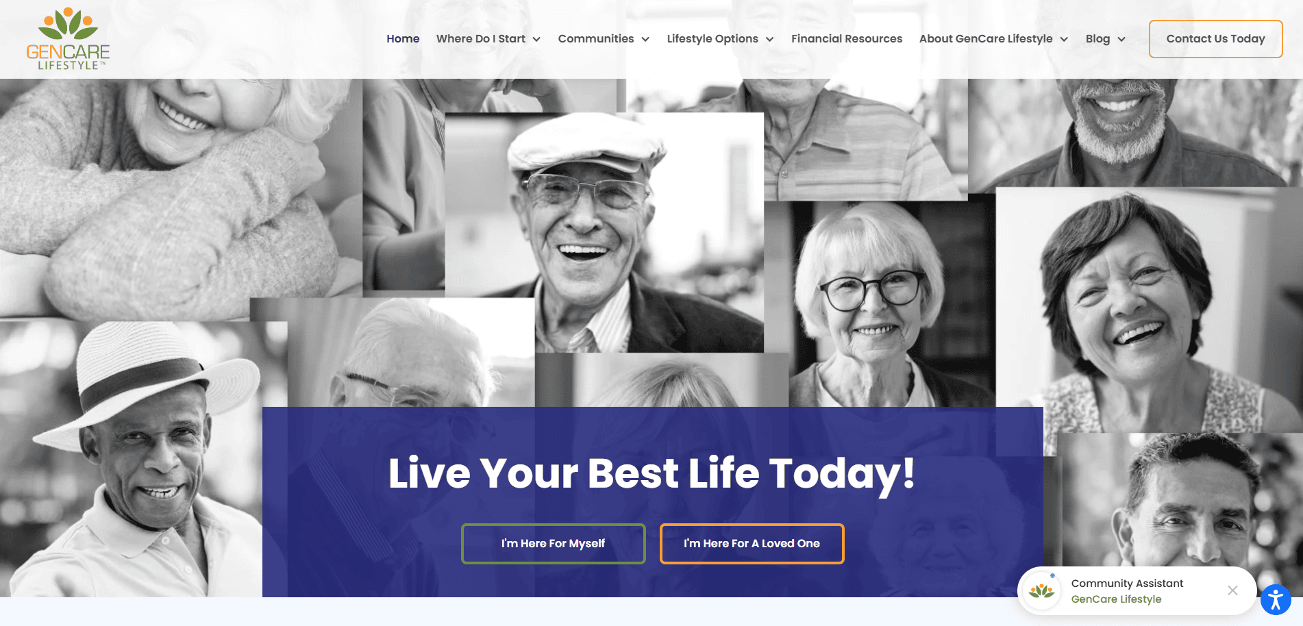 Location: Seattle, WA
Key Takeaways:
- Modern and visually appealing website design.
- Intuitive navigation for quick access to essential information.
- Clean and elegant design tailored to senior care services.
11. Senior Care Solutions
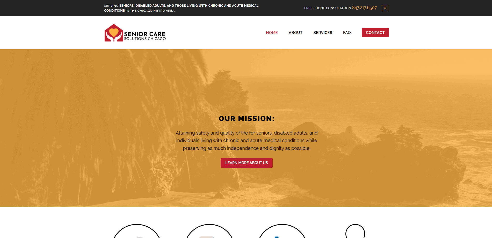 Location: Chicago, IL
Key Takeaways:
- Custom design reflecting the brand’s identity.
- Responsive layout for all devices.
- Integrated contact forms for lead generation.
12. Golden Lodge Assisted Living & Memory Care
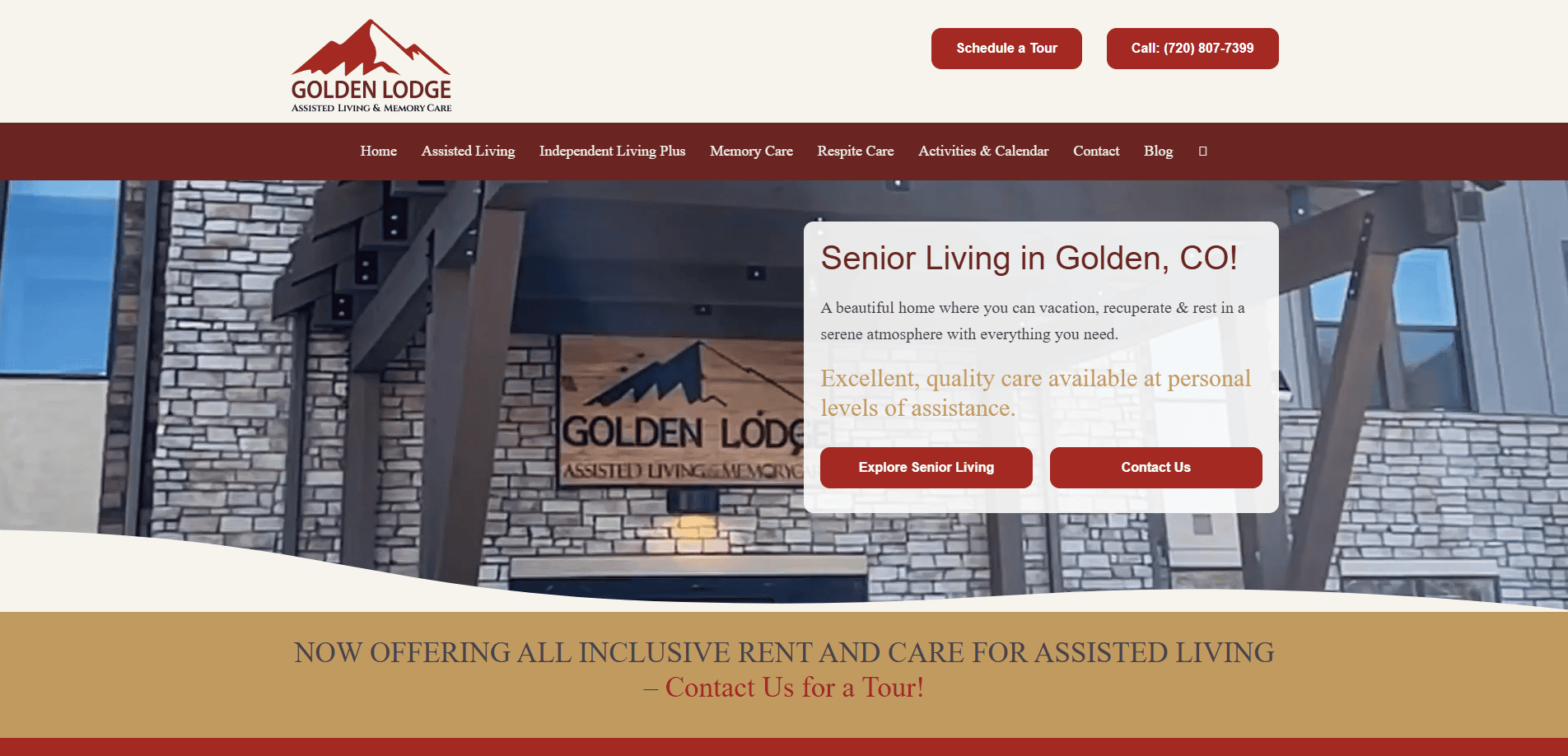 Location: Golden, CO
Key Takeaways:
- Professional senior living web design enhances trust.
- Mobile-optimized, user-friendly layout.
- Strong calls-to-action to generate leads.
13. Dellwood Gardens Assisted Living & Memory Care
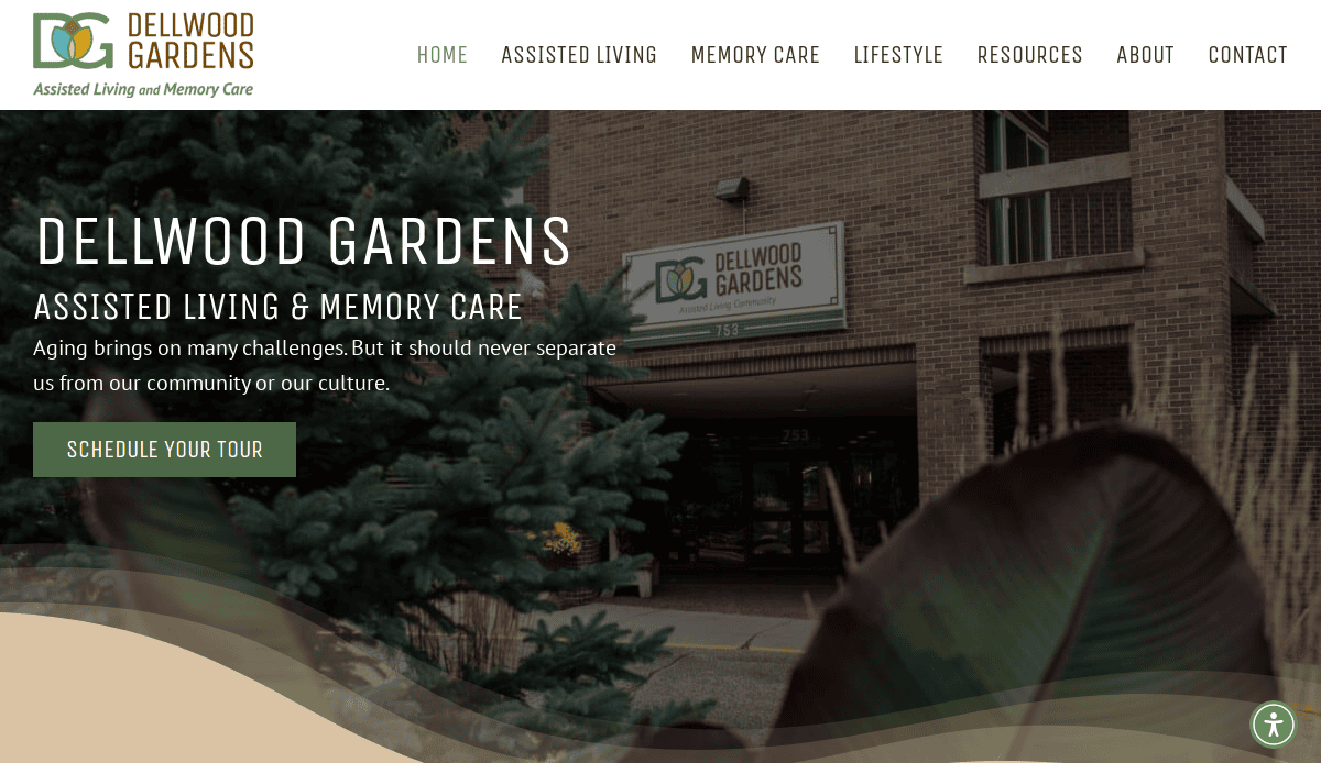 Location: St. Paul, MN
Key Takeaways:
- Responsive website design for senior living communities.
- Clear information on services and amenities.
- Easy navigation to enhance user experience.
14. Colonial Assisted Living
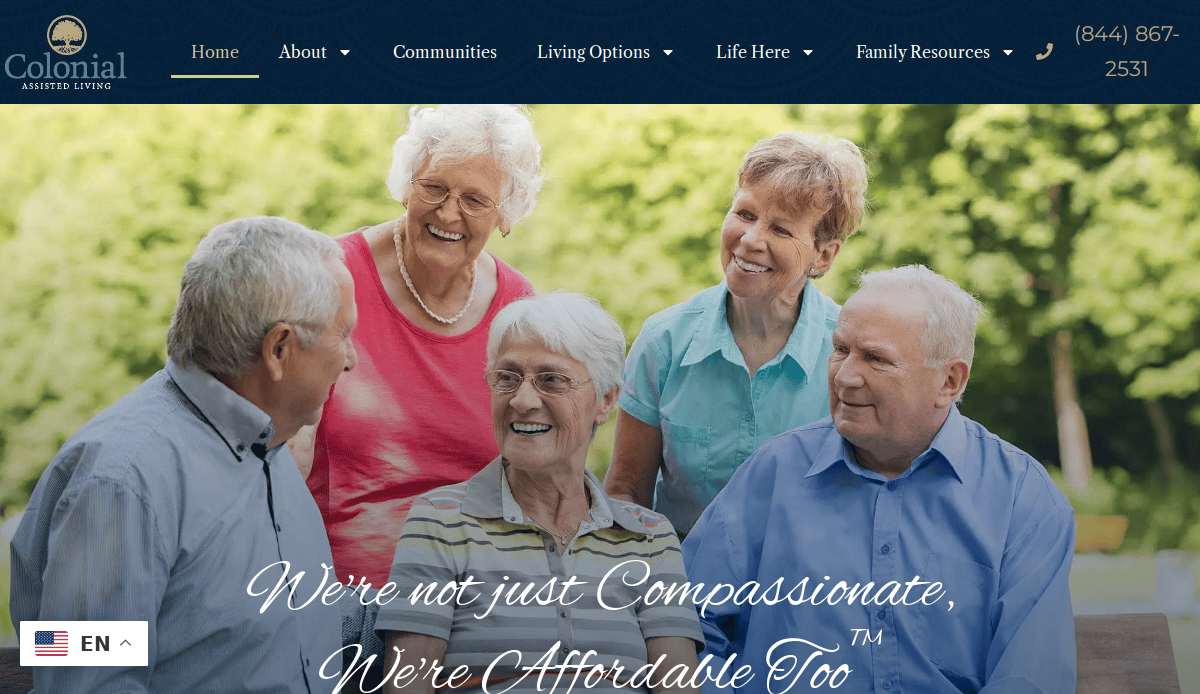 Location: Fort Lauderdale, FL
Key Takeaways:
- Compassionate messaging with affordable care options.
- Detailed information on living options and services.
- Clean and organized layout for easy navigation.
15. Grand Villa Senior Living Community
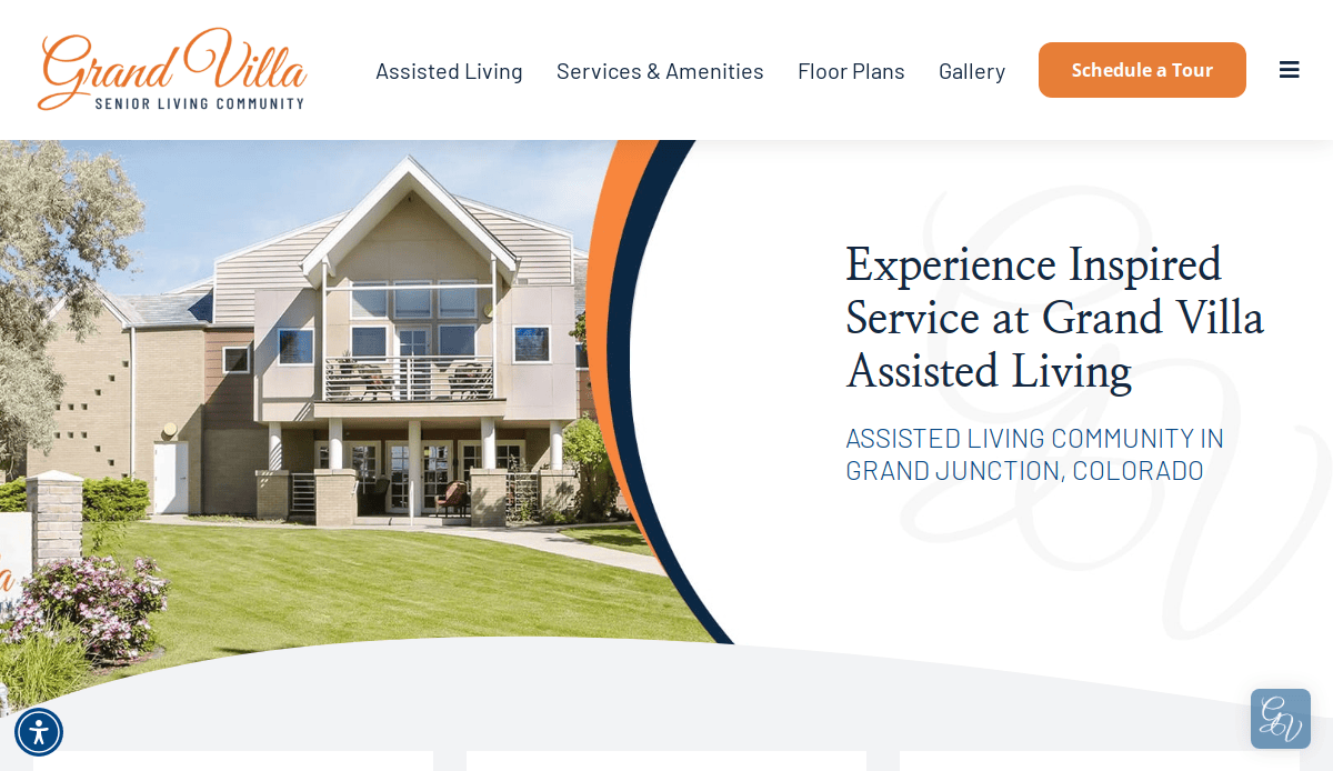 Location: Grand Junction, CO
Key Takeaways:
- Professional design reflecting the community’s values.
- Comprehensive information on services and amenities.
- User-friendly interface for prospective residents.
16. Elysian Fields of Red Wing
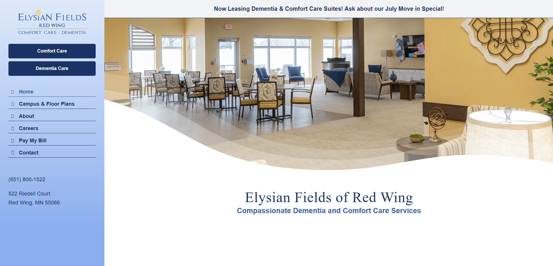 Location: Red Wing, MN
Key Takeaways:
- Visually appealing design tailored for senior living.
- Detailed service descriptions and community information.
- Easy-to-navigate layout enhances user experience.
These examples showcase the importance of professional design, user-friendly navigation, and clear content in creating effective assisted living and senior care websites. Incorporating these elements can significantly enhance your community’s online presence and engagement.
Take the Next Step Toward a Stronger Digital Presence
Your assisted living community deserves a website that reflects its care, professionalism, and values. Whether you’re planning a new website or looking to revamp an existing one, a strategic approach to design, optimization, and online marketing can dramatically improve your results. From increasing visibility to converting more inquiries, the right digital foundation supports both resident acquisition and long-term growth.
Don’t let an outdated or underperforming site hold you back. At our full-service digital marketing agency, we specialize in senior living website design and online marketing solutions that deliver measurable impact.
Contact us today to discuss your new website and digital marketing goals with our expert team.
Common Questions About Website Design for Senior Living, Answered
What makes a senior living website effective?
An effective website offers a professional design, clear and compelling messaging, and an easy-to-use layout. It also includes high-quality images, ADA compliance, and social media integration to support both user experience and senior living marketing goals.
How can assisted living communities benefit from a new website?
A modern, custom design tailored to assisted living and senior care audiences helps communities attract more residents. Updated site design improves search results, showcases amenities like photo galleries and virtual tours, and aligns with your marketing strategy.
What pages should every assisted living website include?
Key pages for an assisted living website should include Services (independent living, memory care), About, Testimonials, Contact, and Floor Plans. These address living community needs while boosting optimization and conversion potential.
Why is mobile-friendly design critical for senior living web platforms?
Mobile optimization ensures your website performs well across all devices. Since families often research on smartphones, mobile-friendly, easy-to-use layouts are essential to reaching future residents.
How does website design impact digital marketing campaigns?
Website design and development influence every aspect of a digital marketing campaign. From paid advertising to SEO, a well-designed community website enhances user trust, engagement strategies, and campaign effectiveness.
What are the benefits of integrating animations and video content?
Animations and video content—like community tours or staff spotlights—boost engagement and showcase care communities in a memorable way. They also support custom content strategies and improve time on site.
How can a senior living website support multiple locations?
Using scalable information architecture and location-specific pages allows companies with multiple locations to provide relevant details to prospective residents, support local SEO, and personalize user journeys.
What role does ongoing website maintenance play?
Regular website maintenance keeps your living web design secure, fast, and up to date. It includes plugin updates, performance checks, and ADA compliance reviews—critical for delivering a consistently well-designed website.
How do you measure the success of a website?
Track performance using analytics: monitor search results, conversions, bounce rates, and engagement. A successful website supports clear marketing goals and helps attract more residents through consistent, data-driven refinement.
What should you look for in a partner for website design?
Choose a firm experienced in assisted living website design and digital advertising. Look for custom web capabilities, understanding of assisted living homes and company websites, and proven results in senior living marketing.
Explore our custom websites and digital solutions for care communities.


