Just looking for our Best General Contractor Website examples list?
Why Great Website Design is Essential for Contractors: The Impact on Your Business
In today’s competitive contracting industry, a website is often the first point of contact between you and potential clients. First impressions matter, and a well-designed website can make all the difference. A great website amplifies your services and portfolio and builds trust and credibility with visitors, creating a solid foundation for long-term business growth.
But why does site design matter so much for a general contractor? A high-performing site does far more than just look good. It plays a pivotal role in converting visitors into clients, optimizing for search engines, and ensuring a seamless user experience on both desktop and mobile. In fact, a responsive and user-friendly website can be your most powerful marketing tool, attracting more leads and turning casual visitors into loyal customers.
When someone visits your homepage, they are assessing your credibility, reliability, and professionalism—all within the first few seconds. Your website should immediately convey these qualities through design, ease of navigation, and clear calls to action, such as an optimized contact form and easy-to-find contact information. Moreover, integrating social proof, such as testimonials and project showcases, can help reinforce your trustworthiness and expertise in your field.
This blog will dive deep into why contractor website design is crucial for business success and offer tips on how to create a website that converts visitors into leads. Whether you’re looking to build a website from scratch or improve an existing one, understanding these fundamentals will give you the competitive edge you need to stand out in the digital space.
Website Planning & Purpose: Laying the Foundation for a Successful Website
The planning phase of design is one of the most critical steps in ensuring the site meets both business goals and client expectations. For general contractors, a website is not just a place to showcase services; it’s a vital marketing tool that needs to align with the unique needs of the business and the target audience. The purpose of this phase is to establish clear objectives and create a detailed blueprint for the site that supports both functionality and aesthetics.
The first step is defining the business goals and understanding the needs of prospective clients. What do you want your website to achieve? Do you aim to generate more leads, establish trust, exhibit your portfolio, or simply establish an online presence for your contracting business? These goals will guide the entire design and development process. For example, a site designed to generate leads will require strategic calls-to-action (CTAs), such as a clear contact form or easy access to a quote request page.
Next, it’s important to consider the UX of the website. In this industry, people are often looking for a combination of reliable information and convenience. The navigation should be simple and intuitive, allowing users to quickly access essential information such as service offerings, past projects, and contact details. A user-friendly layout will help turn visitors into leads by making it easier for them to find exactly what they’re looking for without frustration.
Equally important is ensuring the website is optimized for search engines. Doing so helps your website appear higher in search results, making it easier for folks to find you when they search for relevant keywords. An effective planning phase will involve researching the right keywords, such as “contractor website design” or “general contractor SEO,” and incorporating them into the site’s content, meta descriptions, and image alt text to improve your visibility online.
The planning phase should also involve setting a roadmap for your website’s content. This might include service pages, project galleries, client feedback, and detailed case studies that highlight your expertise and successful projects. Including a portfolio section on your website is a powerful way to amplify your work, cement trust, and demonstrate your ability to handle various types of contracts.
Additionally, identifying technical requirements, such as ensuring mobile responsiveness and integrating tools like online quote generators or project management systems, is essential for a modern website. More than ever today, clients expect fast, mobile-friendly websites that are easy to navigate, no matter the device they’re using.
By carefully planning out the website’s goals, content, UX, and SEO strategy, you can create a website that looks great and works effectively to establish trust, drive traffic, and turn visitors into clients. For more tips on effective site design and planning, you can explore additional insights in our detailed blog on contractor website design.
Design Principles: Crafting a Website that Works for Contractors
An effective design hinges on several key principles that ensure both functionality and aesthetics align with business objectives. These principles help create a site that is user-friendly, visually appealing, and optimized for conversions.
First and foremost, simplicity is crucial. A cluttered website can overwhelm visitors and drive them away. Keep the design clean and organized by focusing on the essential elements. Prioritize a clear layout with simple navigation that directs users to what they need, whether it’s your services, portfolio, or contact information. By minimizing distractions, you make it easier for new clients to engage with your content and take action.
Mobile responsiveness is another vital principle. With the increasing use of smart devices to browse websites, a contractor website must be easily accessible on all screen sizes. Ensuring your website adapts seamlessly to smartphones and tablets is crucial, as many clients may be researching contractors on the go; having a mobile-friendly site is critical to capturing these leads.
Another key principle is visual hierarchy. The design should guide the user’s eyes toward the most important content in a logical sequence. This could mean highlighting services first, followed by a portfolio of completed projects, client reviews, and a clear call-to-action (CTA). Strong visual contrast can be used to make key elements, such as buttons or contact details, stand out, encouraging visitors to take the next step.
Consistency in branding is essential for cementing trust and recognition. Your website should reflect your contracting business’s identity, including your logo, colors, fonts, and tone. This consistency will reinforce your professionalism and help visitors feel more confident in your services. Using the same colors and fonts across the site and aligning with your business’s offline branding creates a cohesive experience that strengthens your brand’s presence.
Lastly, fast loading times cannot be overlooked. Slow websites cause frustration and result in higher bounce rates. Optimizing images and minimizing unnecessary code can speed up loading times, ensuring visitors stay engaged. Faster websites also rank higher, making speed a crucial factor in the design process.
By following these principles, contractors can create websites that look professional and perform effectively in attracting and converting clients. For further insights into proven design strategies for construction websites, check out our detailed blog on construction web design.
Content & Navigation: Structuring Your Website for Maximum Impact
When it comes to site design, structuring both content and navigation is crucial for ensuring a smooth visitor experience and enhancing lead generation. A well-organized site with clearly defined sections and intuitive navigation can help visitors quickly find the information they need and take the next step toward hiring your services.
Start with a logical site structure that prioritizes the most important content for your target audience. The homepage is often the first point of contact, so it should provide an overview of your services, showcase your unique selling points, and include clear calls-to-action (CTAs) like “Request a Quote” or “Contact Us.” It should also feature a brief introduction to your contracting business and what sets you apart from the competition.
Next, organize your service pages in a way that speaks to the specific needs of your target audience. These pages should be easy to access through your main navigation menu, with categories that reflect the range of services you offer. For example, create distinct sections for residential and commercial contracting, remodeling, electrical, or any specialized services you provide. Each page should clearly describe the service, outline the benefits, and include relevant images or project examples to help build trust.
The portfolio page is another critical element. This section should showcase completed projects with high-quality images and brief descriptions. Each project should tell a story, highlighting the work you did and how it benefited the client. Adding client reviews to this section can further enhance credibility and offer social proof that your services are trusted and effective.
Navigation should be simple, intuitive, and consistent across the site. The main menu should include clear categories such as Home, Services, Portfolio, About Us, and Contact. Drop-down menus can be useful for organizing subcategories, but they should not overwhelm the user. Keep the menu short, with just a few key sections that help users easily navigate to the information they need. Including a search bar can also be helpful for users looking for specific content quickly.
Don’t forget the importance of the contact page. Make it easy for visitors to get in touch with you by providing a simple, well-designed informational form. Include your phone number, email address, and physical location to make it easy for clients to reach out in whatever way they prefer. Consider adding a map or a direct link to your Google Business Profile for easy access to your location and customer reviews.
Incorporating these content and navigation strategies will ensure that your website is user-friendly, informative, and optimized for conversions. A site that’s easy to navigate and filled with relevant, well-structured content will keep visitors engaged and help you stand out in a competitive market.
Visual Elements: Enhancing User Experience and Brand through Design
Visual elements play a crucial role in design by supporting both the user experience and the overall brand. These elements help make a website more engaging, informative, and visually appealing, ultimately guiding visitors through their journey while reinforcing the credibility and professionalism of the business.
The first and most important visual element to consider is your logo and branding. Your website should reflect the same color scheme, typography, and style that is used in your offline branding, ensuring consistency across all marketing materials. This consistency strengthens your brand identity and cements trust with visitors, as a cohesive design signals professionalism and attention to detail. For contractors, this consistency can also help clients associate your website with the high-quality work you deliver on projects.
Images are another essential visual component. High-quality, well-lit photos of completed projects can significantly enhance the visual appeal of your site while showcasing your skills. Including before-and-after photos can be particularly effective for contractors, as they visually demonstrate the impact of your work. Ensure that the images you use are relevant, professional, and strategically placed to guide users’ attention to key areas, such as services, portfolio, and testimonials. Avoid using generic stock images, as they can come across as impersonal and detract from your credibility.
Graphics and icons can also be used to improve the overall experience by breaking up text-heavy sections and making content more digestible. Simple icons that represent services, features, or steps in a process can help visitors quickly understand what you offer without having to read lengthy descriptions. Additionally, using visual cues such as buttons, arrows, and color contrasts can direct visitors’ attention to important calls-to-action (CTAs), making it easier for them to take the next step, whether that’s scheduling a consultation, requesting a quote, or contacting you for more information.
White space is a critical visual element that helps create a clean and organized layout. A cluttered page with too many elements can overwhelm users and hinder navigation. By incorporating adequate spacing between sections, images, and text, you create a sense of balance and clarity. White space also improves readability and makes it easier for users to focus on key information, improving the overall user experience.
Typography is another aspect that influences the user experience and brand perception. The font choices should be legible and professional. Avoid overly decorative fonts, as they can be difficult to read, especially on mobile devices. A clean, simple font in the appropriate size for headings, subheadings, and body text will ensure your content is accessible and easy to follow.
Lastly, incorporating video content can further enhance your website’s visual appeal and user engagement. A short video that introduces your team, explains your services, or showcases a behind-the-scenes look at your work can provide a personal touch that helps visitors connect with your brand. Video content is particularly effective in building trust and offering a more dynamic user experience.
By thoughtfully integrating visual elements into your site design, you improve the UX and reinforce your brand’s message and professionalism. A visually appealing, well-organized site will keep visitors engaged and guide them toward taking action, such as filling out a contact form or requesting a consultation. For more tips on using website design to generate leads and drive business growth, visit our blog on contractor marketing and website lead generation.
Ongoing WordPress Maintenance: Ensuring Longevity and Performance
Maintaining a WordPress website is not a one-time task. Regular maintenance is essential for ensuring that the website remains secure, functional, and optimized for performance over time. A website that is well-maintained provides a better visitor experience and improves search engine rankings, helps build trust with clients, and ensures that your online presence reflects the quality and professionalism of your contracting business.
One of the most important aspects of ongoing maintenance is keeping the WordPress core, themes, and plugins updated. WordPress is a dynamic platform with regular updates that address security vulnerabilities, improve functionality, and introduce new features. Failing to update these elements can leave your site vulnerable to hacking attempts, cause compatibility issues, and result in a poor user experience. Regular updates ensure your site is running smoothly and securely, keeping it protected from potential threats.
In addition to updating the platform, it’s essential to perform regular backups of your WordPress website. Backups act as a safety net in case anything goes wrong, whether due to a technical issue, a plugin malfunction, or a hacking attempt. Having a recent backup ensures that your website can be restored to its previous state with minimal downtime or data loss. It’s important to schedule automatic backups and store them in a secure location, either in the cloud or on an external server, to ensure the integrity of your website’s data.
Website performance is another key area of ongoing maintenance. Over time, WordPress websites can become slow due to bloated files, unnecessary plugins, or inefficient code. Optimizing website speed involves regularly cleaning up the database, removing unused plugins, and ensuring that images and other media files are compressed for faster load times.
Another critical aspect of WordPress maintenance is monitoring website security. While keeping WordPress and its components updated plays a significant role in security, additional measures should be taken to further protect your website. Implementing strong passwords, using security plugins, and setting up firewalls can help prevent unauthorized access and protect sensitive client information. Regular security scans and audits should be conducted to identify and resolve potential vulnerabilities.
It’s also important to periodically check and optimize your website’s SEO. Search engine optimization is not a one-time effort but an ongoing process. Regularly reviewing and updating content, adjusting keywords, and ensuring that all meta tags and alt text are in place helps maintain high search engine rankings. Additionally, monitoring the performance of your site through tools like Google Analytics allows you to identify any issues or opportunities for improvement.
Finally, contractors should continuously monitor and update their content to keep the website relevant and engaging. Regularly adding new projects to the portfolio, updating testimonials, and creating blog posts or industry news can keep the website fresh and provide valuable information to potential clients. Keeping the content up to date also shows visitors that your business is active and committed to delivering high-quality services.
Ongoing WordPress maintenance is essential for ensuring that your website continues to perform at its best. By keeping the platform updated, you can ensure that your website remains a powerful tool for attracting clients and driving business growth.
Best General Contractor Website Design Examples
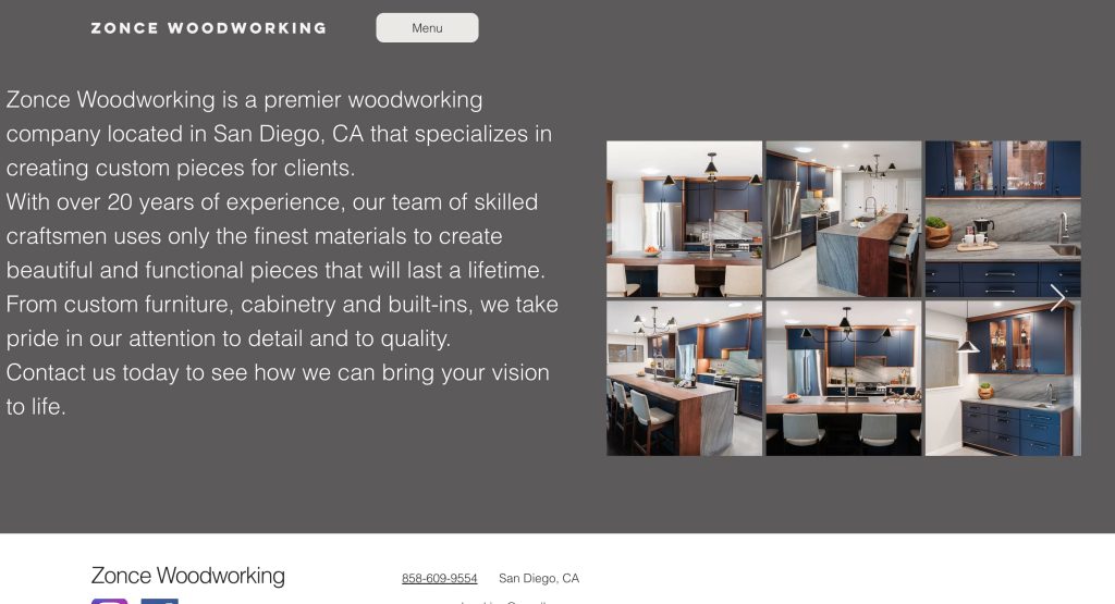
1. Zonce Woodworking
Location: Chicago, IL
Key Takeaways:
- Minimalist design with a neutral color palette.
- Prominent display of the owner’s contact information.
- Sticky header for easy navigation.
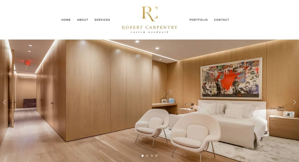
2. Robert Carpentry
Location: Chicago, IL
Key Takeaways:
- Modern design with high-quality images.
- Integrated social media links for broader engagement.
- Clear call-to-action buttons for portfolio access.
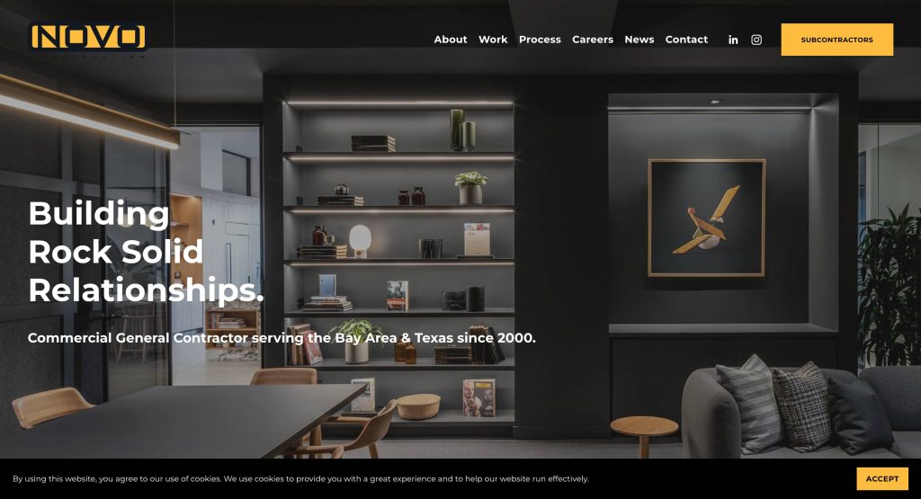
3. NOVO Construction
Location: Chicago, IL
Key Takeaways:
- Striking visuals with clear navigation.
- Project gallery showcasing past work.
- Informative blog detailing remodeling projects.
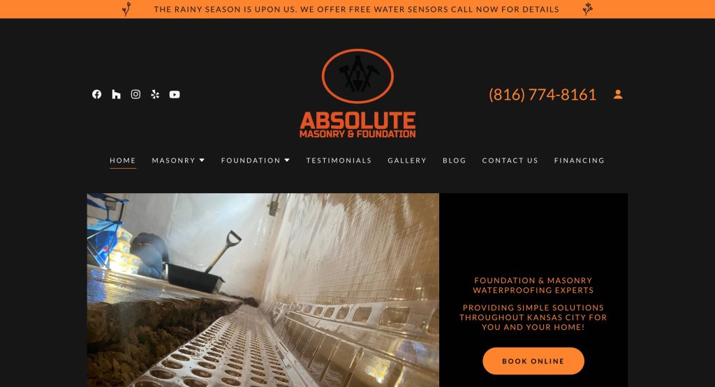
4. Absolute Masonry and Foundation
Location: Chicago, IL
Key Takeaways:
- Before-and-after project showcases.
- Live chat feature for immediate inquiries.
- Professional photos enhance credibility.
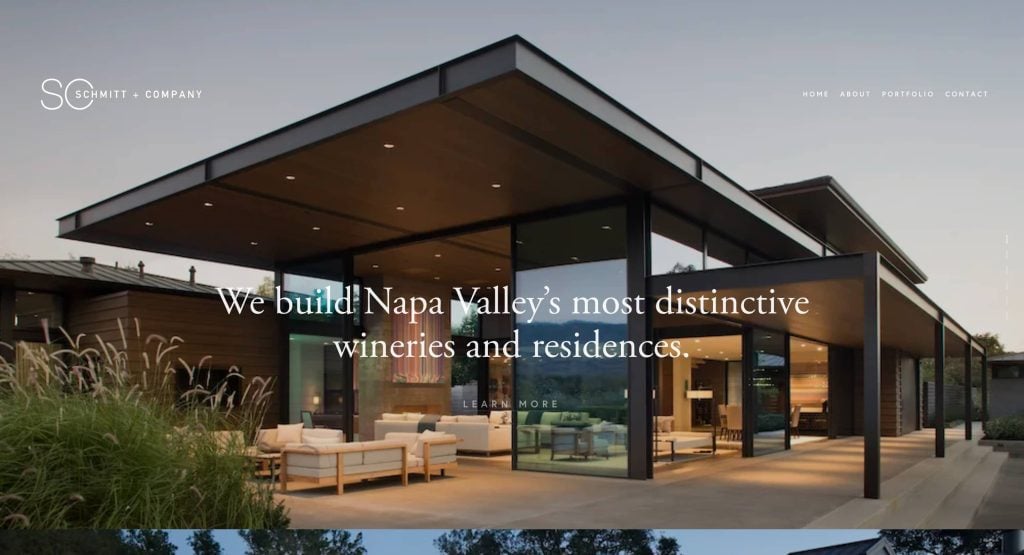
5. Schmitt + Company
Location: Chicago, IL
Key Takeaways:
- Elegant simplicity with intuitive layout.
- High-resolution images of completed projects.
- Earthy tones reflecting natural materials.
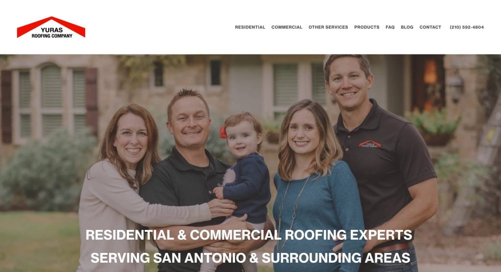
6. Yuras Roofing Company
Location: Chicago, IL
Key Takeaways:
- Clear-cut header image depicting industry expertise.
- Immediate call-to-action in the header.
- Reviews and service icons enhance trust.
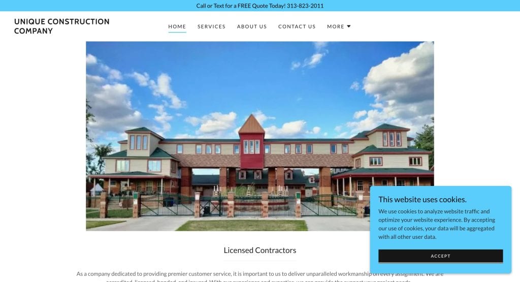
7. Unique Construction Inc.
Location: Miami, FL
Key Takeaways:
- Parallax scrolling for an immersive experience.
- Bilingual site (English/Spanish) for wider reach.
- Blog showcasing past projects and industry insights.
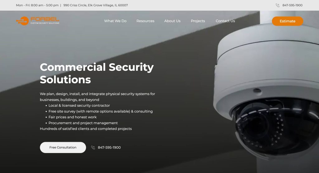
8. Forbel Commercial Security Systems
Location: New York, NY
Key Takeaways:
- Vibrant colors and sleek animations.
- Mobile-friendly design with a hamburger menu.
- Well-structured typography for readability.
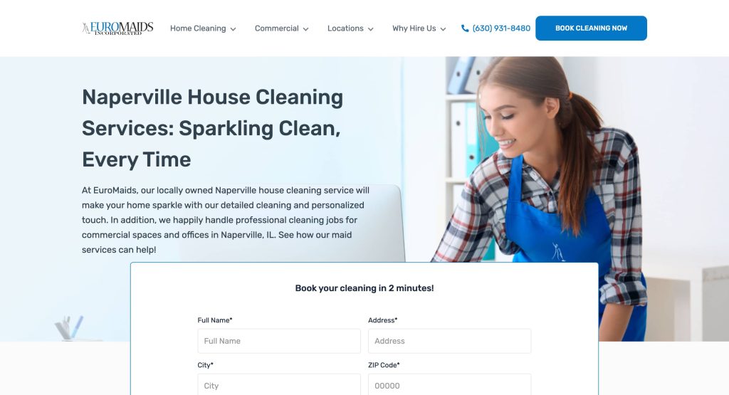
9. Euro Maids
Location: Naperville, IL
Key Takeaways:
- Elegant layout with intuitive booking form.
- Autoplay feature showcasing services.
- Modern typography enhances user experience.

10. MasterDent
Location: Mount Prospect, IL
Key Takeaways:
- Sleek design reflecting dental office aesthetics.
- Real project images for authenticity.
- Clear navigation with well-labeled buttons.
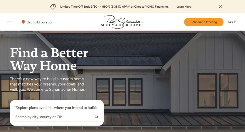
11. Schumacher Construction
Location: Chicago, IL
Key Takeaways:
- Transparent navigation bar over hero image.
- “Start Now” CTA button with hover effect.
- Clear text with easy-to-read fonts.
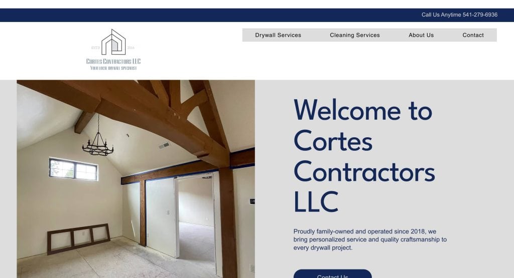
12. Cortes Contractors
Location: Bend, OR
Key Takeaways:
- Minimalistic design with classic colors.
- Descriptive icons enhancing service sections.
- Easy contact options with clear CTAs.
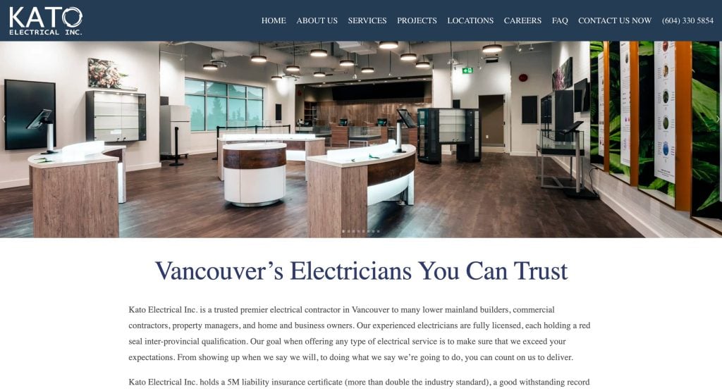
13. Kato Electrical
Location: Chicago, IL
Key Takeaways:
- Simple and professional design.
- Drop-down menu for easy service exploration.
- Google Maps integration for location visibility.
14. LBR Partners
Location: Chicago, IL
Key Takeaways:
- Elegant design with parallax scrolling.
- High-quality images of interiors.
- Content about company owners enhancing trust.
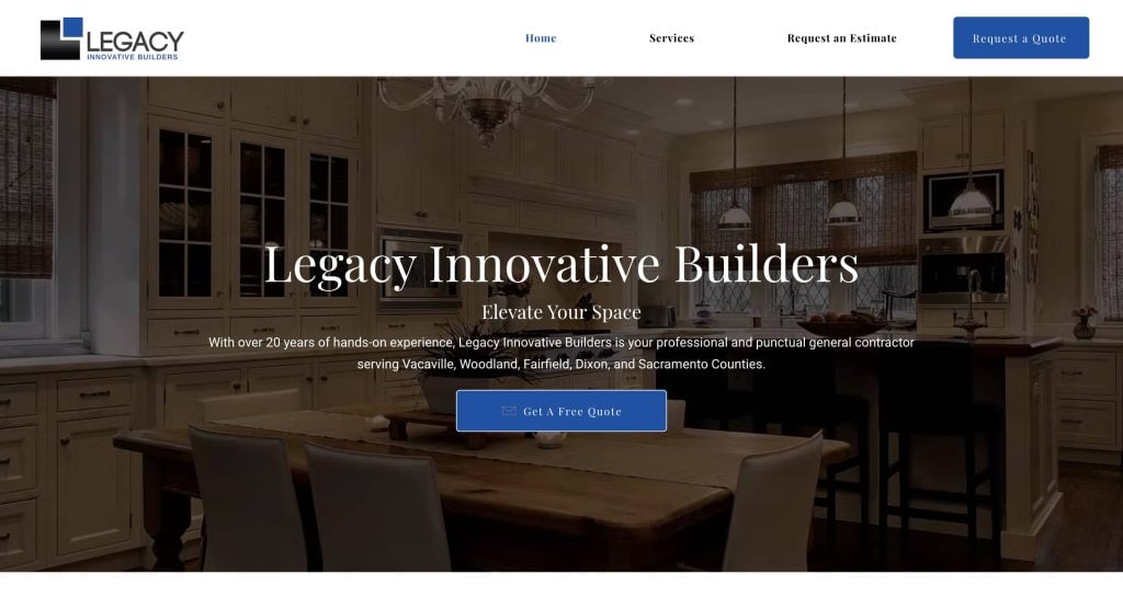
15. Legacy Innovative Builders
Location: Chicago, IL
Key Takeaways:
- Award-winning contractor with state-of-the-art projects.
- Logo-based color scheme for brand consistency.
- “Request an Estimate” CTA strategically placed.
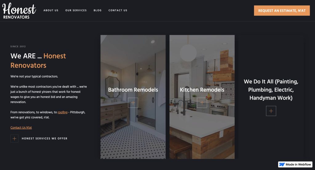
16. Honest Renovators
Location: Chicago, IL
Key Takeaways:
- Black background with parallax effect.
- Engaging customer review section.
- Newsletter section for updates and estimates.

17. Kevin Carpenter Interiors
Location: Chicago, IL
Key Takeaways:
- Bright color scheme with parallax scrolling.
- Customer testimonials with engaging backgrounds.
- Newsletter section for updates and offers.
These examples exhibit a range of design approaches and functionalities that can inspire and inform the development of effective contractor websites.
Take Action: Transform Your Contractor Website Today
Your contractor website is more than just an online presence—it’s the cornerstone of your marketing strategy. Whether you’re looking to grow your business, improve client trust, or enhance your local SEO, the best practices for contractor web design will ensure that your website serves as a powerful tool to connect with potential clients.
If your current website isn’t meeting your needs, now is the time to take action. Start with a clear understanding of design and content that will engage visitors and convert them into leads. By focusing on website features like mobile responsiveness, optimized images and videos, and strong calls-to-action, you can create a high-performing website that works for you, not against you.
To help you get started, our full-service digital marketing agency’s team of web design experts is here to assist with building a website that looks great and ranks well in search engines and reflects your construction services accurately. Ready to transform your contractor’s website? Get in touch with our staff of professionals today and let’s create a web experience that will attract future customers and elevate your online presence.
Contractor Business Site Design FAQs
How do I choose the best website builder for my contracting website?
Choosing the best website builder for your contracting website depends on your business needs and goals. For a construction company, it’s essential to select a platform that allows for easy customization, optimization, and mobile responsiveness. Popular website builders like WordPress, Wix, or Squarespace can provide good starting points. However, it’s crucial to ensure the platform you choose can support your design best practices, integrate with Google My Business, and allow for easy updates and scalability as your construction business grows. For a more customized approach, working with a professional web design company like ours can help you create a tailored solution.
Why is SEO important for my construction business website?
A good website is visually appealing and optimized for search engines to attract traffic. For construction companies, having a website for search engines ensures that you rank higher in local search results when potential clients are searching for services like construction and renovation. Local SEO, including Google My Business profile and incorporating local keywords, can significantly improve your visibility. For more details on optimizing your website for local search, check out our step-by-step guide to local SEO.
What makes a website a “good website” for construction companies?
A good website for construction companies should have key elements like responsive design, fast load times, clear calls to action, and easy navigation. It should also include a portfolio featuring your best work, client feedback and reviews, and images of your completed projects. These elements help establish trust with potential clients and demonstrate your expertise in the field. Additionally, ensuring your website features quality content and design elements will enhance the user experience and ultimately improve conversion rates.
How do I transform my contractor’s website to attract more clients?
Transforming your contractor’s website involves more than just updating its design. Start by optimizing your website for search engines and improving its visual appeal with high-quality images and videos of your work. Incorporate clear and compelling calls-to-action on every page, especially on your homepage and contact page. You can also integrate a blog or project gallery that showcases your company’s best work. Regularly updating your site with fresh content, like customer feedback or recent projects, will also help engage visitors and encourage them to contact you for construction services.
Can I use free Google My Business to improve my website’s performance?
Yes, a free Google My Business profile can significantly enhance your website’s performance. By creating and optimizing your profile, you increase your chances of appearing in local search results when potential clients look for a construction company in your area. Google My Business also provides valuable customer reviews, which act as social proof to prospective clients. If you want to optimize your Google My Business listing, be sure to add accurate business information, update your photos, and encourage satisfied clients to leave reviews.
What are some website examples I can look at for inspiration?
Looking at website examples of successful construction company websites can provide valuable insights and inspiration. Great websites often feature clean layouts, user-friendly navigation, and strong visuals. A good site will showcase your portfolio, include detailed service descriptions, and have clear calls-to-action like “Request a Quote” or “Contact Us.”
How can I ensure my website reflects my construction company’s brand?
To make sure your website reflects your construction company’s brand, focus on consistent design elements like logos, color schemes, and typography. The tone of the content should align with your company’s values and voice, whether that’s professional, friendly, or innovative. Additionally, include sections like “About Us” to explain your company’s mission and values. Showcasing your expertise through case studies or completed projects will further solidify your reputation in the industry.
What role do images and videos play in my contractor website?
Images and videos are essential for a contractor website as they showcase your work and help tell the story of your construction business. High-quality images of past projects, especially before-and-after shots, can visually demonstrate your skills and expertise in construction and renovation. Videos that feature customer reviews or a walkthrough of your services can enhance engagement and provide more context for visitors.
How do I make sure my website is optimized for both design and content?
To ensure your website is good for both design and content, focus on integrating design elements with strategic content. Use simple, clear navigation to ensure visitors can easily find the services they need. Make sure to optimize your content with relevant keywords to improve your website’s visibility in search results. Additionally, ensure that the design is responsive, meaning it works seamlessly on both desktop and mobile devices.
How can my website help me grow my business?
It can be a powerful tool for growing your business by acting as a central hub for all your marketing efforts. A well-designed website with strong SEO practices will drive traffic and attract new clients. By showcasing your best work, you’ll cement trust. Additionally, incorporating clear calls-to-action and contact forms will help you convert visitors into leads, ultimately helping to grow your construction business.


