Just looking for our Best Junk Removal Website examples list?
Your website is more than just a digital brochure—it’s your most powerful marketing tool. Whether you’re hauling furniture, clearing debris, or managing estate cleanouts, potential customers judge your professionalism and trustworthiness based on your online presence within seconds. That means your junk removal website design must do more than look good—it needs to function flawlessly, communicate clearly, and convert visitors into paying clients.
A high-performing site goes beyond aesthetics. It aligns your brand with user expectations, loads quickly on mobile devices, integrates SEO strategies, and presents a clear path to booking services. When done right, your website becomes a lead generation engine, helping you outrank local competitors, build credibility, and grow your junk removal business sustainably. In this guide, we’ll explore the must-have features, design trends, and strategic elements that can transform your site into a revenue-driving asset.
Key Takeaways
- Prioritize Mobile Optimization
A responsive design improves user experience and boosts conversions for mobile visitors. - Implement Clear Calls to Action (CTAs)
Prominent CTAs like “Book Now” or “Request a Quote” can drive up conversion rates. - Highlight Customer Testimonials
Real reviews establish credibility and help convert skeptical visitors into customers. - Optimize for Local SEO
Proper local SEO strategies attract customers in your area and increase your visibility in search results. - Utilize High-Quality Visuals
Strong visuals make your services tangible and build trust with potential clients.
Website Planning & Purpose
A successful website starts with a solid foundation rooted in strategic planning and purpose. For junk removal businesses, the planning phase is not just about deciding on colors or layout—it’s about aligning the site’s design with real-world business goals. Every element must serve a function: attract potential customers, educate them, and lead them to take action.
Start by identifying the core objectives of your website. Most junk removal companies aim to increase leads, simplify bookings, showcase their services, and build trust through reviews and credentials. This clarity informs every design and content decision that follows. For instance, if lead generation is the top priority, the site should feature clear, persistent call-to-action buttons and an intuitive contact form.
Equally important is understanding the needs of your target audience. Junk removal clients are often seeking fast, reliable service. They’re not looking to browse—they’re looking to book. Your site should be designed with this urgency in mind. Quick-loading pages, streamlined navigation, and concise content are essential. Mobile optimization is also critical, as many users search for junk removal services on their phones.
The planning phase also includes mapping out user journeys. Where do you want visitors to go? Which services should be highlighted? What questions should be answered on the homepage versus a service page? By anticipating visitor behavior and structuring the site accordingly, you make it easier for potential customers to engage and convert.
Ultimately, a well-planned website is one that is purposeful from the ground up. It blends aesthetics with strategic function, ensuring that every click brings users one step closer to hiring your services.
The Key Design Principles
An effective junk removal website must blend visual appeal with strategic functionality. In this industry, where trust, speed, and clarity are critical, adhering to key design principles can be the difference between a user bouncing or booking.
- Simplicity and Clarity
Junk removal customers are often in a hurry—they want information fast. Your design should reflect that urgency with a clean layout, straightforward navigation, and minimal distractions. Use clear headings, simple language, and a logical content hierarchy that helps users find what they need instantly. - Mobile Responsiveness
A majority of users will visit your site from mobile devices. A responsive design that adjusts seamlessly to different screen sizes ensures a positive user experience, reduces bounce rates, and increases the likelihood of conversion. Mobile-friendly design isn’t optional—it’s foundational. - Visual Hierarchy
Guide the user’s eye with strategic placement of elements. Highlight essential actions like “Book Now” or “Get a Free Estimate” using contrasting buttons. Use bold headings, large images, and strategic spacing to direct attention and reduce cognitive load. - Fast Load Times
Speed is non-negotiable. Slow websites drive users away. Compress images, limit unnecessary scripts, and use a reliable hosting service to ensure your site loads in under three seconds. A fast-loading site improves user experience and supports better SEO rankings. - High-Quality Imagery
Visuals convey trust and professionalism. Use high-resolution images of your team, equipment, and completed jobs. Avoid generic stock photos. Authentic images help humanize your brand and reassure visitors that you’re a legitimate, capable business. - Consistent Branding
Your website should reflect your company’s identity across all pages. Use a consistent color scheme, font styles, logo placement, and tone of voice. This creates a cohesive experience and builds familiarity and trust with your audience. - Accessibility and Inclusivity
Make sure your site is usable by everyone, including those with disabilities. Use proper color contrast, alternative text for images, and keyboard-friendly navigation to meet accessibility standards and improve the overall user experience.
Web Content & Navigation
Content and navigation are the backbone of a successful website. In an industry where decisions are often made quickly, clarity, structure, and ease of use can significantly influence whether a visitor becomes a customer.
- Clear, Concise Content
Your content should speak directly to your audience’s needs. Use straightforward language to explain your services—no jargon, no fluff. Start with a compelling homepage that outlines who you are, what services you offer, and why customers should trust you. Each service page should provide enough detail to inform without overwhelming, including what’s included, pricing ranges, and areas served. - Strategic Page Structure
A well-structured website typically includes the following core pages:- Home: Snapshot of services, benefits, and a strong call-to-action.
- About Us: Company story, values, and team introductions.
- Services: A main services page plus subpages for each specific service (e.g., residential, commercial, appliance removal).
- Testimonials or Reviews: Real feedback from satisfied clients.
- Gallery or Portfolio: Visual proof of work completed.
- FAQs: Answer common questions and reduce customer hesitations.
- Contact: Easy access to phone number, email, contact form, and service area map.
- Intuitive Navigation
Navigation should be intuitive and minimal. A top-level menu with clear labels (Home, Services, About, Contact) allows users to find what they need without confusion. Use drop-down menus for sub-services if needed, but avoid clutter.Make CTAs like “Book Now,” “Get a Free Estimate,” or “Call Today” visible on every page. Sticky headers or floating buttons ensure these remain accessible no matter where users scroll. Internal linking between service pages, blog content, and contact forms encourages deeper engagement and better SEO performance.
- SEO-Optimized and User-Centered Content
Every page should be optimized for relevant keywords like “junk removal services,” “affordable junk removal,” and “local junk haulers.” But SEO should never come at the expense of readability. Focus on user intent—what questions are your visitors asking, and how can you answer them better than your competitors?
The Proof is in the Visual Elements
Visual elements play a critical role in enhancing the user experience and reinforcing brand identity for junk removal websites. In a service-oriented industry where first impressions are everything, thoughtful visual design can increase credibility, guide user behavior, and ultimately drive conversions.
- Professional Imagery
High-quality, original photos of your crew, trucks, and completed jobs communicate professionalism and transparency. Potential customers want to see the people they’ll be working with and the quality of service they can expect. Avoid stock photos—they create distance and reduce trust. Real visuals humanize your brand and help establish authenticity. - Before-and-After Showcases
Displaying transformation images, such as cluttered spaces cleaned up, demonstrates the value of your work in an immediate, tangible way. These visual stories are powerful tools that communicate success without needing extensive copy and can greatly influence purchasing decisions. - Color Scheme and Branding
Use a consistent color palette aligned with your brand. Bold, clean colors (like blue for trust or green for eco-friendly) can evoke the right emotions and help with brand recognition. Pair these with legible fonts and consistent styling across the site for a unified experience. Visual consistency builds trust and helps visitors remember your company. - Icons and Infographics
Icons simplify complex services and guide users through different offerings. Use icons to illustrate types of junk removed, service areas, or steps in your removal process. Infographics are useful for visually breaking down your service process, benefits, or pricing tiers in an engaging way that’s easy to digest. - Video Content
Embedding a short welcome video or a walkthrough of your process can boost engagement and keep visitors on your site longer. Videos help establish a connection, showcase your team’s personality, and make your services feel more approachable. - Whitespace and Layout
Avoid clutter. Use whitespace strategically to highlight important content, make text easier to read, and create a calming, navigable layout. A clean design helps users focus on your CTAs, service highlights, and booking options.
Ongoing WordPress Maintenance for WordPress Websites
Launching a well-designed WordPress website is just the beginning—ongoing maintenance is essential to keep it secure, functional, and performing at its best. For junk removal businesses, where the website serves as a primary tool for generating leads and booking services, consistent maintenance ensures that the site remains an asset rather than a liability.
- Security Updates
WordPress regularly releases updates to patch vulnerabilities and improve security. These include core updates, theme updates, and plugin updates. Ignoring them can expose your site to hackers and malware. For junk removal companies that collect customer data through contact forms or booking tools, these updates are critical to maintaining data integrity and customer trust. - Plugin and Theme Management
Many websites rely on plugins for contact forms, booking calendars, SEO tools, and more. These plugins must be updated regularly to stay compatible with the latest version of WordPress. Outdated plugins can break functionality or create security holes. Likewise, themes must be updated to fix bugs and maintain performance. - Regular Backups
Routine backups ensure that your site can be quickly restored in the event of a crash, hack, or human error. A comprehensive backup strategy includes database and file backups stored off-site. For junk removal businesses, this guarantees that you won’t lose valuable service descriptions, customer testimonials, or SEO-optimized content. - Performance Optimization
Over time, websites can slow down due to bloated databases, outdated scripts, or too many unoptimized images. Regular maintenance includes database cleanups, image compression, and script minification to keep the site fast. Speed is especially important for junk removal clients who often visit from mobile devices and want quick access to information. - SEO Monitoring and ImprovementsSearch engine algorithms change frequently. Ongoing maintenance involves checking for broken links, updating metadata, and refreshing content to ensure your site stays optimized for keywords like “junk removal service” and “local junk hauling.” This keeps your rankings competitive and drives continuous traffic.
- Analytics and ReportingTracking site performance helps identify what’s working and what needs improvement. Monthly reports can highlight traffic trends, popular service pages, and conversion metrics. This data allows junk removal businesses to make informed marketing and content decisions.
20 Examples of the Best Junk Removal Websites
1. Junk Relief
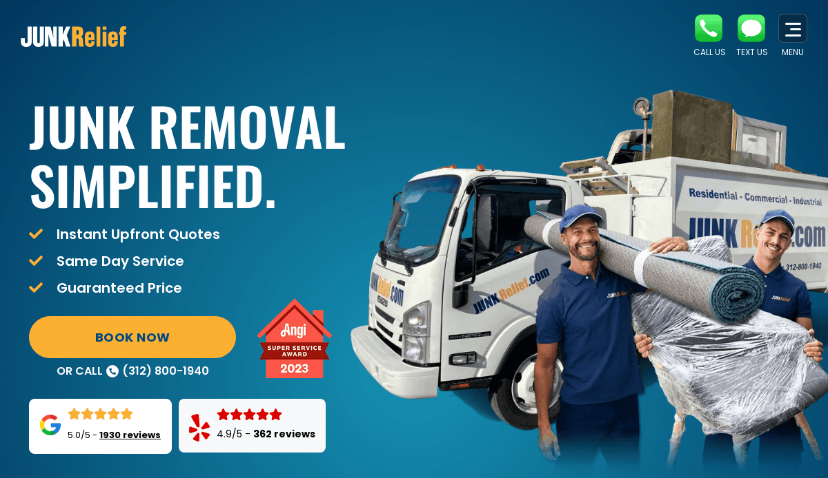
Location: Chicago, IL
Key Takeaways:
- Clean layout with intuitive navigation.
- Prominent call-to-action buttons for easy booking.
- Trust-building elements like certifications and reviews.
2. Jack’s Junk Removal
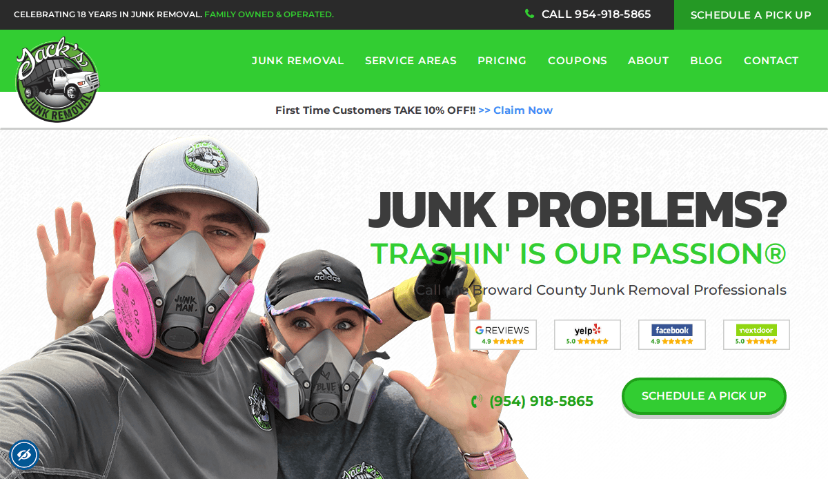
Location: Fort Lauderdale, FL
Key Takeaways:
- Professional branding with a personal touch.
- Consistent color palette enhances visual appeal.
- Showcases genuine customer feedback prominently.
3. Junk Rescue
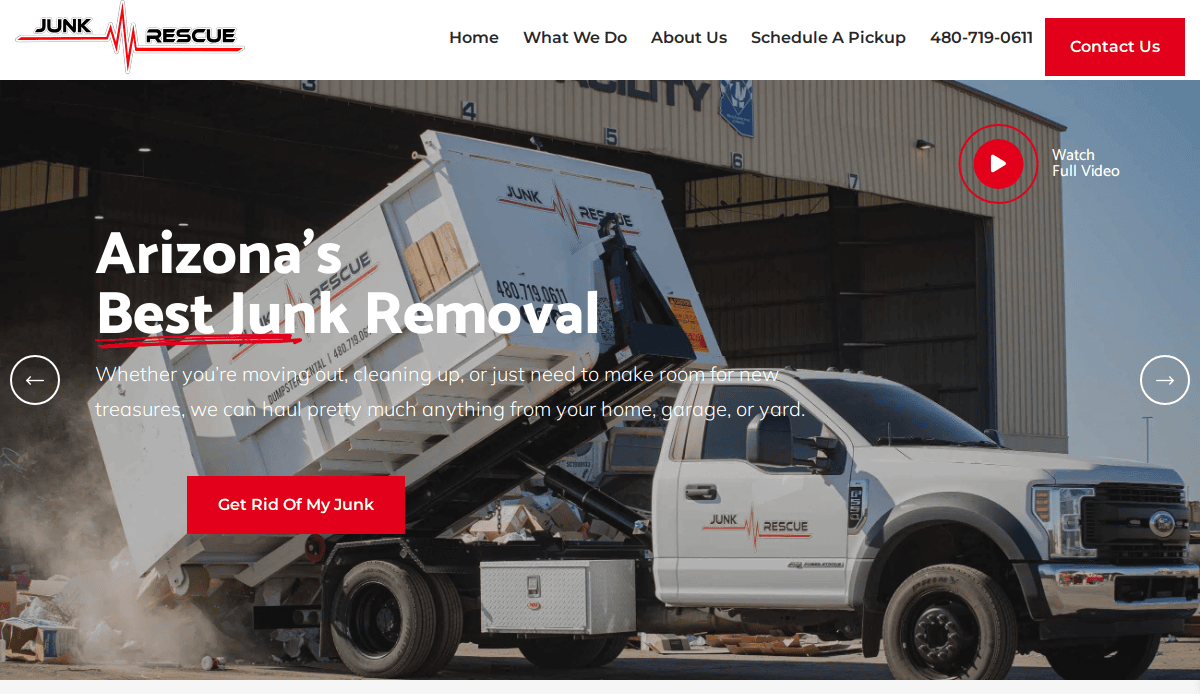
Location: Phoenix, AZ
Key Takeaways:
- Engaging video content demonstrating services.
- Detailed service information is readily available.
- Easy access to contact options on every page.
4. Jedi Junk Removal
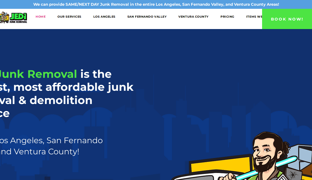
Location: Los Angeles, CA
Key Takeaways:
- Bright colors and playful graphics create a fun atmosphere.
- Persistent “book now” button enhances conversions.
- Simple and user-friendly design.
5. We Chunk Junk
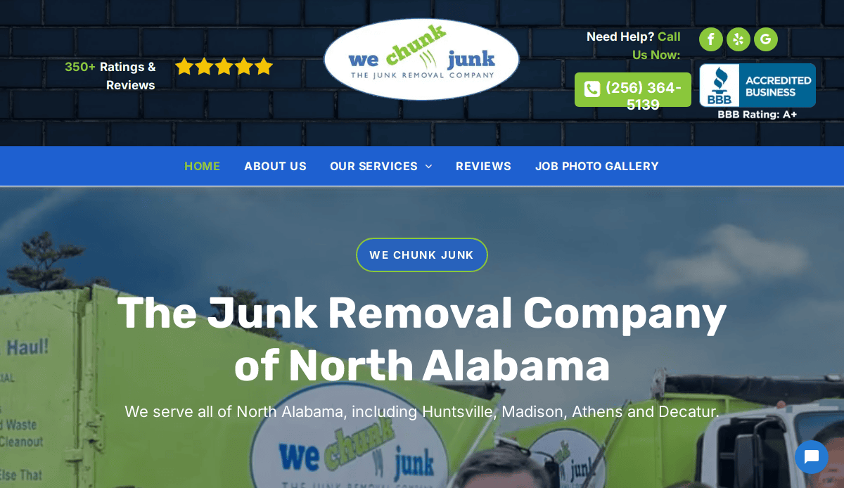
Location: Madison, AL
Key Takeaways:
- Personalized with crew photographs in uniforms.
- Credibility through client and BBB logos.
- Mobile-responsive design with engaging content.
6. Stand Up Guys
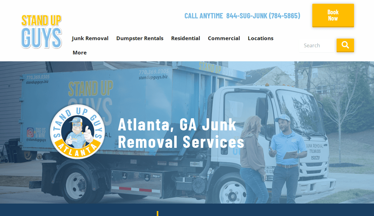
Location: Atlanta, GA
Key Takeaways:
- Prominent contact information and live chat option.
- Discount offers to entice customers.
- Professional video showcasing services.
7. Count Junkula
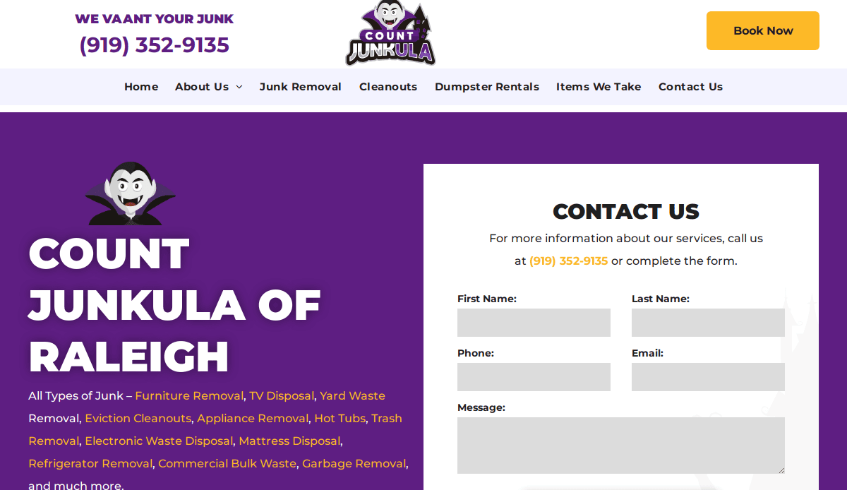
Location: Raleigh, NC
Key Takeaways:
- Unique branding with a vampire-themed logo.
- Striking purple color scheme.
- Easy navigation with clear service information.
8. Green Junk Removal
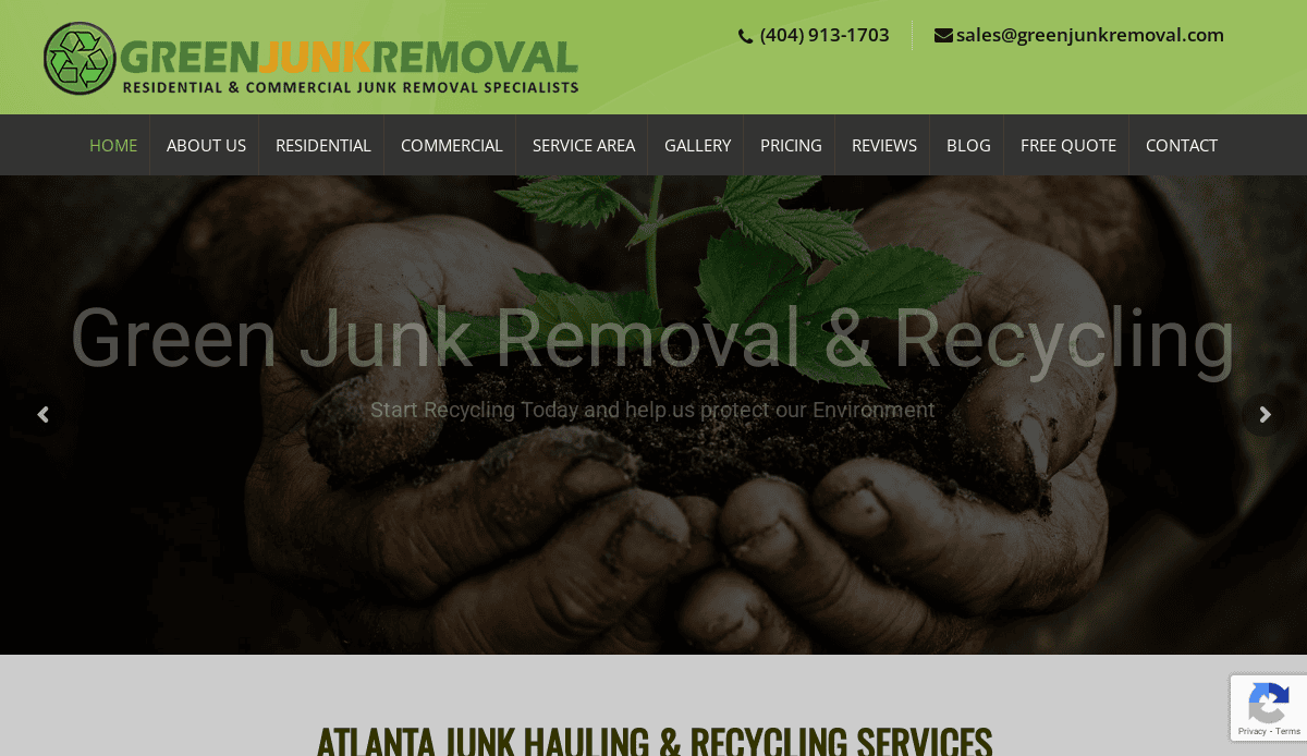
Location: Atlanta, GA
Key Takeaways:
- Eco-friendly focus with a green color scheme.
- Informative blog and service sections.
- Emphasis on recycling and sustainability.
9. Nova Junk Removal
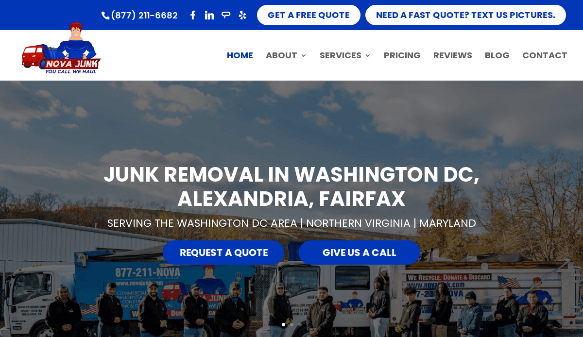
Location: Washington, D.C.
Key Takeaways:
- Clean, all-American design aesthetic.
- Clear service descriptions and pricing.
- Easy-to-use contact forms.
10. Trash Bandits

Location: Vancouver, WA
Key Takeaways:
- Playful, outlaw-inspired theme.
- Bold color scheme with organized sections.
- Unique brand personality while maintaining functionality.
11. Rubbish Rebels
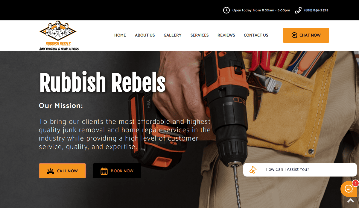
Location: Denver, CO
Key Takeaways:
- Bright and engaging images immediately capture attention.
- Clear calls-to-action for service bookings.
- Optimized for fast loading and mobile responsiveness.
12. Junk Masters
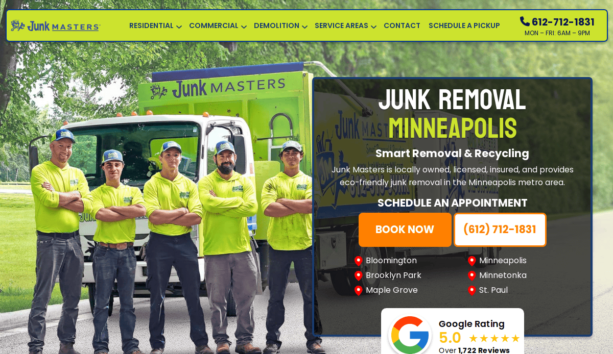
Location: Minneapolis, MN
Key Takeaways:
- Professional design with a focus on user experience.
- Detailed service pages with high-quality visuals.
- Integrated online booking system.
13. Slam Dunkin Junk
Location: Honolulu, HI
Key Takeaways:
- Vibrant design reflecting the local culture.
- User-friendly interface with clear navigation.
- Strong emphasis on customer testimonials.
14. Aloha Junk Man
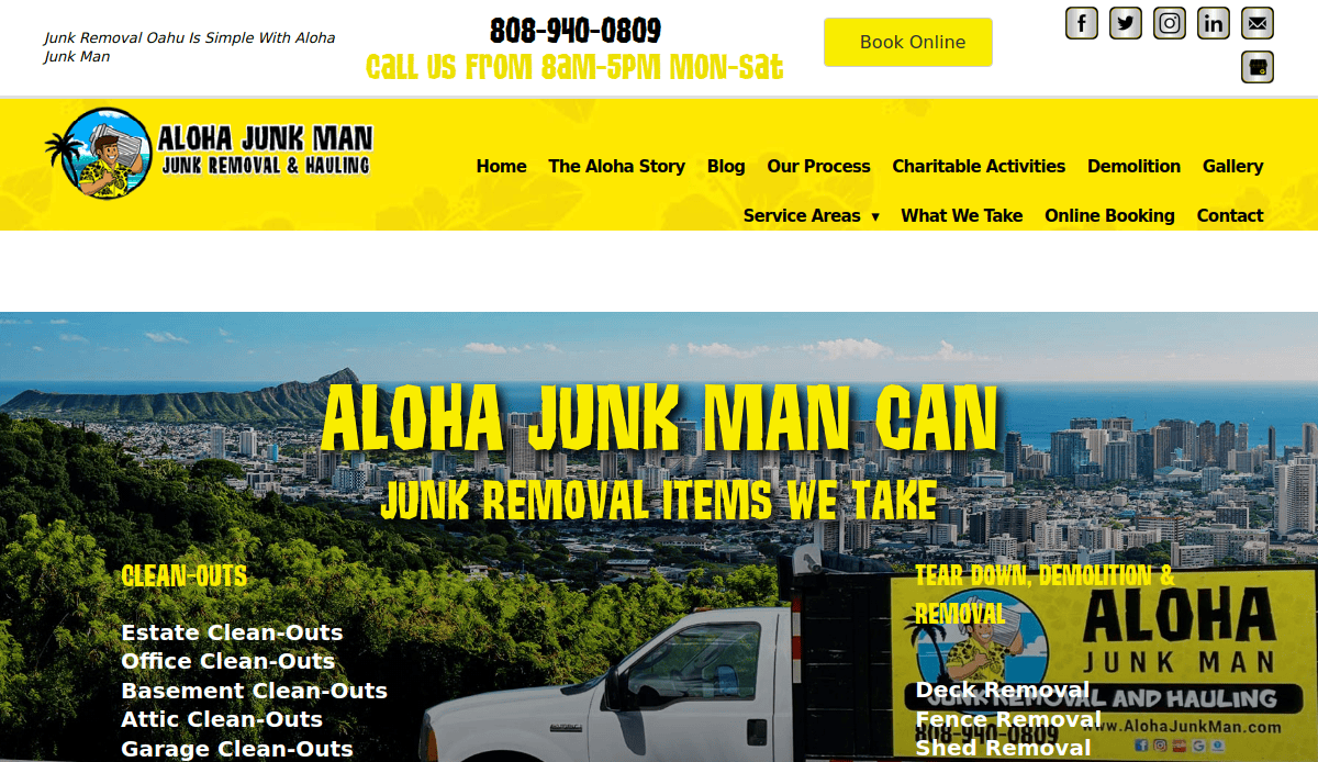
Location: Honolulu, HI
Key Takeaways:
- Welcoming design with island-themed visuals.
- Easy-to-find contact information and service details.
- Mobile-optimized for on-the-go users.
15. Evergreen Junk Removal
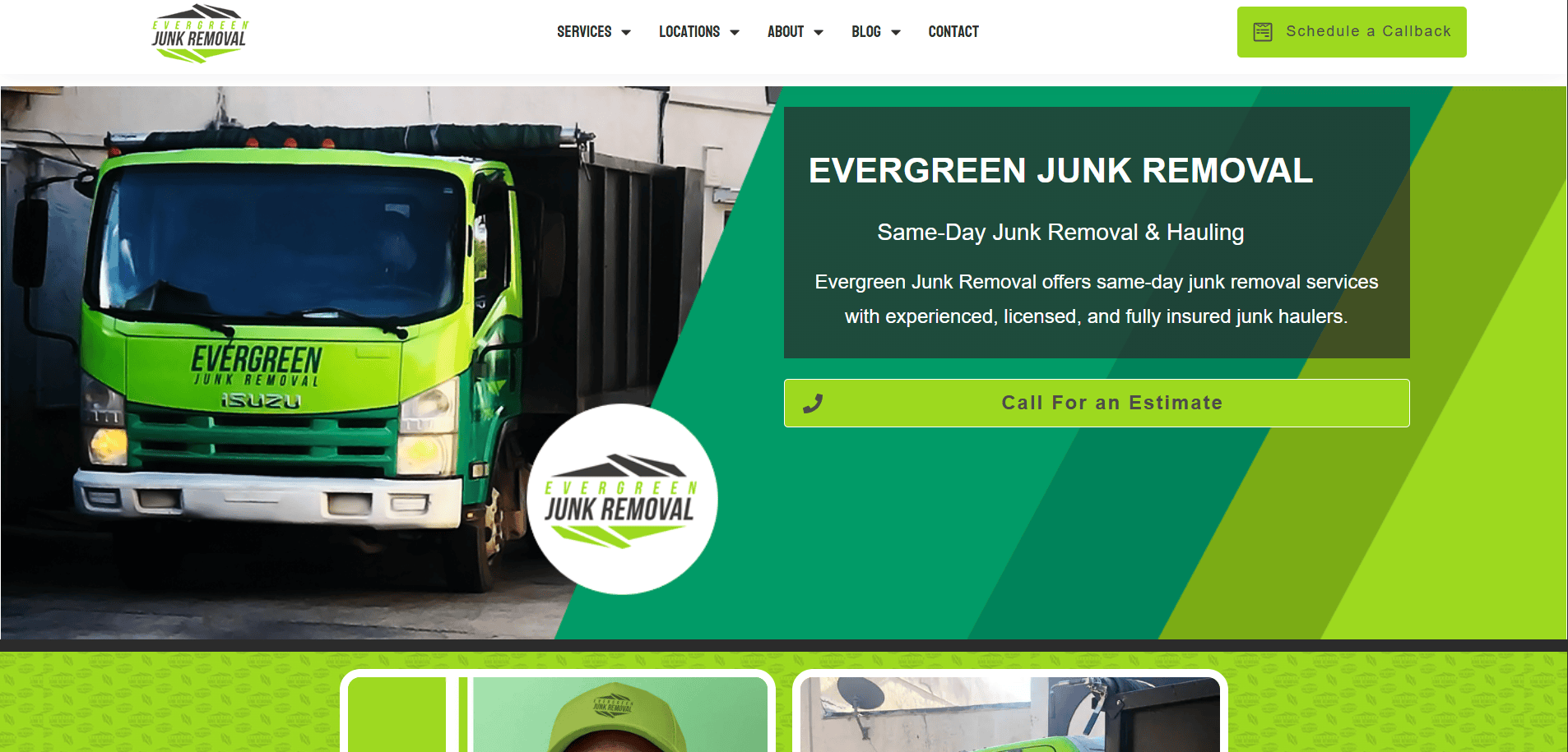
Location: Fort Lauderdale, FL
Key Takeaways:
- Vibrant green branding emphasizing eco-friendly services.
- Clear navigation with accessible contact information.
- Showcases a commitment to fast and friendly service.
16. Junk King
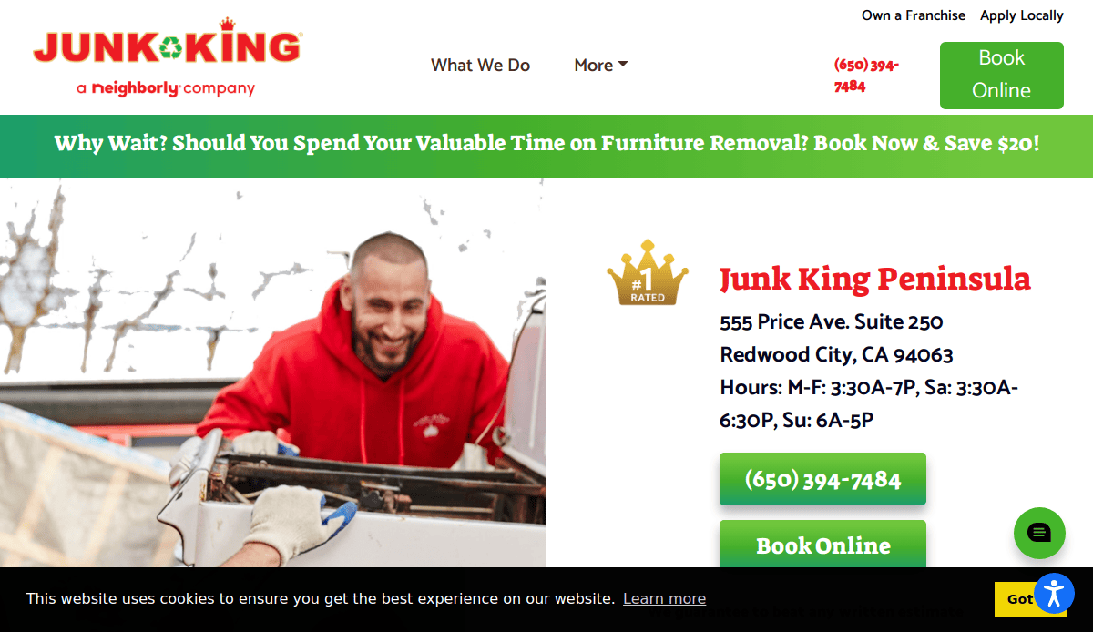
Location: San Carlos, CA
Key Takeaways:
- Bold red branding for strong visual impact.
- Clear service offerings and pricing information.
- Emphasis on eco-friendly practices.
17. 1-800-GOT-JUNK?
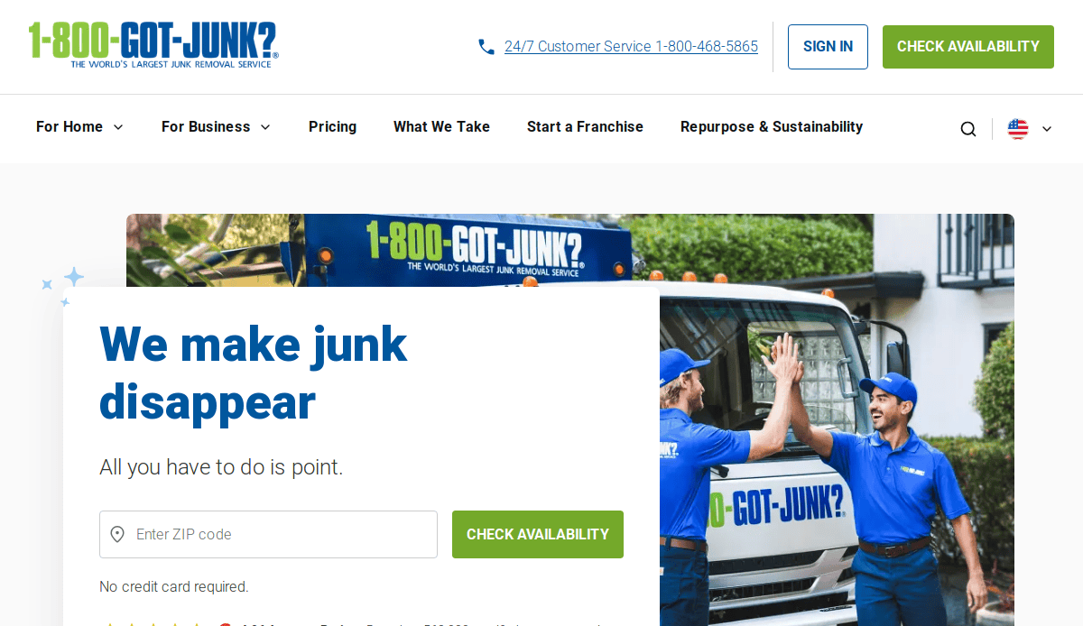
Location: Vancouver, BC
Key Takeaways:
- Highly recognizable branding.
- User-friendly online booking system.
- Extensive service coverage information
18. College Hunks Hauling Junk
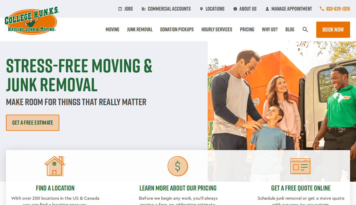
Location: Tampa, FL
Key Takeaways:
- Energetic branding appeals to a younger demographic.
- Comprehensive service and pricing details.
- Strong emphasis on customer service and satisfaction.
19. LoadUp
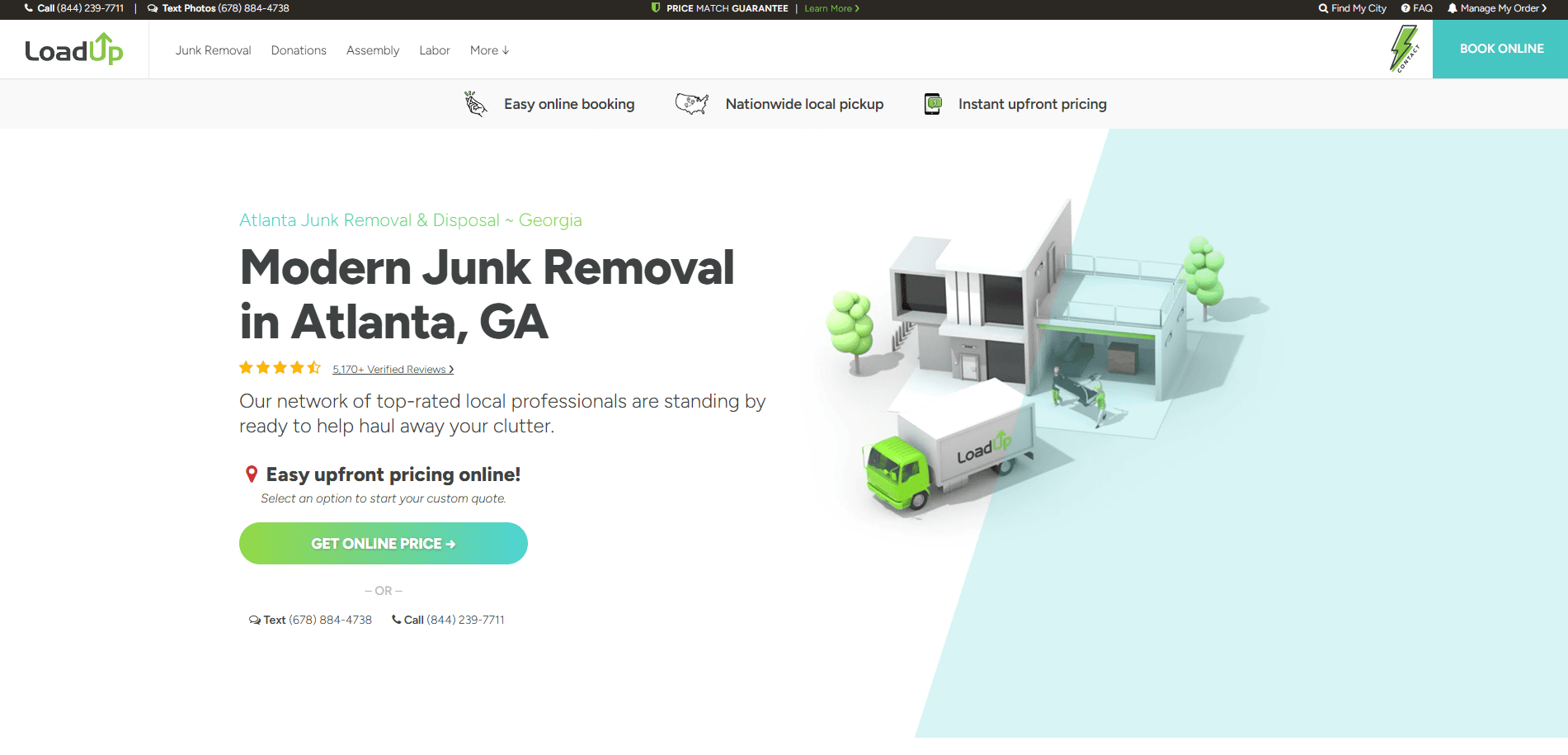
Location: Atlanta, GA
Key Takeaways:
- Transparent pricing with an online calculator.
- Eco-friendly focus with recycling initiatives.
- Streamlined booking process.
20. The Junkluggers
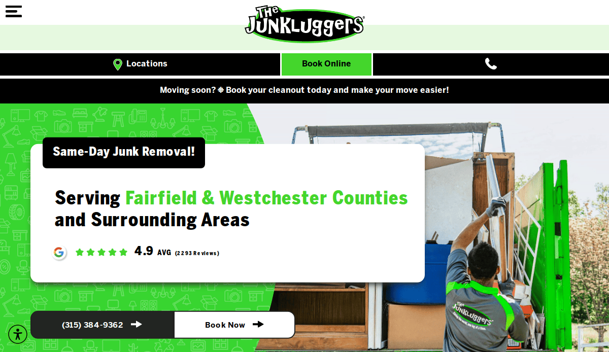
Location: Stamford, CT
Key Takeaways:
- Strong commitment to donating and recycling items.
- Clean, green-themed design reflecting eco-consciousness.
- Easy navigation with clear service descriptions.
These websites exemplify effective design principles tailored to the junk removal industry, offering inspiration for creating a compelling online presence.
Take the Next Step in Building Your Customized Site
Your website isn’t just a digital calling card—it’s the foundation of your online presence and a direct pathway to more leads and better search engine results. Whether you’re starting from scratch or refreshing an outdated template, applying smart web design strategies will help you stand out from the competition and make it easy for visitors to take action.
From mobile responsiveness and clear navigation to professional visuals and local SEO, every detail matters. If you’re ready to build your website with a trusted partner who knows how to make your brand shine and turn traffic into bookings, we’re here to help.
Contact us today to get started with a web design tailored to your goals. Let’s make your website your most powerful business asset.
Frequently Asked Questions About Junk Removal Website Design
Why is a professional website essential for junk removal companies?
A professionally designed website is crucial for junk removal companies because it builds trust, showcases your services, and allows you to attract more customers. A mobile-friendly website with a user-friendly interface ensures that your visitors can easily navigate, find the services offered, and book your services with confidence.
How can a website help grow your business in the junk removal industry?
Your website is designed to function as a lead generation tool. When optimized for SEO and built around best practices, it helps improve your search engine rankings and makes it easy for potential customers to find and contact you. Highlighting customer reviews, offering online booking, and presenting a clear overview of services provided can significantly help you attract more customers.
What content should I include on my site to make it more effective?
Your website should include service pages for junk hauling, dumpster rental, and any specialty offerings. Include high-quality images and videos to showcase your services and create engaging content that addresses common client questions. Adding a section for satisfied customers and customer reviews enhances credibility and positions you as a junk removal authority.
How do I make my website optimized for SEO and local visibility?
To elevate your junk removal business locally, it’s important to claim and optimize your Google Business Profile. Ensure that your website includes location-specific keywords, optimized meta tags, and accurate contact details. Incorporate internal links to related services and blog posts from your site, such as our guide to local SEO strategies for small businesses.
Should I use a template or custom design for my junk removal site?
While templates can offer a quick start, a custom-built website for your junk removal business gives you more control over branding and functionality. A well-designed website ensures that your website makes it easy to book services, display testimonials, and deliver an optimized user experience tailored to your audience.
What are the most effective ways to drive traffic to my site?
Implementing a mix of SEO to improve organic rankings, Google Ads for targeted traffic, and local directory listings like Google My Business are all powerful marketing strategies. Consistently updating your site with blog posts and customer stories also helps keep your website up and running with fresh content that draws in traffic.
How can I ensure my website helps convert visitors into leads?
To ensure that your website helps with conversion, use a clear CTA on every page, implement online booking tools, and provide transparent pricing with no hidden fees. Ensure that your website encourages trust by highlighting customer reviews and offering a professional design that builds confidence.
What role does mobile responsiveness play in website design?
A mobile-friendly website is essential in today’s market, especially for small business owners and local business operators. Many users search for junk removal services on their phones, so your site must load quickly and display content correctly on all screen sizes.
How does showcasing visual content improve a website?
Using high-quality images and videos to showcase your services adds credibility and improves user engagement. Visuals help illustrate your team’s professionalism and the scope of services provided, making it easier for clients to understand what to expect and encouraging them to get in touch.
How can CyberOptik help me create a junk removal website?
We specialize in helping service provider businesses design their sites with conversion and growth in mind. Whether you’re building a website for the first time or need a new website that reflects your brand and goals, we offer website design services tailored for business owners. We’ll ensure your website is crucial for success by making it optimized for SEO, visually engaging, and built to elevate your junk removal business.


