A well-designed website holds immense potential for success for franchises. A franchise’s website, often the first point of contact with potential franchisees and customers, is a critical component of the brand’s online presence. An effective website can propel a franchise above its competitors, offering an immersive and informative experience that reflects the brand’s values and market position. Having one of the best franchise websites can significantly enhance visibility and drive engagement for franchises where consistency and brand image are paramount.
A skillfully crafted website is a marketing instrument and a center for operational effectiveness across a franchise network. It should provide comprehensive information about the franchise opportunities, including insights into the business model, support systems, and success stories of existing franchisees. High-quality franchise website examples incorporate elements that facilitate seamless communication between the franchisor and potential partners, streamlining the process of managing inquiries and applications. Moreover, these websites offer consumers a user-friendly experience that aligns with the brand’s standards, whether ordering products or searching for local franchise locations, instilling a strong sense of confidence and trust.
Visibility in search engines is also crucial, and popular franchise websites often rank well for key terms, drawing in more prospective franchisees and customers. A well-optimized website increases visibility and enhances user engagement through strategic design and content that is appealing and easy to navigate. By focusing on SEO and user experience, franchisees can ensure that their online presence powerfully supports their overall business goals.
Examples of the Best Franchise Website Designs
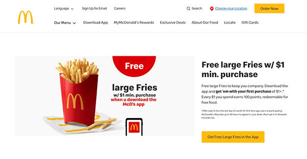
- McDonald’s: Users who enter the McDonald’s website are welcomed with a visually appealing experience that seamlessly blends the brand’s iconic colors and graphics with modern design components. The layout is user-friendly, with simple menus and clear call-to-action icons that guide users around the site. One of the most notable aspects of its website is its enormous menu area. McDonald’s is well-known for its attractive promos and deals, and the website is no different. Visitors have easy access to the most recent deals and promotions, allowing them to save big on their favorite menu items. Recognizing its customers’ different interests and demands, McDonald’s customizes its website content for specific locations, ensuring that visitors receive appropriate information and promotions based on their location.

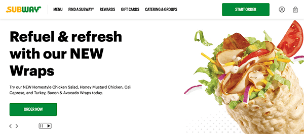
- Subway: Subway, known for its customizable sandwiches and fresh ingredients, easily transfers its dedication to excellence to the digital arena with its user-friendly and visually appealing website. Viewers are met with a vivid and welcoming interface that reflects the freshness and diversity of their menu options. The layout is sleek, with sharp photographs highlighting their savory sandwiches, salads, and wraps, making it simple for customers to locate exactly what they’re looking for. Its menu is as varied as it is delicious, and the website makes browsing its extensive range of sandwiches, breads, toppings, and sauces simple. Customers may easily create the ideal sandwich based on their taste preferences with straightforward navigation and detailed descriptions for each item.

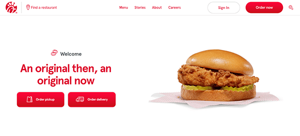
- Chick-Fil-A: The website will welcome visitors with a warm and friendly interface that symbolizes the brand’s dedication to providing a good and uplifting experience for its customers. The design is simple, with brilliant colors and appetizing imagery that immediately piques your interest and takes you into the world of Chick-fil-A. The website’s straightforward layout and user-friendly menus make it easy to navigate. Whether you want to browse the menu, find a nearby location, or learn more about the company’s principles and ambitions, everything is well-organized and easy to locate. Whether you want to dine in, order ahead for pickup, or have your meal delivered, its website provides handy ordering choices to meet your preferences. In today’s health-conscious society, openness is vital, and it succeeds at giving accurate nutritional information and ingredient lists for its menu items.
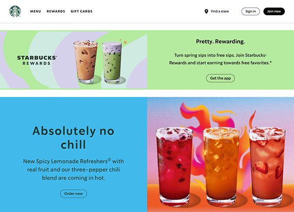
- Starbucks: When viewers visit the website, they are welcomed with a visually attractive layout that harmoniously integrates current design features with the warmth of the coffeehouse atmosphere. The minimalist design lets the bright product graphics take center stage, enticing visitors with tantalizing glances at their unique beverages and delightful delicacies. The color scheme, which is suggestive of rich coffee tones, elicits a sense of warmth and familiarity, immediately putting users at rest. Navigating its website is as easy as drinking a properly brewed cappuccino. The user-friendly layout ensures that consumers can quickly find what they’re looking for, whether finding the nearest store, browsing the menu, or learning about the newest discounts. Starbucks goes beyond static material to provide interactive features that attract and delight users. From interactive maps for finding nearby stores to personalized recommendations based on previous orders, the website uses technology to create dynamic experiences tailored to individual interests.

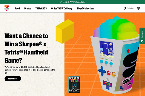
- 7-Eleven: The website welcomes visitors with a sleek design that reflects the modernism and efficiency of its physical stores. The minimalist layout ensures that important information is displayed clearly and concisely without overloading the user with excessive clutter. Vibrant artwork displaying its different product choices offers a pop of color and visual appeal, inviting visitors to learn more. The website’s innovative navigation structure makes it easy to navigate. Whether looking for a nearby store, browsing product categories or checking out the current deals, you can discover what you need with just a few clicks. It has prioritized mobile optimization to offer a consistent user experience across all devices, recognizing the importance of mobile usage in today’s digital ecosystem.

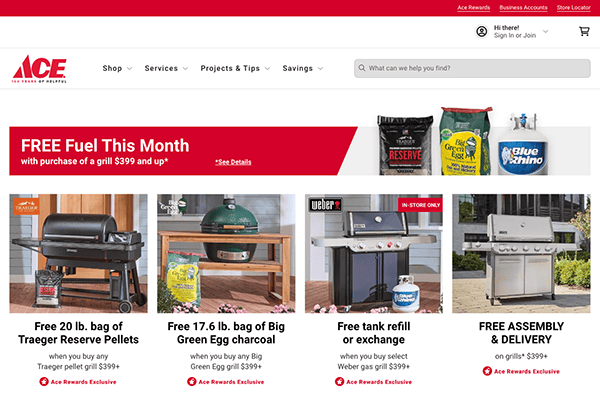
- Ace Hardware: Its website stands out as an excellent example of user-centered design and functionality. Visitors to the homepage are greeted with a modern, user-friendly structure that immediately captures their attention. The color palette is warm and harmonious, with an ideal balance of whitespace to offer a clutter-free browsing experience. The top menu has distinct categories, making it simple to discover what you’re looking for, whether gardening materials, power equipment, or home renovation necessities. The search box is prominently displayed, so you may quickly find specific goods even if you need help determining where to begin. Product pages are comprehensive and well-organized, with high-quality photographs and detailed information to assist customers in making informed purchases.

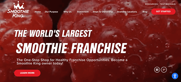
- Smoothie King: The color design is refreshing, with a mix of vivid reds representing the smoothie ingredients’ freshness. This chosen color palette is not only visually appealing, but it also promotes their reputation as a health-conscious business. The website’s navigation is seamless. The menu selections are nicely laid out, allowing visitors to navigate through various sections, such as franchise opportunities, food offerings, and success stories. Large call-to-action buttons and a fixed menu encourage consumers to take the next step, whether requesting additional information or contacting the team directly. One of the website’s distinguishing aspects is its emphasis on storytelling. Smoothie King effectively conveys its brand values, goals, and success stories via engaging images and captivating content. This fosters trust and connection with potential franchisees, allowing them to consider themselves part of the company’s family.
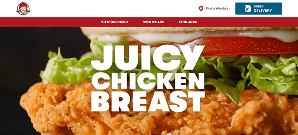
- Wendy’s: From the moment you arrive on the homepage, you are met with a visually engaging design that reflects the essence of Wendy’s legendary brand. The color palette is lively yet sophisticated, including a mix of reds, whites, and blues that convey thoughts of warmth and freshness. This color scheme is consistent with their global branding, resulting in a cohesive and distinctive online presence. The website has an intuitive navigation system. The menu items are properly labeled and easy to locate, allowing visitors to swiftly navigate through various sections such as menu offerings, specials, and nutritional information. One of the website’s distinguishing features is its emphasis on high-quality imagery. Mouthwatering photographs and videos of its famous menu items are prominently displayed across the website, enticing visitors to try their favorite burgers, fries, and frozen delights. The use of visible call-to-action buttons makes it easy for consumers to identify what they’re searching for and take the next step, whether making an order or finding the nearest Wendy’s restaurant.
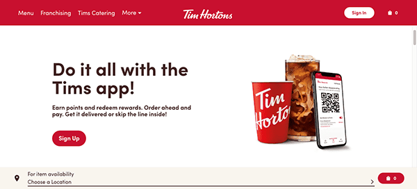
- Tim Hortons: Its website excels at user-friendly design and excellent branding. When they arrive on the homepage, visitors are greeted with the typical warmth and charm synonymous with the Tim Hortons experience. The color scheme is friendly and soothing, using warm browns and vivid reds that reflect the brand’s Canadian roots. This color scheme provides a pleasant ambiance and immediately lures guests into the world of Tim Hortons. The menu items are properly labeled and easy to locate, allowing visitors to swiftly navigate through various sections such as menu offerings, specials, and nutritional information. One of the website’s notable qualities is its emphasis on community. Tim Hortons has always been more than simply a coffee shop; it’s a place where friends and families connect and share memories.
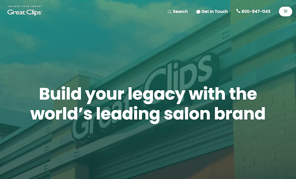
- Great Clips: The color scheme is clean and modern, with a mix of blue, greens, and whites that convey professionalism and dependability. This color scheme gives the website a clean and coherent image, demonstrating its commitment to quality and service. The franchise website has easy-to-use navigation. The menu selections are well-organized, allowing users to effortlessly navigate via sections such as franchise opportunities, support resources, and success stories. The presence of prominent call-to-action buttons makes it easy for consumers to take the next step, whether seeking additional information or contacting the franchise team directly. The website provides franchisees with significant tools like marketing materials, operational support, and ongoing training opportunities. This dedication to supporting franchisees throughout their journey promotes long-term success and growth for the franchisees and the business.

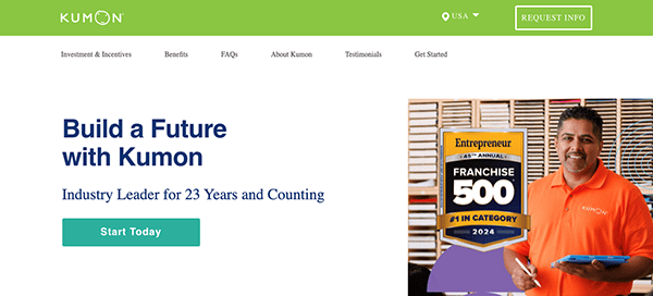
- Kumon: Its website features a modern, friendly design representing the brand’s commitment to educational excellence. The color palette is soothing and reassuring, with a beautiful blend of greens and whites that convey confidence and credibility. This color scheme creates a tranquil and friendly atmosphere throughout the website, allowing visitors to explore the franchise opportunity confidently. The menu selections are readily apparent and strategically positioned, allowing customers to quickly browse between sections such as franchise perks, support resources, and success stories. One of the website’s most notable aspects is its concentration on the Kumon Method, which has an established track record of success. It effectively communicates the impact of its education program on students’ lives through captivating testimonials and case studies, fostering trust and confidence in future franchisees.
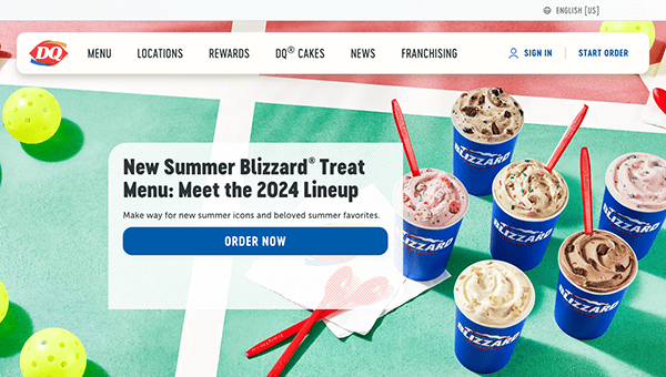
- Dairy Queen: Bright images greet visitors to their website, immediately prompting viewers to crave their famous soft-serve ice cream. The website’s clear and straightforward layout makes navigation easy. Users of all ages can easily browse since everything they need to find their current deals, menu items, and closest locations is just a click away. Bright red, chilly blue, and creamy white—Dairy Queen’s distinctive colors—create a visually arresting backdrop that entices guests. Exquisite pictures displaying their mouthwatering delicacies create an atmosphere of luxury and excitement, making it hard to resist clicking through to see more.

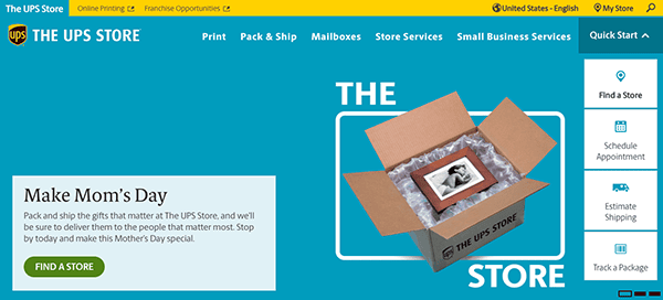
- The UPS Store: Every website page retains a uniform, unified design language, reflecting the brand’s dependability and professionalism. A standout aspect of its website lies in its navigation system, characterized by broad headings housing multiple organized pages. This structure simplifies the user experience, facilitating swift access to desired information for website visitors. Strategically positioned call-to-action (CTA) buttons on the website direct people toward their intended actions clearly and purposefully. The calls to action (CTAs) are visible and make it easy for users to take the following action, whether they are asking them to locate a store, investigate services, or seek a price.
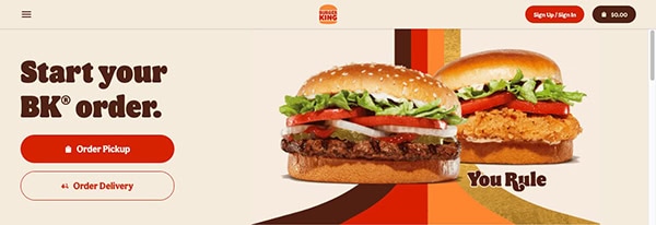
- Burger King: One thing that makes Burger King’s website unique is its contemporary style. With a custom style that crafts a distinctive and unforgettable online experience, it captivates visitors from when they arrive. The vivid colors, dynamic images, and contemporary design create an immersive atmosphere that prepares the senses for an incredible culinary adventure. The site’s smooth transitions and user-friendly user interface make every click enjoyable and easy to navigate. The presentation of its delicious food is the primary focus of its website. Each menu item is showcased with tantalizing imagery and detailed descriptions that leave you craving more. The store finder on the website makes it easy for users to find the closest location.

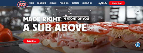
- Jersey Mike’s: Its website is a digital delight for consumers, with an attractive interface that makes navigating simple. With vivid images and an easy design, users can effortlessly navigate the delectable menu and customize their subs to perfection. The website includes helpful information on ingredients, nutrition, and allergens, allowing customers to make more informed decisions. The shop locator function makes finding a Jersey Mike’s location near you easy, allowing you to enjoy outstanding subs no matter where you are. Whether browsing on a laptop or mobile device, the website adapts seamlessly to provide a constant user experience. Jersey Mike’s dedication to quality and client happiness permeates every area of its website. From the enticing visuals to the simple purchase process, every feature is designed to improve the user experience. With an emphasis on personalization and transparency, the website caters to various dietary choices and requirements.

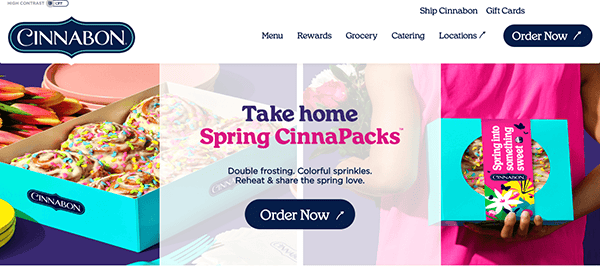
- Cinnabon: The website uses bright, fascinating photos and a harmonic blend of blue and teal to give visitors an immersive and visually appealing experience. From the moment you land on the homepage, the website immerses you in a world of delectable treats. The utilization of high-quality graphics presenting their unique cinnamon buns and delectable toppings is nothing short of tempting, evoking desires and inspiring excitement for what comes next. Important parts, such as menu items, grocery, catering, and shop locations, are prominently shown, while additional components are visually different. In addition to static photographs, the website uses engaging multimedia components like films and animations to attract visitors and successfully communicate the brand’s story.
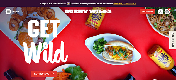
- Burny Wild’s: The website’s appearance is undoubtedly modern, with slick design features that provide life to every page. The bold colors across the site add unquestionable vitality, creating an appealing ambiance that promises a fun browsing experience. Each visit is an experience in and of itself, with a fascinating assortment of alternatives beckoning tourists to explore further. The website features a lively color palette and a well-organized menu layout, which improves the overall user experience. The vibrant colors give each page a sense of movement, grabbing the visitor’s attention and bringing them deeper into the text. Furthermore, the logical menu arrangement enables smooth navigation, allowing customers to explore the site’s offerings quickly and clearly.
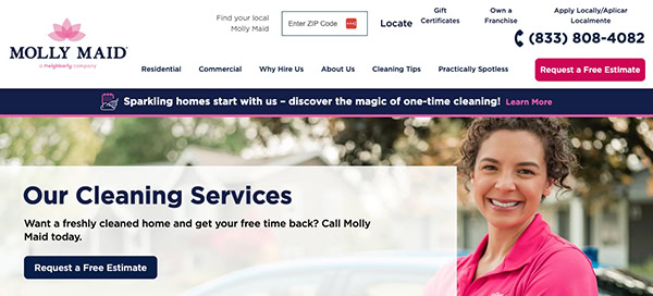
- Molly Maid: The website’s professional design is particularly striking, with eye-catching pink elements that offer an atmosphere of flare and class. High-resolution photographs bring every aspect to life with astonishing clarity, immersing guests in a visually compelling experience from the time they arrive. The site’s menu structure is well-organized, making navigation easy. Whether seeking specific information or simply exploring the content, you’ll notice that everything is nicely organized and easily accessible, optimizing your browsing experience and ensuring you quickly get what you’re looking for. The website excels in seamlessly integrating customer reviews, leveraging them to showcase the positive experiences of past clients. By openly sharing feedback and testimonials, prospective clients are given valuable insights into the quality of service offered, fostering trust and confidence in the brand.
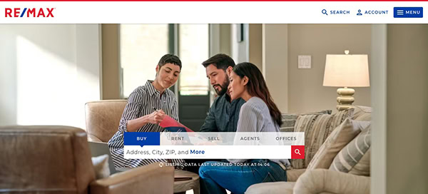
- RE/MAX: This estate franchise website features a vibrant red and blue palette that flows beautifully across its minimalistic style. The judicious use of substantial white space improves visual appeal and clarifies the website’s offerings, allowing information to shine and making navigating simple. However, this website consistently focuses on the user experience, which distinguishes it. Visitors to the homepage are met with straightforward navigation choices that make looking for residences for sale and rent more straightforward. This user-centric strategy guarantees that visitors can easily find what they are looking for, improving their entire browsing experience and increasing the likelihood of engagement and conversion.
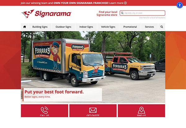
- Signarama: The website features a modern color palette, minimalist design, and well-organized layouts. The minimalist style stands out for its uncomplicated beauty, which adds to its aesthetic appeal. Visitors can enjoy a seamless and exciting exploring experience because of the website’s high-quality pictures, videos, and intuitive menu structures. This harmonious blend of design components enhances the visual attractiveness and provides ease of navigation, making it enjoyable to explore the website’s offerings. Its website also has a search button for quick navigation, a fixed menu with simple access to significant items, and a location finder tool for finding local branches, all of which improve user ease and accessibility. These user-friendly features improve the browsing experience by allowing visitors to find the information or products they need rapidly.

As the digital face of your franchise, your website needs to inform and engage your audience. The best franchise websites manage to create an online environment that mirrors the excellence of the franchise itself. These sites use clean, professional designs, intuitive navigation, and interactive elements to help users find the information they are seeking effortlessly. They consistently reflect the brand’s identity across all pages, reinforcing its message and enhancing trust among prospective franchisees and customers.
Effective franchise websites also serve as a robust platform for growth, incorporating features that facilitate lead generation, market expansion, and brand loyalty. These websites are a cornerstone of a franchise’s digital marketing strategy by showcasing compelling content such as testimonials, case studies, and detailed business model descriptions. Additionally, integrating social media and blog content can help keep the site dynamic and engaging, further improving SEO and attracting more visitors.
Ultimately, the online success of a franchise hinges on its capacity to adapt to the rapidly changing digital environment continuously. This includes embracing mobile responsiveness, leveraging the latest web technologies, and ensuring the website is accessible to all users. As franchises continue to grow and adapt, so too should their websites, always striving to offer the best possible user experience while securing a competitive edge in the industry. A well-designed franchise website is not just a current solution but a future-proof investment that ensures your franchise is always at the forefront of digital innovation, providing a solid sense of security and preparedness for what lies ahead.
Are you looking to develop a standout website for your franchise that attracts and converts? CyberOptik specializes in crafting custom, cutting-edge web designs explicitly tailored to the needs of the franchise industry. Contact CyberOptik today for a free consultation, and learn how we can help elevate your franchise website, ensuring it ranks among the best in the industry while keeping your audience engaged and empowered.


