Just looking for our Best Medical Practice Website examples list?
Why Your Medical Practice Website Design Can Make or Break Your Growth
A website today is no longer just a digital brochure—it’s your most important marketing asset. For medical practices, a well-designed website isn’t optional; it’s essential for attracting new patients, establishing trust, and standing out in a competitive market. But what separates a good medical website from a truly great one?
Patients are more discerning than ever. They search online before making healthcare decisions, evaluate practices based on visual appeal, ease of navigation, and the clarity of information presented. If your website is outdated, confusing, or slow to load, you’re likely losing prospective patients before they even walk through your door.
A high-performing medical website blends aesthetics, accessibility, and strategy. It guides visitors effortlessly, answers questions before they’re asked, and encourages them to book an appointment. More importantly, it reflects your brand and reassures users that they can trust your care.
This guide explores the best practices, latest trends, and 20 inspiring real-world examples to help you create a medical practice website that looks great and drives results. Whether you’re revamping your site or starting from scratch, these insights will help your online presence become a powerful engine for growth.
Website Planning & Purpose: Laying the Foundation for Success
Before you jump into design concepts or content creation, every successful website begins with a clear planning phase. This crucial step defines the direction, structure, and strategic goals of your site, ensuring every element serves a purpose and delivers value.
For medical practices, planning starts by understanding the audience. Who are your patients? What conditions do they seek help for? What information do they need to feel confident in choosing your practice? A discovery phase—often involving stakeholder interviews, competitive analysis, and audience research—lays the groundwork for a patient-centered experience.
Defining core goals is next. Common objectives include increasing new patient inquiries, improving online appointment scheduling, highlighting specialties or services, and establishing trust through provider bios and testimonials. Each goal should be mapped to a specific website feature or section to ensure a cohesive user journey.
Site architecture is also a planning priority. This includes outlining all pages, defining navigation structures, and identifying primary calls-to-action. For instance, your home page should direct users clearly to your services, provider profiles, and booking system. Secondary pages like FAQs, blog content, or insurance info must be easy to access yet not clutter the main user flow.
A comprehensive plan also ensures that compliance and accessibility are built in from the start. HIPAA considerations, secure patient intake forms, and ADA accessibility features must be integrated thoughtfully to avoid costly revisions later.
Ultimately, a well-planned medical website serves both the patient and the practice. It improves user experience, reduces friction in communication, and becomes a trusted extension of your care.
Design Principles: Building Trust Through User-Centered Design
Medical sites must do more than look professional—they must instill confidence, convey clarity, and guide patients through a frictionless digital journey. Applying strong design principles is essential to achieving these goals while ensuring your website functions as a strategic growth tool.
Simplicity and Clarity
Medical users value efficiency. Keep layouts clean and intuitive, using plenty of white space and straightforward visual hierarchy. Every page should have one clear purpose, whether it’s to inform, guide, or convert. Cluttered interfaces or ambiguous design elements can cause frustration and lead to user drop-off.
Visual Hierarchy and Readability
Design with hierarchy in mind: headlines should stand out, buttons should be obvious, and calls-to-action must be placed where eyes naturally travel. Use high-contrast fonts, legible sizes, and structured formatting such as bullet points and subheadings to guide users through content with ease.
Consistent Branding
Your website should be a natural extension of your medical practice’s identity. Maintain consistency in colors, logo placement, typography, and imagery across every page. A cohesive brand presence builds recognition, trust, and professionalism—key drivers in a patient’s decision-making process.
Responsive and Mobile-First Design
More than half of website traffic now comes from mobile devices. Design responsively to ensure your website looks and functions flawlessly on phones and tablets. Mobile-first layouts prioritize essential information and calls-to-action at the top, eliminating the need for excessive scrolling.
Patient-Centered UX Design
Every design decision should be grounded in the patient’s experience. Are FAQs easy to find? Is it simple to book an appointment? Can users quickly identify providers and specialties? Your website should answer these questions without requiring users to think too hard.
Trust Signals and Visual Cues
Incorporate design elements that support trust, such as testimonial sliders, provider headshots, recognizable logos of affiliated organizations, and security badges. Visual cues like check marks or icons can also guide users intuitively without overwhelming them with text.
Accessibility Best Practices
Accessible design isn’t optional for healthcare. Use alt text for images, ensure sufficient color contrast, support screen readers, and provide keyboard-friendly navigation. These features ensure ADA compliance and improve the experience for all users.
When applied consistently, these design principles help transform a medical practice website from a static online presence into a dynamic engagement tool that supports growth, builds trust, and improves patient care.
Content & Navigation: Structuring for Engagement and Ease
For a website to succeed, its content must be well-organized, purposeful, and easy to navigate. Patients visiting a healthcare site often do so with specific needs—finding a provider, booking an appointment, or understanding services. Your site’s content structure and navigation should anticipate these needs and provide straightforward, intuitive pathways.
Create a Clear Page Hierarchy
Start with foundational pages: Home, About Us, Services, Providers, Contact, and Appointment Scheduling. From there, build supporting pages such as FAQs, Insurance Information, Testimonials, Blog, and Patient Resources. Each page should serve a clear purpose, reducing redundancy and helping users find information quickly.
Write for Scannability and Trust
Patients rarely read entire pages. Use clear subheadings, bullet points, and concise paragraphs to make content scannable. Feature credentials, board certifications, and experience prominently on provider pages. Trust-building content like testimonials, affiliations, and awards should be woven into key areas without overwhelming the reader.
Include Conversion-Ready CTAs
Guide visitors toward action using calls-to-action throughout the site. Prominent buttons like “Schedule an Appointment,” “Call Now,” or “Find a Provider” should appear consistently on all major pages. These CTAs should stand out visually and be positioned where they align with user intent.
Ensure Navigation is Intuitive and Predictable
The main navigation menu should use clear, standard labels like “Services,” “Doctors,” and “Contact.” Avoid creative or ambiguous wording. Use sticky headers and breadcrumb trails to improve usability and help users retrace their steps. A site-wide search function also adds utility, especially for practices with extensive service lines or content libraries.
Balance SEO and User Needs
While keyword-rich content is essential, it must serve the user first. Use structured data where applicable, especially for provider profiles and services, to enhance search engine visibility. Every page should target a specific intent while reinforcing your authority and relevance within medical practice website design.
Use Visual Aids to Enhance Understanding
Incorporate diagrams, icons, and photos where appropriate. A simple flowchart for patient intake or an image of a smiling staff member can do more to ease patient anxiety than a block of text. Visual content should align with your branding and support the patient journey.
Well-structured content and intuitive navigation make a website easier to use and increase the likelihood of conversions. For medical practices, that means more patients scheduling appointments, fewer phone inquiries, and a stronger digital reputation.
Visual Elements: Strengthening Brand and Experience Through Imagery
Visual design does more than beautify a website in the medical field—it reinforces brand trust, simplifies complex information, and improves user experience. In an industry built on credibility, clarity, and comfort, visual elements must be purposeful and aligned with patient expectations.
Use Authentic Imagery Over Stock Photos
Real images of your providers, staff, and facility can help humanize your practice and build immediate trust. Avoid generic stock photography whenever possible. Instead, invest in a professional photoshoot to capture the essence of your environment and team culture.
Incorporate Consistent Design Motifs
Every visual element—from icon sets to button shapes—should reflect your identity style guide. Stick to a consistent color palette, image treatment (like rounded corners or overlays), and iconography that speaks to your medical specialty. Consistency reduces cognitive load and fosters a polished, professional impression.
Support Information with Visual Aids
Visuals help communicate complex medical information quickly. Infographics, charts, or animations can break down topics like procedures, patient journeys, or insurance processes in a digestible way. These tools are especially helpful for patients navigating a diagnosis or comparing treatment options.
Highlight Key Messages with Design Focus
Use imagery to draw attention to critical messages or actions. A hero image on the homepage could feature a smiling provider with a CTA button that says “Meet Our Team.” Patient testimonials can be paired with friendly portraits, making the endorsements feel more genuine and impactful.
Improve Emotional Connection
A cold, clinical look may alienate patients. Instead, use warm tones, smiling faces, and welcoming imagery to reduce anxiety and promote reassurance. This is particularly effective for practices like pediatrics, family medicine, or behavioral health.
Ensure Visual Accessibility
Maintain high contrast between text and background, use alt text for every image, and avoid flashing or distracting animations. Accessibility in visuals improves usability and complies with legal standards like the ADA.
Adapt Visuals for Mobile Viewing
Ensure that all images, graphics, and videos scale properly on mobile devices. Compress file sizes to maintain fast load times without compromising quality, and make sure visual content remains legible on smaller screens.
Strategic use of visual elements can elevate a medical website from functional to unforgettable. When visuals are aligned with messaging, accessible to all users, and emotionally resonant, they strengthen both your brand and your patient relationships.
Ongoing WordPress Maintenance: Keeping Your Medical Website Secure and Effective
A WordPress website is not a one-time project—it’s a living digital platform that requires consistent attention to stay secure, functional, and aligned with evolving patient expectations. With WordPress as a popular CMS for healthcare providers, ongoing maintenance is critical for long-term success.
Security Updates and Plugin Management: Medical practices handle sensitive patient information, making security paramount. Regularly updating WordPress core, plugins, and themes helps patch vulnerabilities that could otherwise be exploited. A best practice is to audit plugins monthly and remove any unused or unsupported ones to reduce security risks.
Performance Optimization: Slow load times frustrate users and impact search engine rankings. Ongoing maintenance includes optimizing images, clearing cache files, minimizing script usage, and monitoring uptime performance. Speed tools and plugins like WP Rocket or LiteSpeed Cache are commonly used to maintain fast, reliable experiences.
Backups and Recovery Plans: Automated daily backups are non-negotiable for medical websites. Should a site crash or be compromised, backups allow quick restoration with minimal downtime. A reliable backup solution should include both local and cloud storage and offer easy recovery options.
Monitoring Site Health: Consistent monitoring tools like Wordfence or Jetpack can alert administrators to downtime, malware, or performance anomalies. Routine health checks ensure the site continues to function properly across different browsers and device types.
SEO and Content Audits: Search algorithms and patient search behaviors evolve. Periodic content reviews help identify outdated information, broken links, or keyword opportunities. Keeping your site fresh and relevant enhances visibility and patient engagement.
ADA and HIPAA Compliance Checks: Regulatory requirements change, and compliance audits ensure your site remains accessible and legally secure. Routine assessments should review form encryption, privacy policies, ADA elements, and security certificates.
Support and Troubleshooting Issues can arise without warning, whether from updates or user interaction. Having access to responsive WordPress support means problems are resolved quickly, reducing the risk of patient dissatisfaction or reputational harm.
Proactive WordPress maintenance is a strategic investment that protects your practice’s reputation, patient trust, and marketing performance. A neglected website may not only underperform—it could expose you to security, compliance, or functional issues that directly impact your practice’s success.
Medical Website Design Examples
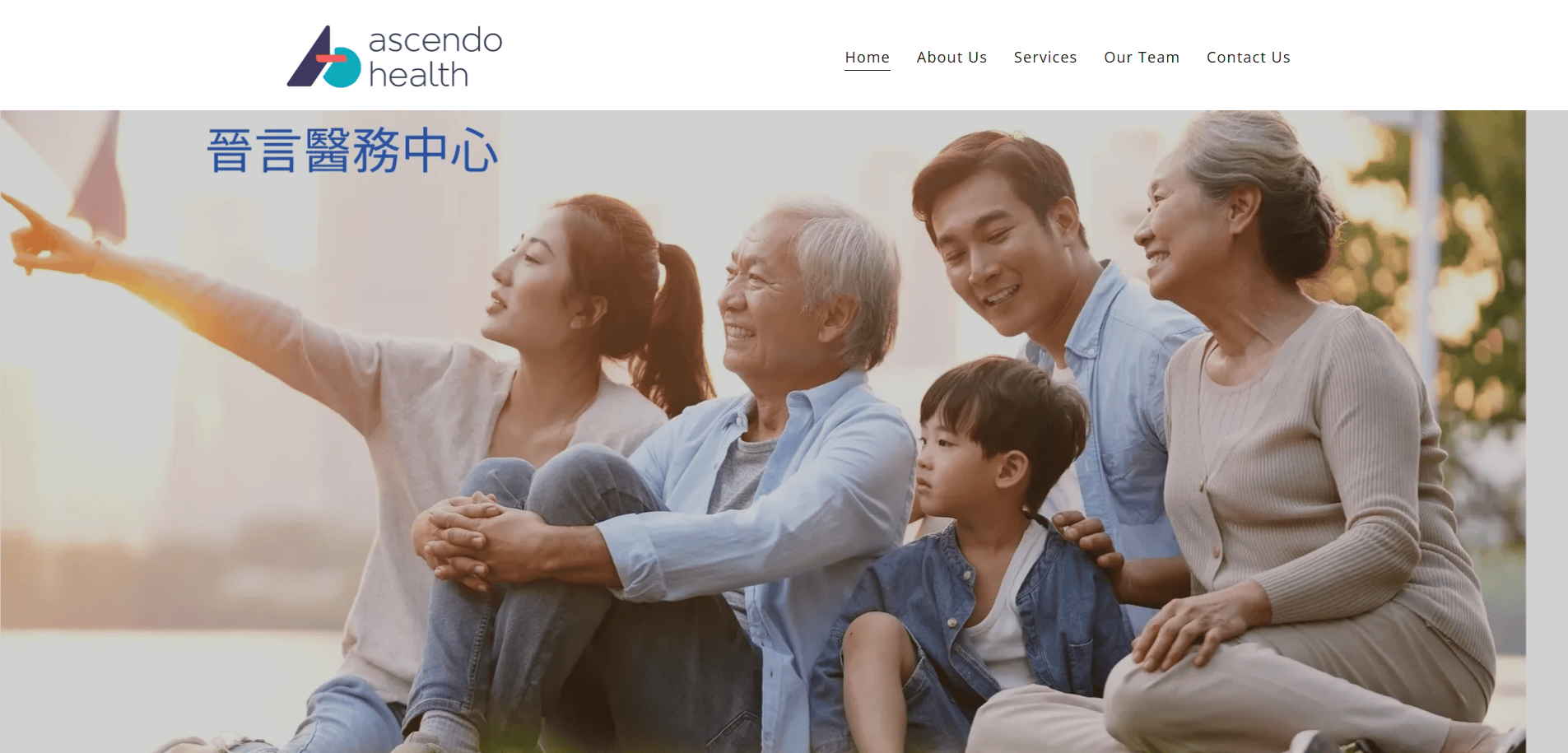
1. Ascendo Health
Location: Chicago, IL
Key Takeaways:
- Clean, professional layout with minimalistic design.
- Modern typography enhances readability.
- The tranquil color palette fosters a calming user experience.
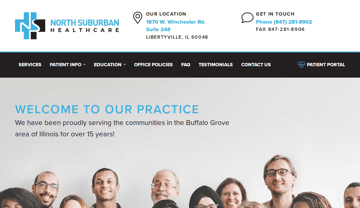
2. North Suburban Healthcare
Location: Skokie, IL
Key Takeaways:
- Trust-inspiring, clean design.
- Clear navigation for easy access to services.
- Prominent contact information for quick appointments.
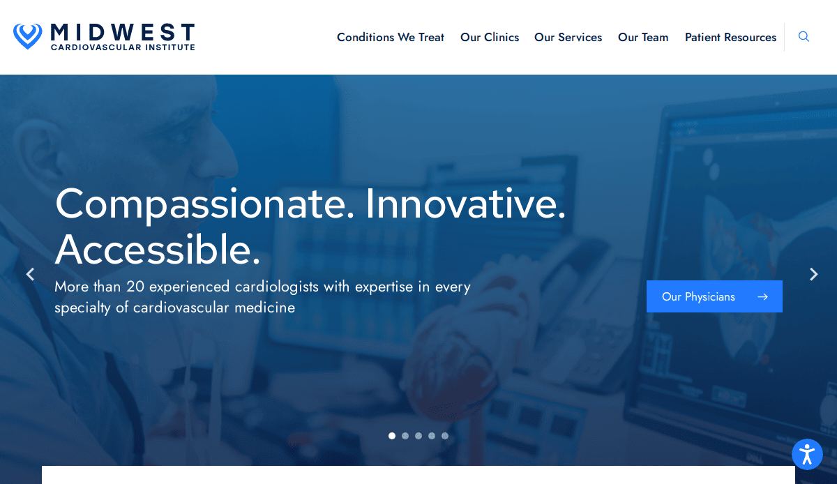
3. Midwest Cardiovascular Institute
Location: Naperville, IL
Key Takeaways:
- Straightforward navigation prioritizes patient well-being.
- Clean layout emphasizing essential elements.
- Easy access to appointment booking options.
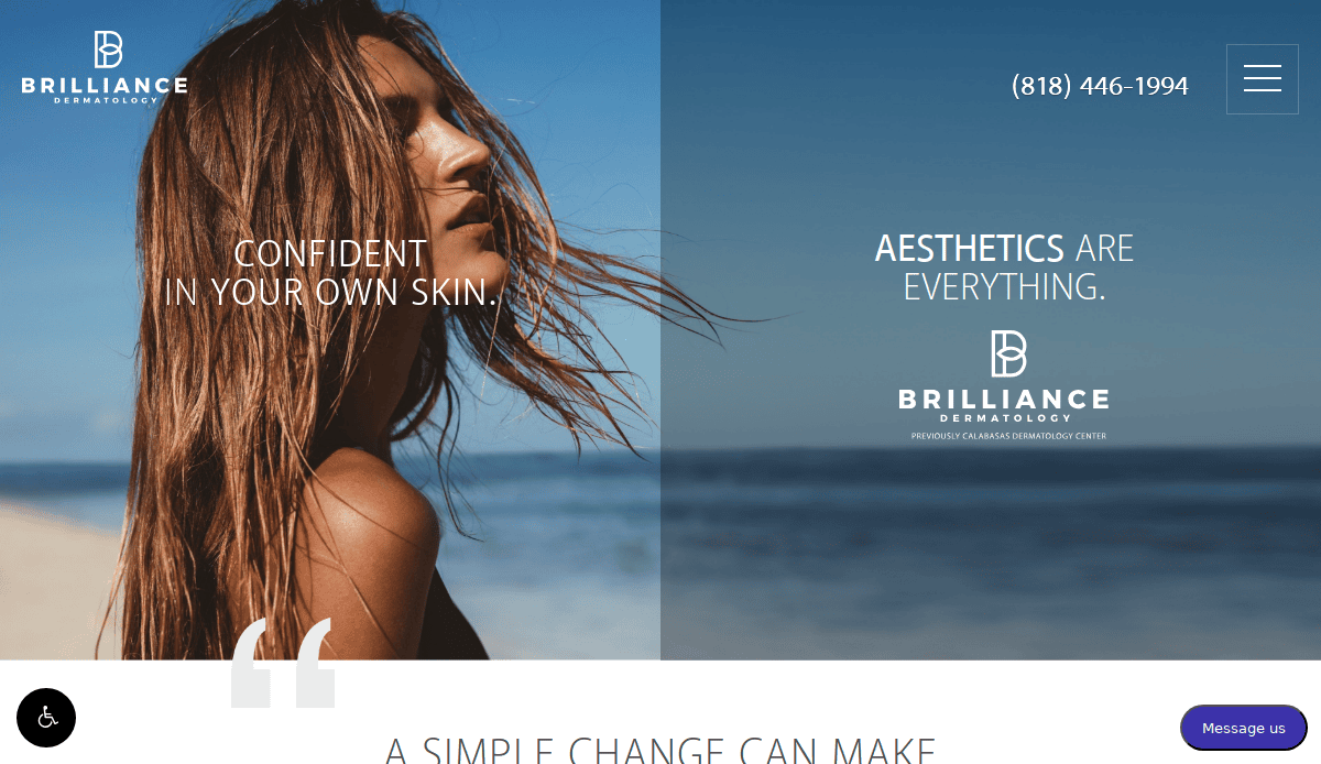
4. Calabasas Dermatology Center
Location: Calabasas, CA
Key Takeaways:
- Captivating full-page hero image.
- Visually appealing layout with intuitive navigation.
- Well-organized sections for easy information access.
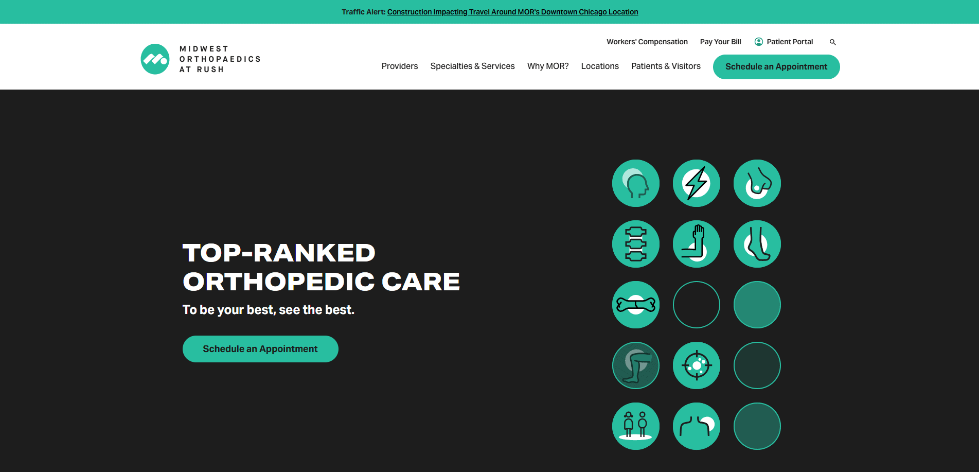
5. Midwest Orthopaedics at Rush
Location: Chicago, IL
Key Takeaways:
- User-friendly design with clear calls to action.
- Comprehensive information on services and providers.
- Mobile-responsive layout for accessibility.
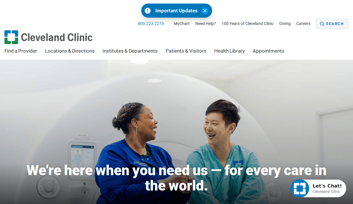
6. Cleveland Clinic
Location: Cleveland, OH
Key Takeaways:
- Comprehensive information architecture.
- High-quality imagery and consistent branding.
- Accessible design meets WCAG standards.
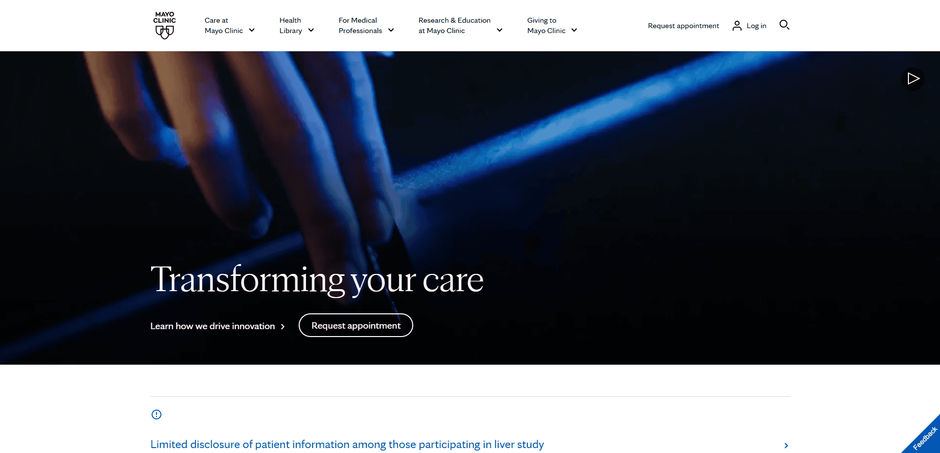
7. Mayo Clinic
Location: Rochester, MN
Key Takeaways:
- Robust search functionality for easy information retrieval.
- Clean, straightforward design.
- High-contrast fonts and accessible navigation.
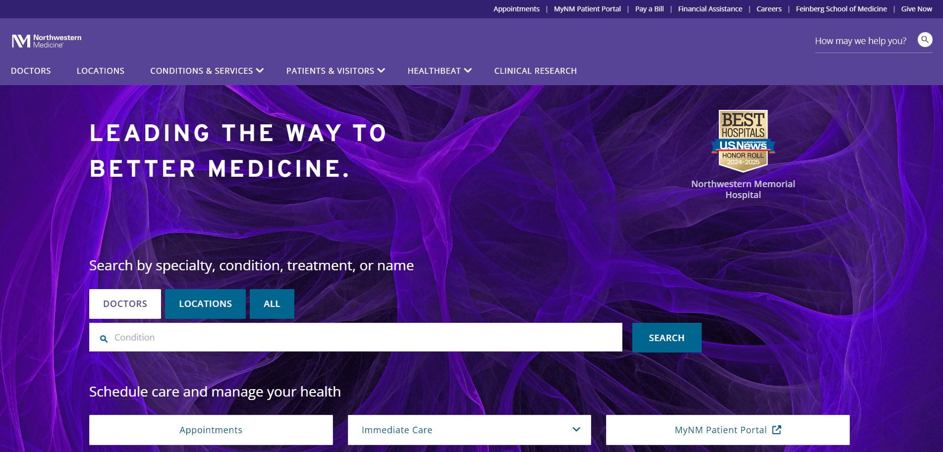
8. Northwestern Medicine
Location: Chicago, IL
Key Takeaways:
- Beautiful design with intuitive navigation.
- Clear categorization of services and information.
- Integration with social media for broader reach.
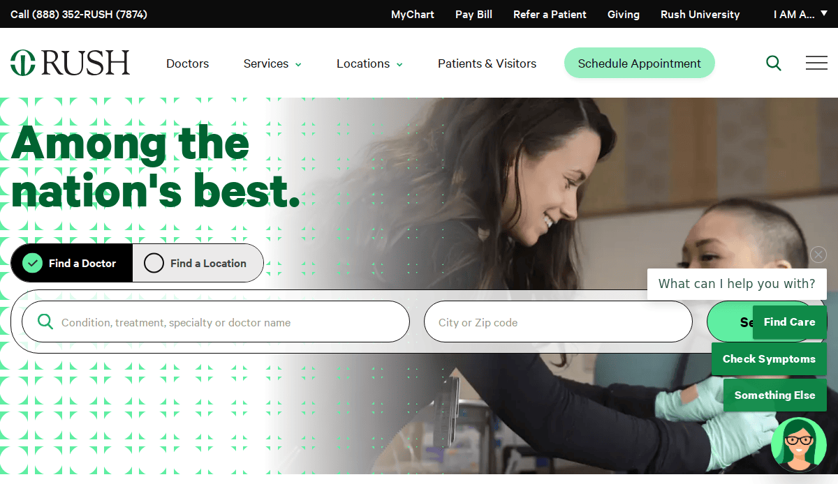
9. Rush University Medical Center
Location: Chicago, IL
Key Takeaways:
- Engaging health-related content and articles.
- Easy-to-use website with multilingual support.
- Integration of social media posts for dynamic content.
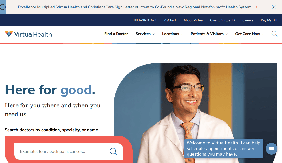
10. Virtua Health
Location: Marlton, NJ
Key Takeaways:
- Impressive branding and imagery.
- Simple yet engaging content presentation.
- Straightforward navigation for user convenience.
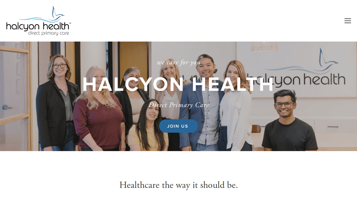
11. Halcyon Health
Location: Santa Barbara, CA
Key Takeaways:
- Minimalist design with a focus on direct care.
- Large banner with clear call-to-action.
- Emphasis on personal access to healthcare providers.
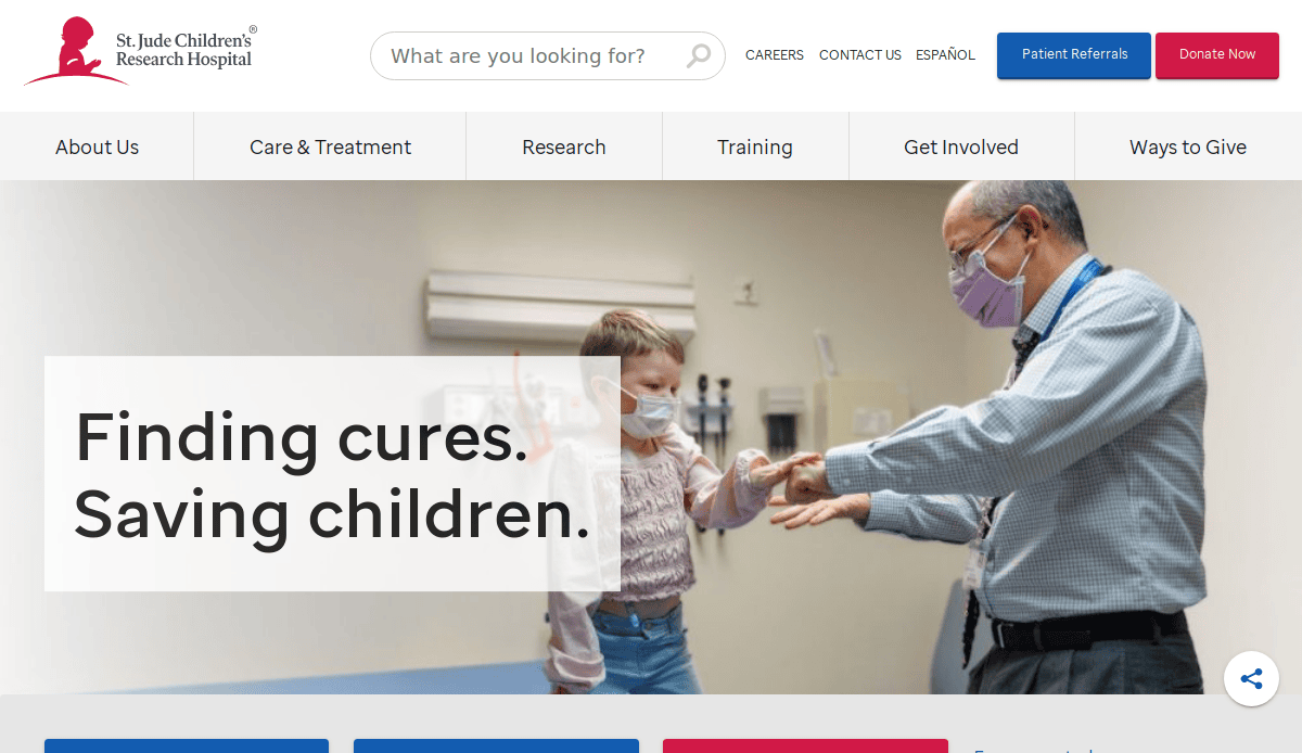
12. St. Jude Children’s Research Hospital
Location: Memphis, TN
Key Takeaways:
- Emotional connection through warm tones and success stories.
- Clear pathways for patient referrals.
- Emphasis on pediatric cancer care options.
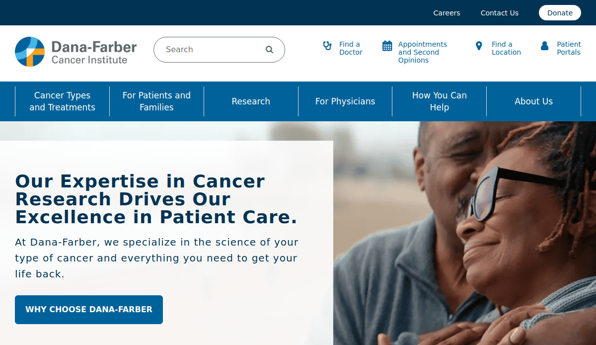
13. Dana-Farber Cancer Institute
Location: Boston, MA
Key Takeaways:
- Modern digital experience with a blue and white design.
- Advanced filtering for doctor search.
- Transparent donation platform supporting research initiatives.
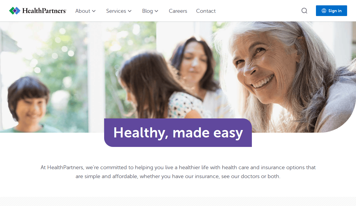
14. HealthPartners
Location: Bloomington, MN
Key Takeaways:
- Emphasis on simplicity and accessibility.
- Welcoming imagery with a clear tagline.Commitment to effortless healthcare navigation.
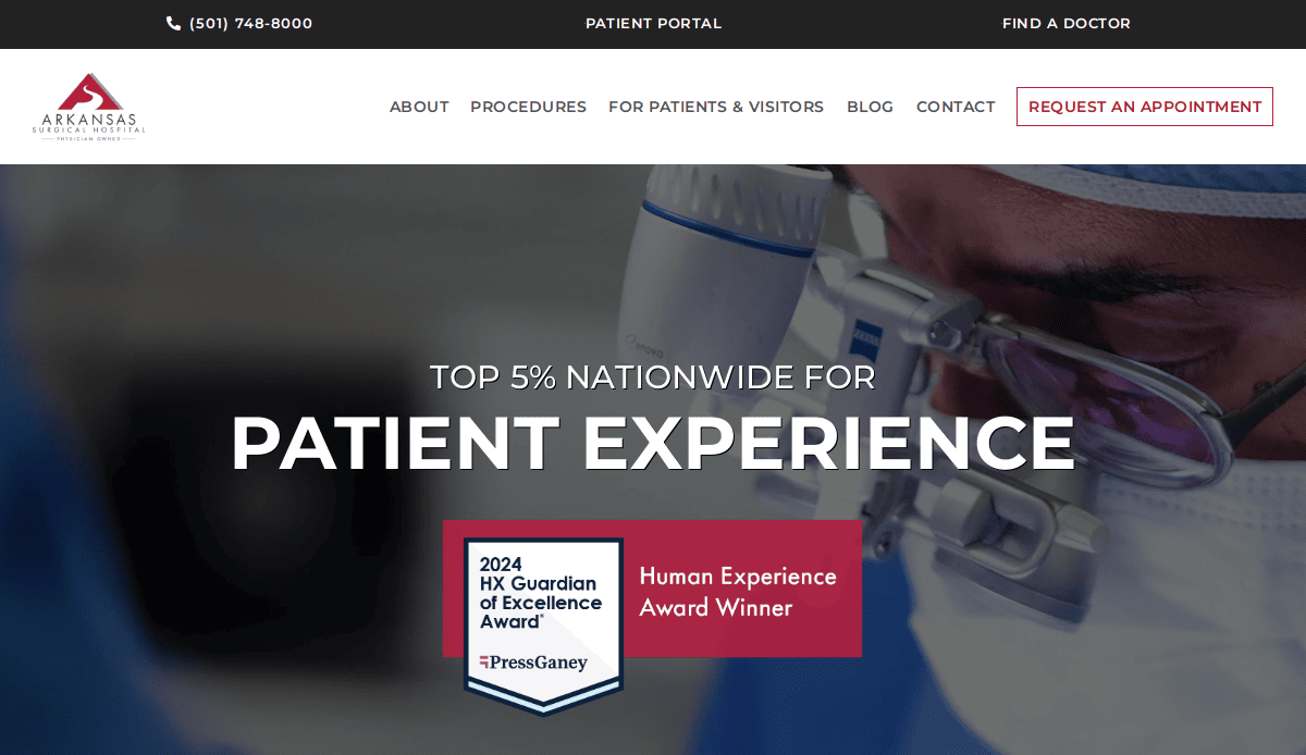
15. Arkansas Surgical Hospital
Location: North Little Rock, AR
Key Takeaways:
- Immediate display of contact details and location.
- Critical safety information is prominently featured.
- Unobtrusive colors and styles for a calming effect.
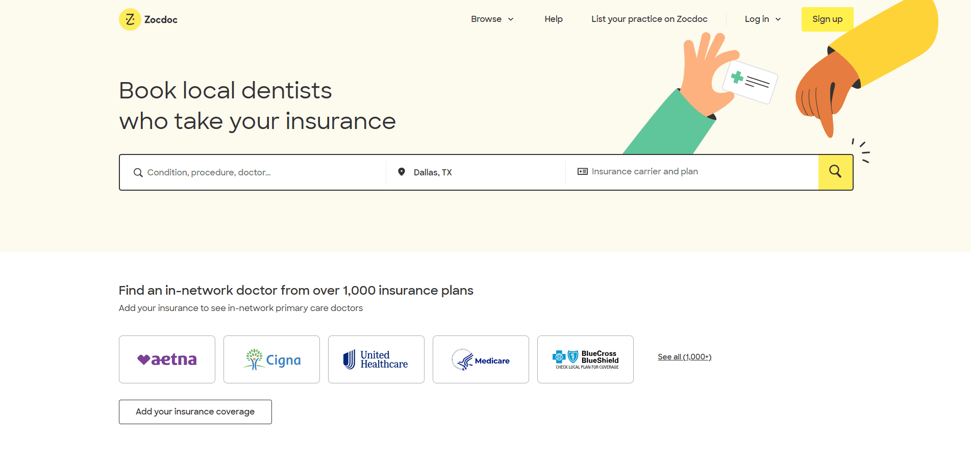
16. Zocdoc
Location: New York, NY
Key Takeaways:
- Modern interface with easy-to-use interactive elements.
- Eye-catching icons and mobile-friendly design.
- Comprehensive appointment booking platform.
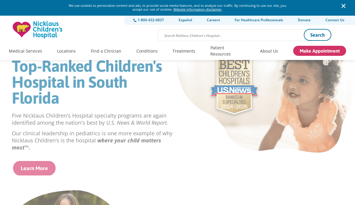
17. Nicklaus Children’s Hospital
Location: Miami, FL
Key Takeaways:
- Friendly and easy-to-use design.
- Engaging visuals and interactive elements.
- Focus on pediatric care and family engagement.
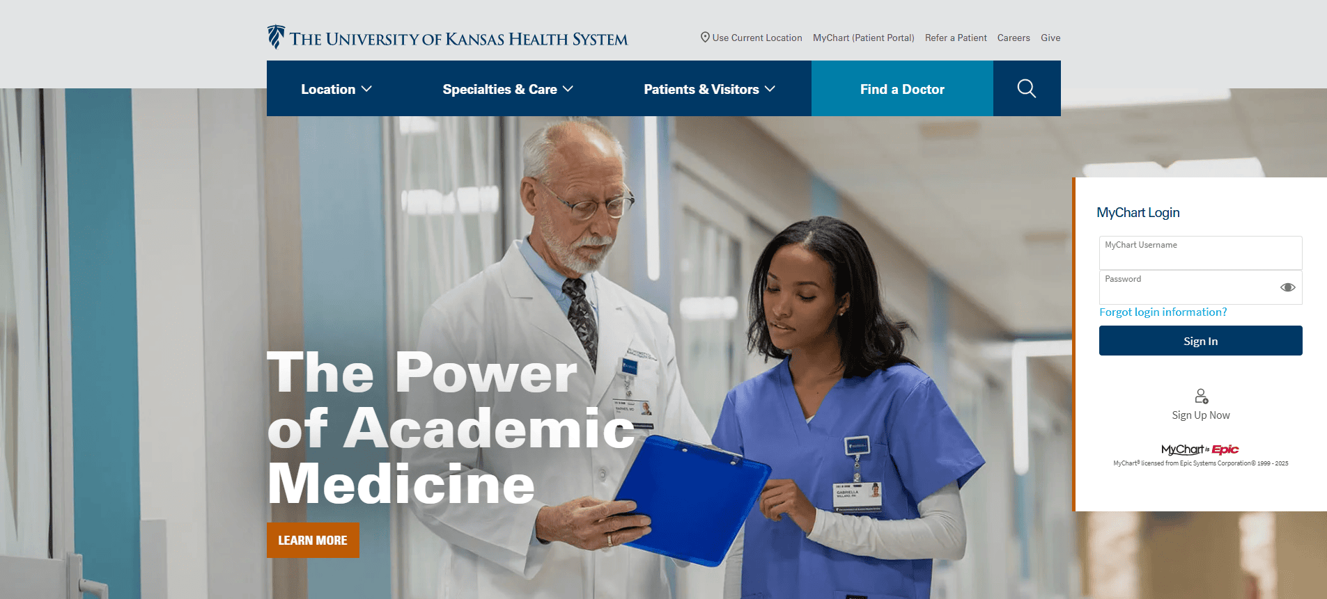
18. Olathe Health
Location: Olathe, KS
Key Takeaways:
- Prominent display of key services on the homepage.
- Clear navigation to answer patient needs.
- Vital safety guidelines are featured for patient awareness.
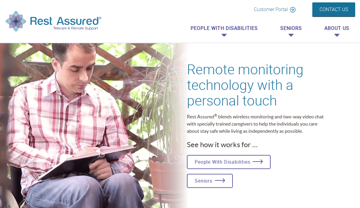
19. Rest Assured
Location: Indianapolis, IN
Key Takeaways:
- Strong accessibility features for seniors and PWD.
- High-contrast text and intuitive user experience.
- Simple design with highly visible buttons.
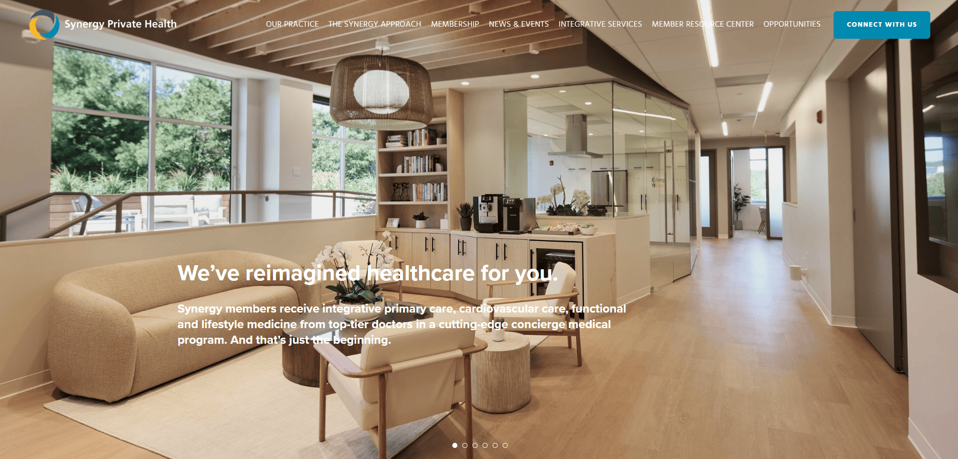
20. Synergy Private Health
Location: San Francisco, CA
Key Takeaways:
- Patient-centric features with a focus on usability.
- Clean design emphasizing personalized care.
- Comprehensive information on services offered.
These examples illustrate how thoughtful design, user-friendly navigation, and clear calls to action can enhance the online presence of medical practices, ultimately leading to improved patient engagement and practice growth.
Ready to Transform Your Website Into a Patient-Generating Machine?
A site built on strong web design principles, responsive design, and user-friendly functionality doesn’t just look good—it delivers measurable results. Whether you’re aiming to improve search engine optimization, boost patient engagement, or build trust in your brand, your new website can be your most powerful digital asset.
As a full-service digital marketing agency, we specialize in creating high-converting, SEO-optimized websites tailored specifically for medical practices. If you’re ready to elevate your online presence and convert more visitors into loyal patients, we’re here to help.
Contact us to get started today and turn your practice website into a growth-driving tool that works around the clock.
Comprehensive Healthcare Marketing and Website Development FAQs
What makes a good medical website design for doctors?
A well-designed website for doctors should reflect professionalism, build trust, and support practice growth. It must feature responsive design, be user-friendly, and integrate search engine optimization to rank in search engine results. Prioritize web accessibility and clear calls to action like “book appointments” to convert visitors into patients.
Why is responsive web design critical for clinic websites?
Responsive web design ensures your website displays correctly across every screen size—from desktops to mobile devices. This enhances user experience, reduces bounce rates, and ensures that patients to your practice can easily access essential information.
What content should be on the landing page of a doctor’s website?
Your landing page should include a clear value proposition, medical services offered, and a direct path to schedule an appointment. Incorporating medical seo strategies and testimonials can also enhance conversions and online visibility.
How can healthcare professionals improve their online presence?
Partnering with a web design agency like ours that specializes in websites for healthcare providers ensures that your site is visually appealing, optimized for SEO, and tailored to your practice’s unique goals.
What role does website accessibility play in healthcare marketing?
Website accessibility ensures people with disabilities can access the website without barriers. It’s a legal requirement and supports inclusivity, improves patient experience, and contributes to better healthcare marketing outcomes.
Why should a healthcare organization invest in website design and development?
A robust website supports digital healthcare delivery, strengthens reputation management, and enhances your ability to reach current patients and new audiences. It becomes a central tool for patient education and lead generation.
How often should a medical web design be updated?
A medical website should be refreshed every 2–3 years, or sooner if it no longer aligns with best practices, branding, or technological standards. Regular updates ensure your web content, design, and functionality meet the preferences of the target audience.
What are the benefits of customized medical websites over templates?
Customized websites are tailored to your practice and offer better control over patient experience, branding, and integrations. They allow for more thoughtful design and flexibility to support your practice growth strategies.
How do you ensure medical marketing compliance on a website?
Ensure your site meets HIPAA guidelines, uses secure web development practices, and includes privacy policies and consent notices. Partnering with experienced developers ensures medical web compliance without compromising on design quality.
Can SEO and web design work together for healthcare providers?
Absolutely. Medical web design should support medical seo from the ground up—structuring content, optimizing loading speed, and using targeted keywords help grow your practice and improve search engine results.
Explore more about our website design services for medical practices and how we can help enhance your online presence.


