Just looking for our Best Recruiters Website examples list?
Why Recruiter Website Design is More Than Just Aesthetics
When potential clients or top-tier talent visit your website, their first impression can make or break the decision to engage. Great website design isn’t a luxury—it’s a necessity for agencies aiming to compete in a saturated market. A high-performing website builds trust, strengthens your brand, and drives measurable results.
Today, your website is often the first point of contact for employers and candidates alike. It must do more than look good—it needs to optimise UX, deliver relevant information quickly, and convert visits into action. From intuitive navigation to clear calls-to-action, every detail matters when you design a website that’s meant to attract, inform, and convert.
Recruitment agencies must pay attention to how staff, job seekers, and new clients interact with their website. Incorporating keyword-rich content, ensuring mobile responsiveness, and designing with both user intent and search engine requirements in mind can elevate visibility and authority. Whether you’re refreshing an outdated site or starting from scratch, the principles of recruitment website design are pivotal to standing out and scaling up.
Website Planning & Purpose: The Strategic Blueprint for Recruitment Success
Before diving into layouts, color schemes, or even job board integrations, the first step in web design is planning with purpose. A website is far more than a digital brochure—it’s a dynamic business tool that drives talent acquisition, showcases the employer, and builds credibility with potential customers.
The planning phase begins by clearly identifying your target audiences: job seekers, potential clientele, and internal staff. Each of these user groups has different goals when they visit your website. Candidates are looking for jobs and insights into company culture. Clients want to evaluate your professionalism and see how you source and place talent. Internal staff may need portals for managing applications or updating content. Understanding these roles allows you to tailor content, navigation paths, and features to serve each user journey effectively.
Next, clarify your website’s primary goals. Do you want to increase job applications, build a stronger brand, or generate B2B leads? These goals guide the selection of features such as advanced job filters, SEO-optimized content, dynamic CTAs, and testimonial sections.
Keyword research plays a critical role in this phase. By identifying terms that job seekers and employers commonly search—like “recruitment agency website,” “best staffing website design,” or “how to build a recruitment website”—you can ensure your site is structured and written to attract and engage the right visitors from day one.
Finally, choose the right CMS and tech stack. Recruitment agencies often benefit from WordPress due to its flexibility, plugin ecosystem, and SEO capabilities. Whatever platform you choose, it should support scalability, user management, and regular updates.
The result of this meticulous planning is a website that’s beautiful, functional, measurable, and aligned with real-world business outcomes. It becomes a long-term asset that supports your marketing, hiring, and operational goals—all while standing out in a competitive hiring landscape.
Design Principles: What Makes an Industry Website Truly Effective
Designing and building a successful website requires more than just selecting a visually appealing template. For recruiting websites to perform, they must embody key design principles that align with both candidate and client expectations, supporting the recruitment process from first click to application submission.
Start with responsive design. Recruitment and staffing websites must work seamlessly across all devices. Many recruitment journeys begin on a mobile phone, and a responsive design ensures that users can easily browse job listings, explore company information, and apply for jobs without frustration.
Next, embrace white space and a clean layout. A cluttered or generic website quickly turns off potential candidates. An effective recruiting website design uses space strategically to highlight important information, such as calls to action, open positions, and guides users through the site naturally.
Focus on intuitive navigation. Your agency’s site structure should allow users to locate jobs, company info, blog content, and application instructions within a few clicks. Guidance menus must be clear and consistent. Drop-downs, filters, and breadcrumbs can enhance the experience further.
Ensure your website content aligns with your company’s voice and messaging. The best websites have a consistent tone, compelling headlines, and fresh content that showcases company culture, mission, and success stories. A site design without authentic, human-centered copy feels impersonal and lacks the power to convert.
Incorporate interactive elements. Tools like job search filters, salary guides, or ATS-integrated application forms help turn passive browsing into engaged interaction. Whether you’re a recruitment firm or search firm, adding functionality such as job alerts or resume submissions improves candidate attraction.
Accessibility must also be part of the foundation. A truly modern website is inclusive, built to meet WCAG standards, and accessible to users of all abilities. This is a legal best practice and broadens your talent pool.
Don’t neglect performance. A website that isn’t optimized for speed or built with a robust website platform will frustrate users and damage search engine rankings. Page load time, mobile usability, and regular updates must all be addressed during development.
Lastly, use website analytics to continuously refine UX. Monitor traffic to your website, track which pages convert best, and use that insight to improve website copy, layout, and conversion paths.
By incorporating these design principles, you can build the best website possible—one that attracts top talent and supports business growth for recruitment agencies of all sizes.
Content & Navigation: Structuring Your Website for Maximum Engagement
Content and navigation are the backbone of every successful website. They shape how users explore your site, access information, and ultimately decide whether to apply for a job or contact your firm. When done right, they enhance UX and drive measurable results in candidate attraction and client engagement.
Start with a clear sitemap that prioritizes key conversion paths. Your homepage should introduce your business, highlight job categories, and include immediate access to your most important pages—typically Jobs, About Us, Contact, and Resources or Blog. Every click should move the visitor closer to a goal, whether that’s browsing jobs or reaching out to your team.
Segment content for different audiences. Candidates, recruiters, and clients should all feel like the website is tailored to their needs. Job seekers should find job listings, application instructions, and career advice. Clients should see case studies, testimonials, and service overviews. Your internal team might need access to ATS dashboards or content management areas.
Navigation must be intuitive. Use descriptive labels in the menu like “Search Jobs,” “Hire Talent,” or “Meet Our Team.” Avoid industry jargon that might confuse users. Sticky headers, anchor links, and dropdown menus improve navigation fluidity, especially for users on mobile devices.
Website copy should be benefit-focused and action-oriented. Use direct, persuasive language that speaks to user goals. A sentence like “Find your next role faster with our expert recruiters” is more compelling than generic statements. Headlines, subheads, and buttons must drive action—whether it’s applying, subscribing, or scheduling a consultation.
Support content with visuals. Include team photos, workplace imagery, explainer videos, and icons to break up text and reinforce your messaging. Visuals support storytelling and help differentiate your recruitment agency’s brand.
Finally, ensure there is a content strategy in place. Publish fresh content regularly on a blog or insights page to improve SEO and provide ongoing value. Content should address job market trends, recruitment tips, and company news to demonstrate authority and relevance.
By thoughtfully structuring your content and navigation, you create a website that is easy to use, rich in value, and optimized for conversions, serving both candidate and client needs.
Visual Elements: Crafting a Visually Engaging Experience That Converts
Visual design plays a critical role in shaping a website’s overall impact. It’s not just about aesthetics—well-chosen visual elements guide user behavior, reinforce your identity presence, and support the decision-making process for both candidates and clients.
Start with consistent branding. Every visual element—from your color palette and font choices to button styles and iconography—should reflect your agency’s identity. A unified visual language enhances recognition and trust, helping your site stand out in a crowded space. Logos should be clear and placed consistently, and every image should align with your agency’s tone and values.
High-quality imagery matters. Generic stock photos won’t cut it in the modern recruitment landscape. Instead, use authentic team photos, real office environments, and imagery that reflects the diversity and professionalism of your workforce. These visuals humanize your business and make candidates feel more connected.
Use visuals to guide the journey. Visual hierarchy—achieved through typography, layout, and design scale—helps direct attention to key areas like job search tools, featured listings, or contact forms. Employ accent colors to draw focus to calls-to-action, and utilize white space to make content more scannable and user-friendly.
Video content is especially effective on agency sites. A short video about your hiring process, employee testimonials, or a behind-the-scenes look at your agency can dramatically increase time on site and improve user engagement. Embed these videos strategically near calls-to-action or about pages.
Infographics, icons, and visual cues also enhance understanding. Infographics can simplify complex data, such as hiring timelines or placement rates. Icons can make menus and processes easier to understand at a glance, while visual indicators like arrows or highlights can subtly guide users toward important features or actions.
Accessibility and performance must be top priorities. Use alt text for all images, maintain strong contrast ratios, and ensure visual components function seamlessly on all screen sizes. Lightweight file formats and optimized media help ensure fast page load speeds, which in turn support both SEO and user satisfaction.
Ultimately, visual elements aren’t just decorative—they are functional tools that help create an intuitive, branded, and persuasive user experience. Compelling visuals improve engagement and convert passive visitors into active applicants and loyal clients.
Ongoing WordPress Maintenance: Keeping Your Site Performing at Its Best
Once your website is launched, ongoing maintenance is essential to ensure it continues to perform reliably and securely. WordPress, while flexible and powerful, requires regular attention to support both functionality and user experience, especially for staffing agencies that rely heavily on digital performance to attract top talent and engage clients.
Start with core updates. WordPress, along with its themes and plugins, is frequently updated to fix bugs, introduce new features, and patch security vulnerabilities. Regularly applying these updates helps keep your website from becoming outdated or exposed to threats.
Security should always be top of mind. Implement measures such as SSL certificates, firewalls, and malware scanning to keep your website secure. Automated backups should be scheduled to protect your content and ensure you can recover quickly in the event of data loss or a cyberattack.
Monitor performance and uptime. Professional websites must load quickly and remain accessible at all times. Use uptime monitoring tools and performance optimization plugins to catch issues before they affect user experience. Slow or unavailable sites frustrate website visitors and negatively impact recruitment marketing efforts.
Content maintenance is equally important. Your website’s content—job postings, team bios, blog articles, and service pages—needs to stay current. Outdated information reflects poorly on your image and can mislead candidates and clients. Create a routine for reviewing and updating content regularly so your messaging stays aligned with business goals.
Accessibility compliance must be maintained over time. As design and content evolve, ensure your website remains compliant with accessibility standards. This serves all users and protects your agency from potential legal exposure.
Additionally, SEO should be treated as an ongoing effort. Make your site easy to find by ensuring that technical SEO best practices are applied consistently, like optimizing metadata, maintaining fast load speeds, and using schema markup. This helps your site stay competitive in search engines that your website depends on for visibility.
Finally, analytics should inform continuous improvements. Track performance metrics to understand how visitors are engaging with the site. Use this data to identify opportunities for refinements in layout, content, or user pathways.
Ongoing maintenance is not optional—it’s a core component of sustaining an effective online presence. Whether you create custom solutions or use a site builder, regular upkeep ensures your website remains a valuable, high-performing asset tailored to your needs and ready to support future growth.
20 Recruitment Agency Website Designs to Inspire
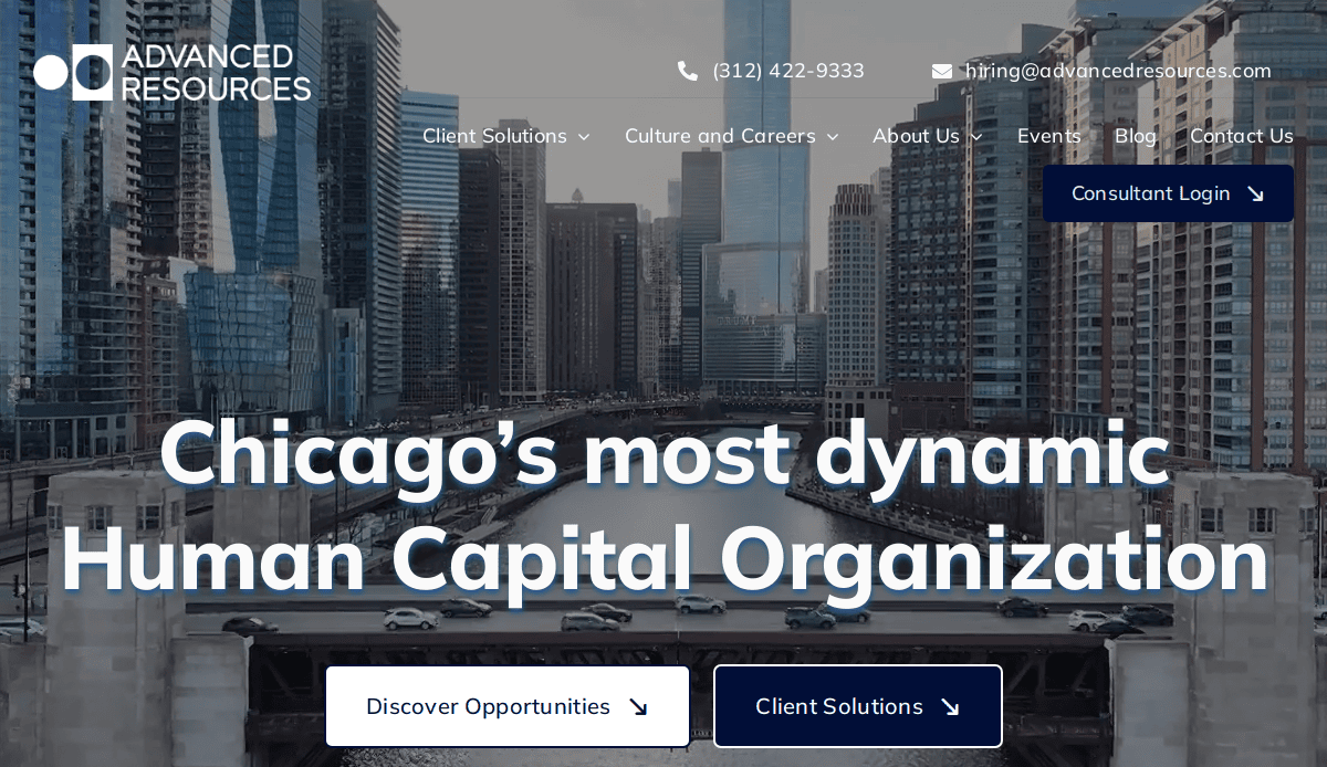
1. Advanced Resources — Chicago, IL
Key Takeaways: Clean layout, great job search filter, consistent employer branding.
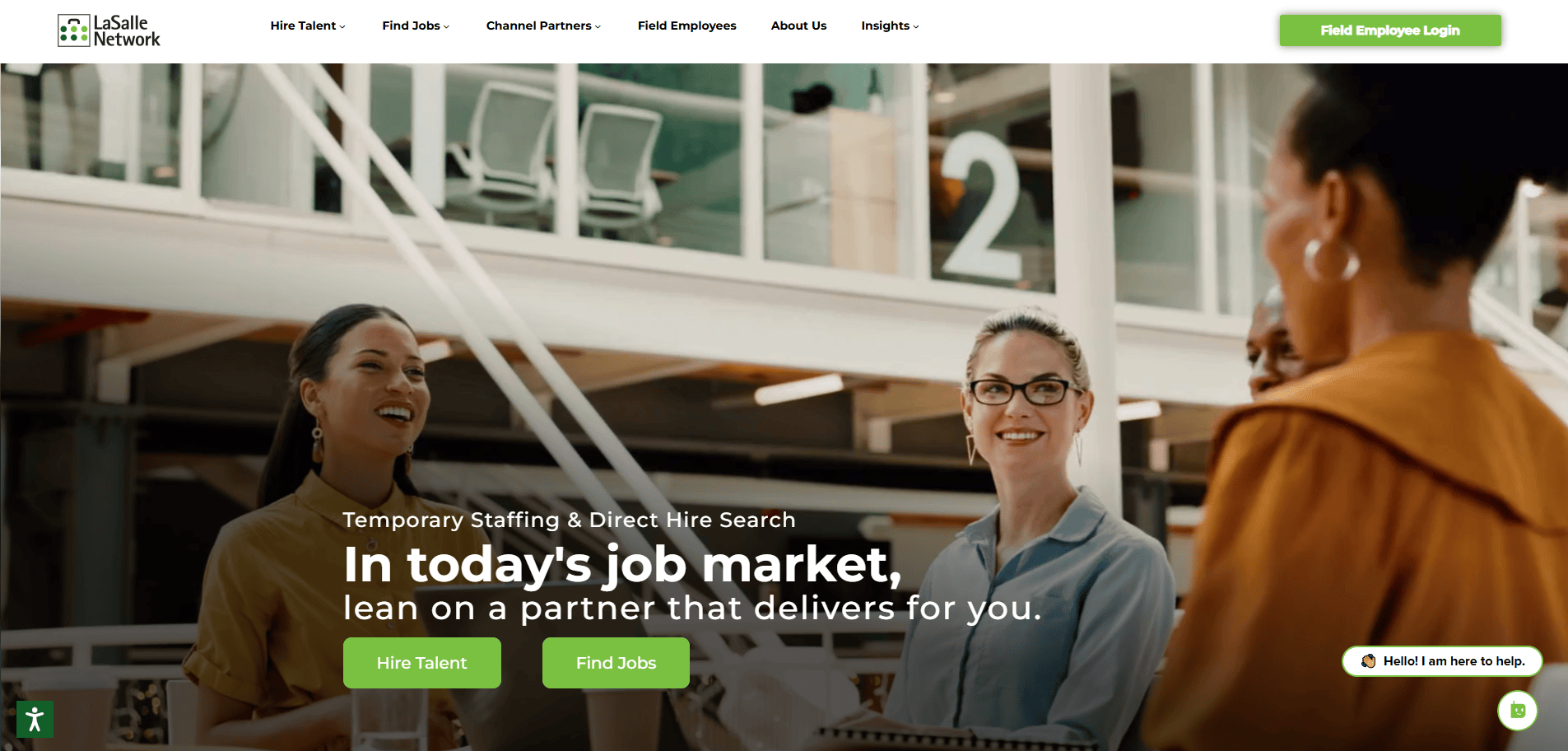
2. LaSalle Network — Chicago, IL
Key Takeaways: Bold branding, strong testimonials, and clear CTAs for clients and candidates.
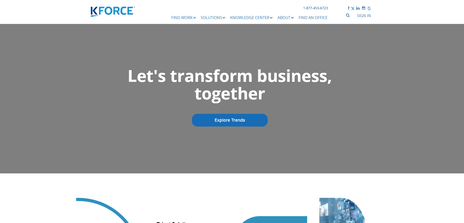
3. Kforce — Tampa, FL
Key Takeaways: Simple layout, mobile-friendly design, intuitive candidate portal.
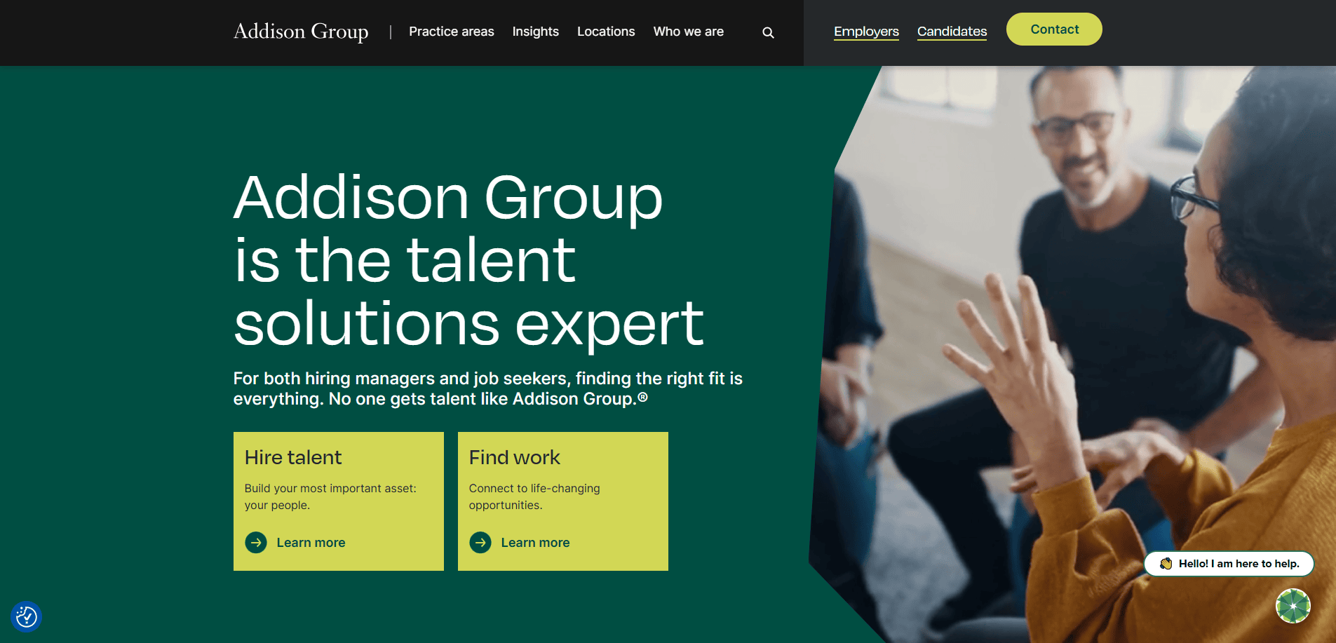
4. Addison Group — Chicago, IL
Key Takeaways: Personalized content by industry, modern design that’s responsive, seamless job browsing.
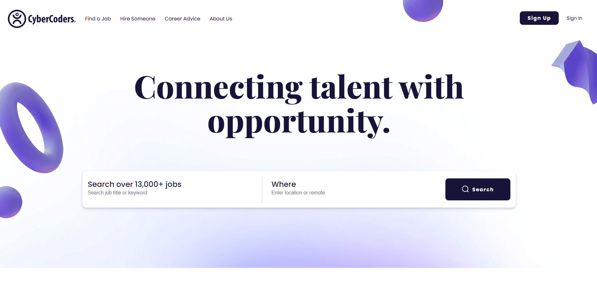
5. CyberCoders — Irvine, CA
Key Takeaways: Interactive job listings, recruiter-focused branding, and an advanced filter system.
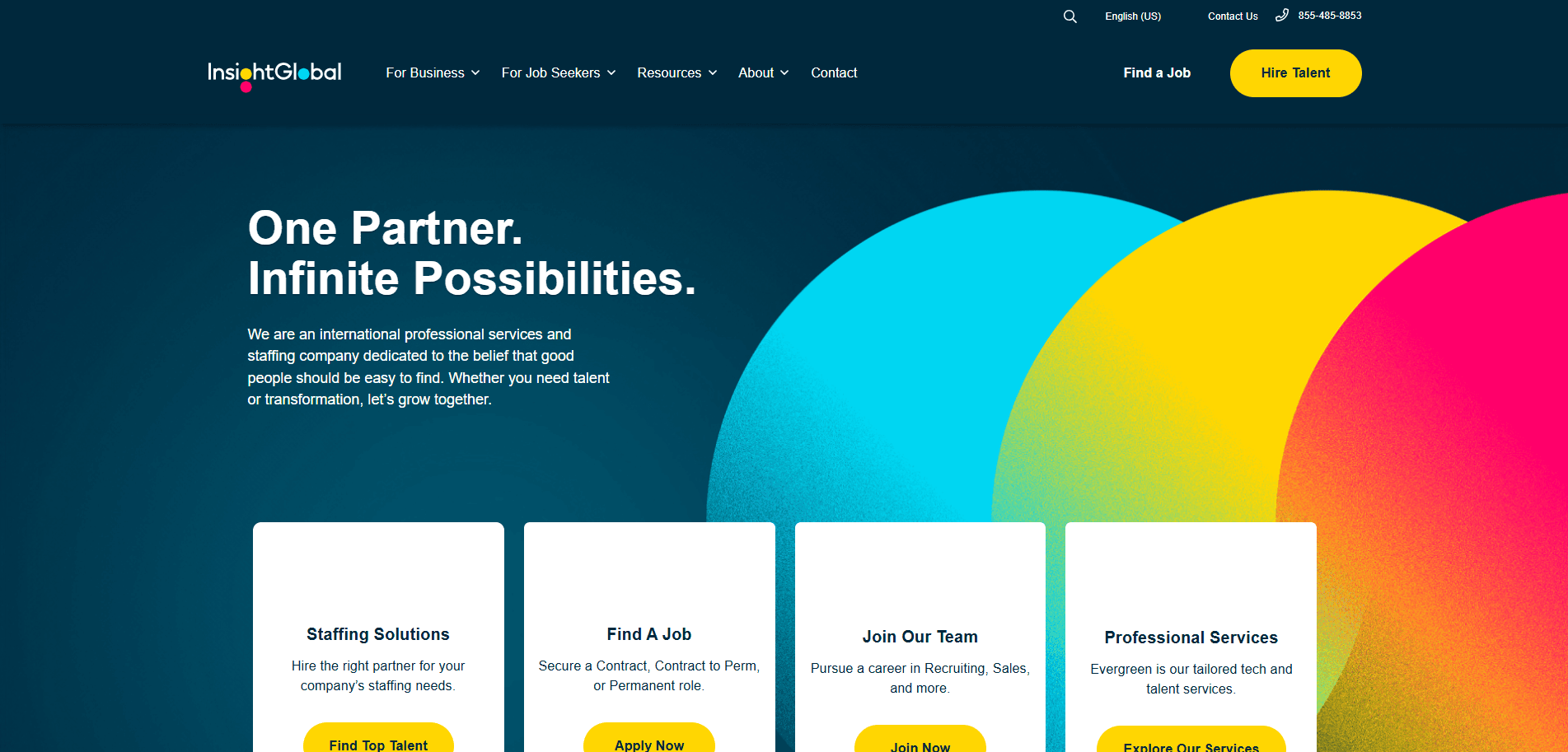
6. Insight Global — Atlanta, GA
Key Takeaways: Vibrant visuals, dedicated client and candidate sections, great use of video.
7. Lucas Group — Atlanta, GA
Key Takeaways: Executive search focus, strategic color use, and a professional and accessible website.
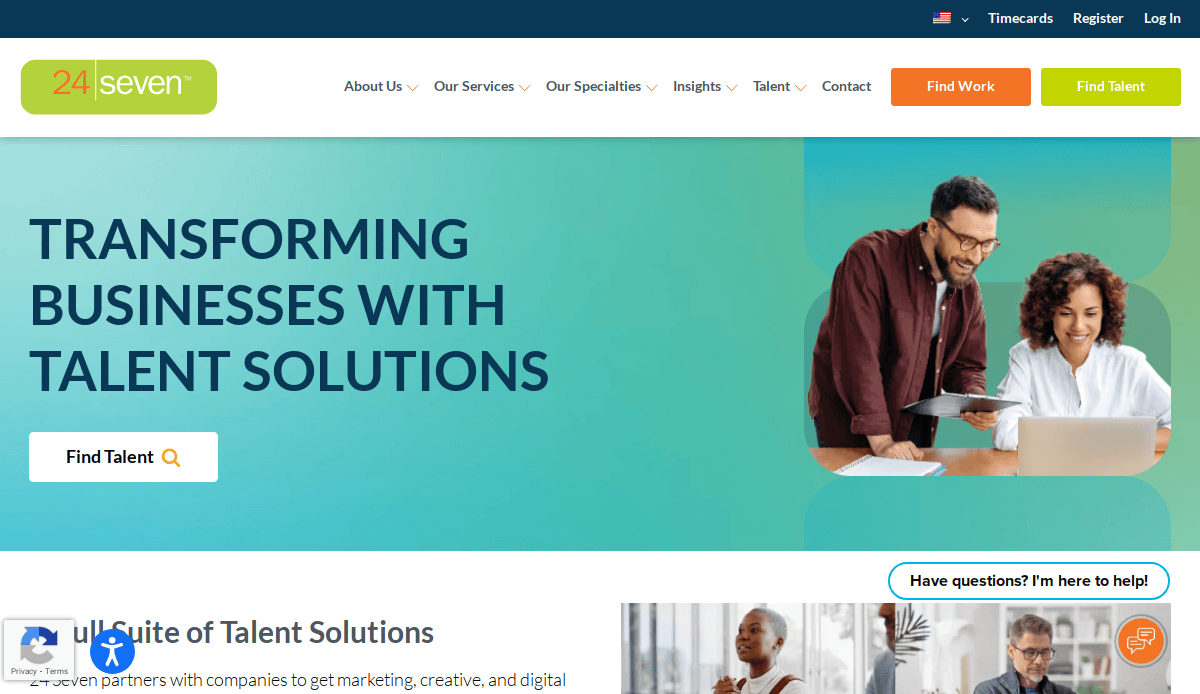
8. 24 Seven Talent — New York, NY
Key Takeaways: Bold colors, tailored industry-specific job searches, and clear action steps.
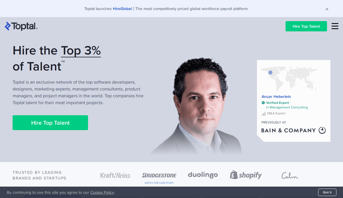
9. Toptal — San Francisco, CA
Key Takeaways: Premium feel, expert-focused positioning, exceptional layout, and hierarchy.
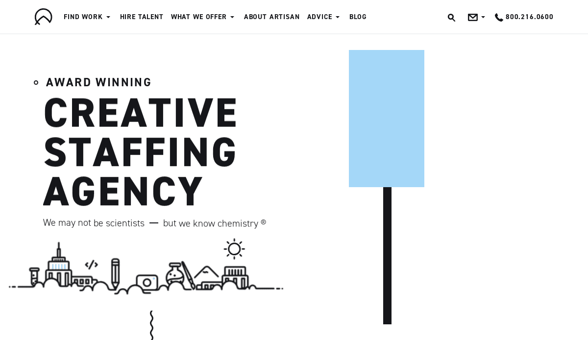
10. Artisan Talent — Chicago, IL
Key Takeaways: Creative-first design, interactive portfolio examples, and inclusive tone.
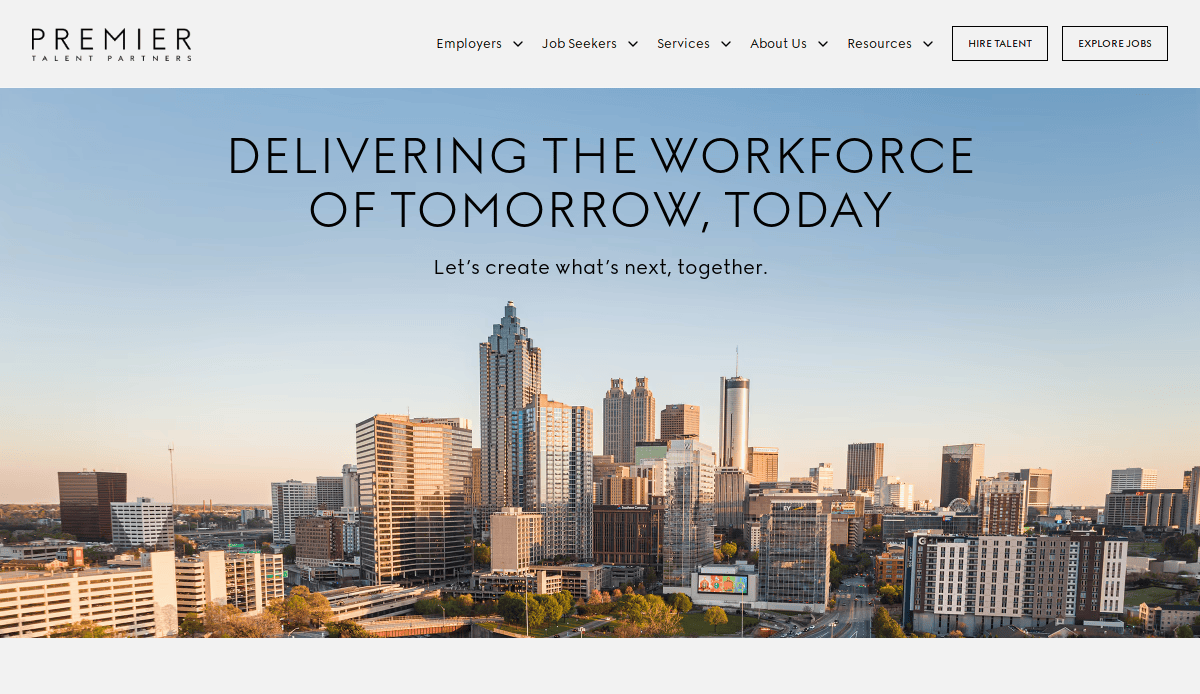
11. Premier Talent Partners — San Francisco, CA
Key Takeaways: Quirky brand identity, clear messaging, and visual storytelling through icons.
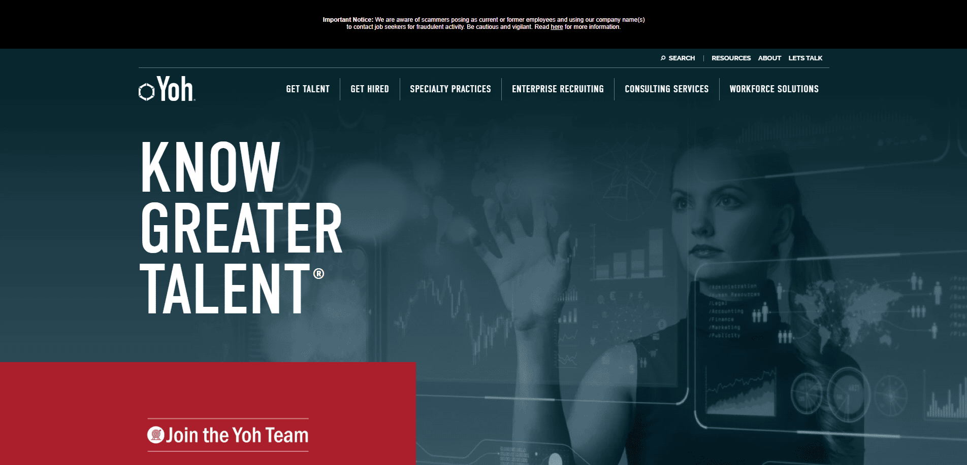
12. Yoh — Philadelphia, PA
Key Takeaways: Niche recruiting focus, excellent job board, strong trust indicators.
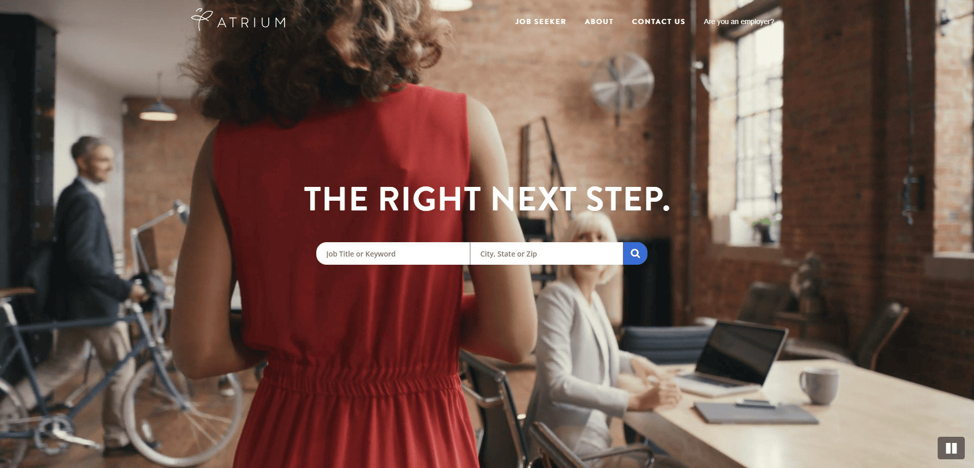
13. Atrium — New York, NY
Key Takeaways: Dynamic design that’s visually engaging, gender-diverse imagery, and easy to use.
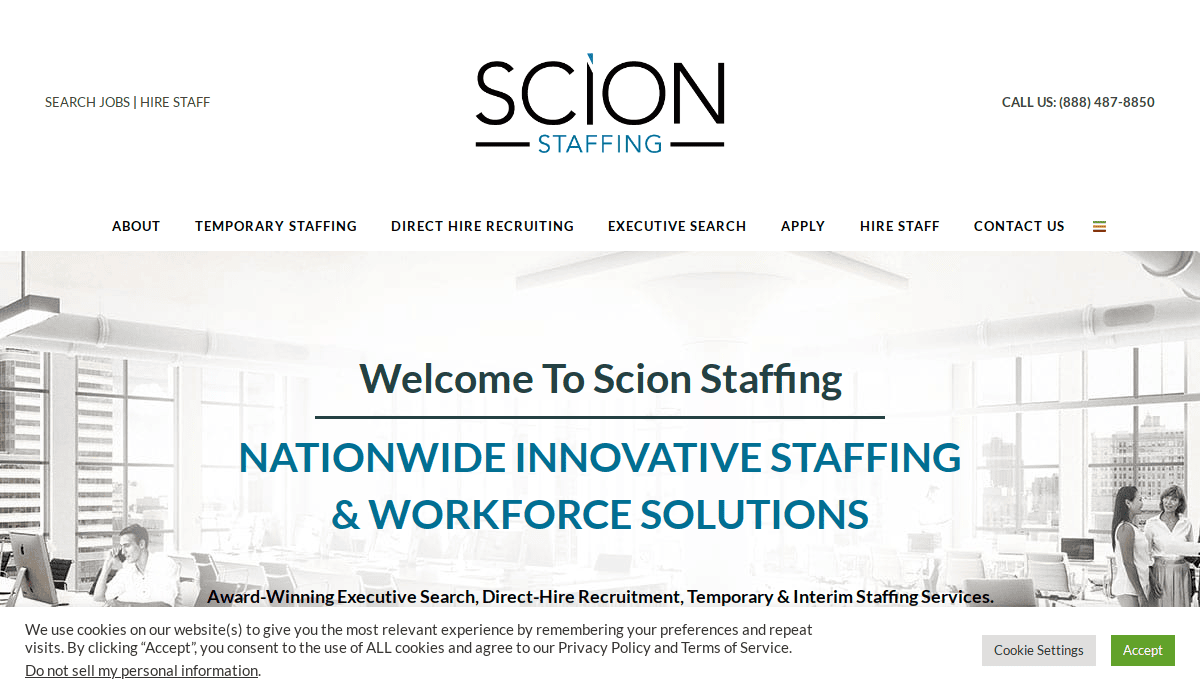
14. Scion Staffing — Portland, OR
Key Takeaways: Nonprofit and DEI alignment, bold call-to-action, transparent communication.
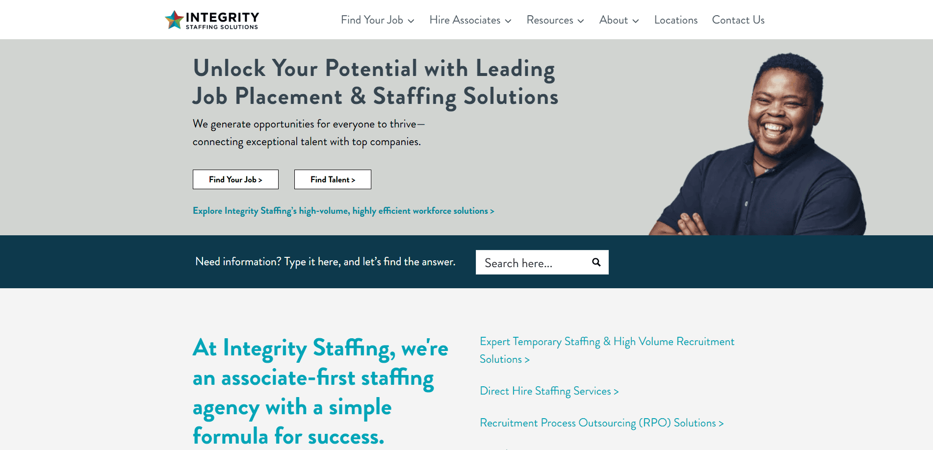
15. Integrity Staffing Solutions — Newark, DE
Key Takeaways: Candidate-first approach, simplified user pathways, integrated blog content.
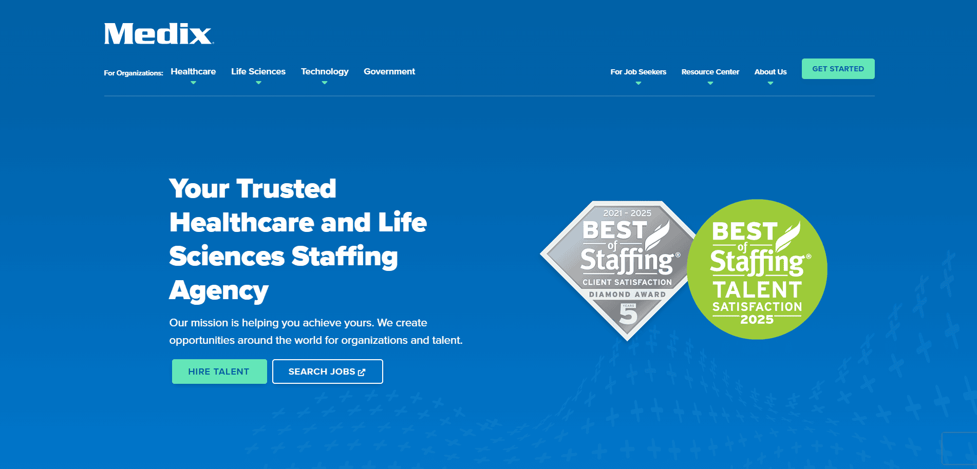
16. Medix — Chicago, IL
Key Takeaways: Medical staffing niche, trustworthy and modern design, impactful testimonials.
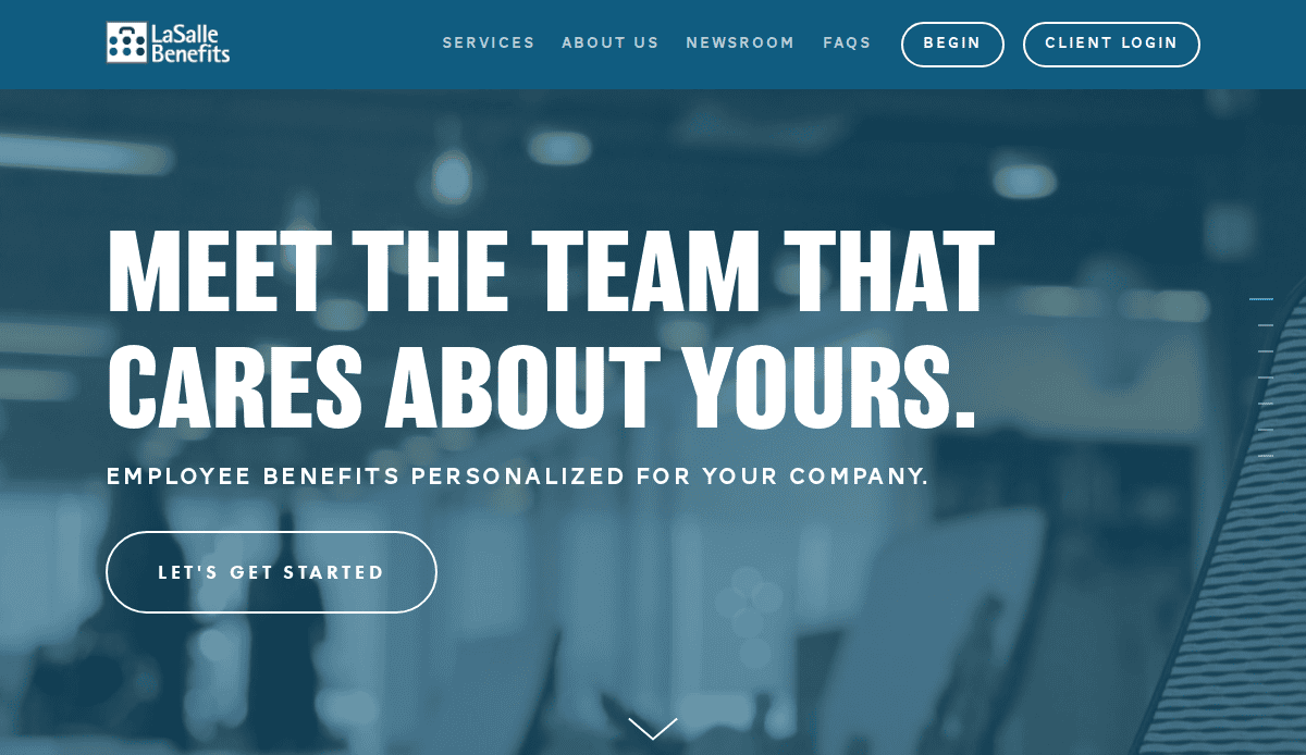
17. LaSalle Benefits — Chicago, IL
Key Takeaways: Clean interface, excellent benefits-focused UX, consistent color use.
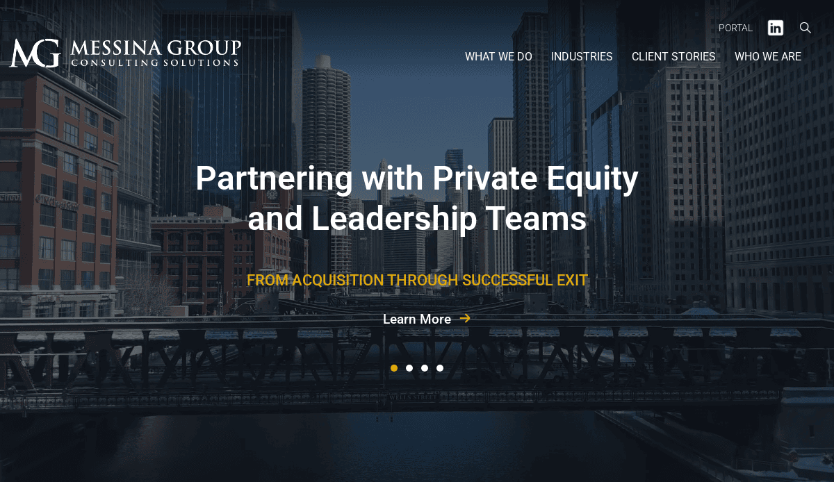
18. Messina Group — Chicago, IL
Key Takeaways: Focused on consulting and staffing, simple job browsing, and strategic layout.
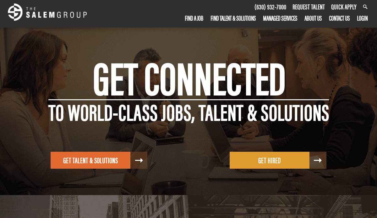
19. The Salem Group — Oakbrook Terrace, IL
Key Takeaways: Multi-sector recruiting, polished visuals, compelling CTAs.
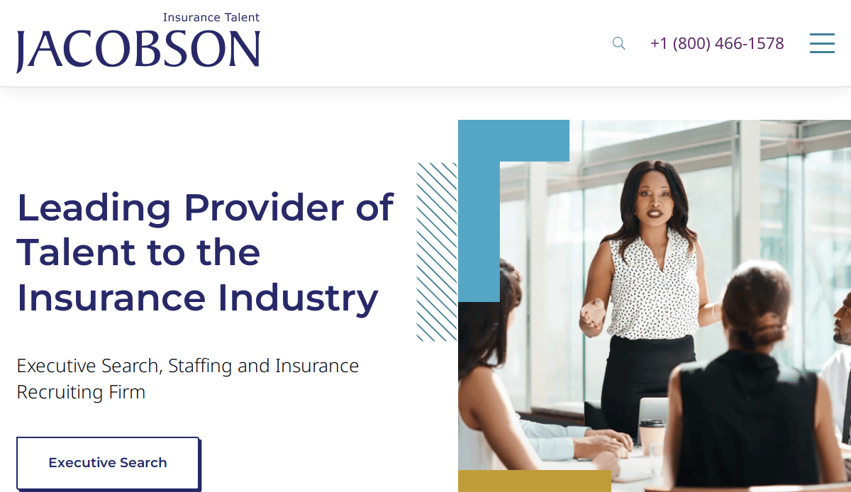
20. The Jacobson Group — Chicago, IL
Key Takeaways: Insurance recruitment niche, effective brand alignment, streamlined site experience.
Ready to Elevate Your Recruitment Website?
Creating a site that attracts top talent, builds client trust, and reflects your agency’s identity is no small task. From foundational planning and design principles to content strategy and ongoing maintenance, every element plays a critical role in your online success. Whether you’re starting a website from scratch or looking for a complete website redesign, our experts specialize in recruitment-focused digital solutions tailored to your goals.
Let’s build a website that looks great and delivers measurable results. Request a Free Consultation with us!
Common Questions About Recruitment Site Design
What makes a website stand out from the crowd?
A standout industry website uses a design that’s tailored to the audience, integrates user-friendly pathways, and communicates brand values clearly. Adding unique visuals, fresh content, and candidate-centric features also enhances engagement.
Why does my website need to be accessible?
An accessible website ensures inclusivity for users with disabilities and is a critical component of compliance and user trust. Accessibility features also support usability for all visitors and can positively impact SEO. Explore our website design services.
How does the website design impact the recruitment process?
A website plays a central role in first impressions. A poorly structured or slow-loading website isn’t just frustrating—it deters potential candidates and clients. A well-designed site can streamline applications, improve brand perception, and increase conversions.
Should I redesign my current site or build a website from scratch?
That depends on your current site’s limitations. If your site is outdated, difficult to navigate, or no longer reflects your goals, a full website redesign may be necessary. However, incremental improvements may work if your infrastructure is still solid.
How do I ensure my site’s content is optimized?
Use clear, benefit-focused language targeted at client and candidate personas. Include keywords naturally, provide relevant job listings, and regularly update your blog. Our copywriting services can help you craft high-performing content.
What role does SEO play in site design?
SEO ensures that your website is found by the right candidates and employers. It improves visibility on search engines through technical optimization, content structure, and keyword strategy. Learn about our SEO services.
What should an industry site design include?
Your website design must support both client and candidate needs with features like job boards, resume submissions, testimonial sections, service pages, and contact options. Mobile responsiveness and fast load times are also crucial.
Can CyberOptik work with recruitment firms for custom builds?
Yes, our experts specialize in custom site design. Whether you need a website from scratch or a new recruitment site that reflects your growth, we can create custom solutions tailored to your agency. See examples in our portfolio.
How often should I update my recruitment website?
Website content should be reviewed quarterly. Blog posts, job listings, and resource updates should happen even more frequently to support recruitment marketing efforts.
Why is it important for my website to reflect both client and candidate priorities?
Your website design needs to serve both audiences simultaneously. Clear messaging, personalized user paths, and relevant content ensure both client and candidate experiences are valuable and efficient.


