Just looking for our Best Local Healthcare Website examples list?
Why Healthcare Website Design Matters More Than Ever
By focusing on these key areas, healthcare organizations can create effective, patient-friendly websites that meet both user needs and regulatory requirements.
Your website is often the first impression patients have of your healthcare organization. This makes it more than just a virtual brochure—it’s the front door to your practice, clinic, or hospital. A poorly designed site can turn away prospective patients, while a high-performing site can inspire trust, simplify access to care, and ultimately drive growth.
With increasing competition, evolving patient expectations, and rising demand for telehealth, it’s critical to invest in a website that looks professional and performs exceptionally. This means ensuring the site is intuitive, responsive, accessible, and optimized for search engines. It means crafting clear messaging, seamless navigation, and a strong CTA to guide users from visit to conversion.
In this guide, we’ll break down the essential components of top-tier web design—from branding and SEO to patient portals and HIPAA compliance. Whether you’re redesigning an outdated site or building from scratch, you’ll gain actionable insights to create a website that serves your audience and strengthens your digital presence.
Design Principles
Effective web design is built on a foundation of key design principles that prioritize patient needs, trust, and ease of use. These principles ensure the site functions smoothly, communicates clearly, and supports the organization’s broader goals.
- Simplicity and Clarity
A clean and uncluttered design helps patients quickly find the information they need. Use white space, a limited color palette, and consistent typography to reduce visual noise and emphasize critical content. - Mobile Responsiveness
With many patients accessing sites via smartphones or tablets, responsive design is non-negotiable. A mobile-optimized experience ensures that your site functions well on all devices, boosting engagement and accessibility. - Accessibility for All Users
Following Web Content Accessibility Guidelines (WCAG) ensures your website is usable by individuals with visual, auditory, cognitive, or motor impairments. This includes using readable fonts, proper contrast ratios, alt text for images, and keyboard navigation. - Trust-Building Visuals and Content
Patients must feel confident in your organization. Use professional photography, credentials, certifications, and testimonials to establish credibility. Consistent branding also reinforces trust and recognition. - User-Friendly Navigation
Navigation menus should be intuitive, consistent, and organized around patient priorities. Use clear labels, logical page hierarchies, and a search function to enhance the user journey and reduce frustration. - Strong Calls-to-Action (CTAs)
Guide users toward key actions such as scheduling an appointment, contacting your office, or accessing patient resources. CTAs should be prominently placed, visually distinct, and aligned with the patient journey.
By applying these design principles, healthcare organizations can create visually appealing websites, deliver an efficient, secure, and patient-centered experience.
Content & Navigation Strategy
Effective content structure and intuitive navigation are critical for websites to serve diverse patient needs and drive engagement. A clear, logical layout makes it easier for users to find the information they need without frustration, which enhances the overall patient experience.
Content Structure:
Healthcare websites should prioritize clarity and relevance in their content hierarchy. Start with a concise, benefit-driven homepage that guides visitors to key areas such as Services, About, Patient Resources, and Contact. Each page should have a clear headline, scannable subheadings, and patient-focused content written in plain language. Include FAQs, educational articles, and location-specific content to improve SEO and address common patient questions.
Highlight services using dedicated pages with detailed descriptions, provider bios, and clear outcomes. Feature timely updates such as health alerts, seasonal tips, or new services through a blog or news section. Use visuals, infographics, and videos to break down complex medical information and keep readers engaged.
Navigation Best Practices:
Your navigation should reflect the most common actions users want to take. Include a sticky or easily accessible top menu with clearly labeled links. Organize menus by service type, patient group, or task (e.g., “Find a Provider,” “Schedule an Appointment,” “Access Your Portal”). Avoid deep page hierarchies that bury critical content; prioritize flat, shallow structures that minimize clicks.
Incorporate breadcrumb trails for orientation, a prominent search bar for quick access, and footer links that reinforce core navigation. Internal linking throughout the site also supports SEO and helps users seamlessly explore related topics.
A healthcare website that excels in both content and navigation doesn’t just inform—it guides and empowers patients to take action confidently and efficiently.
Visual Elements That Strengthen Site Appeal
Visual design is a powerful tool for building credibility and supporting patient-centered experiences on any website. When used strategically, visual elements communicate professionalism, reinforce your brand, and guide users through your site with clarity and ease.
- Branding Through Visual Consistency
Consistency across colors, typography, iconography, and image styles creates a unified brand experience. Healthcare organizations should choose a palette that reflects trust and wellness, such as blues and greens, and apply it uniformly across all pages. Fonts should be readable and used consistently for headings, body text, and calls-to-action. - Use of High-Quality Imagery
Avoid stock photos that feel generic. Instead, opt for authentic, high-resolution images of your team, facilities, or community. Patient-centric photos convey empathy, diversity, and a human touch that builds trust. - Icons and Infographics
Icons help visually break up content and quickly communicate key points. Infographics can simplify complex medical concepts or illustrate patient processes, such as how to book an appointment or prepare for a procedure. - Video Integration
Videos allow you to introduce providers, showcase services, or offer patient education in an engaging format. Place videos thoughtfully to avoid distraction and ensure they load quickly on mobile devices. - Visual Hierarchy for Better Engagement
Use size, spacing, and color to establish visual hierarchy and draw attention to what matters most. Headlines should stand out, CTAs should be prominently styled, and content blocks should be clearly separated for readability. - Accessibility Considerations
Design visuals with accessibility in mind—use proper contrast ratios, descriptive alt text for images, and avoid color-dependent messaging. These elements ensure your website is usable for all patients, including those with visual impairments.Visual elements aren’t just about aesthetics; they’re essential to user trust, brand identity, and communication. When visuals align with your mission and patient needs, your website becomes a more welcoming and effective digital front door.
Ongoing WordPress Maintenance for Website Longevity
A website is not a one-time project—it requires continuous upkeep to stay secure, functional, and effective. For WordPress-powered websites, ongoing maintenance is especially critical due to regular updates and evolving security needs.
- Security Monitoring and Updates
Healthcare websites handle sensitive information, making them high-value targets for cyber threats. Regular updates to WordPress core, themes, and plugins are essential to close vulnerabilities. Implementing firewalls, malware scans, and two-factor authentication further strengthens site protection. - Backup and Recovery Plans
Maintaining daily or weekly backups ensures that if something goes wrong—whether it’s a hack or a hosting issue—your website can be restored with minimal disruption. Backups should be stored off-site and tested periodically to verify integrity. - Performance Optimization
Routine performance checks help maintain fast load times, which are essential for both patient satisfaction and SEO. Optimizing images, caching content, and removing unused plugins or scripts can improve site speed and reliability. - Content and Plugin Management
Healthcare providers often need to update staff profiles, add new services, or post announcements. Regular content reviews keep your information accurate and timely. Outdated or incompatible plugins should be removed or replaced to avoid functionality issues. - Compliance Audits
Regulations like HIPAA require that your website maintain privacy and accessibility standards. Periodic audits ensure that forms, portals, and content remain compliant with evolving legal requirements and user expectations. - Reporting and Analytics Reviews
Monitoring website analytics helps identify areas for improvement. Review traffic sources, user behavior, and conversion rates to refine your digital strategy and ensure your site supports your business objectives.
Reliable WordPress maintenance ensures your website remains secure, up-to-date, and ready to serve patients efficiently. Regular attention to these areas supports long-term performance and protects your digital investment.
Best Healthcare Website Examples
Below is a curated list of 20 outstanding healthcare websites from across the United States, including five designed by our experts. Each example showcases effective design elements, user experience, and features that set them apart in the healthcare industry.
1. Mayo Clinic
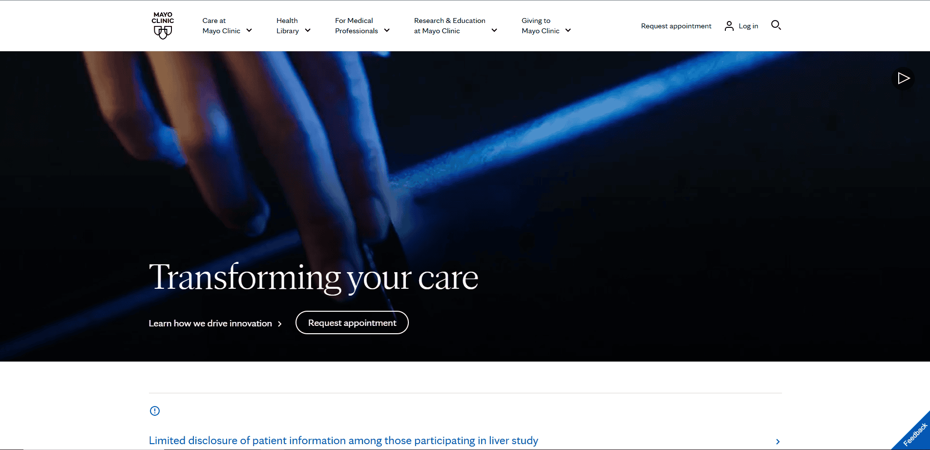
Location: Rochester, MN
Key Takeaways:
- Clean, intuitive layout with easy user pathways
- Comprehensive health information and resources
- Strong emphasis on patient education and trust
2. Cleveland Clinic
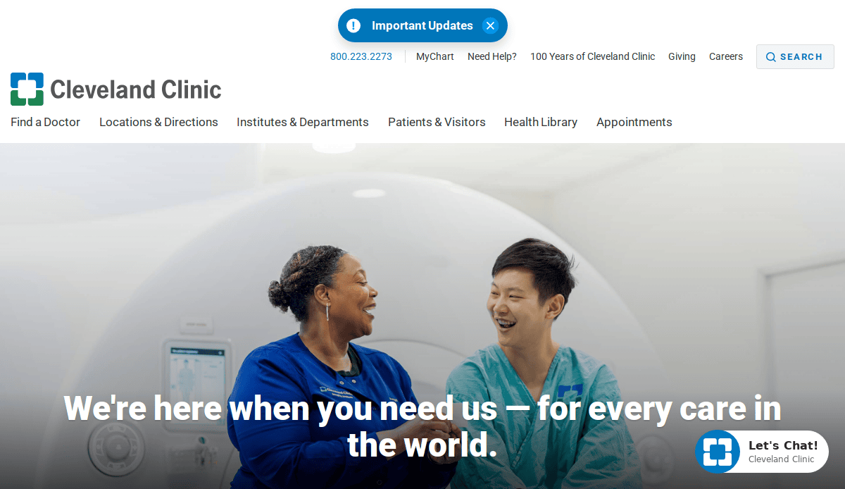
Location: Cleveland, OH
Key Takeaways:
- User-friendly interface with clear calls-to-action
- Robust patient portal for appointment scheduling
- High-quality visuals and informative content
3. Johns Hopkins Medicine
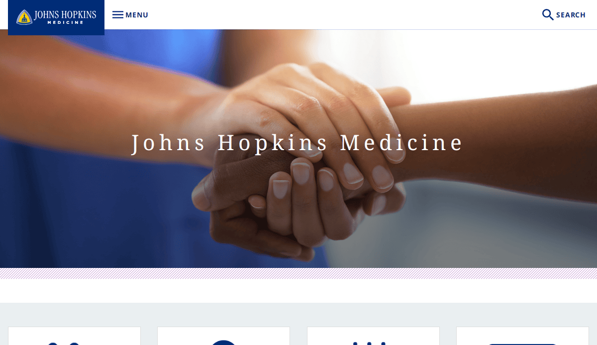
Location: Baltimore, MD
Key Takeaways:
- Professional design reflecting medical excellence
- Accessible information on a wide range of conditions
- Integrated research and clinical care resources
4. Partners in Health
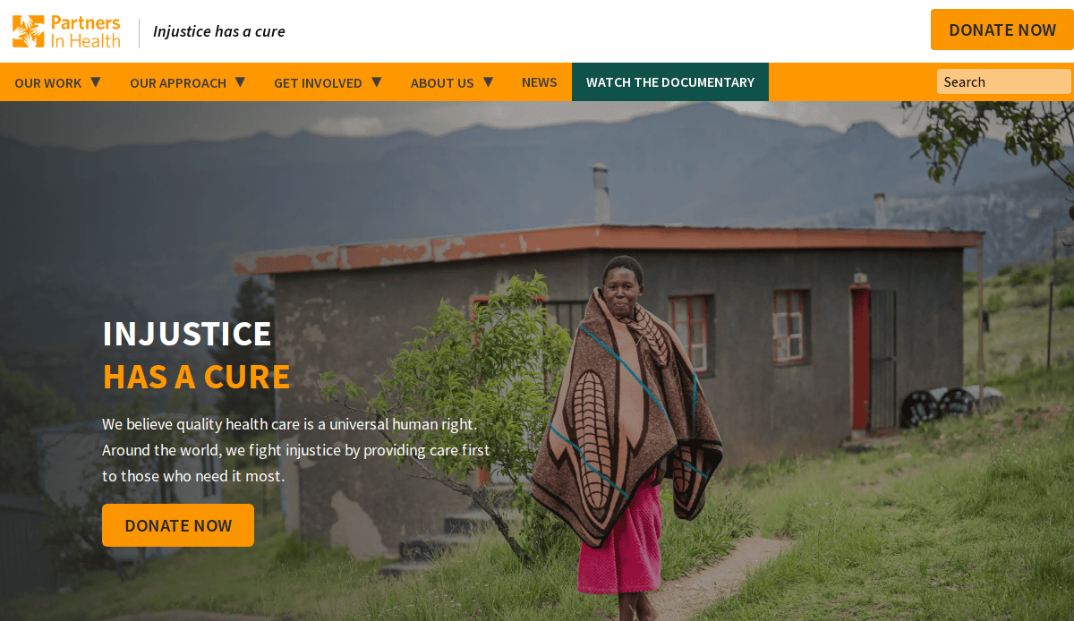
Location: Boston, MA
Key Takeaways:
- Mission-driven design emphasizing global health equity
- Engaging storytelling through patient narratives
- Clear donation and involvement pathways
5. Mount Sinai Health System
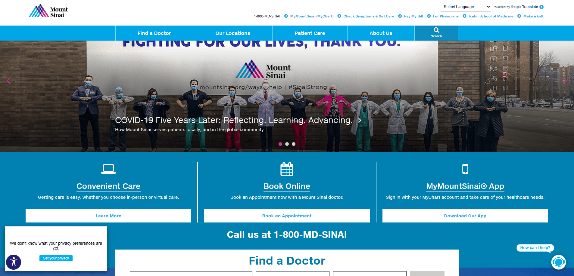
Location: New York, NY
Key Takeaways:
- Modern design with intuitive formatting
- Comprehensive service listings and provider directories
- Emphasis on research and innovation
6. Boston Children’s Hospital
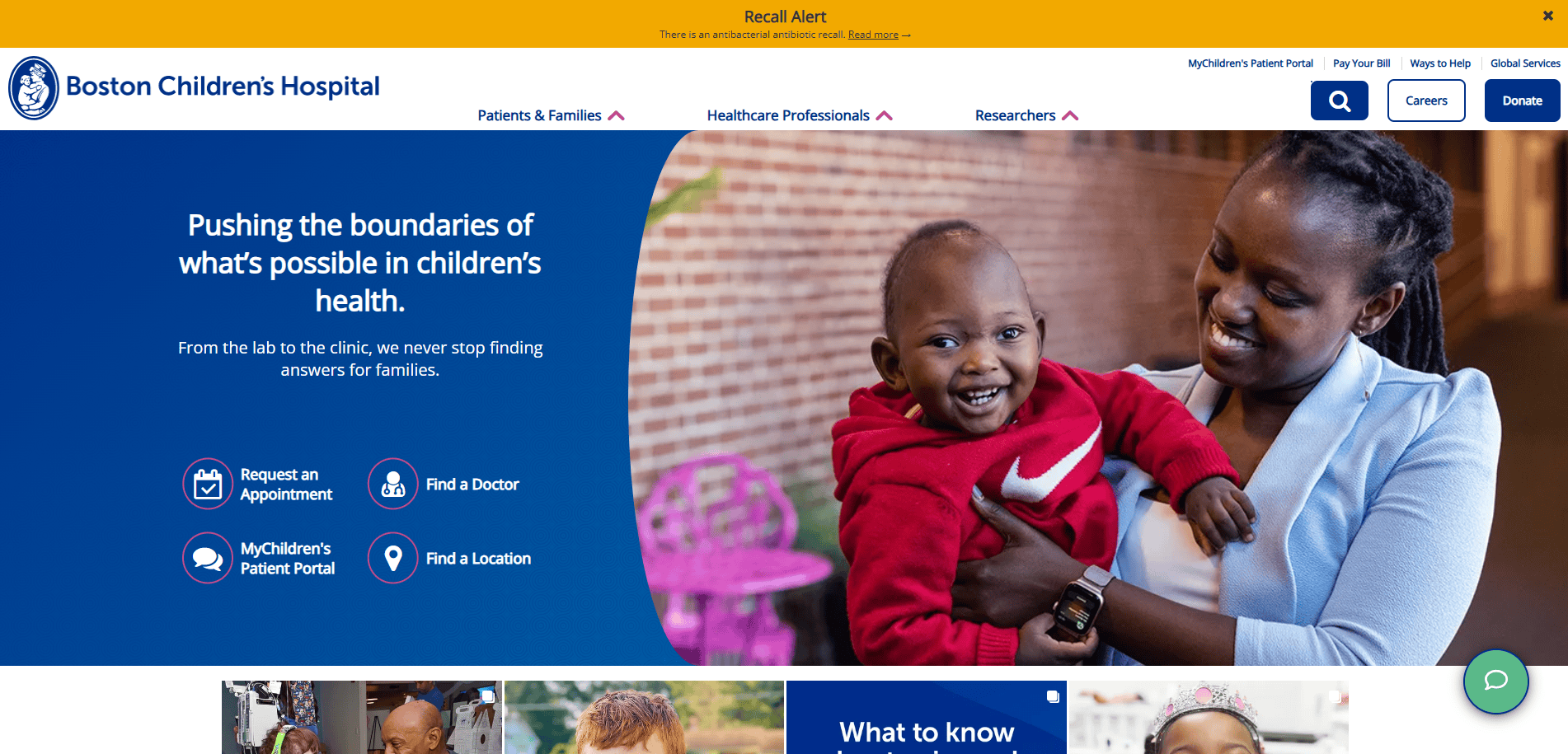
Location: Boston, MA
Key Takeaways:
- Child-friendly design with vibrant visuals
- Extensive resources for parents and families
- Easy access to patient services and information
7. Sutter Health
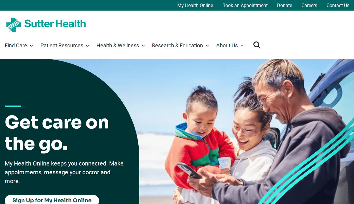
Location: Sacramento, CA
Key Takeaways:
- Streamlined user experience across devices
- Integrated patient portal for seamless access
- Clear presentation of services and locations
8. Kaiser Permanente
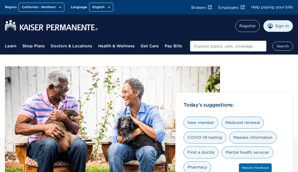
Location: Oakland, CA
Key Takeaways:
- Comprehensive health management tools
- Personalized content based on user location
- Strong focus on preventive care and wellness
9. Northwestern Medicine
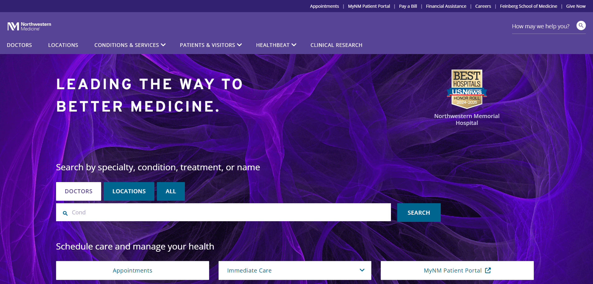
Location: Chicago, IL
Key Takeaways:
- Elegant design with high-quality imagery
- Detailed physician and service information
- Emphasis on academic and research excellence
10. Cedars-Sinai
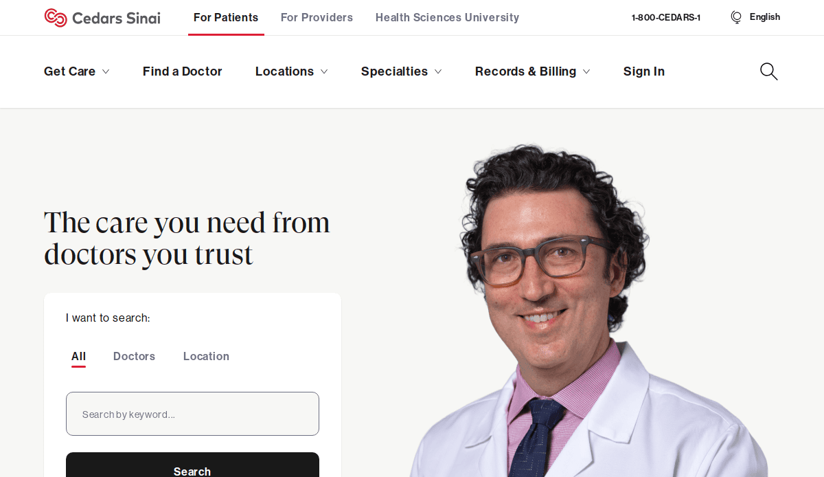
Location: Los Angeles, CA
Key Takeaways:
- Sophisticated design reflecting cutting-edge care
- Extensive health library and resources
- User-centric themes and functionality
11. Memorial Sloan Kettering Cancer Center
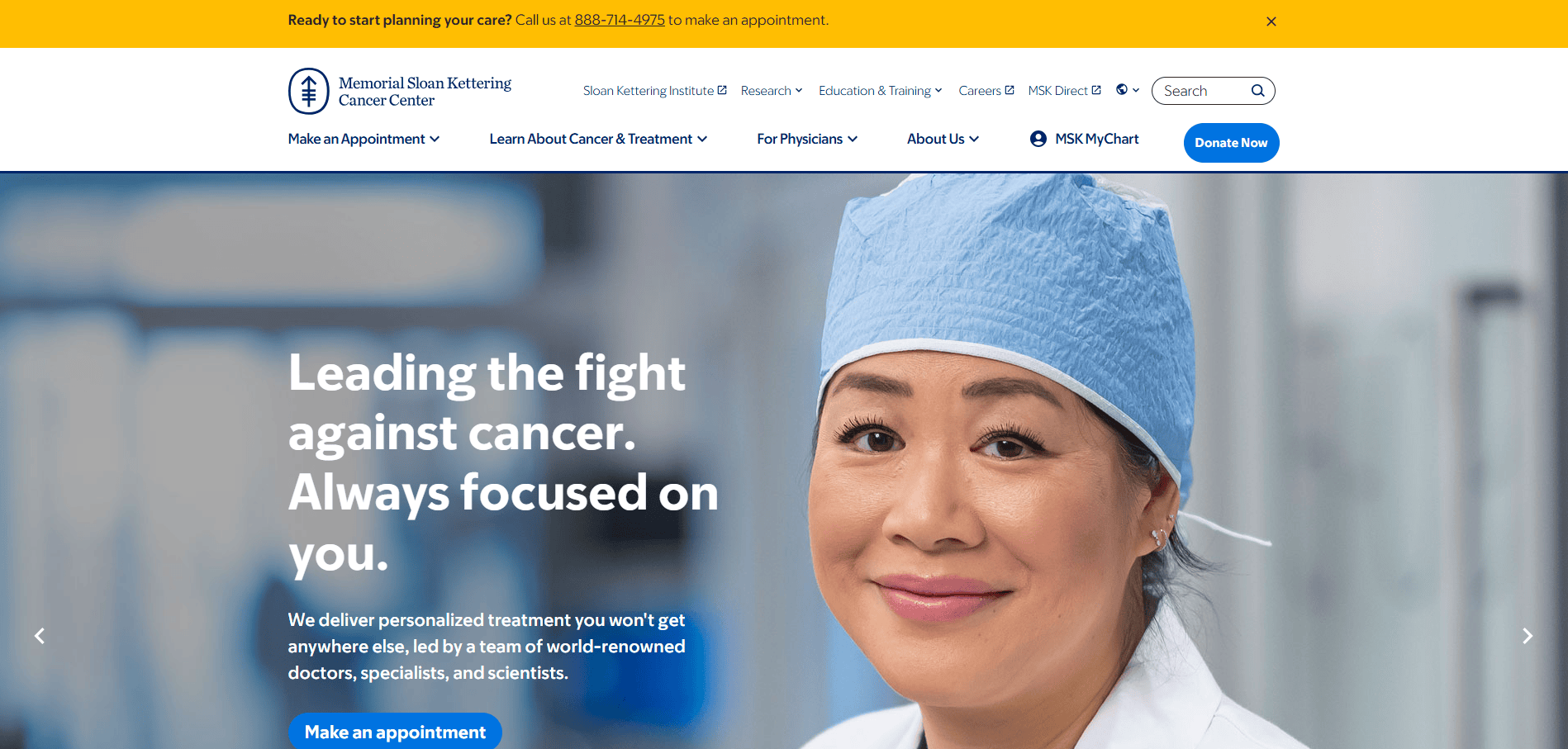
Location: New York, NY
Key Takeaways:
- Focused content on cancer treatment and research
- Patient stories enhancing trust and relatability
- Clear pathways for appointments and support
12. Dana-Farber Cancer Institute
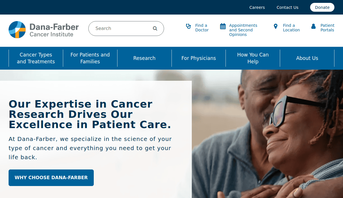
Location: Boston, MA
Key Takeaways:
- Clean design with emphasis on patient care
- Accessible information on clinical trials
- Strong integration of research and treatment options
13. Rush University Medical Center
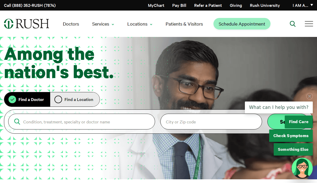
Location: Chicago, IL
Key Takeaways:
- Modern design with interactive elements
- Comprehensive service and provider directories
- Emphasis on education and community engagement
14. Mercy Health
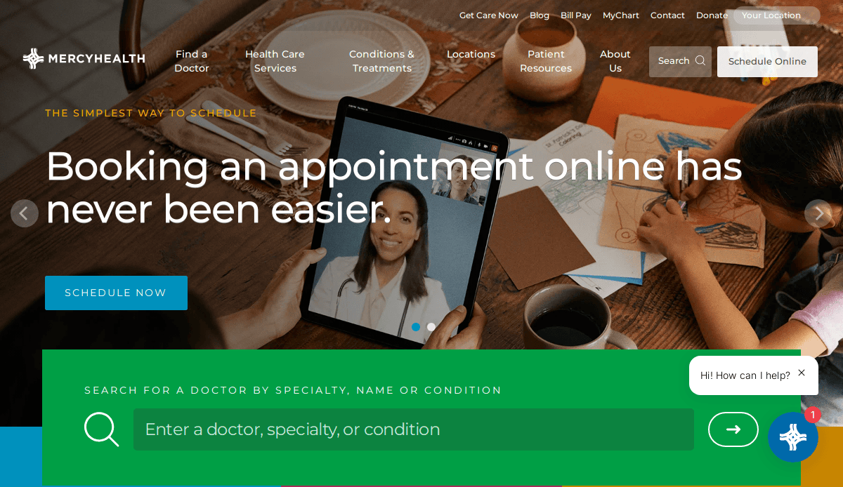
Location: Cincinnati, OH
Key Takeaways:
- User-friendly interface with clear CTAs
- Integrated patient portal for easy access
- Focus on community health initiatives
15. UPMC(University of Pittsburgh Medical Center)
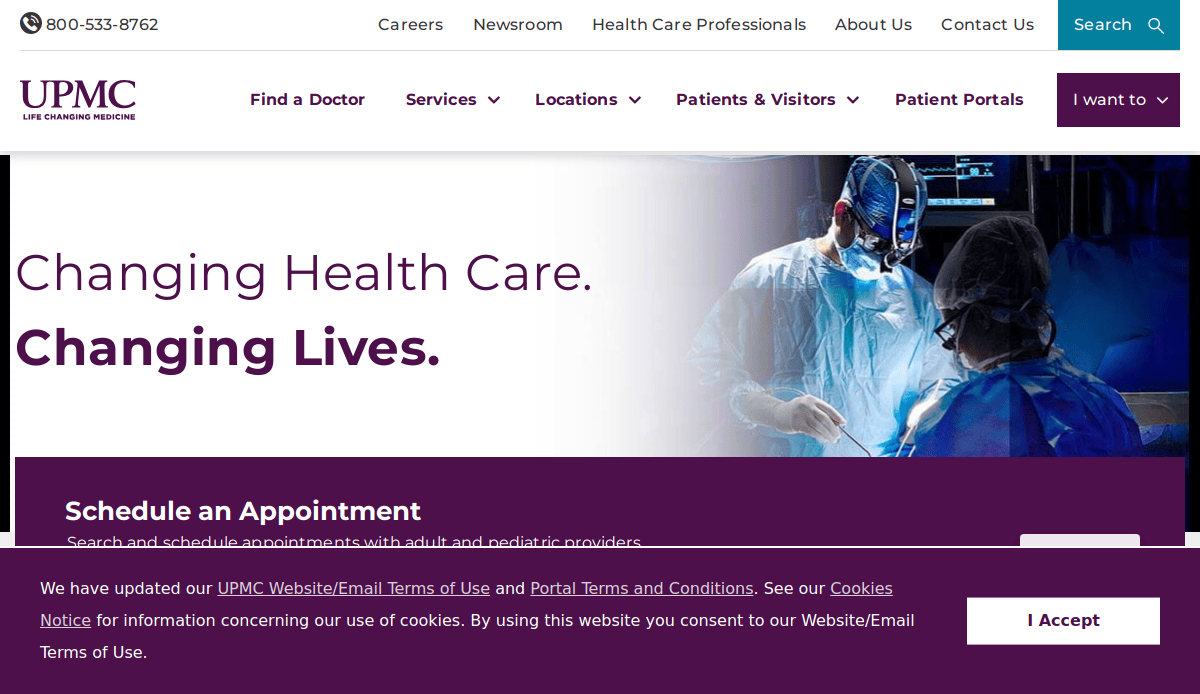
Location: Pittsburgh, PA
Key Takeaways:
- Robust content on services and specialties
- Seamless appointment scheduling features
- Emphasis on innovation and research
16. Froedtert & the Medical College of Wisconsin
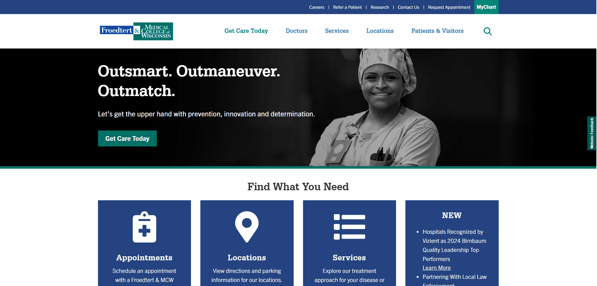
Location: Milwaukee, WI
Key Takeaways:
- Clean, modern design with intuitive formatting
- Comprehensive information on services and providers
- Strong emphasis on academic medicine and research
17. Advocate Health Care
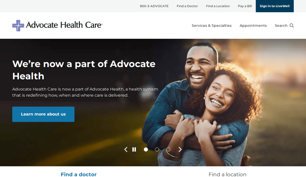
Location: Downers Grove, IL
Key Takeaways:
- User-centric design with personalized content
- Integrated tools for finding doctors and locations
- Focus on preventive care and wellness resources
18. Banner Health
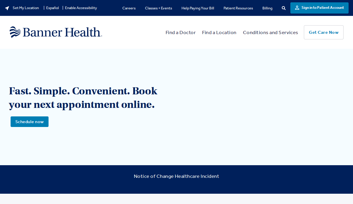
Location: Phoenix, AZ
Key Takeaways:
- Visually appealing design with engaging imagery
- Comprehensive health information and tools
- Emphasis on community health and outreach
19. Intermountain Healthcare
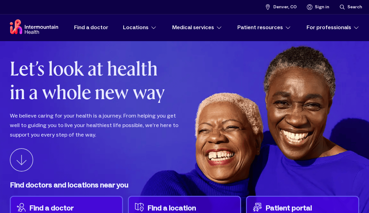
Location: Salt Lake City, UT
Key Takeaways:
- Clean, adaptive design for all devices
- Robust patient portal and online services
- Strong focus on value-based care and innovation
20. Pivotal Health
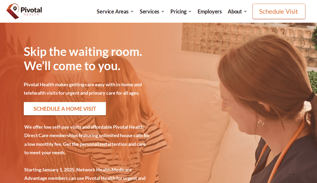
- Location:Madison, WI
- Key Takeaways:
- Innovative service model offering in-home urgent care appointments
- Clean, modern design with intuitive layout
- Comprehensive service explanations and transparent pricing
These websites exemplify the best in healthcare web design, combining aesthetics, functionality, and user-centric features to enhance patient engagement and trust. Whether you’re looking to redesign your existing site or build a new one, these examples provide valuable insights into effective strategies in the healthcare industry.
Ready to Build a Better Healthcare Website?
Good healthcare starts with clear communication, trust, and accessible digital experiences. Your website is more than a platform—it’s a reflection of your mission and the first step in every patient’s journey. An effective web design supports your operations and empowers users with every click.
If you’re ready to elevate your digital presence with a compliant, user-friendly, and SEO-optimized website that meets the needs of today’s healthcare landscape, we’re here to help.
Get a free consultation with us today!
Medical Site Design Frequently Asked Questions
What are the best practices for healthcare website design?
Best practices for site design include responsive layouts, HIPAA compliance, fast load times, intuitive navigation, and clear calls-to-action. These features contribute to a good website design that supports both the medical provider and the patient.
How can a medical website stand out in a competitive market?
A top medical website incorporates user experience design, original medical content, and visually appealing design elements tailored to the needs of your patients. Strong branding, accessibility, and a focus on personal health and patient education enhance trust and engagement.
What role does content play in a successful site?
High-quality medical content helps convey complex medical information in a clear and accessible way. This builds trust with healthcare professionals and potential patients while supporting your site’s SEO strategy.
Why is compliance important for healthcare site design?
A healthcare site must meet the standards of the Health Insurance Portability and Accountability Act to protect patient data. Compliance is crucial for patient trust and legal integrity.
What are some essential website features for a clinic’s website?
Important features include online scheduling, provider bios, patient portals, location information, and mobile-friendly layouts. These help clinics offer a custom healthcare experience that fits into patients’ busy lives.
Can a healthcare business benefit from ongoing website development?
Yes. The healthcare industry evolves quickly, so regular updates ensure your digital healthcare platform stays relevant, secure, and aligned with current patient expectations.
What are some inspiring industry site examples?
The 20 Best Healthcare Websites showcase leading practices in healthcare design, content strategy, and functionality. Reviewing these medical website examples can provide insights for your own site.
How do you design websites for providers with multiple locations?
Websites for healthcare providers with multiple locations should include a top navigation structure that easily allows users to find the right clinic, location-specific pages, and SEO for each service area.
How can a design agency support a medical practice online?
A design agency like ours offers professional web design for healthcare, ensuring visually appealing design, strategic structure, and integration with healthcare-specific tools and platforms.
What is the typical website design process for a healthcare organization?
The process typically includes discovery, planning, design and development, content integration, testing, launch, and ongoing support. Each phase ensures the website meets the needs of your healthcare sector and contributes to a successful website experience.

