Just looking for our Best Civil Engineering Website examples list?
Key Takeaways
- Modern websites must combine aesthetics with functionality. A high-performing engineering website design should balance visual appeal with easy navigation, responsive layouts, and accessible content, creating a seamless UX across devices.
- SEO and conversion optimization are critical for attracting potential clients. A site should be optimized for search engines using targeted keywords, fast loading times, structured data, and intuitive calls-to-action that guide users toward contacting the firm.
- Showcasing projects and services builds trust and authority. A well-structured civil engineering website design should include high-quality visuals, detailed case studies, and clearly defined service pages to demonstrate the firm’s expertise, capabilities, and results.
Why Website Design Matters for Civil Engineering Firms
In the civil engineering industry, your website is often the first impression potential clients have of your firm. It’s more than just a digital brochure; it’s a critical business asset that speaks to your professionalism, expertise, and attention to detail. A well-designed website captures attention and converts interest into action, driving inquiries, showcasing your best work, and positioning your firm as a leader in the industry.
With more clients turning to search engines to find and evaluate engineering solutions, a high-performing website can be the difference between landing a new contract and being overlooked. In this guide, we’ll explore the essential elements of web design, from foundational best practices to modern trends that elevate brand presence and conversion rates. Whether you’re updating your current site or building from scratch, these insights will help you design a site that drives results and reflects your firm’s unique strengths.
Website Planning & Purpose
Before diving into design and development, every website must start with a strategic planning phase. This stage lays the groundwork for alignment with the firm’s business goals, target audience, and technical requirements. For civil engineering companies, the planning process is especially critical because the website must serve multiple roles: informing prospects, legitimizing the business, showcasing technical expertise, and supporting long-term growth.
First, define the core objectives. Are you aiming to attract municipal contracts, private developers, or infrastructure partners? The answer influences the content strategy, tone, and features needed. Planning should include a detailed audience analysis—what are your prospective clients looking for? What challenges do they face? What proof points do they need to trust your firm? These insights help shape user journeys, ensuring that visitors quickly find what they need and are guided toward a clear next step, such as contacting your team or reviewing a project case study.
This phase should also cover technical decisions: whether to build on a platform like WordPress, what kind of CMS integrations are required, how to approach mobile responsiveness, and which SEO structures must be in place. A civil engineering website must be user-friendly and technically sound to perform well with both visitors and search engines. Planning with these goals in mind leads to a professional website that supports growth, reflects credibility, and delivers measurable results.
Design Principles
Effective site design is built on core principles that ensure both form and function serve the firm’s business goals. These principles help create a digital presence that communicates professionalism, enhances usability, and supports conversions.
- Visual Hierarchy and Clarity
A strong website uses a clear visual hierarchy to guide users through content. Headings, subheadings, spacing, and color contrasts should make it easy for visitors to scan and navigate the site. Prioritize the most important content, such as services and case studies, by positioning it prominently on the homepage and landing pages. - Consistent Branding
Brand consistency builds trust and reinforces recognition. Civil engineering firms should ensure that logos, typography, color schemes, and tone of voice are applied uniformly across every page. This creates a cohesive experience that supports brand professionalism. - Mobile Responsiveness
With many decision-makers browsing on mobile devices, responsive design is non-negotiable. Sites must adapt fluidly across screen sizes without compromising usability or design integrity. Mobile-optimized layouts improve both user experience and search engine rankings. - User-Centered Navigation
Simple, intuitive navigation ensures users can find the information they need without frustration. Use clearly labeled menus, breadcrumbs, and internal linking to help users explore services, team bios, and project details. Avoid cluttered layouts that overwhelm or confuse visitors. - Engaging Visuals
High-quality imagery and graphics help bring engineering work to life. Use custom photography, project renderings, and videos to highlight expertise and outcomes. Visual storytelling helps make complex projects relatable and compelling. - Accessibility and Compliance
Design should accommodate all users, including those with disabilities. Use alt text for images, proper heading structures, and color contrast best practices. Compliance with accessibility standardsis not just ethical—it expands your potential audience.
Following these design principles will help ensure that your site is visually striking, strategically built to meet business goals, and delivers a positive UX.
Content & Navigation
The structure of content and navigation on a site must support clarity, accessibility, and user engagement. A well-organized layout and intuitive information flow ensure that users can quickly understand your services and easily take the next step.
Homepage as a Strategic Overview
Your homepage should provide a high-level summary of your firm’s expertise, services, and differentiators. Use concise messaging, engaging visuals, and strong calls-to-action to direct users to key sections such as “Our Projects,” “About Us,” or “Contact.”
Clear Information Architecture
Organize content into logical categories that reflect how your audience thinks. Typical categories include Services, Projects, About, Team, Blog, and Contact. Use mega menus or dropdowns to minimize clicks while maximizing the discoverability of specific subpages.
Strategic Internal Linking
Internal links connect related pages, help guide the user journey, and improve SEO. For example, a project case study should link to the related service page, and vice versa. This approach reinforces relevance and helps users stay engaged longer.
Content That Supports Buying Decisions
Each content section should answer common client questions and address specific needs. Use headlines, bullets, and callout boxes to make information scannable. Integrate proof points such as project metrics, client logos, or industry certifications.
Prominent Contact and Conversion Paths
Ensure your contact options are always accessible. This includes sticky headers with contact buttons, forms on high-intent pages, and strong CTAs like “Request a Proposal” or “Schedule a Consultation.” The easier it is to connect, the higher the conversion potential.
Search and Accessibility Tools
A functional site search, breadcrumb navigation, and mobile-friendly content layout make it easier for all users to navigate. Clear labeling and accessibility standards ensure everyone can explore your site, regardless of ability or device.
When content and navigation work hand in hand, visitors are more likely to engage, explore, and convert, turning your website into a powerful business development tool.
Visual Elements
Visual elements are critical in reinforcing a civil engineering firm’s brand, conveying expertise, and enhancing the overall user experience. A strategic use of visuals turns technical information into digestible, engaging content that resonates with both industry professionals and potential customers.
Professional Imagery
Use high-resolution photographs of real projects to build authenticity and trust. Images should highlight structural work, equipment in use, or team members in action. Stock images may fill gaps, but custom imagery better reflects your capabilities and adds credibility.
Project Galleries and Case Studies
Dedicated sections with visuals from past projects help illustrate your scope of work. Include captions that explain challenges, solutions, and results to support the visual narrative. This educates and showcases success stories that prospective clients can relate to.
Infographics and Diagrams
Complex processes or engineering data can be simplified with the use of infographics. Diagrams are helpful for breaking down workflows, illustrating timelines, or summarizing technical specs. These elements improve content retention and enhance readability.
Consistent Visual Style
Maintain a consistent style across all visuals, including color overlays, iconography, and photo treatments. This visual uniformity enhances brand identity and creates a professional impression throughout the site.
Video Integration
Videos can feature project walkthroughs, team interviews, or drone footage of completed developments. Embedded videos add dynamic content that increases time on site and boosts user engagement.
Interactive Elements
Add hover effects, animated transitions, or interactive maps to highlight service areas or project locations. These elements create a more immersive experience and guide users through content in an engaging way.
Visual elements should serve a purpose—supporting your message, improving understanding, and elevating your firm’s perception. When applied thoughtfully, they enhance aesthetics and help convert visitors into clients.
Ongoing WordPress Maintenance
Ongoing maintenance is essential for any WordPress website, especially for civil engineering firms that rely on a professional online presence to support business development. Regular maintenance ensures that your website remains secure, fast, and fully functional.
Security Updates and Patches
WP websites are common targets for cyber threats. Routine updates to the core, themes, and plugins are critical for closing security vulnerabilities. Professional websites often host sensitive project data or contact forms, making regular security updates essential to prevent breaches.
Performance Monitoring and Optimization
Regularly check for performance bottlenecks, broken links, and slow-loading pages. Optimization strategies, such as caching, image compression, and database cleanup, help ensure your site loads quickly and provides a smooth experience for users.
Plugin and Theme Compatibility
Plugins and themes must stay current to function correctly. Outdated or incompatible components can lead to errors or crashes. Testing updates in a staging environment first helps minimize risk while keeping your site stable and reliable.
Content Refresh and SEO Tuning
Keep your site content up to date with recent projects, team changes, or service updates. Regularly revisiting SEO elements—such as meta descriptions, headers, and keyword targeting—ensures that your site continues to rank well in search engines.
Form Functionality and Lead Tracking
Contact forms and lead capture tools should be tested routinely to confirm they are working as expected. Missed leads due to broken forms or outdated integrations can result in lost business.
Backups and Disaster Recovery
Implement scheduled backups to ensure that a recent version of your site can be restored if needed. A reliable backup system protects against data loss from human error, technical failure, or malicious attacks.
Routine maintenance protects your investment, supports consistent performance, and helps maintain trust with site visitors. A website that runs smoothly and stays current reinforces your firm’s credibility and enhances the UX.
20 Web Design Examples in the Civil Engineering Sector
An effective civil engineering website should highlight a firm’s engineering excellence and provide a user-friendly experience that highlights its services and projects. Below are 20 exemplary websites, including five designed by our team of professionals, that demonstrate how to effectively communicate a firm’s capabilities and attract new clients.
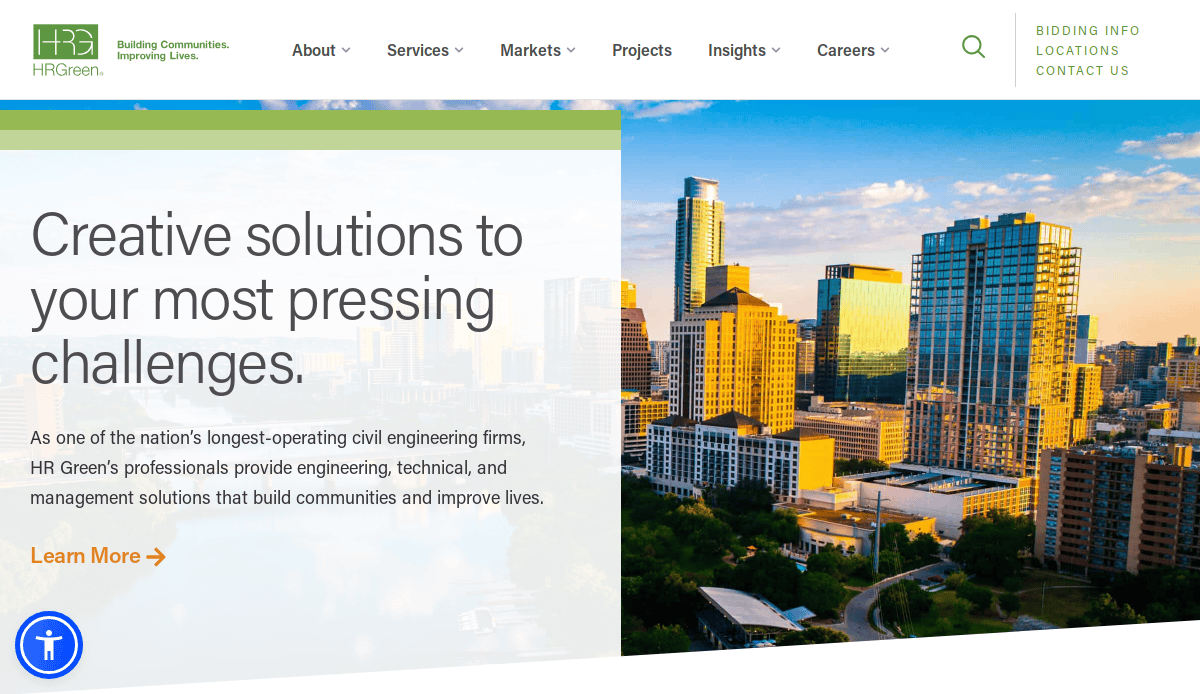
1. HR Green
Location: Cedar Rapids, IA
Key Takeaways:
- Clean layout with intuitive navigation
- Strong calls-to-action (CTAs) prompting user engagement
- High-quality visuals enhance the site’s appeal
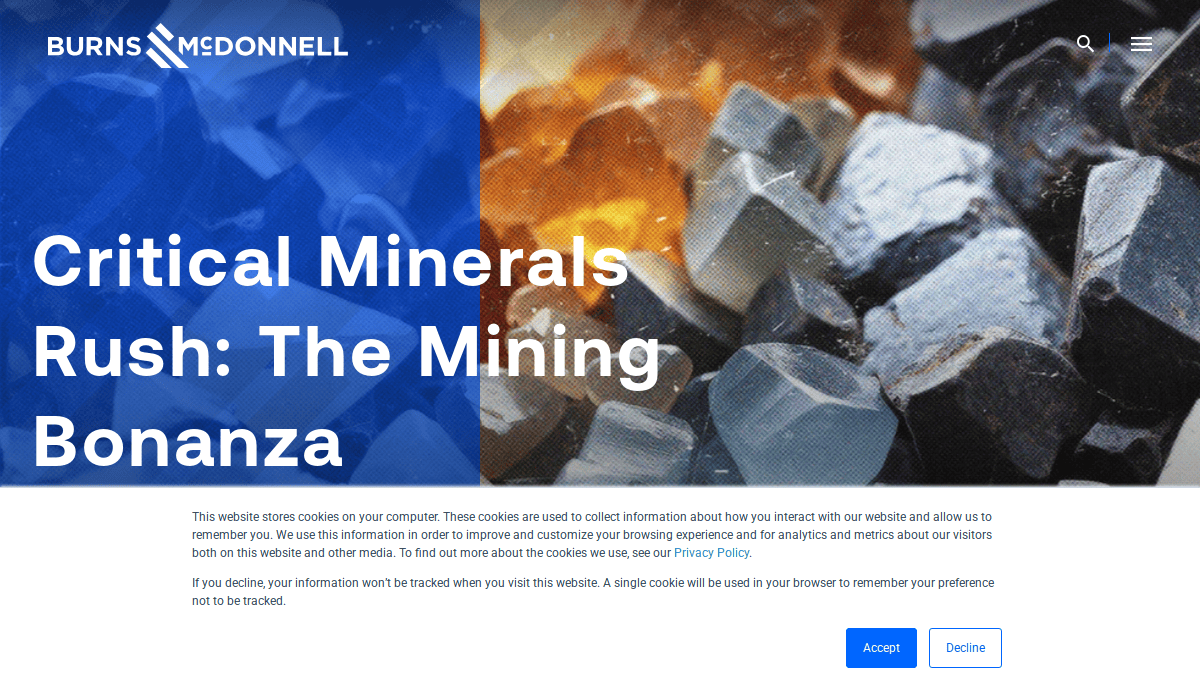
2. Burns & McDonnell
Location: Kansas City, MO
Key Takeaways:
- Comprehensive project displays with detailed information
- Interactive elements improve UX
- Clear presentation of engineering and design services
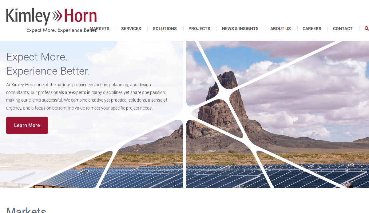
3. Kimley-Horn
Location: Raleigh, NC
Key Takeaways:
- Seamless experience across devices with responsive design
- Engaging visuals that highlight engineering projects
- Easy-to-navigate structure allowing visitors to find what they’re looking for
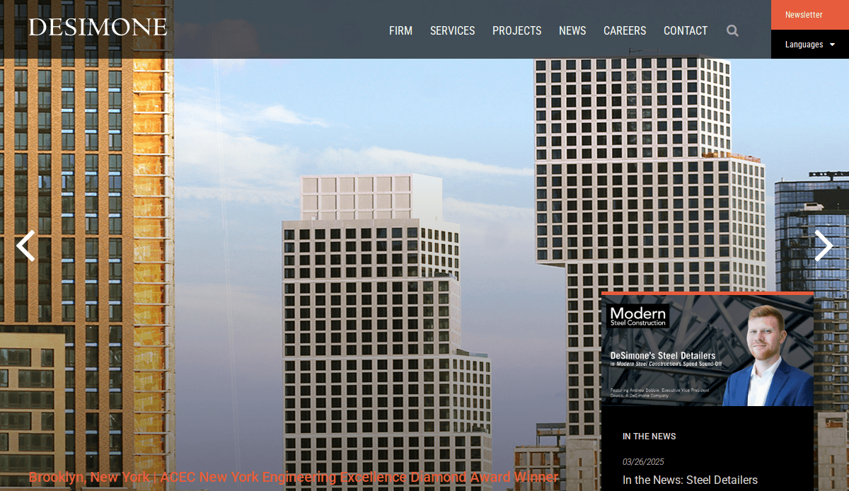
4. DeSimone Consulting Engineers
Location: New York, NY
Key Takeaways:
- Highlights a wide range of services, including structural engineering
- Incorporates engaging visuals and concise content
- Highlights innovative solutions in engineering consulting
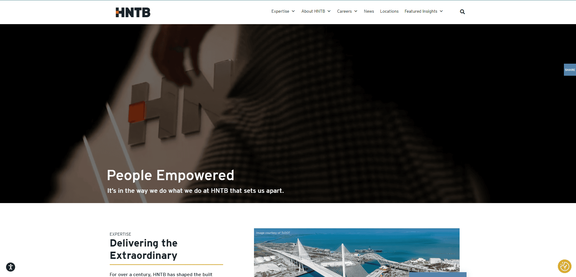
5. HNTB
Location: Kansas City, MO
Key Takeaways:
- Highlights the firm’s capabilities in large-scale infrastructure projects
- User-focused experience with clear navigation
- Detailed insights into the company’s services and projects
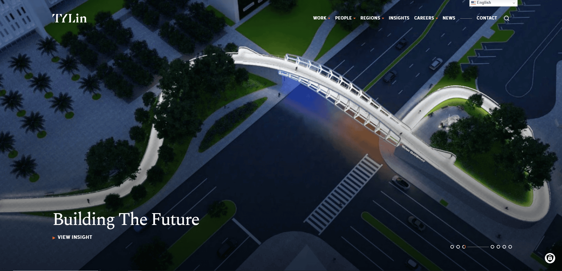
6. T.Y. Lin International
Location: San Francisco, CA
Key Takeaways:
- Emphasizes engineering excellence through project portfolios
- Clear CTAs encouraging user interaction
- Presents a brand’s commitment to innovative design
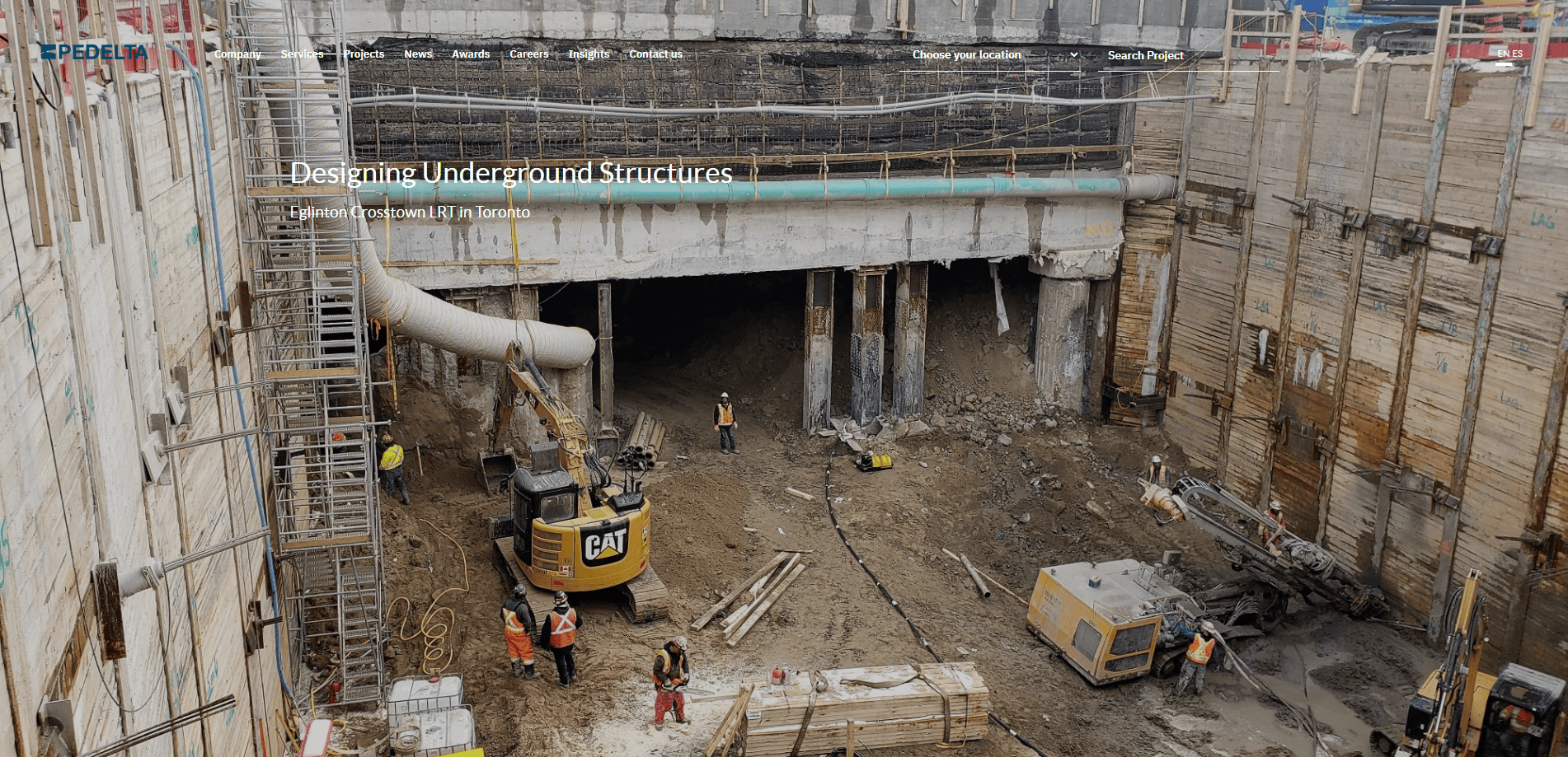
7. Pedelta
Location: Miami, FL
Key Takeaways:
- Focuses on structural engineering with detailed project descriptions
- Visual appeal, but also informative content
- Highlights the firm’s capabilities in bridge engineering
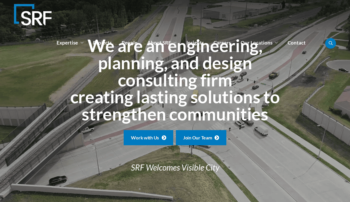
8. SRF Consulting
Location: Minneapolis, MN
Key Takeaways:
- Dynamic and engaging homepage design
- Highlights specific services like transportation and infrastructure planning
- Easy-to-navigate layout enhances UX
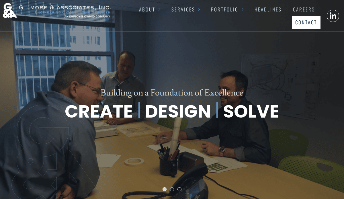
9. Gilmore & Associates
Location: New Britain, PA
Key Takeaways:
- Displays a wide range of services, including surveying services
- Incorporates high-quality images and videos
- Website effectively communicates the firm’s expertise and professionalism
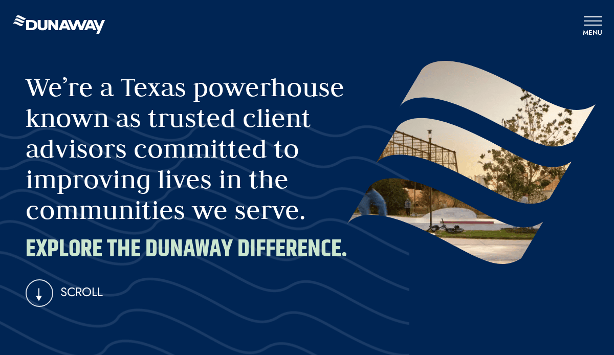
10. Dunaway
Location: Fort Worth, TX
Key Takeaways:
- Highlights services and projects with engaging visuals
- Clear CTAs guiding users to explore their extensive offerings
- Presents a brand’s commitment to innovative solutions
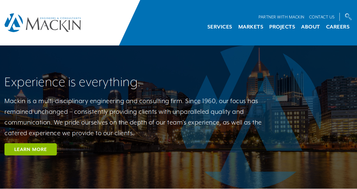
11. Mackin
Location: Milwaukee, WI
Key Takeaways:
- Clean layout with intuitive navigation
- Highlights specific services like civil engineering and surveying
- Incorporates engaging visuals to exhibit projects
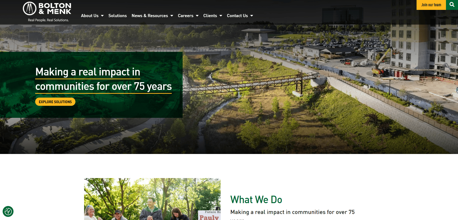
12. Menk
Location: Mankato, MN
Key Takeaways:
- User-friendly experience with clear CTAs
- Highlights a wide range of services, including municipal engineering
- Website demonstrates the firm’s capabilities effectively
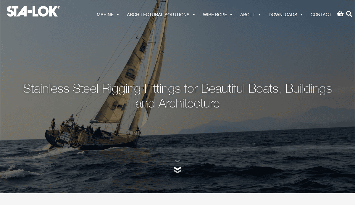
13. Sta-Lok
Location: Chicago, IL
Key Takeaways:
- Highlights structural engineering projects with high-quality visuals
- Easy-to-navigate layout allowing visitors to find what they’re looking for
- Presents detailed insights into the company’s services and projects
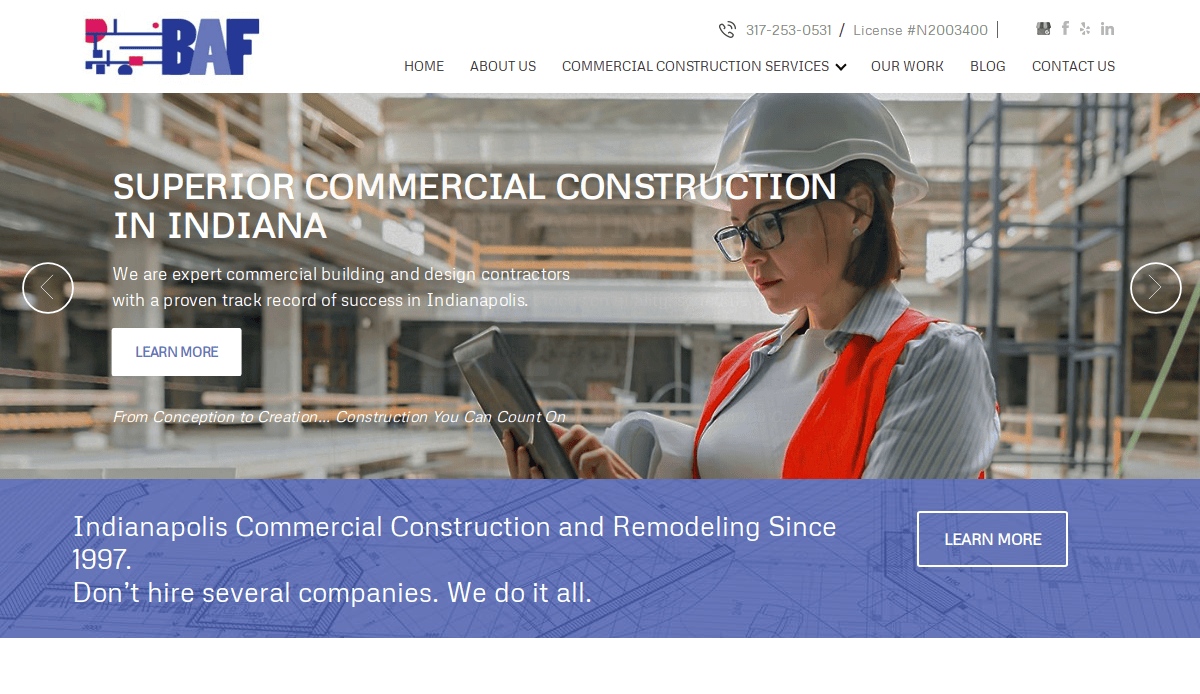
14. BAF Corporation
Location: Chicago, IL
Key Takeaways:
- Highlights engineering and design services with engaging visuals
- Clear CTAs prompting user engagement
- Website effectively communicates the firm’s expertise and professionalism
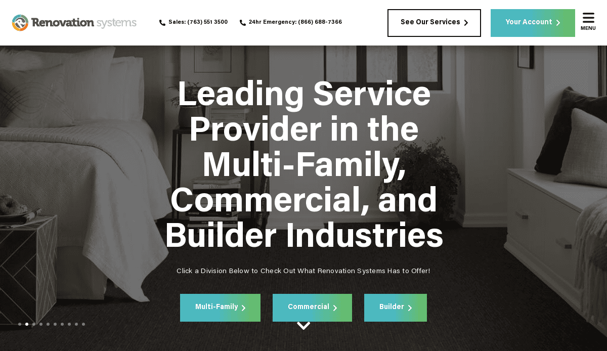
15. Renovation Systems
Location: Minneapolis, MN
Key Takeaways:
- Dynamic and engaging homepage design
- Highlights specific services like electrical engineering and renovation
- Incorporates high-quality images and videos to exhibit projects
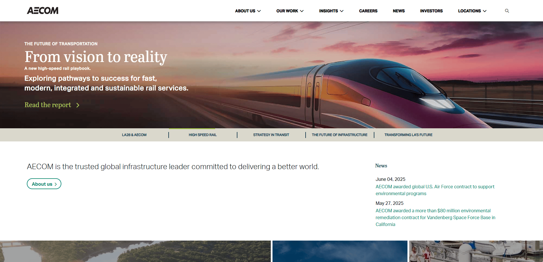
16. Aecom
Location: Los Angeles, CA
Key Takeaways:
- Emphasizes engineering excellence through detailed project portfolios
- Clear CTAs encouraging user interaction
- Presents a brand’s commitment to innovative design and solutions
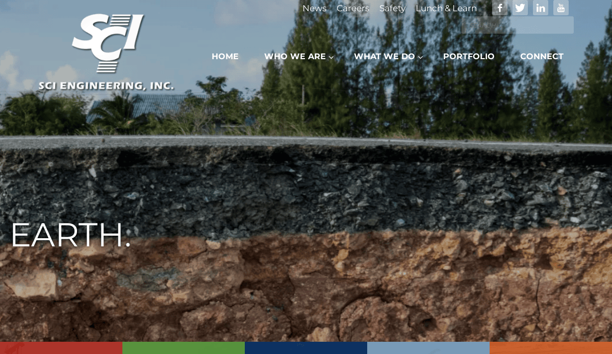
17. SCI Engineering, Inc.
Location: St. Charles, MO
Key Takeaways:
- Displays a wide range of services, including environmental and geotechnical engineering
- Incorporates engaging visuals and concise content
- Highlights the firm’s capabilities in various engineering disciplines
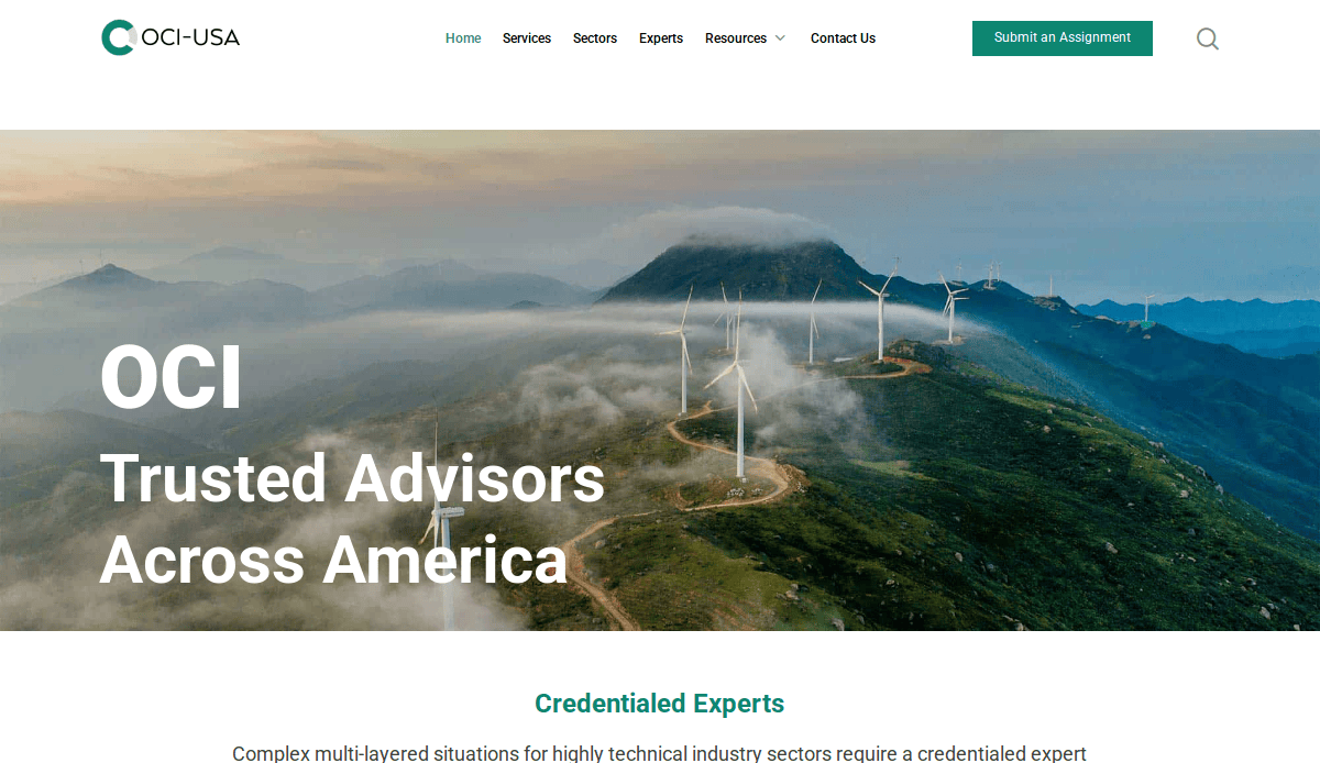
18. OOCI, Inc.
Location: Houston, TX
Key Takeaways:
- Focuses on structural engineering with detailed project descriptions
- Visual appeal, but also informative content
- Displays the firm’s capabilities in engineering consulting
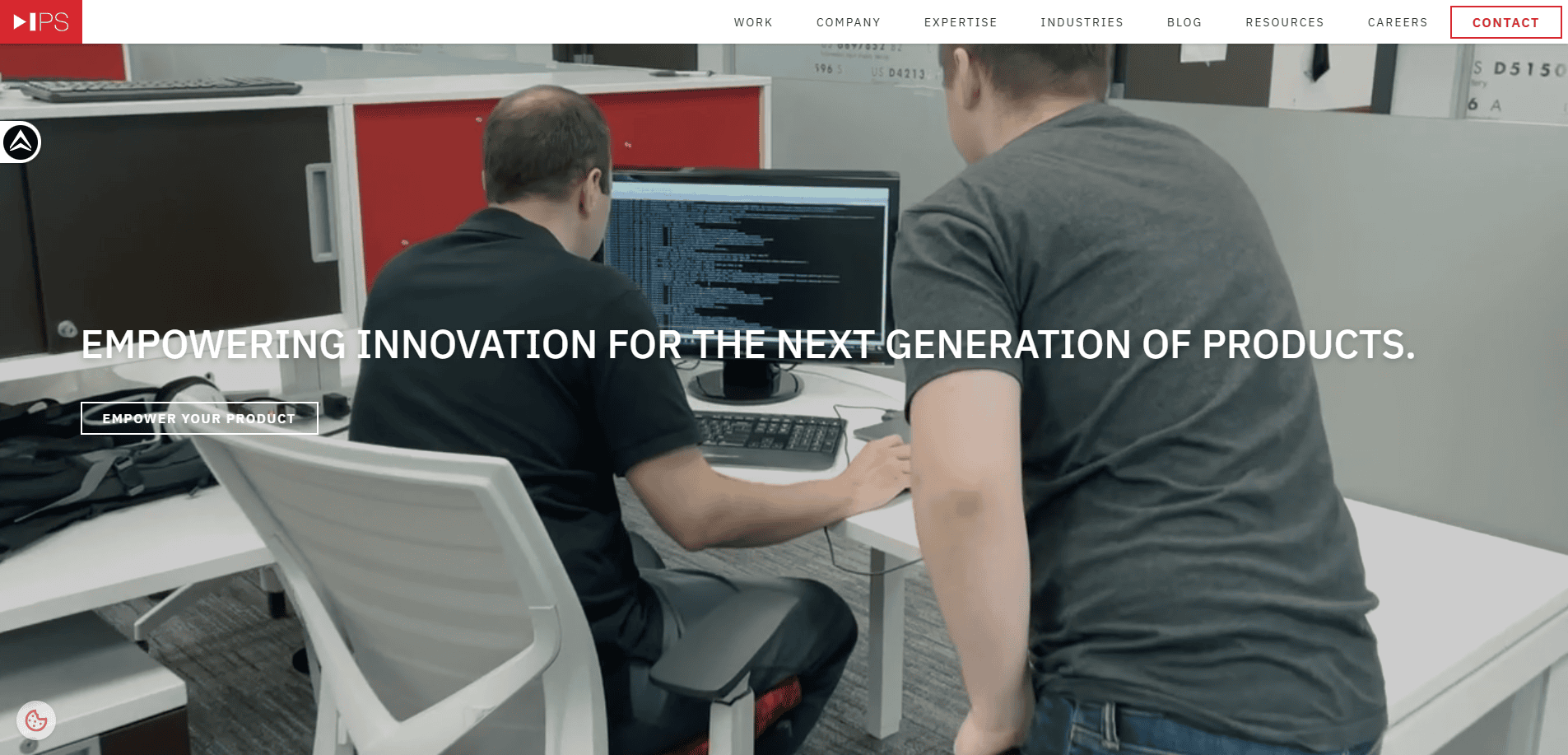
19. Intelligent Product Solutions
Location: Hauppauge, NY
Key Takeaways:
- Highlights engineering and design services with engaging visuals
- Clear CTAs guiding users to explore their extensive offerings
- Presents a brand’s commitment to innovative solutions
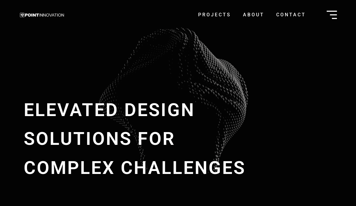
20. Point Innovation
Location: Plano, TX
Key Takeaways:
- Highlights a wide range of services, including product development and engineering
- Incorporates high-quality images and videos
- Website effectively communicates the firm’s expertise and professionalism
These websites exemplify how firms in the civil sector can effectively communicate their services and projects through engaging visuals, intuitive navigation, and clear calls to action. Incorporating these elements can enhance a firm’s online presence, attract new clients, and display engineering excellence.
Take the Next Step Toward a High-Impact Website
Your website is one of the most powerful tools in your business development strategy. Whether you need a redesign or are launching a new company website, investing in high-quality web design can make all the difference in visibility, engagement, and conversion.
Our agency specializes in web design for professional service firms, including civil engineering companies. We build websites that are easy to navigate, optimized for search engines, and structured to drive measurable results.
Contact us today to discuss your civil engineering company website project.
Top Web Designing FAQs for Civil Engineers
What makes a great website for civil engineering firms?
A great website demonstrates the firm’s capabilities with engaging visuals, easy navigation, and content that speaks directly to potential clients and partners. It should reflect engineering excellence while highlighting services and projects with high-quality images and videos.
How can we ensure the website effectively communicates our firm’s strengths?
Use detailed information, project case studies, and visuals that reflect the wide range of services you offer. This helps users to easily find what they’re looking for while gaining insights into the company’s expertise.
What website features are essential for an AEC-focused company?
For AEC firms, essential website features include service-specific pages, interactive project galleries, calls to action, mobile responsiveness, and clear pathways for conversion. A seamless experience across devices enhances the visual and UX by creating an intuitive site architecture.
Should we highlight specific services like electrical engineering and surveying services?
Yes. Highlighting specific services ensures your website captures search results for niche queries and appeals to a wider audience seeking full-service engineering solutions.
How often should fresh content be added to an engineering web design?
Regular updates with blog articles, new engineering projects, or industry news demonstrate your firm is active and current. Fresh content supports SEO and positions you as a thought leader.
What’s the best way to present our engineering and design services?
Use a structured layout that includes overview pages for each service area. Incorporate engaging visuals, bullet points, and case studies to explain your process and innovative design approach.
Why is brand recognition important in civil engineering web design?
Brand recognition builds trust and helps attract new clients. Consistent use of colors, logos, and messaging enhances your website’s identity and supports long-term engagement.
Can a company website help generate leads for engineering consulting?
Absolutely. A professionally designed site with strong CTAs and relevant content can position your firm as a trusted source for engineering consulting and drive conversions from your ideal customer profile.
What role does user experience play in structural engineering websites?
User experience is key. A highly functional, easy-to-navigate site that incorporates engaging visuals and dynamic content ensures visitors to navigate confidently and take action.
Which firms have strong examples of civil engineering websites?
Companies like Kimley-Horn, Mackin, Menk, and Dunaway are known for websites that highlight innovative solutions and present detailed insights into their firm’s capabilities. These sites demonstrate how to explore their extensive service offerings while delivering a dynamic and engaging online presence.
For more inspiration and actionable insights, view our 20 Best Civil Engineering Website Designs to see how top firms display their engineering projects and brand’s strengths online.

